AI Icon Generator Tutorial: How To Create Own Brand Icons with AI in Minutes
8:38

AI Icon Generator Tutorial: How To Create Own Brand Icons with AI in Minutes

AI Master 05.03.2026 391 просмотров 31 лайков

Machine-readable: Markdown · JSON API · Site index

Поделиться Telegram VK Бот
Транскрипт Скачать .md
Анализ с AI
Описание видео
#sponsored Use code AIMASTER50 to enjoy 50% off your annual plan for Venngage Premium or Business Plan https://venngage.com?utm_source=aimaster&utm_medium=referral&utm_campaign=general AI Icon Generator https://venngage.com/ai-tools/icon-generator?utm_source=aimaster&utm_medium=referral&utm_camp aign=general @venngagevids 🚀 Become an AI Master – All-in-one AI Learning https://aimaster.me 📹 Get a Custom Promo Video From AI Master https://collab.aimaster.me 
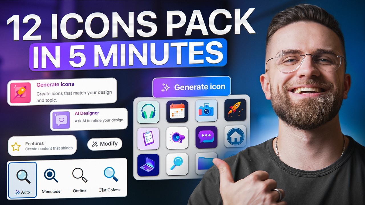
If you've ever downloaded icon packs from different sites and watched them clash on your landing page, this video is for you. Learn how to create a perfectly consistent 12-icon set with Venngage's AI Icon Generator using one base icon as your foundation — same stroke weight, same corner radius, same visual density across every single icon. Whether you're building feature grids, pitch decks, or social ads, you'll have a cohesive icon pack that elevates your entire campaign. ✅ WHAT YOU'LL LEARN: • How to generate brand-consistent icon sets in under 10 minutes • The base icon technique that prevents style mismatches • Step-by-step walkthrough of Venngage AI Icon Generator • Export settings for production-ready icons (PNG, transparent backgrounds) ⏱️ TIMESTAMPS: 00:00 — The Frankenstein Feature Grid Problem 00:55 — The Solution: Base Icon System 01:23 — Getting Started with Venngage AI Icon Generator 02:21 — Creating Your First Base Icon 03:10 — Duplicating & Modifying Icons (Consistency Hack) 06:01 — Exporting Your Complete Icon Set 07:21 — Real Value & Final Tips 📬 STAY UPDATED: Subscribe for weekly AI tool breakdowns, automation tutorials, and no-code workflows that save you hours every week. #VenngageAI #AITools #IconsDesign #Venngage #Productivity #BusinessTools

Оглавление (7 сегментов)

The Frankenstein Feature Grid Problem

If you've ever downloaded icon packs from three different sites, dropped them into feature grid, and realized they look like a Frankenstein's monster, different stroke weights, mismatched corner radius, inconsistent visual density, this video is for you. Here's what that looks like. Messy, unprofessional, and here's what it looks like when all 12 icons come from the same base icon with consistent style rules. Night and day difference. That's what we're building today. Here's the pain point. You're launching a flash sale campaign. You need icons for your landing page, feature grid, sale tag, timer, delivery, truck, the works. You download icons from different sources. Drop them into your design, and immediately realize they don't match. The stroke weight is off, the corner radius varies, the visual density is inconsistent, looks like a collage, not a system. Here's the solution. You can

The Solution: Base Icon System

create a complete 12 icon set with perfectly consistent style by starting with one base icon, then copying and modifying it. Same stroke weight, same corner radius, same visual density, all from a single foundation. You can export as PNG, drop them into feature grids, add labels, and have a production ready icon system in under 10 minutes. No design degree required. Let me show you exactly how this works. We're starting

Getting Started with Venngage AI Icon Generator

on Ven Gage's homepage. In the center, there's an AI prompt widget. I'm clicking the dropdown. You'll see over 100 AI design generators here. Scrolling down to find AI icon generator. There it is. Selecting it. Now, the interface updates. The prompt box is ready. Now, here's the critical principle. We start with one really clear base icon. That base icon becomes the foundation for your entire set. Every icon you create after this will be a copy of this base modified to show different meanings, but the style stays locked. That's how you get consistency. Think of it like a template. You're not generating 12 separate icons from scratch. You're generating one perfect icon, then duplicating and adjusting it 11 times. The AI keeps the stroke weight, corner radius, and visual density identical because it's working from the same source file. That's the key to avoiding the Frankenstein effect. All right, let's create our base icon. Here's the

Creating Your First Base Icon

prompt for our base icon. Sale tag icon for flash sale campaign. Bold, high contrast, consistent style, simple shapes. Why this works? We're being specific about style constraints. Bold outline, high contrast, simple shapes. These parameters will carry through to every icon we copy from this base. The green on white gives us a clean visual anchor. Hit and generate. The AI processes for about 10 seconds and done. Here's our base icon, a sale tag in bald outline style. I've tried several different styles of generations until I found the one I like the most. Clean, recognizable, strong visual presence. This is the foundation for our entire 12 icon set. Now, before we modify anything, I'm going to make a critical

Duplicating & Modifying Icons (Consistency Hack)

move. I'm clicking the icon, making a copy, and pasting the copy below. This is the workflow. Never modify the original base icon directly. Always work from copies. Why? Because if something goes wrong five icons in, you can always come back to the original and start fresh. So now I've got two sale tags on the canva. The original base at the top and a copy below it. The copy is what I'll modify into our next icon. Let's do that now. I'm selecting the copied icon. Clicking that. A prompt box opens. Here's where the magic happens. I'm typing turn this into a percent icon. That's it. No need to restate the style rules. The AI already knows the stroke weight, corner radius, and visual density from the base icon. This prompt just tells it, "Keep the style. Change the meaning. " A few seconds later, the icon updates. Now it's a percent symbol. But look at the stroke weight identical to the sale tag. The corner radius, same. The visual density matched perfectly. This is what consistency looks like. Let me repeat the process for the next icon. Clicking the base icon again. Making another copy. Pasting it below. Selecting the new copy. This time I'm typing turn this into a timer icon. Generate. Done. Timer icon. Same style. I'm building a system, not a collection of random icons. Let's speed this up. I'm going to show you the workflow for all 12 icons. Icon 3. Copy base. Modify. Turn this into a shopping bag icon. Icon four. delivery truck icon. Icon five. Copy base. Modify. Turn this into a gift box icon. Icon six. Copy base. Modify. Turn this into a coupon icon. Each one takes about 15 seconds. Copy, paste, regenerate. Done. By the time I finished all 12, about 4 minutes have passed. And every single icon matches the base. Same stroke weight, same corners, same density. Copy to paste to modify. Never generate from scratch after the first base icon. That's the rule. You can also not just modify the object, but edit the shape and structure of the object, like crop it to have the full size of the icon to fit the image. And here's something important. If you're not fully satisfied with the generation result, you don't have to accept it. You can refine it using the same modify function. You can even highlight exactly what you don't like. Maybe the proportions feel off. Maybe the symbol feels too thin. Maybe the spacing looks unbalanced. And tell the AI to adjust it. The more specific your feedback, the better the refinement. The next result will incorporate your corrections while still preserving the original style system. You're not just generating icons, you're art directing them. Here's the mistake I see people make

Exporting Your Complete Icon Set

constantly. They generate each icon individually from scratch. They type sale tag icon, get a result. Then they type a timer icon, get a different result. And shopping bag icon, another result. By icon five, they got five completely different styles, different stroke weights, different corner treatments, different visual density. It's the Frankenstein's grid all over again. Don't do that. Always use copy, paste, modify if you want a clean, professional icon set. The base icon, it's your style anchor. Everything else is a variation of that anchor. Lock that in your workflow. Now that we've created a complete 12 icon system from one base, these icons are ready to use anywhere. Slide decks, landing pages, ads, social posts, product features, email campaigns. You can export them as PNG files with transparent backgrounds and drop them straight into your workflow. I can organize these into an icon sheet, export as PNG, and send it to my designer. Or use the share tab in Vengage to invite team members so they can access this icon set. Extend it with more icons using the same copy modify workflow or adapt it for different campaigns. One base icon becomes a scalable design system your whole team can use. The real value here is speed

Real Value & Final Tips

and reusability. These 12 icons took about 8 minutes total to create. from the first base icon to the final export. Compare that to sourcing from stock libraries, dealing with licensing, manually adjusting stroke weights, and hoping everything matches. And because you built this from one foundation, you can come back next month for a different campaign, copy that same base icon, and generate a completely new themed set in the same amount of time. Holiday sale, product launch, seasonal promo, same workflow, same consistency, different icons. And remember, icons are just one part of the system. The same AI workflow inside Bangage lets you generate full infographics, presentations, and campaign assets using the same design logic. One base element, copy and modify, lock in consistency. It's a method, not just a tool. If you want to try this yourself, the link to Vanage AI icon generator is in the description below. It's free to start. You can generate icons, experiment with a copy modify workflow, and export your first set without a credit card. And if you found this useful, tag Bengage Vids on YouTube so they know this video helped you. Thanks for watching. and I'll see you in the next one.

Другие видео автора — AI Master

Ctrl+V

Экстракт Знаний в Telegram

Экстракты и дистилляты из лучших YouTube-каналов — сразу после публикации.

Подписаться

Дайджест Экстрактов

Лучшие методички за неделю — каждый понедельник