Matplotlib Tutorial (Part 10): Subplots
21:22

Matplotlib Tutorial (Part 10): Subplots

Corey Schafer 19.06.2019 263 056 просмотров 5 781 лайков

Machine-readable: Markdown · JSON API · Site index

Поделиться Telegram VK Бот
Транскрипт Скачать .md
Анализ с AI
Описание видео
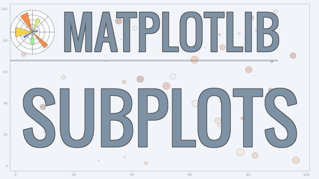
In this video, we will be learning how to use subplots in Matplotlib. This video is sponsored by Brilliant. Go to https://brilliant.org/cms to sign up for free. Be one of the first 200 people to sign up with this link and get 20% off your premium subscription. In this Python Programming video, we will be learning how to use subplots in Matplotlib. Subplots are used so that we can use Matplotlib in a more object-oriented manner. We will learn how to use subplots to plot data we have seen in previous videos, and then we will learn how to use subplots to create multiple plots on one or more figures. Let's get started... The code from this video (with added logging) can be found at: http://bit.ly/Matplotlib-10 Unpacking Quick Tip - https://youtu.be/C-gEQdGVXbk?t=782 ✅ Support My Channel Through Patreon: https://www.patreon.com/coreyms ✅ Become a Channel Member: https://www.youtube.com/channel/UCCezIgC97PvUuR4_gbFUs5g/join ✅ One-Time Contribution Through PayPal: https://goo.gl/649HFY ✅ Cryptocurrency Donations: Bitcoin Wallet - 3MPH8oY2EAgbLVy7RBMinwcBntggi7qeG3 Ethereum Wallet - 0x151649418616068fB46C3598083817101d3bCD33 Litecoin Wallet - MPvEBY5fxGkmPQgocfJbxP6EmTo5UUXMot ✅ Corey's Public Amazon Wishlist http://a.co/inIyro1 ✅ Equipment I Use and Books I Recommend: https://www.amazon.com/shop/coreyschafer ▶️ You Can Find Me On: My Website - http://coreyms.com/ My Second Channel - https://www.youtube.com/c/coreymschafer Facebook - https://www.facebook.com/CoreyMSchafer Twitter - https://twitter.com/CoreyMSchafer Instagram - https://www.instagram.com/coreymschafer/ #Python #Matplotlib

Оглавление (6 сегментов)

Introduction

hey there how's it going everybody in this video we're going to be going over subplots so far in this series we've simply been creating our plots with the PI plot object and that works great for what we've done so far but if you want additional plots or if you want to work with plots in a more object-oriented manner then it's best to create your plots with the sub plots method a lot of people prefer to create their plots this way even if they're only creating a single plot so in this video we're gonna see how to create our plots using the sub plots method and go back over some of the plots that we created earlier in the series and see what changes need to be made in order to use sub plots for those examples now I would like to mention that we do have a sponsor for this series of videos and that is brilliant org so I really want to thank brilliant we're sponsoring this series and it would be great if you all could go and check them out using the link in the description section below and support the sponsors and I'll talk more about their services in just a bit so with that said let's go ahead and get started ok so I've got some sample code pulled up here in my script and if you've been following along with the series then you'll likely recognize the other matplotlib code that I have here at the moment but if not then let me go over this really quick so this is actually a plot that I created in the first video of the series but we're loading in this data using a CSV file here instead ok so let me go over this so first we're importing pandas here at the top then we're also importing the PI plot module from matplotlib we are using the Seabourn style for these plots to just make them look a little bit better here and now we're loading in this data from this csv file using pandas read csv method so what this is doing is it's going and getting the age column from that csv file which if we look at this csv file these are the median salaries for these ages for the respondents who answered this survey so for age 18 these are all the median salaries 19 median salaries and so on so our age is here when we say data is equal to age and getting that key it's setting it equal to that entire age column so dev salaries were getting the all depths high Python column and Jay s salaries were getting the JavaScript column and then we are plotting all of these out so since we have PLT dot plot three times that means that we're going to have three lines on our line plot so the first plot here is the Python salaries with our label the next is the JavaScript salaries and then the all developers plot and we're also giving this one a custom color and a dashed line style then we are printing out the legend so that we know what is what we're giving this a title we are setting the X label and the y label for our axes we have a tight layout here which means that we are getting some automatic padding for our plot and then finally we're doing PLT show which actually shows our plot and as usual I'm gonna put a link in the description section below that links to this code on my github if anybody wants to download that or a copy and paste this and follow along okay so let me just run this really quick using the PLT dot plot method that we're using now to see what we can expect here and we have seen a plot similar to this earlier in the series so this might not look new to all of you okay so now let me close that down so that's what we should expect there okay so we can see that every time we're doing something with our plot we're using the PLT object that we imported that's that PI plot object we never actually created that object ourselves now that might be weird for some people who are used to doing coding and a more object oriented manner we might think at some point we should have done something like this so we maybe should have said like PLT is equal to plot and created a new instance of a plot and we can do something like that and that's what we'll be looking at in this video so the way that we're doing it now is called stateful and it's called staple because we're importing this pie plot object and we it has a current state in terms of what figure we're currently working with and what axes were things like that now we haven't talked much about fig and axes so far in the series because we've been working with a single figure and a single axis object so what are the figure and axes well the figure is the container holding our plots so you can think of that as that whole window that shows us when we that when we run our code and the axes are the actual plots so a figure can have multiple plots and this series we've seen how to work with one plot within one figure so just one axes but we can't have more than one and we'll see how to do that in this video so there have been a few times in this series where we have used these methods of PLT dot GCF to get the current figure and we have also used GC a for get current axes and like I said those will get the current figure and axes for your plot and you can switch between different ones so that's the staple way of doing it but many people prefer myself included to use the more object-oriented approach when working with multiple figures and axes so to do this we can use the sub plots method so let's take a look at this right now let's simply recreate the same plot that we currently have but instead of using the PI plot object that we imported we'll instead and Stan she ate a figure and axis so to do this I'm going to get rid of those examples there down here below my data I'm simply going to say fig comma ax for axes is equal to PLT dot subplots and that is a method now our axes here which you can just think of as plots is only set to a single ax e at the moment or a single plot that's because by default subplots create a figure and then specify a certain number of rows and columns of axes if we don't pass in our number of rows and columns then it just defaults to a one by one so one row and one column which is simply one Texas so let's update our code to plot on this axis that we just created instead of using our pipe lot object for some cases this is as simple as just using your axis here instead of the PI plot object so for example all of the places where we said PLT dot plot we can just replace those with a X dot plot and where we have PLT dot legend we can simply change that to use a x2 so I'll say ax dot legend now when it comes to the titles and on the x and y labels these are a bit different so instead of using PLT title and X label and y label we're instead going to do set underscore with those so I'll do set underscore title set underscore X label and set underscore y label so I'm not exactly sure why they did that with the naming conventions but that's just how it's done okay and we're going to leave everything else the way that it is tight layout as a method for our pie plot object so that stays the same and so is the show method that is for the pie plot object so we can leave those as is okay so now if we run this whoops and I made a mistake here you guys probably saw that as I did it but I never actually put a X here so this is a X set title a X dot set X label and Y label sorry about that ok so save that and run it and now we can see that we get the same plot that we got before but now we're using this new axis ok so why is this useful why are we learning this well let's say instead of having all of this data in one plot maybe we want this broken up into multiple plots so let's say that we wanted the Python and JavaScript plots together on one plot but then we wanted these this all developers plot to be on its own well to do this we can just add more axes and do it that way so the first argument to the subplots method is the number of rows and the none of columns by default it's one by one so that's why we get one axis but we can change that to be a 2 by 1 for 2 rows of axes and one column or however we'd like to do it I'm gonna do two rows in one column but you could do one row two columns or however you want but this is also going to change how the axes are returned so to show you an example of this let me comment out everything below here so I'm gonna comment out from data all the way down to show and let's see what we are getting for this returned AXA here so I'm going to print this out so I will print ax and I will run this and now if I make this a little larger here we can see that this ax variable is equal to a single axis subplot but now let's say that I wanted two rows and one column so to do that I could simply say in rows is equal to two and in calls is equal to one so now if I run this then now we can see that our ax variable is a list of axes subplots and now let's also see what happens if we do two rows and two columns so I will put in and run this and now this gets a little more complicated now we can see that we have an outer list here and within this outer list has two values and those two values are a list so this is one value here it's a list of two axes subplots so a total of four axes total now that might be a little confusing with those nested like that but you'll need to know how these are getting returned if you want to unpack those in a certain way but let's keep it simple here and let's go back to two rows and one column which is just the list of two AXI subplots here okay so that gives us our two axes which is what we wanted in order to break our data up onto two plots now these two plots will still be on the same figure which is the overall window if you want them to be on different figures then we'll take a look at that in just a second as well okay so instead of having these two axes and a single variable of ax like this let's instead unpack these and I can do that since we are returning a list of two values here we can then just unpack this here and I'll call this ax 1 and this ax 2 and now I will print out ax 1 and 2 so let's run that and now we can see that we are getting those ax e subplots individually now if you don't know what I did with that unpacking and would like to see more examples of how unpacking works then I do have a section on unpacking in my Python quick tip video so I'll leave a link to that video in the description section below if anyone is interested in learning more about that okay so now let's uncomment out our other code here and plot this data on our different axes so uncomment out our data and uncomment out where we plotted these out now I'm going to remove these print statements here and I think I'm gonna want the all developers plot to be on top I don't have to move it on top and the code but since I'm having it on AXI one I just want to move it up so that it kind of makes more sense visually so I'm gonna say a X 1 dot plot and plot out that all developers plot there and now I will do a X to plot for Python and JavaScript and now we can do different legends and titles and X& Y labels for these as well so I can copy this and paste it down here so now I can do let me exit that output so that we can see here so I'll do a X 1 for all of these here and I will do a X 2 for all of these here ok so now we have all of those changed so now if we run this then we can see that now we have one figure with two different plots so these are the two rows of axes okay so we managed to split these up how we liked but a couple of things pop out to me here so first since we are on one figure together we don't really need a title for both of these we can see that we have a title here and a title here so let's just see let's just use the title on top and not do the title for this second one here so I'm going to remove that for a x2 so down here we're doing a x2 dot set title I'm going to remove that and also we also have the x-axis labeled on both plots as well but I think labeling it on the bottom axis is good enough so I'm also going to remove the X label from the AXI one here so I'm going to remove that okay so now if we run that with those changes in place then I think now this looks a little bit better we only have one title here and now X label here for our bottom plot and we can kind of insinuate that these are you sharing this x axis here now if you also only wanted the X tick marks on the bottom plot also then we can also do that and we can do that by passing in an argument to the subplots method called share X so let me close this down let's go up to

Share X Y

our subplots method and I'm going to say share X whoops let me spell that correctly and I'm going to set that equal to true and there's also a share Y so share X will only label the bottom ticks for two rows and share Y will only label the leftmost ticks for two columns so if we run this then we can see that now we were we did have these extech marks here on this plot as well but since we're sharing this X now we can see that we only have these listed on at the bottom so we can see that's nice and cleaned up compared to the first time that we actually ran that okay so we have a nice figure here with two different plots but what if we wanted these plots to be on two different figures instead of the same plot well that's easy to do also we just need to create another figure and an axis the same as we did before so

Create 2 Figures

here at the top where I'm creating these using this subplots method I'm gonna change this just so or so that it only returns one figure and one axis so I'm going to take out those two rows and that one column and now I'm going to just set that equal to ax 1 now I'm going to copy this and add in a another figure and also I want to call this fig 1 so I want this to be fig 2 and axis 2 and now we already had those access ones plotted down here so we don't have to change anything there we could add that title back in and that X label back in for a x1 and a x2 down here but just to see what this looks like let's go ahead and run this and we can see that now we get two figures here so with those small changes we were actually able to create two different figures here and we can interact with these just like we would any other figures so in the very first video of this series I showed you how you could save a figure as an image using the save fig method well if we wanted to save both of these figures then we can simply run save fig on those figure objects so

Save 2 Figures

down here below everything if we wanted to save those I could simply say fig 1 dot save fig and I could call this fig 1 dot PNG let me copy this and I will do fig 2 here for the file name and for the variable there and now if I run this if it's still going to pop up with those plots I'm going to close those for now but if I look in my directory here then I have a fig 1 and 2 so it saved both of those so it's nice being able to generate multiple plots at a time like this and save them to our file system so this would be great for automating data analysis where you're plotting data in a background script and you could just have it save the plots for you and then view them that way rather than jumping into the code and looking at them that way so there's tons of use cases for things like this okay so we're

Brilliantorg

just about finished up here but before we end I'd like to mention the sponsor of this video and that is brilliant org so in this series we've been learning about matplotlib and how to plot data in python and brilliant would be an excellent way to supplement what you learn here with their hands-on courses they have some excellent courses covering the fundamentals of statistics and these lessons do a deep dive on how to think about and analyze data correctly they even use Python in their statistics courses and will quiz you on how to correctly analyze the data within the language they're guided lessons will challenge you but you also have the ability to get hints or even solutions if you need them it's really tailored towards understanding the material they've also recently released a programming with Python course and they even have a coding environment built into their website so that you can run code directly in the browser and that is a great way to compliment watching my tutorials because you can apply what you've learned in their active problem-solving environment and that helps to solidify that knowledge so to support my channel and learn more about brilliant you can go to brilliant org Forge slash CMS to sign up for free and also the first 200 people that go to that link will get 20% off the annual premium subscription and you can find that link in the description section below again that's brilliant dot org forge slash CMS okay so I think that's going

Outro

to do it for this video so I think everything that we've covered about matplotlib up to this point covers many of the basics for creating nice-looking plots from your data and also how to customize those in different ways so from this point I'm going to begin working on a series of videos covering the pandas library and how to do in-depth data analysis with that pandas actually uses matplotlib for plotting out information itself so knowing matplotlib will be a great thing to know for anyone who thinks they're interested in watching the panda series when I finished that and it's released but if anyone would like to see me add to this matplotlib series then please let me know if there's anything you were wanting learn that I didn't cover in the series or if there's anything that I just forgot and didn't cover and if I get enough requests then I can always continue adding to this series in the future and I'm also going to try to do a video in the near future showing exactly how I downloaded and parsed out a lot of this data so like I said I got from the 2019 Stack Overflow developer survey that I used in a lot of these videos and it's definitely a good practice going out there and grabbing real-world data and seeing how to get what you want out from that data and write your own scripts to plot out exactly what you want there so be on the lookout for that video because I think that'll be a great exercise for most people but with that said if anyone has any questions about what we covered in this video then feel free to ask in the comment section below and I'll do my best to answer those and if you enjoy these tutorials and would like to support them then there are several ways you can do that the easiest ways to simply like the video and give it a thumbs up and also it's a huge help to share these videos with anyone who you think would find them useful and if you have the means you can contribute through patreon and there's a link to that page in the description section below be sure to subscribe for future videos and thank you all for watching

Другие видео автора — Corey Schafer

Ctrl+V

Экстракт Знаний в Telegram

Экстракты и дистилляты из лучших YouTube-каналов — сразу после публикации.

Подписаться

Дайджест Экстрактов

Лучшие методички за неделю — каждый понедельник