Join this channel to get access to emotes: https://bit.ly/JoinBayleeJae
★♡★♡★♡★♡★
Previous Vlog: https://youtu.be/-X6FVKJ5WD8
Next Vlog:
★♡★♡★♡★♡★
MY SHOP: http://bayleejae.com
Diamond Paintings: https://bit.ly/2uYdeXK
Prints & Phone Cases: https://www.inprnt.com/gallery/bayleejae/
★♡★♡★♡★♡★
TIKTOK: https://www.tiktok.com/@bayleejaeart
BLUESKY: https://bsky.app/profile/bayleejae.bsky.social
INSTAGRAM: http://www.instagram.com/baylee_jae & http://www.instagram.com/bumblebaylee
★♡★♡★♡★♡★
Art Desk Camera Setup: https://youtu.be/yLNlPyQ2vXI
★♡★♡★♡★♡★
Royalty-free music by Epidemic Sound: http://bit.ly/1VUMR6G
Оглавление (14 сегментов)
Segment 1 (00:00 - 05:00)
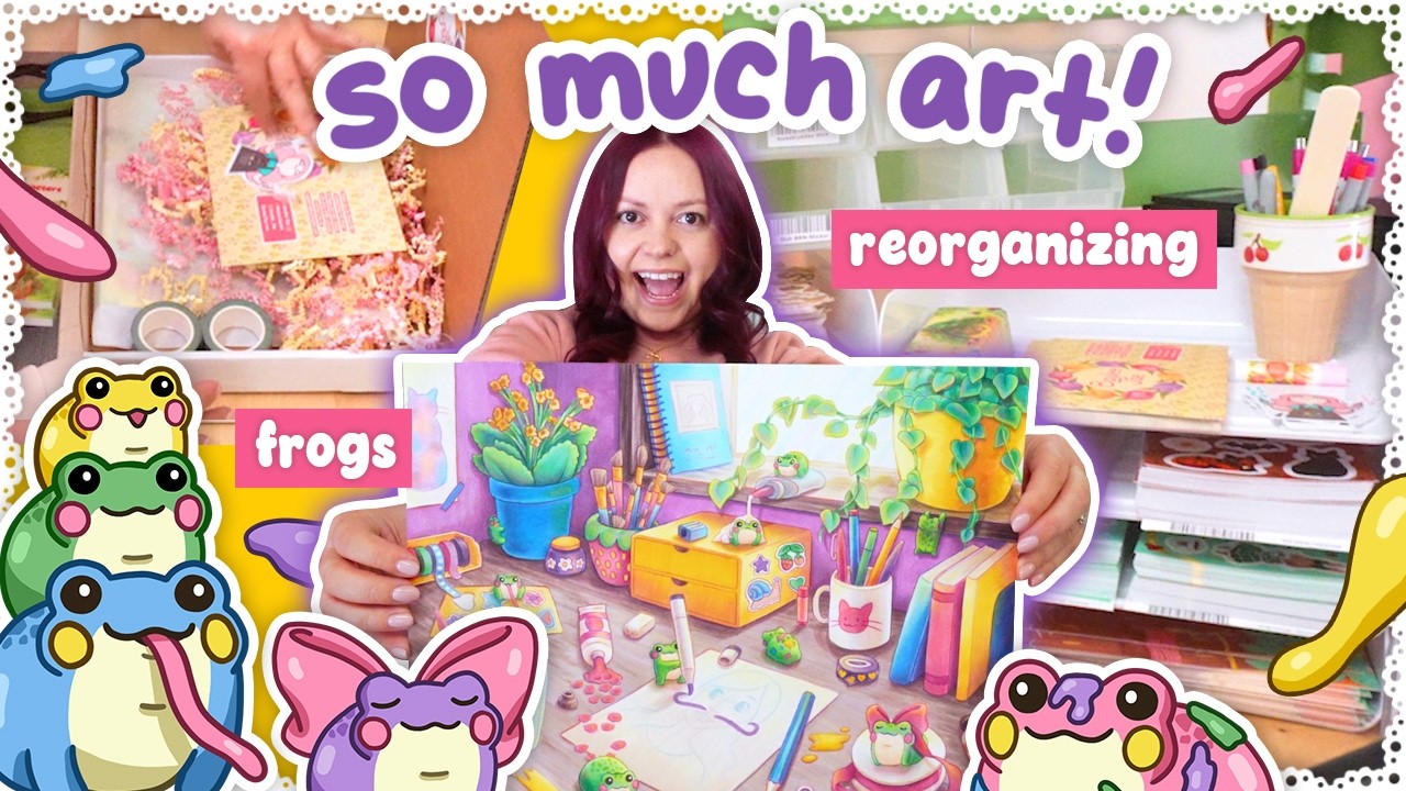
You guys, I've completed the froggy illustration. Wow. I'm going to include the process video at the end of this vlog. I just edited the clips this morning and I really tried to speed it up a lot and cut a lot out and it still ended up being a 15minute segment. So, the last 15 minutes of this vlog are going to be art speed paint with voice over for this. So, if you don't want to watch that, you can just skip the end of the vlog. Or if you didn't want to watch it, yay. And you know how the sticker sheet used to be a spider? He was eating a spider and then I changed it. Well, a real life spider was not so happy about that, which you're going to see in the middle of the art footage. But yes, in the last vlog I said I was not going to start filming another vlog until I had completed this illustration and I stuck to that and it took a long time. Holy smokes. Like I thought I would for sure have it done by Thursday, like end of day Thursday, but it took even longer. I had to do more on the weekend. And uh even just like the final steps, like when I had just the pencil outlines to do and some frogs to color in and like tweaking some values and stuff. Um I thought, okay, this will take me like 4 hours and then I can edit the clips after that. No, this took me the entire day. It took 10 hours, although I did take like a lunch break and supper break during that 10 hours. So probably like 8 hours of working on this just on the final day. So, it was a bit of a beast to complete, but I did it. I might make some final tweaks. Who knows? Like, I I'm kind of scared to. I don't want to overwork it, and I feel like I just need to call it done, but also part of me wants to just display it, and I take another look at it and see if there's things that need tweaking, but also, maybe I should just scan it. I mean, I probably should scan it just to have it scanned in case something horrible happens to it. What if like a cat chews it? I've been keeping it in a drawer, but like if I'm going to keep it out to look at it to see if it needs changes, then it's prone to being assaulted or like what if I spill a drink on it, you know? So, maybe I will scan this right away and then if I make tweaks, I can just scan it again. Mhm. So colorful, so cute. I'll give all my thoughts in the speed paint portion at the end of this vlog. I also want to take some pictures of the artwork for social media, like sitting on my desk surrounded by markers and pencils. So, I'll do that after I scan it. My trusty YouTube pillow keychain that I use for my scanner. And the paper is too big for the scanner cuz it's an 11 by 14 in. So, we're scanning it half and half. Oh, wait. I should probably also like dust this off. I don't want to smear any pencil too much, but just get off a little bit of dust. And I don't nest it right into the corner like this because the SC it can't scan quite to the edge. So to not lose my edges, I need it pushed away a little bit. But then it's harder to know if it's at a perfect 90° angle. But that can be fixed in Photoshop technically. Also, since the lips are raised, there's going to be a little bit of a shadow here. So, I crop off that section. Like the lid will push it down a little bit. It's shifted, too. I need to put the hinges back on my lid. I took it off so I could scan big paintings, but I think I'm just better off photographing paintings. And I kept the hinges. I just need to put them back on. Okay. So, it just scanned a preview, but it's making adjustments to this. Like, it looks a little saturated and kind of dark. They just tried autocorrecting stuff. So, I always hit reset here and see what happens. Woo! Looks a little more washed out cuz I want to do all the adjustments myself in Photoshop. 600 dpi. Great. Let's scan. I'm just going to try to tweak it a little bit. It's not quite straight and the edge is almost cut off. So, I'm just going to move the paper a little bit. Okay, that is better. But I have to hit reset again. And now scan. And now let's do the other side. This activity requires zero cats. No nudging it. It's just doing the preview. But I got to wrangle her while it's scanning. Okay, now it's scanning. Do not step on that lid. It'll shift the artwork. M you are my prisoner.
Segment 2 (05:00 - 10:00)
Just got to give her all the attention and she'll forget about that smelly scanner. Yeah, she loves printers and scanners. Any tech like that makes noise. Mostly the printers. Huh. Okay, it's done. And now I'm going to take my social media pictures. So, I'm going to need that camera. I don't take them on my phone. I just I don't like all the processing a phone does. I mean, there's always pro mode, but I just like the pictures that my camera takes. on there. Ah, Kiki. Rest in peace, lead. Also, when I squatted, it felt like my kneecap was about to pop out. I feel like we mostly need markers top and bottom. It's like a wide thing. Okay. I mean, I should be photographing this in the photography tent. Ah, yeah, I should for the better lighting. More even lighting. Plus, I can get the top down view without glare. Okay, photos have been taken. And into the drawer you go. And lunch time. Got my veggies that I just microwaved for 4 minutes. Mixing some butter in there. Pepper. Wait. Yeah, that's pepper. I thought that was salt for a second. I would add salt, but I'm going with seasoning salt today. Specifically, some cholula. Hi. And my egg. Woo! Excellent. Sometimes I do two eggs, but I did have breakfast today, so I'm not as hungry right now. And while I eat, I'll do today's cryptic close friends secretly videotape as I nap. Odd 4213 O a four-word answer. I had a feeling odd is just here to throw us off because when you look at like the odd or even letters in this it doesn't make sense but also secretly was making me think the answer is just hidden in the letters which it is but I didn't actually spot it. I was just looking at the spacing here and I was like, "Oh, peas in a pod would work. " Which is close friends. And then I looked a little closer. If you start here, peas in a pod. And let's see if it's right. Yay. And I love scrolling down to the YouTube video to see what everyone's saying in the comment section. Odd at the end is devious if someone interprets it as an indicator to take the odd letters. Yeah. Mhm. All right, next on the docket, order packing, which is going to take up the rest of my afternoon. I suspect I have 23 orders. And when I say rest till the rest of the afternoon, I mean till 4:00. I need them all done by then, cuz that's when the mail pickup can happen. And they've come early a couple times lately. Like one time, what was it the other day? I forget. But they were at least 15 minutes early. I mean, they acknowledged that they were early when they came to the door, but we were ready. Thankfully, I didn't have many packages going out that day. Um, but today I need to really get my butt in gear. Santana's getting a B-grade stationery planner pad and a Forest Cuddles bookmark. So, this can all go in a rigid mailer. So, I'll put the thank you and sticker in there. Cute. Now, an order for Jenna, a mousy sketches art print, B-grade stationary pencil pouch, and a coloring book.
Segment 3 (10:00 - 15:00)
Rick's a little moist right now. Ever since I cleaned the brush, the tape has been wetter as it should be. That actually flung some of his juices at me. And let's do one more on camera. Then I just got to get my button gear for the rest of the afternoon. For Bonnie, we have two Winter Buns washi, winter buns sticker sheet, and the coloring book. I keep grabbing the wrong box because this size is usually on the far end, but now I have two of my rectangles up there. I removed one of the square sizes since I haven't been needing it very often. So, the prime real estate goes to this guy instead. But now I have the muscle memory of reaching to the far end. It's now 3:30. I got all the orders packed. Look at that. So satisfying. Thank you guys so much. Now I'm in the mood for a little reorg here at the packing station. I talked about it in a recent vlog how I just want more of the product on this back wall here so you can see me picking the product better. Um either if I'm filming like the live stream or if I just put the vlog camera up here. When you're seeing this view, I want you to see more of the products. Especially when I go to grab the prints over here. It's a little bit slow grabbing them and it's just so much off camera. But also, it's kind of the perfect spot for the prints. They fit so nicely there. But I still just want to play around just to see cuz the nice thing about this is like, yes, I have to reach underneath. And I probably would have to at the other space, too. But there's no counter I'm leaning over. If I move the prints over here, I will have to lean over the counter. But I've been wanting to move this um so I could fit more stuff here or even have one of these stacking things facing this way. I'm unsure, but I want to play around with it a little bit. These are limited in movement because the top shelf actually goes in between these two bins. Like you see this, it's a bit too tall to fit under here. So, it has to go that way. But if some of the print bins are there, that could maybe be a way. I don't know. I'm just going to try moving them over and see if it works. I could move the sleeves. Although, it's kind of fun having you see me grab from there. But if I wanted to, I could put them on the shelf. like this could be more of the packing supplies instead of product. And then there's this area down here which is also mostly packing supplies. So that's another thing I could change. This does stick out further than that shelf though. So I would almost want to like extend that shelf somehow or just have something else in front. I don't know. I just want to play around. Maybe it's as simple as just having more of the pencil pouches down there all next to each other. Cuz right now
Segment 4 (15:00 - 20:00)
there's the pink ones there. But then Forest Cuddles is here and then the B-grade pink ones are down there. They could all just be beside each other. One thing though is usually as I pack orders, I set the completed orders here. As you saw, they're all stacked up here. But as it builds up, it does block access to me grabbing product. So if I had even more product on here, I would have to stop putting those boxes here. And I do like seeing them pile up and how you guys can see the stacks pile up. So, I don't know how I feel about not putting them here, unless they're down here somehow. Like, they stack in front. I don't know. And part of me likes that this shelf is recessed because the garbage can fits nicely under here. So, I don't know. I'm just going to start moving things around. First things first, move these. I don't even use this as my main pencil holder or anything. And the only thing I grab are empty labels from here, but it does not need to be sitting here cuz I've got this for my pen holder. And I put some things in here. So, let's just set these aside. How about just there for now? I just wanted to vacuum under here real quick. And now I'm on a side quest trying to repair this vacuum. It's making a horrible noise. It actually started doing that the last time Christian used it and I forgot about that. Um the motor makes a really weird noise. And now I'm watching videos about how to take this apart cuz I think there's something in there. I actually have the proper screwdriver with the hole in the middle thanks to taking apart my Xbox controller. Actually, this is a bit too small. I got one screw loosened, but on the rest, this is just slightly too small. I'm just convinced there's a little piece of debris stuck in the motor. Whatever. I'm sure I can just take it to Costco and get another one. Let me show you the sound. It's awful. And it just randomly started doing that miduse, so I don't know. Okay, the rearranging is done. Just going to step over this mess. M. So down here, I did what I said, moving the pencil pouches here. I did leave some of the packing supplies down there, just cuz like what else am I putting on the floor there, but in theory, I could have additional product bins. They don't have to be tucked underneath the green. Like they could be partially tucked, but just stick out the same way the garbage can does. Um, but as of right now, not necessary. These sketchbooks I consolidated because we're sold out of one of the Lunas and Halloween cats. And so there's only two variants of each. So we can all fit here except the B-grades I left up here just cuz there's empty space. Now back up here. Um I put the prints on the counter like this, but I realized I can't really have them pushed too far back otherwise these are in the way. So, I'm keeping them pulled forward. And I feel like that doesn't really matter because either way there's wasted space. Like either it's in the front or the back, there's empty space. And if I really wanted to, I could just push them back and pull them out. But I don't think that's necessary. They can just stay sitting out like this. And then for the square prints, they're up here, which is not the best, but I think it's fine for now. And I don't plan to restock those square prints, so I can deal with the awkward scanning that I'm
Segment 5 (20:00 - 25:00)
going to have to do for these. And now moving this way, this storage unit is in the exact same spot it was before, but the other one is now on this side. And I was going back and forth about what to do in this space, but I ended up moving the computer tower, like put it up on its side and moved it back there. And then this is just sitting directly on the counter. It could sit on the computer, but I'm worried about like the computer overheating, even though it doesn't do much. But this thing that was on the computer before, it's raised up on legs, so the computer could still breathe. And I debated propping it on something just to hold it off the computer. And then I was like, why don't I just move it? Like, why do I need it right there? But then I had extra space up here. So, I was like, should I get a couple more of these stacking things to stack even higher? I also thought this could nest into it to create an extra level. But I kind of like it like this for a couple reasons. Number one, I was able to put more of these bins back here on the bin rail. They just clip onto that rail back there. But the bottom one does. The top one's just sitting on the other bin. Um, so I could fit more stickers here. And it allows me to put this cup on top. So it's not sitting in front blocking stuff. It can just sit up here. And I've still got the thank you cards and freebie stickers over here. Um, yeah. I feel like that's pretty nice. I might have to rearrange a few things as products come in for the Froggy collection, but that's looking really good. And I did get all product off of here except those B-grade sketchbooks, which honestly I could find room for them on my other shelves. But again, I was like, this is not even full of packing supplies, so just leave them. Hopefully, it's not too annoying that I moved my sleeves over here. The smaller ones are still at the packing station. They're still right here. Um, but now the bigger ones are moved over. I'm sure that'll be fine. I'll just have to get used to reaching to the new location. Some of this is not even really packing supplies. this mainly. Um, these are just empty tape rolls and I keep them. And you know what? They have come in handy cuz that's what's behind the prints right now. That's what's holding them forward. Poly mailers at the bottom. Brown tape here. Miscellaneous small things in there. And then these are the bags that I put the packages into. As you saw earlier, I just got a new shipment of these in. So, I've got a lot of those. So, these flat book boxes are still up here. And then I put these label rolls up here. They were just sitting right next to the crink. And honestly, they still could, but I was like, let's try just pulling it through these little bars. I don't know. Neat little dispenser, cuz why not? Nothing else is on this shelf. So, yeah. This is now all packing supplies and all the fun stuff is back here and visible to the camera. So, next I am going to do some more froggy collection planning. I wrote this out early January and when I wrote it, I thought I would have the full Froggy illustration done by the end of January. That was not the case. I just finished it now, mid-March. So, of course, we're behind schedule, but um I just need to go through and see what products I do want to do and don't want to do, but also what kind of froggy art do I still need to make cuz I now have that full illustration. Then I also have a digital illustration that's just flat color with some cell shading. That was the froggy palettes that we used for the DTF. And like I could single out frogs from there, but also add to them. Like you know, we have the bow frog. Do I want a digital version of the bow frog? What do you see, Kiki? What's out there? But also, is there any other art I want to create traditionally for the froggy collection? because, you know, I wanted to turn some of the traditional art into products and then some simple digital stuff into products. But like looking at the illustration, I'm wondering what I could even turn it into cuz you know, I could do a notepad for example, but how would I turn that illustration into a notepad? It's not like Forest Cuddles where I had clear sections I could cut out. Like it's different. There are some elements I could isolate, but a lot of items do overlap others and I just don't know if that would work for a lot of products. Obviously, it's going to be a print and I would love to also turn it into a bookmark. I don't know how I'm going to choose which part of the illustration makes it onto the bookmark. I'll just have to kind of see. I don't know, open Photoshop and see what aligns nicely. Some of the frogs in the illustration could be die-cut stickers, but I would maybe rather go with something like what I've already done. Like we have bow frog in the big illustration, but then I also have a bow frog I drew separately. Like both of these little guys could be diecut stickers, but I could also just draw more. I could do more traditional stuff like this. So, that's where I got to decide how much of it's traditional
Segment 6 (25:00 - 30:00)
versus digital and which products for each illustration type and am I going to stick to all the product types I listed out in here? Especially cuz now like the timeline's kind of messed up. So, you know, I wrote diecut stickers. Like, which ones are going to make it into diecut stickers? What could I turn into a sticker sheet? It's hard to fully decide when I don't have all the art made, but I need a list of what art to make. And I wrote stuff on here like embroidered tea. We're not doing that. We did end up doing a DTF t-shirt design, so that's fine. I was also going to do a DTF zip. There's this blue blank I've been wanting to do something DTF with cuz it's kind of a tighter fit than the existing zips I use. So, I wouldn't want to do embroidery on those sleeves, but DTF could be cool. So, I was picturing something where there's some element down the sleeves, then potentially a small thing on the chest. Something big on the back would be cool, but then the DTF's getting real expensive with such huge transfers all over it. I don't know. And we already did a back design with the gallery pets. Um, but anyways, sleeves for sure. Then maybe a little something else. But my original vision for that was like frog and lily flowers and stuff and like watery elements. So, if I do go forward with that, that's going to be quite different from the rest of the Froggy collection, which is fine, but it's like, is that just something I should do later, like a separate apparel drop? I don't know. And yeah, I just want to look at my Froggy art again and be like, can this be turned into a notepad or is the notepad going to be the digital froggies only? And I'm hoping my full illustration I just finished would still work for this. um like not just on the front of the book, but the whole thing would be across the cover. So like if you opened the cover like this, you would see the full illustration. I think that would be pretty cool cuz looking at just one half of it, it still looks good. So that I really want to do. Just looking at this palette right here, my illustration stuck to exactly that. Papers keep falling out of here. I need to make a little pouch for this book. Every time I lift it up, all my sheets are pooping out of it. Still want to make this a shirt. Yeah, I'll do a big like apparel designing thing after the Froggy collection cuz if I can avoid releasing made to order stuff during a big shop update, that'd be great cuz Christian can help me pack orders. There's still going to be some made to order stuff he'll have to make for like existing designs, but I don't want to release any new made to order apparel during a big shop update. Like if I end up doing those DTF zips, they're going to be all pre-made. See, some of these froggies could be cut out and turned into stickers. This could as long as I cut off the ribbon somehow. Um, but we do already have the other version of it. So, which one makes it into a diecut sticker? Um, this one is a bit small. That's one I wouldn't mind redrawing at a larger size. this. I don't know how I'd turn it into a sticker unless it was just the frog and the marker with nothing else. But is that interesting enough on its own? Same with this. He's got too much other stuff going on. Um, but this one could be a diecut sticker. Like it's drawn large enough. This guy, he's got some overlap. Like there's the washi overlapping and the paint brush. So, I don't know if that would work. And then this duo, I guess, could be a diecut sticker. Hang it on by a thread in the middle, but it could work. They're a bit small, but like overall the sticker would be big cuz it'd be that whole chunk. Oh my god, this snail I could turn into a sticker. Oh, wait. I already did. And then of course the whole thing could be a sticker. Hopefully that would read. Okay, I might have to make it a big sticker. I'm going to print off some sizes. Like usually I do a 3inch wide sticker for my full art pieces, but it might have to be like a 4 in sticker or something. We'll see. And let's say I do a sticker sheet. Is it going to be again these frogs and then redraw some of them or is it going to be the digital froggies? These are the things I need to think about. You know, some of this could still be isolated and be at the edge of a product. Like sure, this froggy's overlapping some stuff, but like he could be at the edge of something like notepad for example, cuz there's more stuff I could cut out. I could cut out this whole frog with plant, including this jar. The books could go at the edge of something. I can cut out this cup. Like I could actually make a notepad out of this, I think. And I can take parts of the leaves. It's going to be a lot of cutting out specific things from this illustration, but I think it's doable. I'm doing this in a spreadsheet so I can easily move things around. Oh my god. Imagine bouquet of frogs. I'm quickly going to stitch these two halves together so I have a full version of the
Segment 7 (30:00 - 35:00)
illustration to look at. I'm not going to clean up the scan right now, but yeah, I just cropped off a bit of where that lip was that I was talking about earlier, the lip of the scanner. I'm going to close both those files. And then I go to file, automate, and photo merge. And then I'm going to grab those two files. Okay. Okay. Boom. Merge together with masks in case I wanted to adjust anything. I've printed this off cuz I'm going to take this show on the road. I'm going to fill out my spreadsheet upstairs on my laptop. And it's now Tuesday. spent my morning editing as I often do and then I went back to my vacuum. We have a compressed air gun, like a rechargeable electric one, and I was going to use it on the motor yesterday, but as soon as I turned it on, it died. So, I let it charge overnight and I used it again today in addition to a compressed air can that we have. And I think the vacuum is fixed. It's still a little scratchy on startup, but it sounds great while it's running. SO, I think it's fine, at least for now. I haven't reassembled it because the filters are wet. I washed them. Um, and so they're just drying right now. But, woohoo, potentially fixed without having to take it apart. Cuz the level of disassembly I've done so far is just your standard disassembly to clean the filters. Maybe I should have just let it be broken and took it in for another one cuz like who knows how long it's going to last now. And also the battery doesn't last as long as it used to. Although it's technically replaceable, but it's such a shame to throw away stuff rather than fix it. Like if it's fixable, I would rather do that. Now, as for my spreadsheet I was working on last night, I can show it to you. It's not complete. I think for some of the decisions, I'm just going to have to start creating more of the art and go from there. So, first of all, listing out some of the artwork. So, there's the full marker illustration. I can cut some elements out from that marker illustration. Then, there's the froggy palette art that exists already. Then, there's individual digital frogs and then digital frogs with props. And then I also want to make a pattern out of those digital frogs. And so, some possible props would be the bow, the wings. I was thinking like a frog sitting in a puddle of paint with paint smears on it. A little stack of frogs, two to three frogs, like a big one, a medium one, a small one. And then maybe a beret and brush to stick to the art theme. Who knows? Then I'm, you know, writing out the different product types and what I'm going to order for those product types. So, enamel pins. I want to restock some old ones. Halloween Cats, Luna Moth, Luna Moth Pink, which I've never done before, but it would use the same mold as the regular Luna moth. And then Monkin, and then for a new one, evil frog. But any of these, wait, where was I? Any of these could become an enamel pin. I just want to draw them out and see what they look like. So, to be continued there. Um, sticker sheets. I don't know still if the illustration is going to work for that, like the full marker illustration. Um, but I could add on that individual bow frog and wing frog if needed. And then the digital one will for sure work as a sticker sheet. Then for die cuts, the froggy palette can be a die cut. The watercol frog maybe. And same with bow spool frog. I'm undecided, but it's a possibility. Or maybe I'm just going to stick to the digital froggies for the diecut stickers. Um, I'm going to bring back Squeaky Seamstress and Floral Kiki, floral midna, and the floral bouquet. I swear I can taste dust from that vacuum cleaner. Okay. Um, notepads. I think I can make the marker art into one if I just cut out different elements and uh then the digital frogs. It' be more of a border style. I imagine the marker art one being a bottom heavy design like maybe a little bit of stuff at the top but then a lot bottom of the notepad and then a sticky note version of those. And then planner pad. I feel like I'm just going to do one. So, it's either going to be the digital frogs or the marker art depending again how the art turns out. I'm going to look what I have, look at what I have, and decide because I feel like it's going to be too much to have both. Unless one of them is digital download only, then maybe I would do both. But it's kind of a wait and see. Pens, I didn't write anything down, but I'm assuming it would be the digital frogs. I just don't know if it's going to be the pattern or the digital frogs. Then the journal will be the marker art. And then the end paper on the inside is going to be the froggy pattern. Now I need to move this. I shifted some stuff down. DTF zip still a question mark. Then prints. Of course, froggy chaos will be the new print. But then I'm going to restock all of these cuz for most of these I do want to keep
Segment 8 (35:00 - 40:00)
them around longterm cuz I'm not restocking everything that I brought back in the print restock. some of that as it sells out, it's being phased out because it's older art that I'm not as proud of and just don't want it displayed on the website. And honestly, uh where was it? Trick or treat buns. I don't know if that's going to be a long-term one or not, but it's popular enough that I'm going to restock it now. And then I was thinking of like what's the background color or base color for these designs because you know yeah I'm gonna make a notepad out of the full illustration but what's the background color going to be or like accents. Same with Digi Frogs. Like I keep picturing light blue but I don't know if that's too similar to the Ducky collection. But we're at a point where no matter what I do it's going to be similar in color to a previous collection just cuz I've done a lot now. So, that's a good starting point for me to go off of and I can try to make some of these products. Now, also the ones that I highlighted in red, which was enamel pin, the washi, the pens and journal, those are the things that would be made in China, and I need to order those sooner than everything else. Everything else on that list is made in Canada, I guess. Not the sticky notes. I order from a Canadian company, but it's outsourced to the US. Um, but yeah, all that other stuff I can get quicker, but the ones in red I would need to order first. So, those are the things I should design first. Oh, and I glossed over washi because there's nothing really written there under washi and clear washi. Under regular washi, I wrote evil frog cuz I think it'd be fun to do like an evil froggy tape or like a gothic froggy. I don't know. Just kind of play on the batwing one and turn that into a full washi. There could be a few different colors of the froggies or maybe some have something else instead of the bat wings just like a dark themed froggy washi cuz like not everything has to match every other product in the collection. There can be some froggy stuff that's a different design. And of course the digital frogs will make it into a washi. It's just a question of is it like a clear washi or regular and like what else is there other than just the frogs? Like little accents. Do we still want paint blobs or do I want something else? There's so many possibilities for washi. So many that I didn't even write anything down for some reason. Oh, and I never mentioned bookmarks either. So, I'm for sure going to do one using the marker art. Will the digital frogs also be turned into a bookmark? I don't know. Do I need two different froggy bookmarks? Maybe not. But we'll see how much I end up liking the art I create. Maybe I will want to make it into a bookmark. Now, as for today's tasks, I feel like I either need to clean up my scan of the marker art and start cutting elements out of it, or do my digital froggies, isolate them from the palette design, and then save those off as just plain frogs, but then also the froggies with props. And honestly, I'm kind of leaning towards that one cuz then I'm going to have a better idea of the elements I have for all these products. Okay, I've opened up Froggy palette and I saved it off as its own file because I'm going to be moving stuff around. Like I've got a color layer on the lines. I'm just going to merge that. It's like just the pinks and then the pink shadows. All the purples and the purple shadows. Okay, now the lily pad is the only green there is. So just hiding that. Boom. So I'm going to do this a lazy way. I'm going to save this off as a PNG and then just delete the stuff I don't want. Then I'm going to save off each frog and each of the main blobs as its own separate image and I'm going to add those to an Adobe library. So I'll bring this over a little closer to you. I've got various libraries like stationary collection assets. I click that and I've got each of my stationary collection items separate as its own item and I can drag and drop that into any document and that makes it so much easier for creating a bunch of different products and it automatically makes it a smart object which is nice. Uh we have winter buns for example. Ooh, all my winter bun stuff. So, that'll be today's project is getting the regular digital frogs in the library as well as the versions with their props and any paint splotches and anything else I want. Okay, the file now looks like this. Everything's stacked on each other and all the layers are named. I went file, export layers to files. Made a folder for my froggy assets. I'll save them as PNGs. Let's run this. Mhm. Uh-huh. Flash is a froggy. And if I look in my folder, I can see each item being added. I did save out every single little blob cuz I was like, you know what? I might want those. I'm picturing arranging
Segment 9 (40:00 - 45:00)
frogs on a washi or something. I'm going to want these little blobs to stick different places. And I'll probably end up changing the color of some of them as needed. But um yeah, every little paint blob is saved off. And now I can take these froggies and add stuff to them. So this one's going to have the bow. You know, if I scanned this frog, I could just trace over it. Drawing it backwards was the key. Select, modify, expand, then fill in the color. Okay, I'm not going to struggle with the bat one. I'm going to paste in the scan, which I just scanned. Honestly, I think the bow looks better in the new one. Like the shape of the bow kind of looks better over here. Evil froggy. Now, because of the thick digital outlines, I'll have to modify it slightly. Like I might trace around the wings for my initial lines and then do the inside stuff. Okay. Froggy showcase. We have wing froggy. Then the bow frog. Mhm. Then the paint frog. This is what I just did. So cute. And then the artist frog. I just don't know if this one needs a little Oh, extra something. I just realized I didn't color the handle properly. I need to do that. The outlines of the handle. And then stacked froggies. now in green as well. Haha. So, for this one, I had to recolor a frog to be green and yellow cuz that's not the same angle as the as this guy. Okay, the handle outline colors were fixed. Also, I feel like it was just missing highlights on all the props. So, it looks so flat. Plus, I'm used to like my girly colors, obviously. So, orange and blue not a combo I typically go for. But I think that's a good thing just to have something different than my usual. I guess you look so much cuter now, puppy. I modified this a bit so that the puddle didn't stick out as far just cuz it was so attention grabbing. And now I have my froggy library. At least for the digital froggies. I'll add some of the stuff I cut out from the marker illustration as well. But that's the progress on that. Now, if I had to pick some froggies to become enamel pins, I think I would go with these three. I don't want to do the full line. And this I think is just going to be too big. This one obviously would have to lose the paint splotches. Actually, it might even lose all the paint underneath and be just the frog. I'll have to decide. Um, but for sure those two little blobs would have to go. Now it's making me wonder if I should ditch those blobs in general. Just keep the two little ones for the sticker and then the two big blobs are just gone. Like is it are the two big blobs a little awkward? Oh, now I'm secondg guessing everything. H. This is kind of better like old. I don't know. Like I like them both in some ways, but I just feel like these puddles are too big. Which one do you guys like better? Without the big puddles or with the big puddles? Looking at them small like this, I feel like without the big puddles is kind of better and it matches the other ones a bit more cuz they are more simple. But let me know your thoughts. I am inserting a clip from the following day because I've made version three of this froggy. Okay, this version does not have any orange in it. And why did I do that?
Segment 10 (45:00 - 50:00)
Well, I thought I would remove orange from everything. Whoa. Now, the palette version of this, like with the lily pad, it's going to stay orange. There's no green frog in that because the lily pad is green. But for these Digi Froggies, I was like, what if we change the orange frog to a green frog? And then it narrows down the color palette just a little bit and helps things feel a little more cohesive in my opinion. I played around with colors but ultimately decided on yellow and pink for this one cuz then the pink goes with the cheeks and then the yellow hat matches the feral of the brush. So that's what I've settled on. And I feel much better about this one compared to the orange froggy. And I'm so sorry if you're a fan of orange froggy. I just I decided for this we're eliminating orange altogether. And so my library grows. I'll keep orange frog in the library, but I don't plan to use it for merch. And just look at this as a color palette. Isn't this so satisfying? I love this. This is simply too adorable. And none of the other froggies had orange in them other than that paint splotch froggy, the pink one. So it was a quick fix. And now that I have these digital froggies done, it's making me realize I don't think I need to do diecut stickers of any of the traditional art other than the full art piece cuz like we've got five different froggies here plus the version of them all on the palette with the paintbrush. So that's six stickers there. That's probably enough froggy die cuts. Plus there's overlap. It's like okay it would be frog like bow frog again or wing frog again or something from the illustration. like it's making me realize that is enough for die cuts. So yeah, I'm happy with those. I'm standing up because I just I can't sit anymore right now. I'm looking around the room like what could I do standing up? I suppose I could clean up a little bit. I could put away more markers and pencils and things. Just clear off the surfaces a bit. It's not that messy in here, but it's a little bit. Got a few things laying around. I can bring up that cardboard. I just want to be on my feet for a little bit cuz I've been sitting and I will be sitting all of this evening as well. So, just got to get up and move. My old DS's. And there's this one. This is the one that has the capture card on the bottom that allows me to plug it into my computer and live stream DS games. I did a lot of Pokemon shiny hunting on here, but this was my original one without the capture card. And then even before that, my DS Light crusty needs a bit of a cleaning. But I charged these up cuz I wanted to see if I had Pokemon Bank on here cuz I'm transferring all my shinies to Pokemon Home, which I just got on my Switch. But Pokemon Home doesn't exist on the DS's. It's Pokemon Bank, but also the Nintendo eShop for the DS is now inactive. And I was like, okay, I could homebrew the DS, I guess, to get Pokemon Bank. But I do have it on this DS specifically. It's not on the pink 3DS, but on the teal 3DS, I have it. So, I want to take my shiny Pokémon off my games, put them into bank, and then transfer them from bank to home. And once they're transferred to home, they can't be sent back. But I just I want to do that. I want my shinies all in one place where I can look at them and I could even send some of them to new games that come out. Um I just yeah, you know, I never play my DS games anymore. And maybe I will restart my old Pokemon DS games at some point once the shinies are off of there. I mean, I might as well transfer over more than just that cuz I should probably go for decks completion. Like I could do it in tonight's stream, but the DS with Bank on it is the one that doesn't have the capture card. So, what I'm thinking of doing tonight is returning to Tears of the Kingdom cuz I haven't finished that game. I'm just trying to play more of my existing games that I have that I never finished, especially on the Switch cuz I didn't touch my Switch for so long. And since returning to it, cuz I was doing like the Pokemon Violet DLC stuff. Since returning to it for that, I just want to get more use out of my existing games. And I love Breath of the Wild, Tears of the Kingdom. Those are some of my top favorite games. So, I'm surprised I haven't finished Tears of the Kingdom yet, but I just got so into my PC games for a while. Like, between Fall Guys and Elden Ring, I wasn't touching my Switch very much. Okay, tidy time.
Segment 11 (50:00 - 55:00)
Got kind of a warm and cool thing going on with the pencils. And it's looking a lot better in here. Oh my goodness. Now, I think I'm going to do some more video editing. Just edit the footage I got today. At least as much of it as I can until supper time. Premiere Pro is not letting me drag clips onto the timeline. I have never had this problem before. Okay, I restarted my computer. Yay. And now on to the art segment. The 15minute art segment. I'm not going to have 15 minutes worth of things to say about the art, but I've got some backup topics I can hit if I need to. So, first, let's talk a little bit about the art. I only filmed small segments of this, okay? I filmed less than half of my time spent on this, and then I cut out about half of what I filmed to present you with this video. So, I don't show everything. this would be way too long because this was a very timeintensive piece as I was talking about at the beginning of this vlog. Spent many days on it and I wanted to get it all done quickly and not drag it out cuz it's so easy for me to just put off working on something especially cuz it's like okay I can't just sit and draw for 3 days straight. I have to actually film some stuff for the vlogs and like do some things for the business. But with this I was like okay I'm going to sit down and do it. For the first few days, I did have business stuff to do on the side, but then I got a couple uninterrupted days to work on it for like the full day, and that was really nice. And I'm just so glad I didn't drag it out cuz it's just so easy, like I said, to set it aside and be like, "Oh, I need to do something else, so I shouldn't work on this. " But this was like, "Nope, this is the priority this time. " So, this is what we're doing. And with a piece of this size, I eventually end up with so many markers all over my desk and it's a mess. And then I get frustrated trying to find a certain color because I don't want to put them all the way back in the Copic case as I go cuz I'm quickly switching between colors, but also I don't want to forget what colors I'm using. And at the beginning, I was writing down what colors I used for which sections like, oh, for the purple walls, I used this as the base color, this for the shadows, whatever. And then I forgot about that and forgot to keep tracking it. But uh what I decided to do this time though is just focus on one color at a time. So after the background was done, I was like, let's hit up all the yellow objects first. And I have my little color mockup that I made previously. I already planned out what colors each object was going to be so I could just reference that. And so, okay, everything's yellow. We're coloring that in first. That way I remember what shadow colors I'm using, what pinks I'm using as well, cuz everything's got a little bit of pink in it. And that made it much easier. And then I could kind of set those yellows aside while I moved on to the next color. So I went like from yellow to blue, then to the purples, then to the pinks, and then just filling in whatever's left. And during this process, I spent most of my time with the show Friends on in the background. Every few years I got to do a Friends rewatch. It's such a comfort show for me. Plus, while working on something like this, it's nice to have on a show I've already seen because then I'm not tempted to look up at the show. I'm mostly just listening. And so, that's a good show for that because I've seen it multiple times. And that got me thinking, let's talk about some other shows I'm watching currently. That'll that's one of our filler topics here today. It's actually the filler topic. If I need more topics, I need to figure that out. So, okay, what have I been watching lately? Um, Love is Blind, which you know what? I don't think I'm going to watch Love is Blind anymore. I don't know how I've been watching for so long, but I don't really enjoy the show that much. I really only like the scenes where the groups of people are all seeing each other for the first time. So, like there's the Mexico trip and then they all meet up and see each other and then there's usually an episode
Segment 12 (55:00 - 60:00)
later on where they're in their hometown. But again, they all meet up, including some of the singles that never found a partner in the pods. Um, those are my favorite moments, but everything else is such a slog. And so, when the season ended, I was like, why am I watching this show? I've been watching every season of the American Love is Blind, but I don't know if I'll continue now. Everything else I've been watching, I have been liking. So, there was the new Bridgetgerton season, which I loved. I was so into this season. It got a little slow in the second half at times, but I don't know. I just liked the story line. I've never read the book, so it's all new to me. Although, I do know a couple spoilers because it's so hard to read stuff about the shows online without coming across book spoilers. But that's one of my favorite things is to see what people are saying about things. Like, if I see a funny post online, I'm in the comments. I got to like I just I'm a big fan of reading the comments of things and like I'll finish an episode and then I have to go run and read the discussion Reddit thread about that episode. You know, that's my kind of thing. But with Bridgetton, it's so dangerous. U another show, Survivor, there's a couple seasons every year, but the currently airing season is Survivor 50, and it's a returning season. And so I'm familiar with a lot of the players. I actually haven't seen early Survivor seasons. I really just became a fan during the new era, although I have since seen some of the older seasons or like bits and pieces here and there, but um mostly seen the new era stuff. But man, this current season, the episodes are so entertaining. Like they just picked really good players to return. They're so entertaining and I'm just loving it so much. I'm having a blast with the current season. And then I've also been watching One Piece, the live action. I've never read the manga, never watched the anime, but I love the live action. I really liked season 1 and now season 2 is out and we are about four episodes in, I think, four or five. So, I'm not fully caught up yet, but I just love how zany this show is. It's so outlandish and cartoonish despite being the live action. It's just so fun. I love it. And I like how they didn't try to uncartunify character designs and different attacks they have. Like there's a guy who picks his nose and flings his booger and the boogers explode. Like there's really weird powers like that different characters have. It's just so silly. I love it. Then I've been watching Plurabus. I'm not caught up on the episodes, but we're again maybe five or so episodes deep, and I'm quite enjoying that one. Although, I had to Google it a little bit because I was getting antiax vibes from it because it's like, you know, the big baddy is this RNA that changed people's behaviors and now humans are just one big hive mind aside from a handful of people who were not affected by this. And so it's following this one woman's journey and like her dealing with everything and you know it's kind of also about rejecting conformity and so I had to like look this up and Google it but apparently that's not the case and it was written before co and like the creator is not antiax but I was just kind of getting that vibes from the early episodes. Um so I have to get back to that at some point and then there's a new season of Outlander airing which is the final season. Ah, I thought the last season was the final season while it was airing. So, when the last episode ended, I was like, that was not a series finale. Like, what? I was misinformed. Um, so I haven't watched any of the current season. Need to get to that. And then we have a monthly movie thing we do where we have a theme every month and Christian will pick a movie based on the theme. I And this month's theme is dark fantasy. And it's currently the 18th. We haven't watched either of our movies yet. If you have any dark fantasy recommendations, do let me know cuz I have not chosen my movie yet. And I'm the one who picked the dark fantasy theme. You'd think I'd have a movie in mind. No, I still got to find one. I was just zoning out staring outside at the sun. It's a gorgeous day. I'm recording this voice over on Wednesday and it's 17° C. Oh yeah, almost all the snow has melted over the last few days. We've kind of been jumping between like warm weather and then it snows a bunch, then it's warm. That's been our current pattern. And today just feels truly spring-l like. I know it's too early to be spring. We'll most likely get more snow at some point, but man, it's just giving me good vibes. I keep staring out and I'm feeling happy, content. Oh my god. looking in that general direction out the window. I've got my little three tier pink cart next to my
Segment 13 (60:00 - 65:00)
desk and there are these glass cups in there that look just like the cup in my illustration. I could have been using that as reference for the cup cuz I was struggling with the cup. So, when the illustration was completed, as you saw it at the start of this vlog, the cup was a lot lighter in color. I've since gone back and darkened it. So, in the final look in this video, you'll see the darkened version. But then I was worried I darkened it too much or like over rendered it because it looks almost too good. Now I'm looking at these cups and I'm like, dang, I could have put a little bit of water in the cups. Although the water in my cup is bluish on purpose. It's not like perfectly clear water. I'm imagining it's paint water and maybe has a bit of paint in it. So, it's not clear water. But anyway, I had the perfect reference exact shape and size of cup sitting right here this whole time. Now, the dangling froggy who's hanging off the lip of the shelf. I was doing some of his back spots in marker and then I was like, what am I doing? It's like I totally forgot how I did the spots on the froggies last time in my sketchbook cuz I was just doing little dots of marker and then I was like, "No, I'm supposed to do it in pencil at the very end with very precise angular shapes. " So, dangly froggy. Bit of an experiment, but I kind of fixed them a little bit with pencil and then made sure to do it differently for the other froggies. And that's one thing I debate about is also the spots on the head. Should the frogs have spots on their forehead or no? For the digital version, I opted for no spots, but here in this illustration, I did add spots to their forehead, and I'm a little conflicted about that. Like, maybe I shouldn't have. So, here's what it looks like before adding any pencil. The marker is mainly done at this point. But look, I was attacked by a spider. He was on the screen, not actually on my hand. He's on the screen. Midna was a little interested in the spider, but would not attack it. And eventually, she ran away. And then the spider ran across the artwork. And look, he's mad that the licking frog is no longer licking a spider. He's mad I removed him from the illustration and now here he is on my sketchbook and I wanted to shoe him away without killing him. So I decided to like shake out the book, but then he wasn't falling. And then I got scared that he was crawling on my arm, so I dropped it. But he actually was under the book and got squished. I'm a monster. Okay. Then I took a photo of the artwork and converted it to grayscale to see the values. Now the plant in the window, the sketchbook in the window, and then the potted plant at the back were problem areas. I felt like the potted plant and sketchbook didn't have enough contrast. And then the potted plant at the back corner had too much contrast on the pot. So that was kind of like a little before and after of me fixing those areas. And that's just a handy little trick. Take out your phone, take a picture, convert to grayscale. Although I will say a lot of phones do process the artwork a lot and so I switch to the pro mode. So I cuz like it'll boost the contrast, saturation, all that stuff. So yeah, switch it to the pro photo mode and kind of mess with it till it looks accurate. Then take the picture, convert to grayscale. And I wanted to make sure my values were in order before starting the pencil because the pencil's waxy. And once you have pencil down on the paper, it's hard to color with markers cuz the wax will prevent the marker ink from absorbing into the paper. So I had to make sure I had the majority of my marker work done before going in with the pencils. And this is where it really crisps up because this whole time the footage has looked slightly blurry. It was not out of focus. It's just that all the outlines of every object were fuzzy. And so now adding in the pencil just so much better. But not just adding outlines, but darkening certain shadows. Maybe I want to add a bit more yellow to the highlights of some areas cuz it's kind of going like pinkish in the shadows, yellowish in the highlights for the colors for this. And this step took me hours upon hours. I cut a lot of it out. But by the end of the day, once the piece was finished, my arm was hurting so bad, especially in the elbow, cuz my elbows are easily irritated. And it was hurting. But man, was it worth it. This is such a satisfying step. I just love it so much. Plus, I got to add the blue on the paper, like the illustration inside the illustration, the drawing of the girl with the purple mustache. got to finally add the blue pencil for that cuz the blue pencil you see laying on the desk is the same blue pencil that was used for the sketch in theory. Then the paint water, I don't know. We don't actually see any paint actively being used. There's an open tube of paint, but I'm kind of assuming that was the frog's fault and the frog's got paint everywhere. Maybe the artist whose desk this is has a bunch of works in progress and there's just stuff everywhere. you know, the colors in this and just the subject matter. It gives me very nostalgic vibes. Maybe just cuz, you know, childhood is colorful, but just
Segment 14 (65:00 - 67:00)
something specific about this that I can't pinpoint makes me feel happy and nostalgic. Oh, these paint blobs here for the froggy footprints. They got a little out of control cuz the footprints were already a little on the big side and then I was trying to feather out the edges with pencil and it made the blobs look even bigger. But maybe the froggy just had like a lot of paint on his feet and it's kind of smooshing about. And I even added paint blobs under his feet and so that makes it kind of match. I don't know. The paint is squishing and spreading as he's hopping and so the paint marks are bigger than the froggy fitsies. But there were no major mishaps during this. There were a few spots I had to try to clean up. like on the window planter on the yellow part of it. There was this dark purpley smudginess on it. I think it was just a dirty Copic marker. Like there was some Copic ink on the outside of the barrel and it smeared on there. So I tried to lighten that up with a colorless blender. And then on the blue pot when I was darkening the values, there was randomly this really dark dot like as if I booped that spot with a marker. I don't know what that was about, but I couldn't fully cover that up. And then at one spot on the desk below the blue pencil, there's some blue marks. I don't know what that is. But other than that, I didn't mess up the artwork cuz that's always my fears. I'm going to royally mess it up and destroy it. But yes, here's your final look at the illustration with the updated water cup. I feel like it almost looks too good compared to other stuff. Like other items don't have that level of rendering. So, did I overdo it? I don't know. But it needed to be darkened. like it didn't have any real shadows to it. So, I'm glad I changed that. And on that note, that is the end of this vlog. Thank you guys so much for watching. And I'll see you in the next one. I keep tweaking things. I need to step away. I darkened this edge of the paint tube right here. It just felt too white. Show's darker now. I need to stop. Now I'm looking at this cup and I'm like, the shadows need to be darker on the cup. just I'm kind of scared to touch the cup for blending reasons. Like maybe I just darken that digitally. I don't want to overwork it, but I keep seeing things and I've scanned it multiple times. I keep photographing haven't photographed the latest iteration because I need to just step away. The cup is the main thing standing out to me now. But maybe just a digital fix. Yeah. So, this is the exact same thing, but in a cute shimmery blue, and it's got bubbles on it. So cute. So, that will live in my purse. Item number three, slippers. Cuz I've been wanting some slippers cuz, you know, I wear my foam slides around the house, but I just wanted another option. Um, especially something where I could