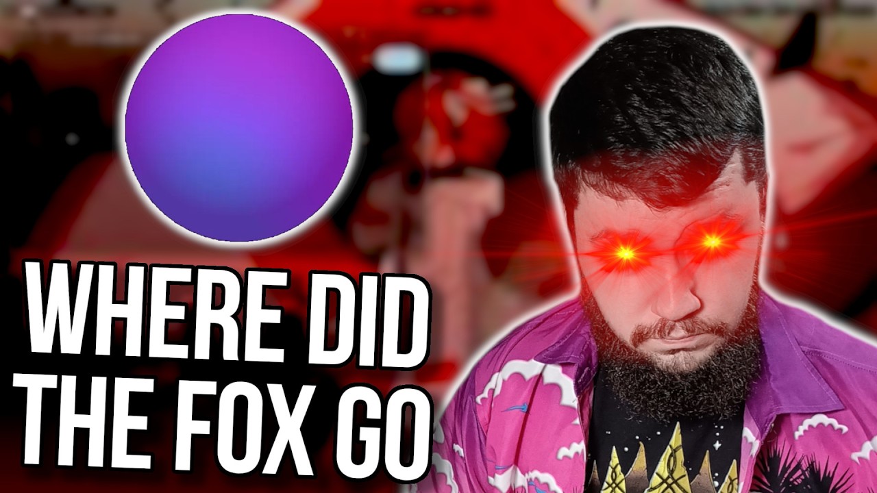
There is this long-running, and I'm going to call it a joke, but I think for a lot of people, it really isn't a joke, about Mozilla killing the fox. Ever since 2004, and we don't talk about the logo before 2004, Firefox has been a Firefox logo. It has been a flaming fox grasping the world. But as time has progressed, it has been getting more and more minimal, where now we're at a point where it still resembles a fox. You can tell this is a fox, but the world part of it is completely gone. If you said, oh, it is grasping a marble, bowling ball, it is grasping any other generic round object, I would believe you because nothing about a purple ball says world to me, says earth to me. This became such a big deal that back in 2021, they published this. Remain calm, the fox is still in the Firefox logo. This was following a bit of a social media either troll op, or just social media doing the social media thing of not actually knowing what is going on. Ah, I'll admit, I was one of the people that was duped by this, that saw this and thought, oh, well, yeah, they've gotten rid of the fox. There is no Firefox in this new logo. This went around Twitter and Reddit and everywhere around the world, and even had some fun variations to it, because at the time people cared about Among Us. Now, this, not the Among Us logo, but this logo is a logo that Mozilla was using at the time. Granted, they did an absolutely horrible job at announcing the logo and how it was being used. So that was done in this post back in 2019. Firefox, the evolution of a brand, and that is the logo. The Firefox you've always known as a browser is stretching to cover a family of products and services unite by putting you and your privacy first. Yeah, Firefox is a browser and an encrypted service that sends huge files. It's a way to protect your passwords on every device, and an early warning if your email has been part of a data bridge. Safe, private, eye-opening. That's just the beginning of the new Firefox family. Now Firefox has a new look. To support its evolving product line, today we're introducing the Firefox parent brand, an icon representing the entire family of products, when you see it, it's your invitation to join Firefox and gain access to everything we have to offer. That includes the famous Firefox browser icon called Desktop and Mobile, and even that icon is getting an update to be rolled out this fall. So this is what they had done at the time. You had the Firefox brand, and then all of these things under Firefox. So the Firefox monitor, Firefox lockwise, Firefox send, and of course the Firefox browser, which still had the Fox. All of these things, except for the browser, if they still exist, are now Mozilla thing. Mozilla monitor. Because calling it Firefox just was a confusing branding situation. People call the browser Firefox, so now changing Firefox to be the parent brand, and then calling Firefox browser, and then everything else, Firefox various other things, just led to a confusion, and you can see how they put themselves in this situation. They called this logo Firefox, they were just calling the browser, Firefox browser. If this happened so many years ago, why are we talking about this? Well, you might have spotted the logo on the video here. That's the Firefox YouTube channel. There's no fire. There's no fox there. If we actually go to the YouTube channel, yeah, we don't see our Firefox. It's in the banner. That's Kit there. But like the actual logo for the account, where's the fox? If we go to Blue Sky, the exact same thing, and also over on Instagram. Now, Twitter still has the old logo because no one actually updates their Twitter, but this is a new thing they are showing. This logo with a complete lack of fox, of fire, or better yet, the Firefox. Now, on Instagram, they posted this video. The fox, you know, it's leaving. Where did the fox go? And they said, BRB, this Firefox is going to browse for a bit. Along with posting basically the same over on Blue Sky, just without the video. And a lot of people are seeing this and thinking, oh, what is happening here? Where's the logo? What is going on? Is the fox actually dead this time?
Segment 2 (05:00 - 10:00)
I could sit here and say, oh my God, they actually did kill the fox. The end is nigh. Oh my God, what's going on? Oh no. Now, they posted a bit of a funny, funny thing here. Next week, you'll see in reply to someone saying, where'd the fox go? This is obviously bait for a marketing campaign, right? Like that is what this is. They're getting rid of the fox to get attention on this and then going to reveal some sort of new Firefox logo. It's a very obvious PR marketing stunt. And I took the bait. You took the bait. I knew what was happening here. And you know what? I'm all for it. And if you're running a site like OMG Ubuntu, for example, you might as well take advantage of it. Now, this fox here, this isn't the normal Firefox logo fox. The Mozilla designers have been having a bit of fun as of late, as in giving themselves a reason to exist because Mozilla hadn't really done a logo rebrand in a while. So this was their new mascot, not the new logo, just the new mascot to sell merch of, to use for like backgrounds and things like that. And frankly, I like Kit. Most people like Kit. Kit is a really nice design. Do they still? Yes, they do. Look, it's adorable. I like Kit. Everybody likes Kit. Kit is great. This new mascot came about in 2025, but the last Firefox logo redesign, the actual change of the main Firefox logo, that was done back in 2019. So if you're a logo designer and, you know, you don't want to keep redesigning other logos for things outside of Firefox and new logos for various things that Mozilla might be deploying, you might be itching to make a change to the actual Firefox logo. You know, the logo we have right here and the removal of the fox we are currently seeing. Honestly, if this is anything but like a marketing campaign to reveal a new fox, I will be genuinely surprised. With the last redesign being from 2019, this is the longest Mozilla has ever actually gone without redesigning the Firefox logo. It is really asking for a redesign to be done. Now, do I think a redesign needs to be done? No. Would I like it to go back to one of the older logos? Yes, personally, I do like 2017. The older logos are also nice, but 2017 was the, I think that was a good stopping point between minimal and the older design. This, I think it loses too much and I don't like the removal of the blue. But, we will still see. We have to wait and see what's going to happen here. And Joey from OMG Ubuntu has a bit of a theory on what might happen here. I'd put money on the new Firefox mascot Kit being incorporated. It's unlikely Mozilla will drop the fox hugging a globe motif and the social teasers retain it, so expect it to include Kit. A rounder looking fox is fur, tail, to visually echo the new Nova redesign coming. We will talk about that in just a bit. And honestly, I wouldn't be opposed to that. I think the current logo kind of lacks a bit of personality. It feels very, it feels very corporate, right? It feels like there is, it's like, oh, this is the optimized version of the fox. I think the older ones had a bit more flair to them. And incorporating Kit in some way, I think it'd bring at least some of that back. And whilst it is not confirmed, I think there's some evidence to back up the introduction of Kit. So on the Reddit from the official Reddit Firefox account, you may have noticed something new in Firefox. Let's talk about it. Hi everyone. If you've been poking around our recent updates, you might have noticed a new mascot showing up a little more intentionally. We figured it's time to introduce them properly. Meet Kit. And before you ask, Kit is neither a fox nor Red Panda. They're a Firefox, of course. As we've been talking more about Firefox being on your site and giving you more control over your browsing, we wanted a clearer way to show that personality outside the product. Kit isn't an assistant, a pop-up or a new feature inside the browser. This is just us giving the Firefox a name and a bit more fun with how we show up. Kit's one job is being your companion for a new internet era. Over the next few days, and this was posted about four days ago, you'll see us teasing Kit across social channels before officially introducing a new mascot next week. We wanted to share it with you all first. Welcome Kit. So obviously it's being used as a mascot within the browser, but I could see that very easily then being extended to being used as part of the logo as well.
Segment 3 (10:00 - 12:00)
Whilst I think that is highly likely, I want to propose a counter-argument, just for the sake of playing devil's advocate. Mozilla Orbit. So this was an absolute garbage AI extension Mozilla had before integrating AI directly into the browser. And the Firefox logo without the fox looks a lot like the Orbit logo. I don't think this is the direction they're going with like a redesign to sort of indicate more of their AI sort of intentions, but I don't think that's impossible either. But as I said, I do think the introduction of Kit along with their new Nova redesign does make a lot of sense. So Nova is a new design being worked on for Firefox. This is following the Proton redesign back in 2021. These are relatively early design pictures and I think it looks awful. I genuinely think this is the worst that Firefox has ever looked and I really hope they completely redesign this before it gets anywhere near users. I hate how disjointed the UI elements feel. There's like a gap around this instead of being directly connected. There's like everything is hyper-rounded. These are hyper-rounded. Then you have these different shapes for these buttons here. Look, it's a browser. It's Firefox. And I know every time there is a redesign of Firefox, people complain. But I'm just not a fan. I do like rounding. Don't get me wrong. But I like a subtle rounding. I do not like this much. It's the same problem I have with the GNOME design. I don't think it looks good. I think it makes every interface look worse and look more childish. And I'm very happy to be using Florp because I don't want to deal with this. That's for sure. But what do you think is going on here? Where do you think this is going to go? a new logo to go with their new redesign? Do you think they've actually killed off the fox? Do you think that they're just going to bring back the same logo and nothing at all is happening? I'd love to know. So, if you like the video, go like the video. Go subscribe as well. And if you really like the video and you want to become one of these amazing people over here, check out the Patreon, SubscribeStar, Liberapay, linked in the description down below. That's going to be it for me. And don't fire the fox.