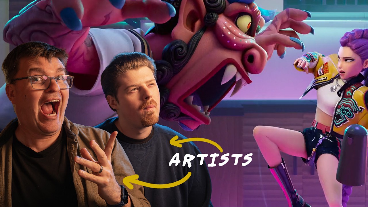
Heat. — Welcome back to another live stream everybody. Today we are joined by Tiffany Mang, an artist that you've seen all over Proco videos for like five, six years now. — Yeah, it's crazy. We've had history. — Yeah, it's wild. Yeah. Your video about was this the debunking color myths is actually the most common videos that I think we still get comments on from — Oh, really? I know. — Yeah, it's a good one. I mean, if anyone hasn't seen it before, it's uh debunking color myths with Tiffany Bang. I'll go ahead and put it in the chat here. — Uh but yeah, — is that the first video I filmed with you guys? I've done a couple color videos. — I think that's the — That was the first one, I think. Yeah. — Yeah, cuz I remember I went into the raw video of it and I saw you guys were talking about how to even like go through a scripted video on camera. — Yeah. and I'm writing the script for that and stuff. Yeah. [clears throat] — So, yeah, for those of you guys who don't know, uh, Tiffany is a person who's worked on tons of the different animated shows, movies, and other things that you watch and that you've loved over the years. Uh, but luckily, Tiffany also is a person who shares her skills and she has a new course on Proco that is the essentials of painting. It's currently 20% off right now, but we'll talk more about that later. Tiffany, uh, do you want to share some of that work and what people can do with their digital painting and traditional painting skills digitally? — Yeah, for sure. So, as Stephven said, um, I am, uh, a visive artist working in the animation industry and I also uh am a fine artist. So, I primarily work in I don't know where to look. I'm looking at the camera up there. I'll look at you. Okay, my eyes like going up and down. Um, and so I primarily work in landscapes in gouache, which is my favorite medium. And so I'll just go ahead and share my screen. Um, but yeah, essentials of painting came about. Oh, cool. You can share my screen. — Oh, can you — I'll I have just the videos right now. — That was the videos. Yeah. Um, so I just have some gouache and digital work that I'll just quickly go through just to show you guys. Um these are some gouache plers that I've done. So in the fine art world I do uh plan air competitions where I go to different places in the states around the world and you paint the location and there's a gallery show. So these are some paintings from Maui um that I've done. These are just all these gouache paintings that I've done. This is a bigger gouache painting. Um this painting was done in Door County, Wisconsin, which was my first time going last year. Um, here are some other paintings that I've done. And these are relatively small, like 6 by8 most of them. The biggest I've done is 18 by 18, 16 to 20. And so this year I'm actually really trying to go bigger as well. Um, and these are just all plain air paintings that I've done. Uh, besides this one, which was a studio painting, which you can see is tighter. — And in my course that my course essentials of painting, directly leads the skill of planer painting. Cuz if you've watched any of my videos, you know that I'm a big proponent of planer painting because I truly think that is what will make you a better artist in the animation world and as a fine artist. I truly believe that 1,000% guarantee. I'm also a color key artist in animation. So, I'm just going to show one of the episodes I worked on for What If. This is actually a lighting breakdown. I might get in trouble for showing this, but whatever. um — we won't tell them. — Yeah. Um so I actually did all the keys for the first episode of Zombies and I also had to do a lighting breakdown and so I painted around 150 keys and you can see they're tiny but basically what I was in um my job was to work with the art director and the directors to chart the lighting and color progression of the whole episode. So you can see, you know, is it nighttime, is it interior, is it, um, this is one of my favorite. Maybe I'll go full screen so you guys can see it without the stuff. Um, you know, uh, this is this crazy fight scene. Um, don't ask me about the characters. I forgot their names. Um, but I'm not a Marvel. I don't know to. Um, but yeah. So basically, if you scroll through the whole episode, you should see, you know, the background painters and the comp artist
Segment 2 (05:00 - 10:00)
should have a clear understanding of how they're going to light each scene, where the light direction is coming from. Um, is it interior, exterior, the time of day, um, all that stuff. You need to be able to qu paint quickly and efficiently and convey information clearly in a color key because as a color key artist you are painting sometimes many keys depending on how much time you are given. And so the skills that I got to this I actually just funny enough I landed into color key without having any experience with color keying. [clears throat] — Yes. The art director I kind of knew her. She's a good friend of mine, Christina Vidazar Ryan, the art director from What If at the time. I met her at Burbank Roadtrip CTN like many years before and I liked her work. And she's like, "Oh, I like your work. " And then she randomly texted me one day. She's like, "Are you looking for work? We really need a color key artist. " And I didn't have any portfolio stuff. No, none. Like Marvel was my first big break into animation like four or five years ago. I had worked at Cartoon Saloon before doing color keys as well. So I lied. I had color keys from Cartoon Saloon. So I had to massive portfolio. — Yeah. Just not a ma Exactly. I did not have a lot of work. But what has gotten me jobs is planer is my planer work. I strongly believe that. So they saw that I understood how light works, how to efficiently capture light. And so um and so that was what started. And ever since then I have worked um at Marvel um tip mouse Warner Brothers I'm forgetting now Sony premise um as a color key artist and visv artist primarily color key artist — and so um it has been super fun and uh I love my job. I really love my job. So, my essentials of painting course is really what I went through as I was trying to get better as an artist to get to [clears throat] where I am now. And I've basically put it all in one course, like one giant course, starting from composition, value, and color, color and light, plain air painting, and all that stuff. — So, that's how it all ties in. Um, and this is just a little showcase of my Oh, I didn't show any of my digital work. Sorry. Um, so for example, like this is some of my digital work. I love this one so much. — I do too. I really like this one. This is my favorite one. So, I'm like going through a phase right now, Stephen, where I'm super bored with my art. I just released a podcast episode about it. I'm like, — where can people find your podcast? — Oh, it's on YouTube and Spotify. So, my podcast is called Scribbles of a Modern Artist. — Your channel? — Yeah, my YouTube channel. Yeah. So, — it's this right here, guys. — Yeah. Thank you. Um, I just started it on a whim. It is nothing more. I just love talking and sharing my thoughts. And I was inspired by a podcast I listened to, Diary of a CEO, who he said he started in his basement. — I was like, "Oh, I can do that, too. So, I'll just start talking. " — And um and people have really responded well, and they say, you know, they love hearing the struggles I've gone through. I'm very open, um personal with what's going on artistically in studio and outside of studio. And so, um that has been really fun to do. I just record like 20 to 30 minute episodes. Um but yeah, these are some of my digital pieces, personal pieces where um I'm really influenced by a lot of fine artists as well. And each of these um this was like another one where I was just playing with texture and how far I could go with that. Um these are some gamut some quick studies that I do digitally playing with the gamut tools or just playing with different color palettes and stuff. But you can see I paint like I paint traditionally quite loose I guess and that's the fun part of exploring um both mediums [clears throat] for me. Yeah. — I think one of the nice things about your work is like let's say if someone decided to like crop in on your work really like really far. — Oh, it's super abstract. Yeah. It's like all like mess abstract shapes. Yeah. Um but I love that in paintings. Yeah. If you were to crop in I don't know which one like this one it's just literally — literally just — crazy [ __ ] — Yeah. Like it looks kind of like your screen is messing up. — Yes. — Your display. — But then when you pull out because of the value, the color structure, the way that you've used everything, it reads as a complete image. It allows you to do something nice and quick. Thank you. uh whether that's just establishing something or if you're just doing a quick study for the purpose of like uh increasing your skills — and it can be something that you use to make a finished work or make something really quickly. — Yeah. And that's what I love when I look at other paintings personally like I love it when up close it looks so abstract like I I'm actually trying to push my work more towards abstraction
Segment 3 (10:00 - 15:00)
and it's not easy. Um and then but like you said when you step away it's like whoa it all comes together. I find that much more compelling than um more realistic things for like more realism personally. That's just me personally. Not saying that um that work is bad or anything. Not at all. There takes great skill to do that. But I just love that kind of play on shapes and texture and kind of playing with that on a fundamental level. So yeah, it's I know sometimes with my color keys I'm like, "Oh, don't zoom in. " because it's like so it's like not it's not super clean or anything but with color keys it's not about being like I teach in my course color scripting it's not about being super clean it's really about conveying that mood and the feeling of of light and if you can get those key — key light sources in and your value structure and everything then um you know it will it helps this gets passed on to the background painters which then create their backgrounds space and the color keys and that's how the whole pipeline goes. So, it's really cool to see the whole pipeline. — Yeah. Absolutely. Yeah. It's what we were talking about before the stream started. You let people — who excel at one part of the thing like do that to just 110% and then the next person can take the thing, do their 110%. — Right. Exactly. Yeah. And that's the beauty of animation that I love. That's why I love working in both industries because animation is such a team effort. Um, and it's so cool to see everything come together. And then with fine art and working on my own paintings, you know, it's like this internal struggle um, with me and myself and, you know, the story that I'm trying to get across and things like that. So, they're both fun worlds, I think, in that aspect. — Yeah, agreed. — Yeah. — So, um, this was you were going through some of these pieces. Do you have any of these other ones to show to anybody? — Um, which one? Uh, these are the ones I pulled up, but I can definitely pull up more. Um, I just pulled up 10 images — because we can go into the next stage of the thing if you want. — Yeah. Yeah, I think that sounds good. — And if people have any questions at any point, you know, feel free to ask me. Uh, whether it's, you know, working in animation or fine art process or whatever, things like that. Um, I'm happy to answer those questions. — Yeah. So, uh, over the course of the, uh, this today's stream, I'll be pulling any questions that you guys give in that chat to put them in here for Tiffany to answer over the course of it. I have one question if you want to start with one. — Oh, yeah. Where do I look at it? Is it um — Oh, I I'll grab them for you. Don't you worry. — Oh. Oh, okay. Thanks. Okay. — Yeah. Uh, so here at the beginning, we have TD Robinette who had asked, "Uh, do you have any tips for stopping somebody from overdetailing? Use timers or any certain exercises? " — Oh, yeah. That's like half my battle as a teacher. Um I think yeah um so I have a few tips. One is that you can do a timer. I think that's really helpful. So if you're doing daily studies, time yourself to 10 minutes, 20 minutes and stop no matter what. Even if you think it's ugly, horrendous, whatever. Um and the whole point is to keep doing that, not just once, but every day. And you'll soon find that you'll be able to get more in the same amount of time than you were before. and you'll get better that way if you have this set parameter. Um, another thing that I like to do is I always limit my students to one to two brushes. That's one of the exercises I have in my course and they're like, "Ah, this is so at first they might think, oh, it's so weird and restricting. " And then most all the students like, "Oh my gosh, this is actually really freeing. " Because with more limited tools, they find that they have to make those brushes those couple of brushes work. and they're more creative that way in making those brushes work. And so they find that, oh, I don't actually need 50 brushes. Like, I don't need a brush for grass. clouds. Like, I can actually make my painting work with a couple brushes and understanding the fundamentals, the visual tools of edges, where should I smudge, of grouping values, all that comes down to those fundamental tools that I talk about in the first lesson of my course. And so, that's a favorite of mine. And to be honest, I paint like that, too. So everything that is lessons in the course, it's something that I have done. still paint like and so it's tried and true with hundreds of students and I know it works and I know you can do it. So I'm not just like giving exercises that I'm like, "Oh, I think it sounds torturous and you can try it. " — You do it. I'm not — I do it. It's like actually my workflow. So it's tried and true. Um and that's another one. Another one that I've done with gouache and digital is to time yourself to 50 strokes or less. So sometimes, you know, just do a master study or a film study and just go, "Yep, 50 strokes. Count them. " It might feel weird at first, but it's kind of fun because, you know, you're putting these parameters on yourself. And all these things serve to help you become more aware of what you're putting down, right? That's the whole point of overworking, I think, sometimes comes
Segment 4 (15:00 - 20:00)
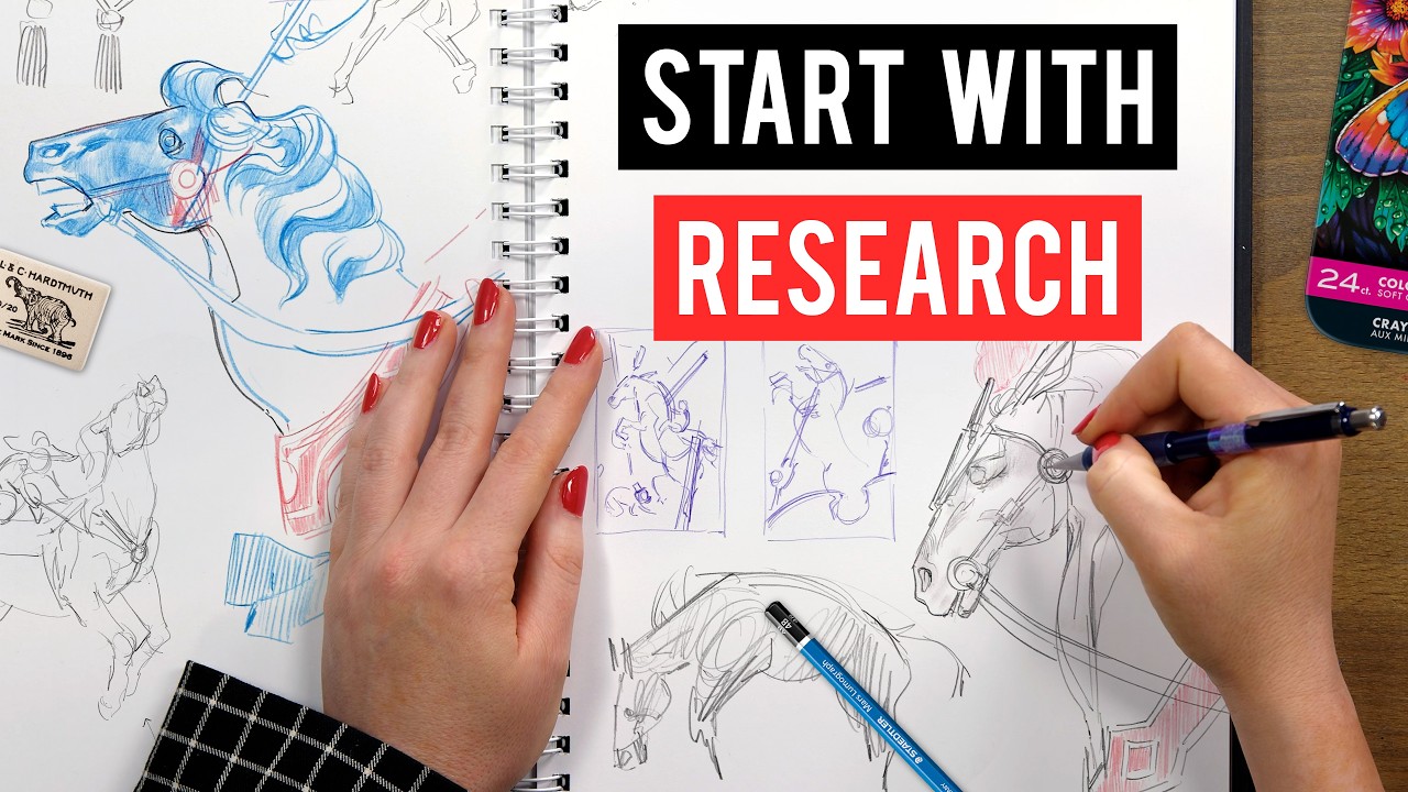
with not being really um intentional or maybe um present with your painting sometimes. And so you're just noodling and you're not stepping back enough all the time. — And so um I think when you're forced into those parameters, you're hyper aware and then you're like, "Okay, what can I do to make these work in these limited parameters? " So I like to say that this restriction is freedom and then it helps you get better as an artist. [snorts] — Okay. Heck yeah. Just one other one that I want to get in here right at the start is from Poquest 2000. They said, uh, do you go over abstraction in the course? — I do not because that's something I'm currently trying to learn myself with my mentor. So, I don't consider myself um, okay, that's a lie. Um, so I don't go over abstract paintings, but in my actual matrix lesson, when I talk about matrix studies, to me that is all about abstraction. So, I do talk about abstraction. to me um just a little quick caveat like if you can design well it you actually understand abstraction at a core level and that starts with two value studies — in my opinion so I do go over abstraction in that way but I don't and I show a variety of paintings some more realistic some more abstract but I don't have like a whole lesson on abstract artist if that's what you mean um okay — I'm still trying to learn more about that yeah — yeah and so you said that one of the core things that you can do to learn abstract rejection is to do two value studies. I think that we actually look — that is such a perfect segue. Oh my god, — this is perfect. — So I'm going to go ahead and bring this in. — Uh so we can go over this. So we prepared you prepared some demonstrations where you actually go through the process. Uh we did you did record these in advance so that you can talk about them, bounce back and forth as is necessary as opposed to getting to do like you know like 30% of the thing. I think I wouldn't have been able to get as much done. So, you guys are going to be able to see a much more because I was focused — and recording. Sometimes when I talk and paint, I just I cannot get as far. So, I wanted to make sure that you guys saw the full process. — Yeah. So, I'm going to go ahead and hand these uh controls over to you on that one. Feel free to go through it. Uh talk about it as you feel and talk about your process. — So, I'm just going to pause it really quick. Just a quick background. Um these are sketches that I did. So, I'm part of a project called Orbit, um which is created by Streets of Design. And Orbus is this new book that Streets of Z is releasing. We just got backed by Kickstarter successfully. So, it's going to feature um I think over 200 artists from around the world and each of the artists are assigned to a different location. Um so, and basically the book's going to feature like all these different beautiful illustrations by each artist featuring a different country in the world. So I was assigned Guatemala. So that's why um what we had to do first was do these quick sketches and which you see on the top part. And I decided after doing researching Guatemala, I wanted to do something influence I hope I don't pronounce this too wrong but the Semuk Champi and Los Conscious waterfall in the Alta Vapaz region in Guatemala. So, um, you can see all the reference photos that I gathered up top. And, um, what I'm going to be doing is taking that bottom study that you see. I grabbed it onto a new canvas. And then I'm going to be doing a matrix study. And from a matrix study, I'm going to be doing a value study, which is one of my favorite ways to do a value study because I find that it's just such a nice shortcut way to explain as I keep playing it. So, that's kind of the backstory. Um, and yeah, the book is coming out, I think later this year or next year. I can't remember when, but it's going to be a really awesome book. So, um, you can see here what I'm doing is I'm just grabbing my reference over. Those are my two main references that I want to reference for this quick sketch. Now, you can see this quick initial sketch is quite messy. I was just getting down ideas. it read what was in my mind and then after looking back at it after a month I'm like oh it's probably not super readable to most people. So what I'm going to do now is I'm going to start cleaning it up and I'm going to first do a matrix study which is um or no tan study I should say which is a two value study. — Now two value studies are um so valuable and honestly I think yeah everyone should go they should not before they do value studies they should do two value studies. Ignore this part right now. I'm going try to figure out how to fit it in my frame and I'm like, why is it not working? And then soon you'll see me get to it. But um two value studies are so valuable for so many reasons because they help you design clean intentional shapes. And I got this from Stan Proco. CSI shapes, Curves, Surves, and straights. If you can think about designing straights, sorry, designing shapes with those
Segment 5 (20:00 - 25:00)
edges. C curves, S curves, straits versus road mapping messy. You know, think of a road map, the edge of a boundary of a country or state or [clears throat] whatever, and it's, you know, really squiggly, — your painting is going to start being more readable because of that. And so what I'm doing now is I'm using my awesome flat brush. Um, and it's just a it's like the equivalent of a flat brush I use for gouache, you know, like a 1in flat brush. So, I love this brush. It rotates to where I angle my pen on my Cinti. — And so what I'm doing now is I'm finding the main patterns in my painting. I'm not thinking about detail just yet. I want to think about the main masses in my painting. And so you can see, yes, there's many different elements. There's trees. There's the mountains in the back. There's um they call them the terrace. I think there's like these terrace cliffs in that area, like these terrace waterfalls. Um, I added some rocks in the foreground to lead your eye in. So, I'm using the top painting or uh photos as a reference, but I'm not copying exactly. I'm still thinking about what is unique in my composition or what I'm — the focal point I want in my composition. Now, the focus of this project is landscape. So, I'm not going to be adding people or anything. Uh, I do think I add one little person in the end in the four corner, but they're not, you know, focal point. Just for scale. Exactly. And you can see now my shapes. I'm trying my best to make my shapes clean. U unique and specific is what Quangho used to say. And I always remember that when I took his workshop. Are my shapes unique and specific? Are they all squiggly and wobbly and unclear and undefined? — And now does that mean unique and specific within that particular — in that particular Yeah. — Okay. — Yeah. So for example, I have a little bit more cutin shapes at the top part cuz that's trees, right? So, they're a little bit more nuanced versus the cliff has a straight simple curve leading down. Uh, my rock shapes are more angular. So, everything has a purpose, right? Um, I'm thinking about where to use my curves and straits. And so, as you can see now, I'm starting to pop in some light shapes, aka sky holes. But I want to emphasize that at this stage, I'm still thinking about the readability of my painting. And basically at its core, you know how um the abstraction and you'll see me turning it on and off you how I build from the sketch and you'll see how different it looks because the sketch — was just a sketch, right? — So, one thing I do want to get out here early on. — So, people might be looking at this uh and they see this screen and there's all the screen space around here and then the area that you were working on in that earlier stage was so small. That's intentional. It's not like it's accidental or anything. very intentional. Yeah. So, I like to say I know sometimes people when I'm doing demos, they're like, "How come you don't ever zoom in? " I'm like, "I don't zoom in because I need to see the whole picture. " I'm so used to painting uh smaller. And if you talk to all artists, like, you know, they will do that as well because and that's another thing hearkening to the question that the first person had asked, another way to not focus on detail is to not zoom in. Try to lock your canvas at a certain size and then just paint like that. It's gonna you're going to be tempted to sometimes. I'm not I'm the opposite. I'm like zooming in. I'm like it's weird for me. But you will be tempted to. Don't because that's going to help you focus on the big picture. — Yeah. — Now, I want to point out these shapes that I just put down. I hated them. I tried to maybe I thought I could sculpt out the cliff in the back and I realized that they were too they made the whole study too busy. And so I'm trying to figure out right now how could I sculpt some of those, you know, rimlit trees on that cliff. And I just didn't like how any of those shapes looked. And so what I ended up doing was nope. Simplify, simplify. That cliff in the back just needs to be a solid mass. And we need to draw attention to the terrace waterfalls and the midground and kind of the foreground area. So you'll see me finoodling in that area a little bit trying to you know see if I can make it work but ultimately I think I end up taking out most of those shapes which I will add in the value study. So you'll see — that's was going to ask. — Yes. So a lot of the times here's another thing do matrix studies if you want to practice simplification because matrix studies will force you to simplify. It's so helpful in that sense. I cannot stress the many benefits of matrix studies. Um and there so many benefits and this is another one of them because you're only dealing with two values. You cannot possibly add every detail that you see. You can't you're not dealing with the infinite values that you see in real life. Right? So you are forced to really intentionally
Segment 6 (25:00 - 30:00)
bring out where what areas you want the most contrast, the most important shapes in your piece and leave out the rest. Edgar Payne once said, "Part of being a painter is to reject, oh my god, I'm going to butcher the quote, but he says basically to reject and redesign and revise things. It's not just about copying. " And matrix studies force you to do that, right? because you cannot possibly copy what's in front of you, whether it be a photo reference or plane air. So, you're forced design. And that's what I think matrix studies are so great for. I just pulled up the sketch so you guys can compare how it's looking now to um to the matrix study. Um and so yeah, I think that's a really powerful aspect of matrix studies that I absolutely love. Yeah. — And do you think so? I was curious. So, from you looking at it now where you have this objectivity — from the outside of the thing, — Yeah. — do you think that the problem that you're running into when you were trying to put that rim lighting on the hills, the mountains in the background, was it because you had um shapes that were the same size as those shapes below it? — Yeah, I think that was a big part of it. They're all kind of scallopy and the same size. Um I think that's a big part of it. oftent times with matrix studies it's a lot it becomes a lot more aware not or apparent when you have shapes of the same size equally spaced and that's honestly most of the time when I'm critiquing student work that's what I see starting in composition and I like to say — everything starts with composition right like if you have a piece with beautiful color but the composition is not there the story is lost right and you know what you're trying to say and so yes exactly those shapes are too similar to now these shapes I'm trying to put down in the terrace waterfalls, they're all kind of competing with each other. And so through doing matrix studies, I become hyper aware of when shapes are competing. And you'll see me constantly editing because I'll put something down, I'll be like, nah, that doesn't work. And I still have that problem. Like I tend to put too many shapes down and then I'm constantly editing. And so I think that skill of self-editing is very important to develop as an artist I mean yeah because it's like in itself right like you have to be able to self-edit as an artist. — Mhm. — And so um it's okay to try things and put things like I don't even like those shapes on the far right. I'm trying to do a tree but I edit that again. — I left it for now but it's like this ugly like lots of tiny shapes that is distracting. So I'm probably gonna edit that out. Um, — one question here. So, I put I put forward a poll here, uh, asking people if they've done a no tan study before. — Uhhuh. — Uh, we got 56 yes, 44% no. So, a pretty even split of yeses and nos. Okay. — But then we also got a question in here. Uh, this was, uh, Cynthia was asking, "Please clarify the difference between matrix study and no tan. " — So, they're kind of interchangeable. Um, so not is actually a Japanese term meaning light and dark patterns. That's a great question. I started using matrix settings. I heard Bill Perkins say it when I took his class and then so I just started saying matrix. They're kind of they're used interchangeably. But I will say no tan um no tan really means light dark pattern. So which is different from light shadow patterns and that's something that I talk about in the course as well. can be different because some paintings have a stronger light dark pattern while some paintings are cheerro no tan dominant meaning they have a stronger light shadow pattern um in this case it's in this study I'm doing it's probably um more of a cheer scarero although there are because of the light and shadow there is a nice light dark pattern going on as well but for example let's say you have a still life and you have a white vase on a dark background ground that in itself I think primarily would be a light dark pattern because you have a light vase on [snorts] a dark background. — Mhm. Um, and so at its core, I like to say, and this actually ties directly into color keys as well, because I still remember I think it's my interview with Marvel when they were interviewing me really quick and they're like, and I thought they would ask me all these Marvel questions, which character this and that, do you know this character, blah blah, — and all they were like, yeah, you understand cinema. We can see in your paintings and light on dark and dark on light. And I was like, yeah, I totally understand what you mean. — Thank you. — And once I said that, I was like, yeah, I got you. Because if you study film stills, a lot of the cinematography goes back to playing with silhouettes, maybe dark on light or the opposite, light on dark, the way they're costumeuming is, right? This character is specifically wearing something lighter against a darker background. Maybe the background is in shadow. Or maybe it's everything's in light, but the character is still wearing a lighter shirt and the background has a darker
Segment 7 (30:00 - 35:00)
local color or vice versa. that those are all innate light dark light patterns that I'm always searching for um whether it be in a master study, a film study or whatever. And so all that ties into professional work, especially I would say as a color key artist because I will say that if your painting doesn't read and doesn't have those innate light dark patterns, it might not read as well. So, um it's kind of a confusing aspect to think about like oh light dark and light and shadow. Um but I like to think that sometimes um a notan study can be matrix based which means it has more of a prominent of light dark pattern dark light patterns — or it [clears throat] can be more cheer scarrow based which I um when I taught a workshop with Mike Hernandez he I can show a page on my screen after this which is more light shadow dominant. So, think of like Rembrandt or those painters back then who really pushed the light shadow. Um, yeah. — One thing I wanted to make sure here that we get in uh for anyone who's — they started they're watching the demonstration to learn how to do the thing. Uh, and they're hearing us like throw around terms uh that are about different types of studies uh some other types of like value structures that you can look for and everything. At the end of the day, a lot of these they're things that you will learn that you learn to do. You don't have to carry the idea of the specific terms with you or anything, but there is going to be some variance between those different types of studies. You could call all of them something like a two value study and they just have individual goals. It's like if uh if someone said something was just like a cake, — there's so many things within that. Uh, a wedding cake exists inside that same space just as much as a Twink does, — right? — So, — I wouldn't get too caught up on the names. Is that what you're trying to say? Like that? Yeah. — I don't want anyone to get scared away because they're hearing some words, you know? — Yeah. Exactly. — And then in here was uh Wormings in the chat said, "I still haven't figured out how to find the threshold between light and dark shapes. " Uh if you want to just learn a little bit about that kind of thing, we actually uh on our in our drawing basics — there — playlist here on YouTube, there's actually whole chunks in there that are just about value and then another section about edges. Uh and both of those things will teach you a lot of the things that you need to know to be able to find those different structures inside of a piece. uh and then how to play with those as well because what Tiffany's doing inside of these pieces um she's getting so much of a range of things suggesting so many edges plane changes with just the two values and that's the core skill behind those. — Yeah. That's but I was interrupting. Yeah. No, no, no, no. What you said was great. Um yeah, it it takes I think if you have um trouble with that, I think it takes repetition. It's not it's not an easy exercise. Although I do say I will find sometimes matrix studies easier than value studies that I've heard others [clears throat] say that too. Um I just find working with less things easier and I like the problem solving and so um really quickly here before I go I'm using grids just to see how my uh composition is aligning. Grids is something I also talk about in my course. I'm not going to go into too much detail now, but basically what we're seeing here is the centerline grid, the diamond grid, and the rule of thirds grid. And I'm just seeing um if where I want the eye to lead is centered. I do want it kind of be centered some around the center of the composition. Contrary to what we've been taught, it's okay to put things in the center sometimes if you have an intention with it. Uh, and you'll actually see lots of fine art paintings who do that, like Emil Carlson. And because of this, I realized that I wanted to eliminate the white froth on the right side and kind of center more of the cascading waterfalls towards the bottom rule of thirds in the center. Um, so there's more contrast towards the center of my painting than outside on the edges. So I'm just kind of shifting that over and playing around with that a little bit. And uh, — yeah. So, so uh you know you can see that all the tangents, the lines and the shapes that are created with the grids, I use them a lot for where to place certain accessory elements like rocks, um pathways, weaving pathways, cloud shapes. I'm in fact I'm working on another bigger gouache piece right now and I'm also doing matrix studies and I'm working with my friend and mentor in that and I did a pen study first and then he just simplified half the sketch matrix sketch me and made it so much more readable. So I myself went through many iterations just with the matrix study — um exact same process that you're seeing now except I did it on paper and then I trans and then I took a picture and put it into digital. So, uh, that's if in
Segment 8 (35:00 - 40:00)
case you're wondering what those lines are, those are grids. And grids, by the way, have been used by painters throughout the centuries. Odd uses for ages. Mayor Dixon, the most common one you'll see is just a square grid, but there's many other grids. Alfonso Muka used a lot of circles, — um, overlapping circles in his uh, art nuvo paintings, and Edgar Payne used grids. Adir used grids. And so I don't know why people think it's maybe lost nowadays. I feel like I didn't hear of grids until my mentor told me about it. — And um and a lot of times people think grids are oh they sound restrictive like you have to match everything to every line and no — Yeah. It's not the No, I want to hear you say it. Yeah. — No, it's it's not like it's something that is a tool. It's a jumping off. — Exactly. It's like any other art technique or art method that's shown. Like when someone shows the Lumis head or any Lumis proportions or anything, — everyone's like, "Oh, I'm just going to make a bunch of dudes that look the same. " And no, it's a thing that you kit bash to your purpose. — Even when you laid the grid over there, you see the things in that composition, but it's not that all of those things are laid out and then you go and you correct the lines to fit the grid. The grid is a thing that informs it and you depart from it for flavor. — Thank you. You said it so beautifully, Stephen. Yes, it informs you. And what I like to say is, would you rather design blindly and guess your way through or use something like a tool like grids to help inform you better of why you're making those decisions and make better [clears throat] decisions possibly? So, the number one thing I get is like, "Oh, that sounds like math. There's no math. " Like absolutely no math involved. Like, if you just draw from the diagonal corners and you mark the center, that's already right. if you draw the diagonals and then you can draw the vertical to cut through the center and there's no measurement involved. Like people are like, "Oh my gosh, it's so hard. It looks so complicated. " It's you can do it in your sleep. — So, um it's super straightforward. — It's super straightforward. Um and something I did uh in between or before I worked at Cartoon Slooh and I had a lot more time. I [snorts] would just take I have a bunch of books on my bookshelf and I would take tracing paper and I would draw grids on top of paintings that I really liked and see how they worked out. And so, sorry, someone just ding-donged. I'm right by the door. So, — yeah, — I don't know if you guys heard that. — Do you need to go answer that or anything? — No, I think — Okay, sounds like it's just delivery. My husband's got it. — Um, [gasps] sorry about that, guys. And so, um, and that was so fun. Like, it was so fun to draw things analog, which is why I'm a [clears throat] proponent of painting traditionally with gouache or, you know, pen or paper, whatever. And, um, you just learn so much from doing that. So, yeah. — Yeah. There was a question here that came up. This is from Crab 59. They said being broke. Uh I'm wondering if your miniourse capturing the landscape is a good alternative or introduction to essentials of painting at least for now. — It is. I created that course as sort of like a little mini segue to this course. So if you want to know how I study um how I study uh master paintings and how I break them down compositionally and what I look at in terms of masses and shapes, I do go over all that. And then I do a um quick gesture study. I don't do any value studies like you're seeing now, but I do a quick color gesture study timed 30 minutes and then I take that same gesture study and I talk about how I refine it and expand my brushes and etc. So yeah, I would say that's a great — um little mini course for sure. — Where can people find that? — That is on my website under store. So if you go to tiffanym. comstore, you should wait, let me just check. put the I'm going to put the slashstore in there. — Yeah. You'll see my book and then you'll see the course. Um I it should be there, but if you want the actual link, it's tiffanym. com/storepcapturingthe landscape. — You go, you guys go over to her website and you just go around through the entire thing until you find it. Okay? You'll be rewarded at every single page. — Thanks, Stephen. Yeah, it should be somewhere under store. — Yeah. — But oh, — so um really quick now what I'm doing is I'll just pause it really quick. Um I'm just kind of showing you guys how I'm thinking about the rhythms in my painting and how your eye can weave through the light dark patterns that hopefully I've created. Um now it's not a perfect matrix study. Nothing's perfect. I probably look at this like ah I can clean up and eliminate more and more shapes to make it more readable. often you'll find that eliminating and simplifying more helps with the readability of a painting. Um, but that's what I'm trying to do now. So
Segment 9 (40:00 - 45:00)
what I like to say is yes, there's physical lines in a painting and there's also emotive lines that that lead your a good painting will lead your eye through the light and dark shapes that are created. Right? So, um, that's here I'm hopefully leading your eye in through those rocks. Here's another lead in. A lead in through the trees. I've designed the sky holes to lead your eye in. That cliff diagonal leads your eye in all kind of towards the center. And then here we have these kind of cascading diagonals that hopefully aren't all the same angle, right? And so, um, hopefully your eye can zigzag through the painting that way as well. — What were you gonna say, Stephen? — Uh, you forgot. — No, I think um — I interrupted you. Sorry. — No, you're fine. Um, there was one question that I think you actually kind of addressing here. I don't know if you wanted to expand on it more. — Yeah, for sure. — Okay. So, the way that they had asked, um, they were saying, can you do like essentially environmental gesture studies? — And that's what my whole capturing the landscape is about. It's an environmental gesture study. You could do it with anything, right? Um, for sure. I do it in pler, digital, I do it with film studies. a gesture study to me. And I actually have a couple YouTube videos showing how I do a gesture study in eight minutes. Um, so check those out. I don't remember the exact title, but if you scroll through my digital playlist, should find out somewhere. I think it's a painting I did by Glendine, — studying Glendine. Um, but absolutely, it doesn't just have to be people, right? We think of gesture studies as like people gesture studies, but you could do a quick I'll just pause really quick. you do a quick landscape gesture study and that's just capturing the main notes right of light and shadow when you're doing something in full color. It's not about getting all the details and the leaves and the rocks and everything. I mean someone like Nathan Fal is great at that, right? And very gestural, very beautiful. Um and a lot — a lot of the finer that's what planer paintings is essentially exercising. So absolutely you can Yeah. Mhm. — Uh, another question here was from guys. — Yeah, they got some good ones today. — Sometimes they're just dead silent. This is — I'm glad you're not. That's I've been in those before, too. Like, no one has questions. Okay. — Yeah. Come on, guys. Um, no. So, Murlock enthusiast in here was asking, "Who is Tiffany's mentor? " There's the person that you've mentioned studying. — Yeah, I have. Yeah. So, he's my good friend. I've known him for 10 years. Um, his name is Corey Peters. I will give him a plug. Um, — Cory spelled how? — Corey Peters. C O R E Y. And then Peters. P E T E R. He has a terrible social media presence. — And but he runs a school with his wife called Rightbrain Academy in Alhhamra, LA. And they prepare students um they take students from like six to pre college and prepare them whatever they need to, you know, get a portfolio into college. So, they've had great success rates with Art Center and other really good hard schools. Um, Corey, I call he's my friend. He's like a good friend. Like, I love him and his wife. And I call him my mentor because he's just the one person that has really helped me um expand my view with art. Um, and it's he's someone that I just asked I don't feel bad asking questions to. And he's the one that introduced me to grids. He's working on me with me now because basically if you listen to my latest podcast episode talking about I'm bored with my art. What am I doing about it? — I was like dude I can't go back to just I can't just do pretty landscapes anymore. Like I'm at this phase where I'm like I know I can do a cute small pretty landscape. I get all the fundamentals. I want to personally take my painting to something that has more symbolism and storytelling involved. And so that's where I'm I want to take my art now. So if I look at people like George Carlson um who's a really great contemporary painter um to me his paintings have a lot of symbolism or poeticness or someone like Casper Frederick. These are the they're dead, but they're great, you know. Casper Frederick, Alexander Colum, uh Albert Birdat, right? I think I'm pronouncing his last name. Like those people. — Yeah. Um I'm studying those people again because um I just there's so much romanticism, but also a lot of symbolism that goes on in the elements they put in their painting. — [snorts] — And so he's working with me um on a painting right now that I guess I'll just announce it with you guys I guess here. I haven't announced [clears throat] it. It's a painting about my journey with pregnancy. So I guess I'll put it out there now. I have not publicly announced it, but I was
Segment 10 (45:00 - 50:00)
planning on doing a podcast two weeks from now about what I've learned through my journey. So I am 23 weeks pregnant and it's just been such an amazing journey and I want to make a painting about a hard and that through a landscape. So he's been really helping me think about okay why are you making this painting? I have to actually write out a thesis like really write out my thoughts and then I starting from thumbnail sketches to a matrix study. Um I'm actually if you see behind my studio I'm working on a wooden board. So before I make this painting, he's making me — Yeah, you can't really see. I could bring I haven't done the painting yet. Um Okay. If it's on the right side, but I'm going to actually play with different textures with gouache, with modeling paste. — So I'm going I told him I want to challenge myself. I want to I you know I want to prime my canvas in different ways and be able to push my limits with how I can apply paint with certain textures on the board or make certain textures. And I want to see, you know, a lot of people deal with oil paint. I want to see if I can do that with gouache. And so he's working with me on all that. And literally in two weeks, I can't tell you like I've learned so much. I just started um I meet with him once a week and for now and I went from I have no idea what I'm going to paint because this painting I actually have to make it for a show I'm submitting to in May at the Maynard Dix Dixon Museum and no June I'm sorry. So I'm like I have to create this painting. What I want to what do I want to create it about? I don't want to just create another pretty landscape. This I want this to have personal meaning, but also something that maybe um if I share like other mothers can relate to or something. [clears throat] — And so um and so literally I went from like Corey, I don't know what to paint. I'm not inspired by anything to digging through my photos and then thinking, okay, I was really inspired by this landscape. I actually really feel like I could turn this into something. How can I recompose this? Etc., etc. and then getting all my pens out and just feeling like a little kid drawing it. Like it was the best feeling ever. And so I've just learned so much in two weeks. So he's my mentor. They do one-on-one sessions, him and his wife. If you want to reach out to him, definitely can. Sorry, that was really No, it's good. I like the things that we got from it, too. No, it's Cory Peters that you were mentioning there. Uh and then an update about some awesome upcoming projects that you mentioned in there. — Yeah. — Yeah. So that'd be great. Uh yeah, there were a couple other questions in here. — Yeah. — Um now that everyone's already gone through in this chat and said congratulations a million times about the — Oh, thank you guys. I can't read anything, but thank you. Yeah, I was kind of debating whether I wanted to share it. Um but I wanted to wait a little bit more till I was like later on. Um so I haven't shared it publicly at all. Yeah. — Yeah. No, it it's awesome. Uh, I think it's going to be an interesting one because now you're going to have this awesome new kid who's who grows up steeped in uh being raised by a painter and a photographer. — There's all these art skills right there. — Yeah, we're so excited. I'm going to definitely teach her to see the world um — through an artist's eyes and it's just it's so awesome. I can't describe how this journey has been, but it's it's great. Yeah. — Yeah. We we'll see it in the painting, though. — Yeah. Exactly. Uh so there were a couple questions that we got here that are some things about um your job professionally. — Yeah. — And then some other questions that were about procedural bits inside of uh how you work that doesn't necessarily have to be about your professional life. — Project Brian had asked, do you use the drawings made by the storyboard artists? — Is that part of how you do it? — Yeah. So um that's a great question. In my professional work, I have p been painting on top of storyboards. So 2D good old pen or not pen but just you know no value sometimes. If you are lucky enough to work on beautiful story boards clean nice which was the case with Mighty Nine. Oh those story boards were so beautiful then you know the characters like really nicely drawn out. But — these were for Tit Mouse right? these um I did show. Yeah. So, I worked on Mighty Nine uh and those storyboards are awesome. Um but sometimes you'll just get like if they're you know they're really quick, you'll just get a circle and and a stick figure and you have to know how to paint the characters. So, um definitely you just basically storyboard just helps you figure out where the angle, the perspective, the composition is. But yes, you have to have the skills to fill out and flush out the environment, right? Mhm. — Granted, [clears throat] not super detailed, not like a key frame illustration, but you do have to have those skills. Now, for 3D pipeline, if the pipeline allows you, you do paint on top of layouts. And I know this is what they did for K-pop. — I haven't had that chance. Even with now the show I'm working on, it's a 3D show, Motel Transennsylvania. The pipeline's
Segment 11 (50:00 - 55:00)
kind of weird that we're still painting on top of the storyboards, [snorts] but usually they'll give you back like a basic lighting layout, 3D layout, and then you enhance that. I did that on the feature film I worked on Jesus. And so that was it was funny. I was so used to painting on top of like chicken scratch storyboards. I was like, "Oh, I don't know how to paint on top of a 3D layer. " Like it was harder for me. So, it was like this skill I had to learn because I'm so used to starting from scratch and I had my workflow that I had just like okay and it's exactly what you see now like blocking the masses then adding figuring out the light the direction of the light the quality of the light and all that stuff interior exterior time of day temperature of the light all those things that come into play — so it depends whether it's 2D or 3D yeah — but mostly storyboards — uh I paused the video here because you started Ed moving into a different stage. — I did start moving into the value study. Yeah. Sorry. I you can ask the question then and then we can keep playing it. — Yeah. So, no. Uh there's one other question here about the professional work that I wanted to make sure and get in here. Yes. And this is going to be a big one. — So, — okay. — Uh I'm going to go ahead. I'm going to put this on screen. — The whole deal. — All right. — I'm so curious. What we've got is what are the skills that you consider the most important for working in the animation industry? — Oo, that's a doozy. Um, what are the skills that you consider most important for working in the animation industry? Um, well, there I think there's people skills that are really important and I think there's obviously fundamental skills that are really important. [snorts] Um, it does depend on whether you are a storyboard artist, visv artist, color key. I'm not going to go into storyboarding because I don't have those skills. I don't and I probably couldn't answer those skills very well. But if you are a vis artist, color key goes into I think goes into the kind of the whole process of visv a little bit. Um, uh, I would say the technical skills that you need is that I see missing a lot in portfolios is that you definitely need to have a strong understanding of light and color. Like you've probably heard that a million times, — but you need it's true. Like it takes one second for art director to look at something and just be like, "No, you can tell they don't have those skills. " — Yeah. And my last art director at Warner Brothers, he was like, "You're as good as your worst painting. Just remember that. " So if they see one bad painting, you're out. — Uh and so just keep that in mind. I just always tell my students, "Take take this out. Take this out. " Because you're just — you're just um putting yourself up more for not being, you know, selected if you have too many okay pieces. — You have to have a strong fundamental of values for sure. Values and color are tied, right? like the video that I made with Proco. — Uh, and that shows if you don't have a complex understanding of value structure and how that's tied to mood. So, I would say all those things if you're aiming to be a color key artist, background painter, visv artist, I would say you need to be able to think quickly and ideulate quickly. Um, a lot of times people think they just need to show polished paintings. A lot of times art directors I've talked to, they like to see your sketches. So like how you came to that idea. — Um so even — I love seeing that as well like even your compositional sketches, how did you refine that and get it to that piece. That's very valuable because a lot of the times you'll find that your first idea like the designers on our show they're amazing but they go through many ideations. Your first idea is never going to be the one that's picked up. — You have to know how to take feedback from the showrunners. They give you lots of feedback and you have to know how to pivot. Can you pivot? So those are starting kind of the slash people skills and you know also drawing skills. I guess — you have to be able to draw. — Um that's for sure because if you can draw you can paint not the other way around. And I can always tell when people can't really they're cheating drawing with painting because their proportions and their shapes are off, their silhouettes are off, their angles are off. They don't really truly understand the relationship of shape language. And even though there's no lines in their drawing, you can tell that their drawing is not strong. So I would say definitely practice drawing along with painting. Um, and I would say a lot of times even when a portfolio has shows a lot of pretty color, I say quote unquote as in like, you know, lots of happy saturated colors, um, if their value studies aren't reading well, that's a kind of a red flag for me personally. If I'm looking at a portfolio, um, you know, to take my color scripting mentorship or something
Segment 12 (55:00 - 60:00)
— or, you know, just looking in general. So I would say those are really important skills and I would say in terms of people's skills it's very important to um I think know how to take feedback smartly and know how and be very fast in pivoting um because the t the production can be very fast. So, I think for example, what I have gotten good at is like when I hear the art director explaining something, I have a pretty good idea of what they're aiming for and I can usually nail it on the first or second try, I think. — And if I don't understand it, you have to build up those skills to ask the right questions to be like, "Okay, is this what you mean? I don't quite understand what this means. Can you clarify that? You know, — yeah, because the alternative is the person thinking like, oh, I was actually trying to do that here, and here, but what they the art director was saying was something entirely different. So, you need to be able to establish that frame of reference so you can even communicate well from there. — Yeah. Yep. Exactly. And so, I think not being afraid to I was going to talk about this in a podcast. This is a great question. I should probably talk about that um or an episode. But um I think don't be afraid to ask the right questions and knowing and also but efficiently like you don't want to pepper them with a ton of questions because their time is precious. I mean there are meetings [clears throat] all the time. — Uh I and there's probably a ton of other stuff I'm missing but I would say [snorts] — make sure you can deliver on time or even a little bit early. — I was hoping for this one in there. I was really hoping you would say just timeliness and reliability. — Timeliness and reliability so important. That's what will get you rehired. Yeah, — absolutely. Yeah, there was um I was talking to another person that we work with, another instructor who I'll leave nameless in case anyone's trying to like backtrack and figure out uh the other person that was working with them. Uh but they were turning in work that was done. It was them knocking things out very quickly — uh for doing work that is going to be in movement and the work that they were doing was incredibly good. They put a lot of time into their work. Um this artist that we work with and then another person that they work with who has a like a well-known name makes very good rendered work in general. — Yeah. they took the same amount of time to do like two seconds of something as this as the other person that we work with who had done like — 70% of the total like full like two minute kind of piece. — Yeah. — And so the fact that the other person did so much to such a high level in that amount of time while the other person took that same amount of time to do such a small portion of it. You choose where you put your effort and being reliable and having good effort distribution is huge. — Yeah. Having good effort distri Exactly. Yeah. If you can if Yeah. Like I think reliability is so important. So if you can prove that you're reliable or you can go above and beyond um then they're going to remember that and and that just goes such a long way. I mean, when you're hiring, like most people, they will hire people who obviously they get well along well with and they know they have the skills, [snorts] but that they get along well with and know they can do the job, you know, and so even if you're super good, but you constantly are late or something, that's just eventually not going to work for the larger pipeline scope. And so, I think that's really [clears throat] important to keep in mind. Yeah. — Yeah. Yeah, at this point I want to I think all the things that you said were incredibly useful. We have a lot of other questions that I think oh my god really useful ones. But I think some of these I actually kind of want to I want to hand off to you that anything that we don't cover today uh for you to possibly address in podcast episodes. — Oh yeah don't miss out on getting to hear from you. Um, but I do want to ask, so we're if we go back into having, let me get us out of this uh solo kind of layout that we have going here. — There we go. Um, so in here, we're about to move into a different stage of the going to do. — Do you want to possibly we can like take a break here? I'll tell people about your course and then we'll come back into it. — Yeah, let's take a quick break. Um, like five minutes and then uh we'll keep starting. Yeah. — Okay. Yeah. So, um, uh, I'll go ahead. I'm going to take you out of here. I'm going to tell people about your course and answer a couple other just Proco specific questions. And whenever you're back, uh, I should be able to see that you're back and then I'll bring you back on. — Awesome. Should I just like mute myself and turn — I'll just I'll remove you from here. — Oh, okay. — Yeah. — Okay. Bye, guys. I'll be back. All right, guys. So, uh, I
Segment 13 (60:00 - 65:00)
want to go ahead and share with you. There was one question that we had here from this was Poquest 2000 asking Tiffany's course is about painting. So that's different from visv. Uh anyone know any visv courses then? Uh there are some people out there who do have some great v visual development courses. Uh on Proco though, a thing that we have that I'll show you on my screen uh is from a person who's worked in animation uh in a huge way for quite some time on a bunch of films that you've liked in the past. Uh is Jeremy Vickery. So Jeremy has three different courses here uh actually four um that I think are applicable for this. So we've got Painting Light 101 from Jeremy, Painting Light 102, and Painting Light 103. uh the way that he teaches inside of those courses is actually pretty focused on the idea of visual development for something, refining something, taking something from uh just the very beginning of a piece, finding the strengths of it, the things that you'll extract and communicating with intention in the way that Tiffany was talking about four pieces. Uh but doing that in a way that's more specific for production because Jeremy does work in production so heavily. He worked on the Incredibles. Uh, a bunch of other good projects. Yeah, filthy dog MF in the chat saying, "Oh my god, Jeremy Vicker, he's the goat. " Yes. Yes, he is. Jeremy's wonderful and we're lucky to have him on ProCo. Um, while I'm here telling you about a Jeremy thing, I'll go ahead and point out that he also has a cinematography for artists course. That's a brand new one that he did. Um, that's sold in two parts. It's also a pretty good one if you're looking to learn composition for production in general. Now about uh about Tiffany's course, one of the things that I wanted to make sure that people knew about here in the course is that it's not just something that you can do digitally. There's also a traditional aspect to that. Uh so Tiffany does uh she does the different things that we've seen a little bit of inside of the course digitally, but also does that traditionally. There's a whole section in there where she's actually uh doing gouache demonstrations as well. And so the I was gonna play the audio for this. Um but yeah, so some of the things that you see that she starts where it's more simple right here, those things do extend into working traditionally as well. And I think that if you're a person who wants to work digitally or traditionally, the skills that you would learn and use for both of those, they're pretty uniquely presented in this course in a way that I don't think that you get in many other courses because a lot of times people are using very specific digital tools when they're demonstrating digitally and that doesn't translate over to traditional work or vice versa. But the way that Tiffany works is incredibly similar across the two mediums. So I think it's really important to make sure that people know that going into it. — Um so here in the course like this the way that her work looks in this course is also what she does when she works traditionally. And again I just think that's it's really cool to see someone do that kind of thing across both of them. Uh we do it looks like uh Tiffany is back. Do you want to join Tiffany? Yeah, she says yeah. Okay. So, I'm going to bring her back in here and then I'm going to share one other thing real quick to answer one question that we had that came up uh from a person. This was uh they had asked about doing a particular kind of thing. Okay. So, this was uh Uday 2730C. uh they had said how to deal with a flat lighting flat lighting scenes with almost similar but slight value differences. For example, Sergeant's white stair painting. Tiffany, uh if you want to tackle this one, I would love to hear what your thoughts are on it, but I do have one tool to show people on — Yeah, go for it. — So, I'm bring up on my end. I'm going to go to proco. comvalues. Uh, and for anyone who doesn't know about this, I'll write that on screen as well. Uh, this is a tool that we have on Proco where you can put any image into the thing and it will give you essentially like that posterized kind of effect that you'd get in Photoshop. But if you don't have Photoshop, don't worry, we got you. Uh, so I'm going to load in the painting that they mentioned. — This is that painting here. Uh, and then we're going to lower the number of values down to just two. And we can uh increase the amount of simplicity in there. And this actually is a good beginner kind of idea about how the values are distributed in this. You can move them around if you want to find what's most important for you. But you get to choose as an artist. you look at what is uh a value range of let's say you know like if you have uh one to five values that you're going to use. You can say put the most information uh like uh
Segment 14 (65:00 - 70:00)
you're evenly split the information across all five of those values or you can choose to put more of your information into just the mids, the highlights or the shadows. And you can distribute those as you want. And you don't have to have a um this even distribution of them. you can make something really interesting inside of that. So if we increase the number of values, you can see where that interesting space is. You can move those around and it still stays that image. So you can do that with just the two values as well. Uh and a tool like this will help you to see a little bit of what that is, but you at the end of the day want to train your own eye for this. Uh Tiffany, do you have any thoughts on how — that's really cool? Yeah, I remember you guys showing that tool and I think that's a great tool to start understanding um how you can start with a notan study and also like you said how you can key most of your information in the darks or in the lights the value distribution. I think that's really cool. — Um and you know this painting at its core is quite abstract to me. like if you turn into a notan study, it's it's super abstract and I think that's what's really cool about it. And even though it may seem simple, there's actually a lot of value nuances — within [clears throat] the shadow — and temperature even. — And temperature and exactly and that's what makes this painting still read — form wise because of the temperature. So, it's like there's bounce light. Um, and then the top facing planes, the shadows might be a little bit warmer. There's a little bit of warmth speckled in the walls. Yeah. Like those are cooler. There's a little bit of warmth speckled in there. — Um, and so there's very much there's still nuance. And nuance is very hard to do in paintings such as with limited value like this painting or highkey paintings. And so I think to train your eye to see that and understand that that's where doing a lot of studies with paintings like this can be so helpful where it seems simple and it's not like that's what I find out about these paintings like to make it read correctly. It's not easy at all. — Yeah. — It's a it's a heady task. — It's Yes. Yeah. It's not something that you'll be able to do really easily right away, but you can build up your skills to that point where you'll be able to achieve something like with that much nuance. — Exactly. Yeah. — I'm really cool tool. — It's really fun. Yeah, it was an interesting one to get to for us to be able to have this the timer tool and some other stuff. — Yeah, — it's good. — Actually, I need to remember to give you a piece of software that we made if you want to try something out. — Oh, yes, I would love to. Yes. Yes. — Okay. So, I'm going to give you the screen back and so we can dig into the rest of this piece that we were going over earlier, — but then — I don't know if we want to kind of like speed through the last portion of this so that we can show the Kyoto one. — Yeah. I don't know if I can make this faster. Can I make it faster? I I'll just um I'll just kind of jump through it. Yeah. So, what I'm doing now basically is on top of my matrix study, I've basically used the wand tool or color range tool to select my darks and my lights. Uh, and so now I I'm still maintaining my shapes, but I'm now adding more nuance and value. So, you can see I'm adding those mid-range grays or darker grays and basically now adding more atmosphere. Um, eventually what you'll see me do at the end, I still like to paint all in one layer. So even though I have one layer for the darks and lights, I in the end I just like to paint like a traditional painter. I'm uh so that's kind of where my traditional skills come in. I just I don't like the fuss of many layers. But you can see now I'm using a brush. You can see it's called sample brush transfer. I don't know if you can see my cursor, but that just gives a little bit of opacity and so it's not 100% like it's see-through a little bit. So, it allows me to pick a gray and now kind of um add a little bit of translucency so I can get more nuance in my grays. And so, I'm just going through the darks and adding the those lighter values, right? Because not everything is pitch black. That's what it would be in a two value study, but not uh but now that I'm doing a value study, not so much. But see that I'm still the whole point is that I'm still trying to maintain the clarity of shapes that I established in my matrix study. I'm not trying to completely, you know, chuck that out the door, right? So that's why I love building a value study on top of a matrix study because it's like you've done part of the work already. You don't need to start from scratch. I just [snorts] use a soft brush to add some atmosphere on top of everything. It's not clipped to any layer. I turn that off for now because I don't want it to affect the
Segment 15 (70:00 - 75:00)
values that I'm choosing. Um, but you can see that, you know, I'm just going to fast forward a little bit. Now, I'm adding some values to the water and everything because it's not just pure white, right? There's many subtle values to the water as well. Um, and I'm adding a soft gradient to some of those shapes because those shapes really are kind of, you know, translate uh transitioning into shadow. And so, I have a little bit of a technical difficulty here. So, I'll just skip over this part. I was like, why is my white shapes not selecting? So, I'll skip over this part where now it's like, okay, I just — I don't know what happened. Um, and now at this part, I can start to play with some fun textural brushes basically that give me a variety of little shapes. Um, and so, uh, this is a brush I got from Mike McCain, his brush pack. I just bought it off his Gumroad and it's just like I like to use it for trees and just to give a little bit more of a speckle. And so that's where one of the visual tools I talk about is texture and shape, right? You're now giving a little bit more playfulness in the shapes and they're not just all blocky. And that can help build up areas of complexity and then therefore make other areas a little bit simpler. Right? So, it's all about that comparison, that contrast, that hierarchy in a painting. — If I had used that tiny brush everywhere, like let's say you're like, I really like this brush, and you just like start using it everywhere, your whole that brush isn't going to feel special anymore because it's being used everywhere, right? And that's often sometimes what I see. Um, it's like when a painting is — it's like, you know, this one brush is just being used too much everywhere. So, I try to be mindful of that as well. And yes, you can see me constantly zooming in and out because I just want to see um you know how it's looking and I go through some technical difficult I don't know what h I tried to merge it here. I'm like why is it merging all weird? So I didn't edit anything out guys. It's just you see me but I'll skip over this part because I'm like what's going on? — Um — you see you see how the sausage gets made here guys. — Exactly. Yeah. I don't know what was going on when I merged it. just all the shapes got kind of weird and so um I somehow fixed it in the end. But you actually see me what I'll do sometimes is I will turn the value study off and look at the matrix study because sometimes there's some simple shapes I like in the matrix study that I lost in a value study. So I'm constantly comparing. And so you'll see that the rock shapes that I have in the foreground, I kind of liked how they were more simple in the matrix study. So, I erased part of my value study and brought that back a little bit. — This is another technique that I use a lot in my personal paintings. Like my paintings are never a direct compilation of like adding up. It's usually like a combo of my first initial gesture sketch and elements I liked of that with more refined things that I built up. — Um, so that's just kind of a fun tidbit. Yeah. Any questions? So, there are many questions if you want them. — Yeah, of course. I'll try my best. — Okay. — I love that. That's like the most active group that I've ever talked to. Usually, it's like no one's asking a question. — Uh, [snorts] so there are a couple different ones I think that we can tackle pretty quickly. Uh, this one, [snorts] oh man, I'm not sure how you're gonna say your name here, guys. I'm so sorry. Um, but they said, "What's your best source for doing studies? " I know that you actually collect a lot of reference yourself while you're out in the world, but are there any um recreatable things for people where they can go to a certain website, get a magazine? — Yeah. Um I will say right now it's like the weird layer thing going on, merging. So just ignore what's happening. It's a perfect time to talk. Um I'm trying to merge everything and it's not working. It's like doing weird stuff. But um yeah, so uh I like to take a lot of pictures myself. I think that if you can go travel more and take pictures, that's usually the best. Um, practice your picture taking skills. — Um, my husband has a site called uh Lam or he posts his pictures on a site called Lamography, which I think is a really cool way. Yeah, you probably know. — Um, where you can find really cool film photos and digital photos and things like that. So, I think that's a really cool place to find reference. Um, for film stills I like to use shot deck. You do have to pay. Um, so the free version is I think it's animation screen cap. No, no, no. — Uh, my friend had just told me about it and I forgot about it. Let me check my Discord. — For anyone who does want the other one though that you mentioned, that is the paid one. I think it's a legendary resource which also got mentioned uh recently by Jeremy Vicky in another stream we did. — Yeah, that's shot. com. Shot tech is incredible. It does cost money, but it's a pretty handy tool. — Yeah. The other one my friend, one of my students recommended is evan e
Segment 16 (75:00 - 80:00)
richchards. com. — Okay. — And I think — with an A or an E uh for the second — E evan. So E van — E and then Richards all lowercase. com. — Okay. — Evan E. Richards. Yeah, I never heard of that before. Um but that's another one. But I primarily use Shot Deck. I pay for it. Um, and it's worth it because I use it to gather film stills all the time for work for color keys. And they've just recently had this thing where you can even like choose by color. There's lots of filters you can choose from like time of day, um, color, lighting, direction, things like that. And so, or you can browse by title. — And [snorts] so, that's really helpful as well. Yeah, Shutt is great. — Yeah. Yeah, I would say that's probably the industry standard. But if you if you're new and you don't want to pay for it, I get that as well. But I think it will pay you back in dividends because you can just save screenshots and create your whole library, which is what I do. Like a movie I watched, I look it up and see if it's on there. They have animated movies and live action music videos. All kinds of things dating back to many, many years, like old movies as well. uh black and white movies and things like that. So, um — yeah. Was it was that the question? — No, pretty much. Yeah, you were they were saying uh they were asking how it is that you most often find references to do — I would say those are my main ones. — Um I used to like Pinterest too. — I use Pinterest sometimes, but I don't know. It's a lot of AI stuff, too. So sometimes you don't know what — like you can see the look and if I'm looking for something — um — like material ref um there's other sites I can't — it's okay you know what guys I think you guys should follow Tiffany uh on Instagram because at some point in time this part where you asked about this and Tiffany didn't necessarily have the complete list of things to tell you it's going to become some social post or a newsletter thing from Tiffany — if you follow her over here. Uh you'll probably end up seeing a whole post made about that in the future. — Yeah, thank you. — Uh there was one other one. So I think this is a complex one to ask about references. — Um — but Trickier Crab 59 was asking, "I've heard some people use Google Maps for references. What do you think about that? " — I think that's really cool. I think it's a really cool way to do studies. because I know there's a whole thing with Google Crunch um and you know doing studies of different places. Um I think that's a great way to my only caveat is that if you're a beginner and you're and you don't know how to push color and lighting it, the tendency is to copy exactly what's there and Google doesn't have the best, you know, like it's not like a photographer, right? And so, um, I would say it's a good reference starting point, but if you only know how to copy, that's probably not the best starting point to go from, — if that makes sense. Yeah. — The thing that I was going to say might be hard for some people is that um the question that usually comes up is in the order that they come up is where do you get your references? Yeah. — And then, uh, how do you find good references? And those are two different — things. Yeah. What makes a good reference is usually the things that you're actually seeing here in the study that Tiffany's doing. That's going to be value distribution and composition. And you want those things. If you have the most like evenly lit cloudy day uh and bad composition, that means you're not going to have anything interesting to do in values and leading your eye composition — wise. Yeah. And a lot of the Google images, what they're there for is to show you what that space looks like when you go to find the Jack in the Box that's on 32nd Street, you know, or something like that. — Uh it's purpose driven. And so some of those things you can find interesting challenges for yourself on Google Maps. — Uh but you'll also set yourself a challenge — for sure. I would say you have to be prepared to design and and not copy what's in front of you. like it's you wouldn't it wouldn't look good if you just copied what was your Google screenshot for sure. — Yeah. [clears throat] — Uh so I think that was a good one and I I think the rest of them again Yeah. I think some of these other questions I'm going to save for you to be able to tackle later. — Okay. Thank you. — Is there any anything else that you want to mention in this particular piece that you're working on here before I think we'll speedrun through the other one? — Yeah. Um I think with this we're almost at the end really. So, you'll just see me just playing around with um refining certain things, but you can see that I'm still keeping the values quite grouped. Um maybe I could push the background a little bit more, although I kind of like I don't want to make it too blown out. Um so, probably on another pass I might, you know, do some little
Segment 17 (80:00 - 85:00)
tweaks here and there, but you can see I'm playing around with adding little trees. I'm like, I don't like that or little leaves. And I'm just constantly adding, editing, re-editing, and things like that. Um, this is not, you know, I'm going to obviously when I do the color version of this piece, I'm going to uh refine even more. So, I'm never too obsessed with like making a perfect value piece because, uh, one, it's not in my nature. Two, I know that things are always going to evolve. And so, um, but you can see really how I started again off with my matrix and I really kept a lot of those shapes that I had. I didn't deviate too much from it because I wanted to make sure that I kept those patterns and the main uh what do you call it? Framework of my composition still there. — So that's just if you guys haven't done matrix studies before, definitely try it out. And um now you know I can now add fun stuff. I'm adding like lines and hatching just for fun. I don't know um little things like that. So, sometimes I like to just take a hard brush and hatch and add patterns like that and texture just for fun. Um, and I'm just going to scroll through a little bit more and see. I'm just playing around with now using adjustment layers to see if I can — uh just blow out some stuff. Just putting on my emotive lines again to make sure everything's kind of flowing. Um, — this is the thing that line that you had going through there. uh showing the actual like the leading line of everything for the conversation. — That's what they were talking about earlier when that person had asked if you can kind of do like gesture studies for landscapes. — Oh, you mean like breaking down the gesture. Yeah, of course. — Yeah, of course. So, I'm just showing you kind of the steps that I took from Matrix to value study. — Um and of course you can do that and I think that's a really valuable skill. That's another actually part of the homework that I give in my course is breaking down the emotive invisible lines that you see in a landscape. — So is it uh your new course on Proco Essentials of Painting that people 20% off during pre-sale? — Yes, that's the one. Yeah, that's the one. You guys have five more days, right? No, four more days. — So if you get it a little bit afterwards, it's okay. We'll work with you guys. Just reach out. — Okay. Okay. Yeah. But definitely take advantage of that. Um, but yeah, it's one of the first homework assignments I get because I believe that as a painter Oh, you can switch to the next lesson. I think this is — Oh, sure. You want to go to the Kyoto one? — Yeah, sure. — Okay. I can't tell which one's part one and part two, right? — It should be the first uh left one. Yeah, that one. — So, now what I'm going to do is I'm going to show you how I would do a photo study uh in color starting from color. So, I didn't do a value study for this. This is a picture that I actually took in Kyoto. My husband and I traveled there in 2023 and lived there for about a month. It was so fun. And um I don't know why I was really I really like the lighting on this building and I don't do a lot of urban stuff so I wanted to challenge myself and I kind of like this simple kind of I don't know like split right in the middle composition. I wanted to challenge myself with that. Just a simple street scene. So what I'm doing here is I have my quick sketch. could have I will admit I could have sketched it better. I should have maybe spent a little more time on the sketch. But for me, I am such a shape person that I need I can visualize the painting more when I start putting down actual shapes of color and value — and I tweak from there. So what I'm doing is I'm actually using the U tool right now and a simple brush tool. Well, first what I did was I tow my canvas and put all these random colors on. And then now what I'm doing is I'm using the U tool on Photoshop, the rectangle U tool, and I'm blocking uh I'm blocking my shapes of color in of correct value. So I've I can skip the value step because I've just done it enough that I can when I put a color down, I know if it's the right or wrong value and I can tweak immediately. So I skip the value step. Um, and this is actually this what you're seeing me right now, this process is what I do for a lot of my paintings. I do like really crude blocky shapes. I just love it because I like how it feels abstract and how it starts to form as I refine those shapes. Um, and this, by the way, I have a this demo is in my course and I have the whole, you know, uh, voice over for it and everything. — Yeah. you're you take people through the actual process long term. — Yeah. Um so yeah so now you can see me. So even the things that are little right what I want to stress is that was going to go back to what I was going to say is I believe as a painter the first step is to this is my view is that you need to train yourself how to
Segment 18 (85:00 - 90:00)
see before you actually paint. When you can learn to see things a certain way it will translate into your painting. So a lot of times people think, "Oh, I need to like get all the skills and all the right supplies and I have to have exactly this person, the brushes and stuff that this other person has and then I can paint like them. " But what you're not asking the questions is how did they learn to see what's in front of them? How did they learn to translate what's in front of them into their painting? So when you've learned the art of seeing um then that's how you become a faster painter. And so, [snorts] um, that's to me I when I had that aha moment, I was like, "Oh my gosh, like that's it was really, I guess, life-changing for me in a way because it was like, oh my gosh, I could just have all the same brushes as this one person and never paint like them because I see differently from them. " And that's the beautiful thing. — Um, and so yeah, this is basically I'm going to just fast forward a little bit more because it might get kind of boring. Um, I'm just blocking. You can see I've taken out my line now and it still feels very blocky right now, right? And I haven't gone through any of the details. But what my point was being was that even though there's a lot of literal stuff in the photo reference, like there's a window and I took out this construction thing [clears throat] — um and you know there's a bunch of staircases and light. Those are all just shapes to me. Like when I how I distill complexity is that to me this is how I view things. you might view it differently, which is totally fine. Uh, is that they're just shapes and that helps that calms me because then I don't have to think so literally. So, um, that's what I mean by the seeing. To me, they're just this relationship of different size shapes, different proportion, shapes of different values, — and how can I group more? Yeah. When you say that you find a thing like you find the shapes inside of something, does that exist as uh something that you would refer to as contour or is that purely about something like value and color? — I think it contour being the outer edge of something for — outer edge. Yeah. I think about it more in terms of the actual shape. I don't really think in terms of contour. That's just how my brain works. Some people are really great at that. Um, I'm thinking in terms of the relationship of the proportion, the angle, the size, and the value of that shape, and how I can put them together abstractly to to make the painting read. Now, you'll see what I'm doing is I'm starting to throw on a little bit of texture to separate different elements. I suppose you can see I have a I don't Can you see my curse, Stephen? — Cursor. — Uh, I can't see your cursor. Yeah, it'll just play the video, unfortunately. — Oh, got it. Okay. Well, you can see that I've used a little bit of a raking brush with the vert horizontal lines and the shadow there. Um, there's a little bit of texture in the building in the light. Like, for example, I'm not going to paint every single brick on this building, right? But I'm going to find a brush that implies the feeling of the texture of brick of brick. Um, so now what I'm doing is I'm starting to play with softer edges. Um, you can see that I'm putting down shapes that have a gradient and so they fall off and they're softer. What I'll do a lot of times is I'll put down a shape and I'll use a mask to erase it. That's sometimes how I get soft edges. I use masks a lot — and I'll just use a soft brush and I'll erase that. Um, — you guys will notice that the piece like if you were squinting at this that is that photo already. — Yeah. So, I'm Yeah, exactly. I probably should have had this photo. Well, it's good that I have it big. So, you can see how I'm simplifying. I also play with this shape a lot as well. I can't remember if I changed the actual shadow shape, but um it was — the one being cast across against — Yeah. being cast across. Yeah. And now I'm starting to use adjustment layers just to play around with. Okay. Like how can this I can make add a little bit of translucency in the shadow. Maybe blur it a little bit. You don't have to use adjustment layers. I was just playing around. Um I don't really think I like that shape. So, let me see. I think I end up softening the ed. So, see, I end up changing it and softening the edge a little bit. It might not make sense lighting wise, but I liked how it looked in the actual painting. So, that's just where I take a little bit of leeway and I'm like, "Okay, it still feels kind of it could work. " And you will find that in professional work. Sometimes you do have to cheat lighting. You can't be completely literal. So, sometimes in color keys, it's like that doesn't quite make sense, but we we'll cheat it for this shot right here, for example. You know, in a professional pipeline, there's space for that, too. Like there's a thing where it's like, let's say, uh, this doesn't necessarily make sense for where that key light is actually supposed to be. In a moment, they'll just throw in an extra light for something — and that's totally doable. That happens all the time in actual film as well in
Segment 19 (90:00 - 95:00)
the real physical world, you know? — Right. Exactly. So, um, like I remember I was studying a film school by Breaking Bad. I love that show. — And the there was like a main light source in the um coming from the ceiling between the characters, — but then their heads were like rimless in the back, but then the whole background was dark. It was I was like, "This doesn't make sense, but it works because it separates them from the background and it makes it for more clarity. " And so it's like things like that. — I think that's sometimes the hardest thing with more um literal students that I work with. They're like, "But that doesn't make sense. How can I cheat? " I'm like, "It you. " It now it becomes, "How does this make the scene feel? How does it add to the readability of the scene? " And if it works, — it it just works, you know? And so there's a few scenes like that in Breaking Bad where I'm like, "Huh, how did they do that? " Like, and I'm just imagining they probably have all these light sources off screen that are creating this. Yeah. And if you look at the set, it's like nothing, — you know, like you would picture. Yeah. — Yeah. It's wild the the way that lights work in film. Uh so one thing I did want to get in here — was someone asked a question that I — I think — for us here at Proco and for you we could talk about this forever and do a million lessons about the thing and still never [clears throat] tackle every aspect of it. — But they asked uh let's see here. Oh man, I want to get their actual wording. They so they just said, "How do you learn to see and observe? " — Yeah, that's a great question. Um, I was also going to do a episode. Someone had asked me about talking about this in my podcast. Um, how do I learn to see and observe? I think it comes with a lot of trial and error and frustration because it's not going to be perfected right from the get-go. Um, I think I will say planer painting has helped me a lot because the more constantly you put yourself out in the elements and that uncomfortability of, you know, painting in front of people or in front of things that you don't necessarily like to paint, I think you are forced to learn how to see things so that you can paint efficiently in the time manner. So, planer painting again has a trove of benefits. Not only um getting you to paint better skill-wise, but mentally and even spiritually because you're out in nature as well, right? Like there's so many benefits. Um and I think I also think asking the right questions to artists like when you take workshops a lot of times people are like what brushes you I freaking hate those I'm sorry but I hate those questions because it's like no ask more detail. And I remember one time I was at a watching Kong Ho do a demo or maybe we were both watching someone do a demo and people were like, "What brushes do you use? What canvas do you paint on? " — And I think I remember Kangho saying, I believe it was him, he was like, "Maybe if you just didn't ask questions and just observe the way they put down their strokes, what colors they're mixing, you could learn a lot more that way. " So I think a lot of times learning the art of observing and just like no offense like shutting up not you guys sorry I was really sorry — but like sometimes you learn so much more about how that person is thinking just by watching the way they pause in front of their c u their pallet — how they put on a stroke just once and they don't fuss over it like I noticed like when I bought DVDs it's like he's very intentional the way he puts down his strokes. He'll stop before each stroke and put it down. It's not like it's like and then as you start to notice that then you start to maybe some bring some of those into your paintings into your own paintings. — So, um I sorry I apologize guys. I don't want you guys to shut up. Sorry. That was really — No, they all understand. — Yeah. Okay. I feel like I always have to apologize nowadays. I'm like, "Oh, no. I did something. " — No, it's a good thing. It's You're saying that you want someone to learn from someone's actions rather than — learn from actions. Yeah. — Yeah. And I think that's one of the most useful things in almost anything. Finding out not necessarily just like the actual question that you're asking directly sometimes. Yeah. — But also finding out the like the how and why of those things rather than just the question you're asking in a moment. — Yeah. So a lot of times people ask that you brought that great question up or that comment up the how and they're like how do you do this? that? But the [clears throat] questions is like the why, why did you make that decision? I think those are really important. — Um, so I think if you go to workshops, ask those questions. Why did you take a big brush and just simplify it there? Or why did you choose to add this shape to break down that shape? Those are things that I think you can get deeper into what the artist is thinking about uh versus the how as
Segment 20 (95:00 - 100:00)
well. Yeah. So that's a great question. — Yeah. I uh I did point them towards some lessons that we have because there are again some fundamental lessons inside the drawing basics course. That's — we have a lot of those fundamental uh lessons in the free lessons here on YouTube. Check out that playlist. There are some things that — like uh we have a lesson that's literally just called how to see values but then there's some other stuff that's about like you kind of like get in like Mr. miagied into learning how to do a thing. Uh rather than it being something that's directly saying how to do this, some of those things you'll learn along the way. — Exactly. I think the things that Tiffany's shown through the stream so far, — uh, doing those practices, those simple studies, those not tan/matrix studies, uh, going through and starting entirely in color like this is something that you would do after that just to make yourself have to slow down like — slow down. Yes. — Pull yourself. — That's such a great point. — Like, and do something with intention. I think that's one of the real benefits of doing something where it's not like you're you haven't drawn for two years and suddenly your grandma's like, you know, I miss when you drew and you go to draw a portrait for her. — You don't have the skills built up in you at that moment because you've let them kind of atrophy a little bit. Doing small practices to — reconceptualize those skills is really good. Also, — a thing that I've learned, I don't know about you, Tiffany, but one of the greatest things to learn anything, I have found, is trying to explain it to somebody. — Oh, yeah. That's why I love being a teacher. Yeah. Oh, yeah. You learn so much. You learn so much from students. It's so humbling and it's amaz like I love teaching. Like, I say I love working in animation, but teaching is my passion really. I just I love it. And it's because you see you learn you learn there's like people come from so many different um you know backgrounds in the way they were taught like maybe other people taught them differently. And so I find that I don't know about you Stephen but like you I I feel like there's roughly two camps of people. I might be wrong but this is just what I've observed like the very um logical like they have to have everything explained science and then the more intuitive people. — Yeah. And I'm personally more intuitive. — And so yeah. And so if someone sat me down was like, "This is the science of how light works. " I would just like start zoning out and I wouldn't help me paint better. — But some people need that. And and then they don't get there like but — but like that doesn't make sense in this scenario. Like how did this painting work even though blah blah. And so I think finding different ways to explain the same thing is definitely a skill that — is it really helps you become um learn more as an artist yourself. Yeah. — Yeah. No, I'm very much with you. Like there's there are people like Dorian Eaton uh who they just dig all the way in and they're like this is how light falloff works technically. — Right. Right. 10% 20%. — Yeah. Uhuh. the the most intense I get about wanting to use anything kind of falls into the space of what you were talking about earlier with grids where I think uh some formulas are a thing that you can use to pair with the knowledge that you've built up intuitively. Uh and so things like working with the 60 3010 rule. — Yeah. — I think those things are immensely useful. — Yeah. So um I don't know is there anything that you want to mention here about this piece or to show what the final stage of this is? — Yeah. So this is the first part. I'm just going to scrub through. So you can see me what I'm doing is I'm just slowly refining right and similar to what I showed in the previous demo but just with value. I'm playing with texture now. So, I'm like, what can represent the windows? Um, the reflections. Like, I'm not really thinking logically about reflections because like I just shared, I'm not a very logical I mean, like I I'm paint more intuitively. [snorts] Um, I'm not a very precise person, let's put it that way, for better or for worse. So, um I'm I have fun finding brushes that can imitate the feel of something. And once I get I'm like, "Oh, that feels like reflection. That feels like windows. " I'm like, "Okay, that's cool. " um because it all goes back to that kind of abstractness and that kind of play with textures and everything. And so um that's what I'm doing now. And you just see me fiddling around, pushing and pulling, as I like to say. You're pushing and you're pulling back a little bit. And then you might go, "Oh, I push in this other area and then pull back a little bit. " — Um at the same time, I'm also thinking about edges and all that stuff. So where I want edges to feel softer, not necessarily through smudging, but actually through value grouping. So a lot of times if you look at someone like Albert MGO's work or other people who are really graphic, they don't necessarily smudge. You know, they're not painterly like me or Marco or you know, Marco and I are much more I would
Segment 21 (100:00 - 105:00)
say painterly in that sense, but they group their edges through value like similar values. And that can be another way to create hierarchy in a painting. Um, so I'm just going to I zoom in a little bit. Um, I'm going to go You want to pull up the next video because that's when I kind of start. — You'll see that I don't start really fine-tuning anything until towards the very end. I think I've done a sharpen. Um, so I've just sharpened the painting up a little bit. I realized I'm like, "Oh, I kind of like that telephone pole thingy. " Mabi, I haven't added the person yet. You'll see me kind of cheat. I take a person from the internet because I don't know how to paint people. That's I know that is my weakness. like I need to learn how to paint people better, but I just do something from a starting point cuz I think she has a baby and I was like, "Oh, that's cute. I want to paint that. " Um, so if you see close up, they're just all abstract shapes. And you can see I'm putting smaller and smaller shapes in the back because that gives the impression that something is farther away kind of in a sense — versus when I have more variety of bigger and smaller shapes in the foreground. Um, so, so I'm trying to keep that in mind as well. Um, just gonna fast forward. I'm not sure where I add the person as well. But — these guys are asking good questions. — Yeah, they're asking basically like some of the best questions I've heard, honestly. Like, I'm so impressed. — There there's really some like some of genuinely good ones. So, um, there's a person here. — There's no way you get to tackle all of these right now. Uh, — okay. If you want this one, you can have this and it's probably the thing that we would like wrap up on. Do you want to do this question? — Whatever you think is best. Yeah. — Okay. Cuz I don't want to make you stay here for too long and we're already an hour 41 into all of this. — Oh, okay. Yeah. — Um, so yeah, we can tackle this question. — So, this is um this was 5M2306 asking, "Can you speak a little about your approach to soft versus hard brushes? " I think this might be a good time for it because you were talking about like Alberto Mielgo's work where [snorts] it's all really boxy and blocky. — Yeah, definitely. Um, when I first start blocking in a painting, I like to use hard brushes. Um, because I like to get my clarity of shapes. Now, then when I start getting into the nuance of like, okay, what can recede into shadow? What doesn't need to come forth so much? Um, I will usually start using masks to soften certain shapes. So what you see in my layers panel, I have like everything is on a separate shape, — which is like super counterintuitive to how I work. I eventually merge everything and I paint on one layer again. So I do these kind of ways where I'll separate separate merge and then paint on one layer and then separate slowly and then merge and then but I have layers of my progress so I can take turn off the layers and see. Um, typically when I when light is hitting something, I like to have that edge where the light hits. And I think I talked about this in a Instagram post. I can't remember um a carousel. I can't remember I talked about it, but um I like to have the edge like let's say lights hitting a bush or something. I like to have that edge where that of the bush crisp like the leaves crisper. So that will be a harder edge. And then the parts of the leaves that are falling into shadow like think of it as a sphere transitioning. Um then I will soften that part of that light transitioning into shadow. And that usually is what gives that painterly effect that people go ooh it's glowy or like ooh it feels so crisp. And the reason why it feels painterly because this question I get so much like my students come to me like I want to learn how to be painterly like you. Like your paintings look so effortless. And I'm like, well, first they're not effortless. I struggle in every one of my paintings. Like, they might look effortless, but I they're not because I struggle. — There's blood in that painting. — Yeah. It was just every painting I go through. There's not one painting I'm like, "This was a breeze. " It's like halfway through I'm like, "Crap, I don't know what I'm doing. I go through all the same things that, you know, people think like great paint painters or I'm not saying I'm great, but like people they look up to are immune. " And it's like, no, we're not immune to that. We go through all the same doubts and everything. And so, um, I think that comes with challenging yourself as well, — but uh, what was I going to say? I think it's the reason why it looks painterly is because the contrast of harder and softer edges. So, if things are in shadow, — I will usually keep it softer or I will make sure that you don't pick up on those edges because the values are so similar. Does that make sense? like there's kind of two different ways — to mimic the loose the mimic the feeling of a softer edge. — Um, and I would say usually around the focal point, I will keep the edges a
Segment 22 (105:00 - 110:00)
little bit harder. So, you can see I've in this area where the light is, I've kept some areas crisper and then some areas in the shadow, they're all kind of similar. I have some softer ed you can't see my cursor but softer edges in some parts of the left building. Um and things like that. There I am putting my grids on again. And so I hope that answered the question. Um — it did. Okay. — And they actually responded here. Uh VM said in all caps, "Wait, that just clicked so well with me. Thank you so much. — I'm so happy. Thank you. — That's awesome. Then I think — Oh, I copied her. Okay, that's good. Oh, I know what I did. I found an online version of a baby carrier because I didn't know how they look like. I think that's what I did. You see me do that. But I just copied I just laugh at her. But that's a photo I took, so it's not cheating. — No, no, no. Yeah, you composed that already. That's your work. — I decided to cut out the person behind her because it just didn't help her silhouette. So, um, I mainly just wanted to get her to get the gesture of someone walking so I didn't have to guess through that. But I, but I paint over her. So, you're going to see what I do now — is I clip her and I start doing a flat brush again, the same flat brush I did with the Matrix study. And I'm just um painting over her to because the texture just feels off right from the photo. — Yeah. — Um, and I was like, "Oh, there's a baby. How do baby carriers look like? " And so I was trying to figure that out. Um, and in the end you'll see I'm just going to fast forward a little bit more. You'll see me she's in shadow in this piece. I believe I make her hit with light a little bit because I'm like, "Oh, I want to kind of have the viewer follow that light down to her and back up. " And so, — [clears throat] — um, I do add that in the end a little bit. I'm also missing a occlusion shadow under her. So, I need to add a soft shadow, right? that would be a soft shadow cuz she's already in shadow so it's it shouldn't be a hard shadow. So things like that the basics of that I think are also important as well where to have hard and soft edges. It's like you wouldn't have hard cast shadows in a shadow area and shadow, right? You would have harder edged shadows in a direct light situation, for example. — Baby, the things that you're mentioning right now that you're wanting to make sure feel contextually correct with the scene. Those are also the things uh someone had asked how you see the stuff. Those are the things that without knowing it conceptually — throws off something that's like badly composed like badly composited VFX — in a movie when you look at something and you're like I [snorts] don't know what's wrong here but I know that this is visual effects. — Those are some of those things where you see a shadow that doesn't mesh with the other shadows or overlapping shadows, you know, things that shouldn't happen. — Exactly. There's actually a — Yeah. There's a really good video I watched on YouTube by this guy and he was breaking down why a lot of modern VFX movies like feel fake like they don't immerse you in versus older movies and a lot of that is because of like you said it's like everything's too contrasty there's too much detail in the foreground midground background it's too hyperrealistic one or more of those things and so I think — like even if you're a matte painter for live action whatever like all those fundamentals still are so important and come into play. Um, and so yeah, um, that was a really good point you brought up. I'm going to fast forward. Yeah. So now I'm just adding light on her. And so you see what happens is that brings her silhouette out from the background a little bit. It might be cheating it, but you know, I'm doing it in a way that's still realistic, I think, or believable. And so, um, at the very last part of this, I won't do this till the very end of any painting. Then I start playing with like crazy adjust not crazy but adjustment layers and kind of seeing how far I can push it color-wise — um to play with value contrast and everything. So um I'm going to just fast forward here since we're almost out. Oh, I just lasted a person again. Let me see. Um — Oh, look at that sentence. That's a sentence that you've never said before. I just laugh at a person. — I just lasted a person. Yeah, I love the last sequel if you haven't seen already. Um, I used to not use it at all and then after working at Marvel I was like, "Oh, I can't live without this tool. It's like where is it? Did I not record? " Oh, I might not have recorded it. — Um, okay. So, here I use color lookup sometimes. This is a trick that a friend taught me. And it just kind It's like a L. Is that how you say it in live in photography? And it just helps you
Segment 23 (110:00 - 115:00)
come up with different value structures and color schemes sometimes that I might not have thought of. But what I'll do is I'll erase a lot of it. So I only I'm like, "Oh, I only like it in some parts. I like how it brought out contrast in some parts. " So I'm going to erase most of it and just keep it. So now you see I've just brought out more contrast in the bottom part where it wasn't before. And then a lot of times what I'll also do is play with color balance and I will like push the color like really to one way like really red or really green and then I'll just erase everything and only bring in the parts that I want and okay this is me trying to make her light on dark. Okay, so you see I'm trying to make her and I'm like I don't like that. I don't like her light pants and so or maybe I keep it. I don't remember. Um so I'm trying to just play around with making seeing how if I can make her a light on dark pattern overall. If you squint she feels lighter. Her pants are almost the same value as the ground, — but that's okay because her shirt is overall lighter and so she still stands out in that way a little bit. — Um, that's the end of the video. I think I do a little bit more off camera. I don't I have the final painting somewhere. — Oh, sure. Yeah, if you want to show — um I can — like you were saying the whole reason that she worked in there even though you changed some things was that the value structure again worked nicely so it feels consistent — and yeah exactly — yeah I'm going to open up the um — yeah painting so let me share my screen because I moved her actually more in the middle now that I see And so this is the painting. Um, I'll zoom in so [snorts and clears throat] you can see I even brighten the light on her a little bit more. — Nice. Pop pop from the background like you were talking about, — right? And I like to add a sharpen to my paintings. I just kind of like the way it sharpens her, but maybe a little bit too much everywhere. — Do you like it for the — the like the some crunchiness it gives? — It's just like a crunchiness. Yeah, it's like this texture. Kind of makes it look more painterly weirdly. So I did that. And then you can see how I have hard edges, then I have a softer edge, breaking texture. Here I'm playing with texture. These I could probably have softened um a little bit. That's just all from the sharpen. But um if I pull up my um PSD, let me see. Um then you can see again just it's big file so it's just loading. — Um you can Where is it? Um, — are you looking for the original? — Uh, this is the PSD. I'm just going to I have a layer. So, person new. — Oh, wait. Hold on. Glow person. What is this? Oh, person new. I have like multiple versions of a person. But anyways, you can see the effects. — Can you see that? So, I have like a layer I call effects. And this is I put this always in a separate layer because I don't want it to affect I don't want to merge it. And you can see how through that layer I have color lookup, color balance. — Mhm. — And another color lookup. And it's just subtle things that I that you know that might be changed. But if you zoom in, you can see these like color temperature shifts and blue and pink and everything. [clears throat] And sometimes that is just done by doing this where I'll just do color balance and I'll just be like, let's push it to purple and I'll do that. It's like my favorite thing. — Yeah, it's so fun. Yeah. To do. And I'll turn it off. And then I can take any brush that I want. Let's say this sample. And I'll just brush in temperature shifts like that. And if it feels right, cool. If it doesn't, I won't do it. But I'll just play around with that. And like see, I just now it's like, oh, I can transition from purple to neutrals or something. Or maybe have the ground more purple, which I don't want. But I'm just showing you like a obvious example. And then if that's too much, I can always just turn down the opacity — and have it less subtle. But I'll do this with another color. Sometimes I'll be like, let's make everything really yellow or green. I don't know. Like, and these this is a way for me to think of colors that I wouldn't have thought of. Now I can brush in this green. That's too green. You know, obviously it has to make sense for the painting. I'm not going to put it willy-nilly, but that's how you can get some cool color shifts like that. And then I see how it looks with everything. I'm like, ah, don't like that. I'm going to turn this lower. And I just I could spend hours just playing around like this. Those are like the little minutia stuff. So, um, yeah, this is that's how I finished up the painting. Yeah. — Heck yeah. No, this is great. — Yeah. — I appreciate you taking us through it. Yeah, in the beginning — for anyone who wasn't here earlier, uh in the beginning we talked a little bit about what Tiffany does professionally, how those things how uh what she teaches plays into that those
Segment 24 (115:00 - 119:00)
particular roles. Uh we went through a two value study then that got rendered a little bit and then we went through this color piece that was a photo study that started from color not from any sort of value study or anything. — That's that one was interesting with just the texture behind them. — Yeah. That's so that's kind of the steps if you see um of what I took that you guys just saw. Um I just have this I'll just group the person in another layer like that. But um — I like the narrative idea of the person being present through all the rendering stages. — Yeah. Yeah. I know. So if I just turn Yeah. I start like that. It's like that was kind of cool too. Sometimes I will do this and then I'll be like, "Oh, I really liked some of the textures I had before. " Um [clears throat] — but yeah, this process you see is really how I build up gouache or traditional paintings. And so that's why my course like um I heard you mentioning on break, it's like I do have gouache and digital demos in my course, which I think — is what makes it unique. It's like you can see how I apply the same fundamental concepts of value, design, composition, color into both digital and traditional mediums. Mhm. — Yeah. If you guys didn't hear me sing its praises in that part, — I think everyone who's here who took anything away from what Tiffany said so far, chances are you're probably a person who might be interested in this course. And now is the best time to buy it while it's on ProCo. It's 20% off during the pre-sale for the next few days. Uh after that, it'll be full price, but it'll still be available if you want it. Uh, that being said, if you can't buy a course right now, that's okay because you can find Tiffany over here on YouTube, youtube. com/tiffanymart or on socials over at Tiffanym Art. So, you can follow her for tips over there as she shares them and she gives us some updates on the painting uh about the your pregnancy that you'll post sometime in the — future. Yeah. I'll see how that goes. I'm going I'm actually planning on I will say um I'm going to go off of social media for a while so you won't see me posting on Instagrams. This is like the last thing I'm doing and then I'm I want to try to go off for a while. I'm still going to be um sending newsletters, posting on YouTube and making videos, but I'm just going to go off of namely Instagram. I don't really have any other social media. Um and so — um I'm still alive. I just there's some things I want to focus on that I realize that, you know, I need undivided attention on. So, — you can still reach out to me through um you can email me if you want to put my email. That's probably might be a better way. Um — they should they can find out your contact information over on your website if they go — they can. Yeah, they can. So, if you just go on my website and you can submit something. Um, and yeah, if you sign up for my course, you also get to enter into my Discord channel, and I'm pretty active there with my students. And we're running a film study challenge right now. So, it's really cool to see them do daily film study challenges. So, I've run fun challenges there, and people can post progress if they want there as well. Yeah. — Okay. Heck, — yeah. — All right. Yeah. So, guys, go pick that up. Follow Tiffany on every single platform just in case you can find all the things. uh subscribe to her newsletter that she's got on her website on the website you see on screen right now. — And most of all, remember to do some studies. — Yes, — it's important. It'll build up your guys' art muscles. — Exactly. It's the consistent repetition that is most important. It's not about huge, you know, like stopping and doing nothing and then like doing one big painting and not painting for a while. It's that consistency that will make you better. And that's what I always tell students. So, definitely keep that up. — Yeah. Thank you so much, Tiffany. I appreciate you being here. — Yeah, thank you. And thank you, Stephen. You're an excellent host. And thank you everyone who tuned in. That was really, really fun. — Yeah. Thank you. Uh guys, we'll see you again on the next stream. I don't know when that will be exactly, but you're probably already subscribed to the channel, so you'll find