In this hands-on Project Lab, you'll step into the role of a data scientist at an investment firm analyzing the Indian IPO market. With guidance from the Dataquest’s Director of Curriculum, Anna Strahl, you’ll build a deep learning classification model using TensorFlow to predict IPO listing gains, a high-impact task with direct real-world applications.
This project is ideal for learners looking to deepen their deep learning knowledge and apply it to financial datasets. You’ll go through the full machine learning pipeline: from exploring a real IPO dataset to preprocessing, building, training, and evaluating your modelall inside a Jupyter notebook.
What You'll Learn:
- How to explore and visualize real-world IPO data
- How to identify and treat outliers in financial datasets
- How to build and train a deep learning model using TensorFlow and Keras
- How to evaluate model performance for classification tasks
- How to apply machine learning to guide investment decisions
Recommended Prerequisites:
- Python Basics for Data Analysis → https://www.dataquest.io/course/introduction-to-deep-learning-in-tensorflow
Access the Project: https://www.dataquest.io/projects/guided-project-a-predicting-listing-gains-in-the-indian-ipo-market-using-tensorflow/
Video Chapters:
00:00:00 - Intro
00:06:06 - Project Brief
00:07:27 - Loading and Inspecting the Data
00:09:52 - Exploratory Data Analysis (EDA)
00:24:28 - Building the Model
00:30:16 - Evaluating Model Performance
00:33:28 - Analyzing and Interpreting Residuals
00:39:43 - Refining the Model
00:49:26 - Audience Q&A
#MachineLearning #pythonprojects #DeepLearning #Python #DataScience #tensorflow
Оглавление (9 сегментов)
Intro
So this is the data quest project lab and today we are going to predict listing gains from the Indian IPO market using tensorflow which is deep learning. So it's our first deep learning related project lab. So I'm very excited to dive into it with you. Okay. So what are we doing today? We are going to talk about what is this project. We're going to analyze our data set. That's our EDA step. We're going to prepare the data for modeling, build the model, and then have some time to explain the results, and then wrap up with that Q& A I promised. So, what is the project about today? Um, I'll give a small disclaimer now. I am not a financial data expert. So, um, if I misrepresent anything about IPOs, please don't quote me on it. But we're going to be acting as if we work for an investment firm that wants to invest in initial public offerings or IPO for the Indian market. And we're going to build a deep learning classification model to determine whether a listing will be profitable or not profitable so that hopefully we can guide our company to invest profitably. So jumping into the datab environment here, we are going to dive in straight away with importing our necessary libraries. Um I we always get asked this question, where can I download the data set? If you unclop the panel here, you'll see that there is a green CSV file icon. If you rightclick this and click download, you should be able to work with this locally if you want. And then you can do all of the same code we're working on um in Jupiter in Google Collab or here in our data quest environment. So we have numpy, pandas, seabour, mapplot, lib. All of these are going to be very useful for our exploratory phase where we're seeing what is our data, what does it look like? And then we have our deep learning um imports here. So we're going to work with TensorFlow caris layers and then train test split is a way that we can split our data set into our training data and our test data. So shift enter to run this cell. And there we go. We can see it ran successfully because it has a one in the corner. So EDA, this is the exploratory data analysis step. Let's see what our data looks like. And I'm doing all of this in one fell swoop where I am importing our data into a data frame called DF. And then I'm using the display method which is very handy in Jupiter if you feel like being a little lazy. Usually in Jupiter only the last line will display in a cell or you can use print statements but for working with dataf frames display renders the output in a prettier format. So by using display and then we have our head, our tail, our info, and describe, we're going to get all of our data information in one output cell, but it's going to look nice. Okay, so what do we have? So we start with the head of our data set here. Um, we have date, we have IPO name, and then we have some things um that are more financially specific. So issue size this is the size that the IPO is listed as and then we have some information about um people who decided to invest in this particular listing. So QIB is qualified institutional buyers. So this is banks is kind of a simple way to think about it. HNI is our high netw worth individuals. So, people who are dropping a lot of money, it's like over $2,000 to invest in this IPO. RII is retail individual investor, so kind of smaller individual contributions. And then we have the total amount uh for the IPO. Then we have the issue price and then our target listing gains. So was this IPO listed profitably or not so profitably? So positive numbers means it is kind of profitable and negative numbers mean it's not profitable. So our dates look like they start in 2010 in our head and then taking a quick peek at our tail dates go up until 2022. assuming that this data is linear um sorted from smallest state to largest state, but we'll take a larger peek at that in a minute. All right. And now we're looking at our info. So info, we have 319 entries. This is a relatively small data set. [snorts] Keep that in mind because it will be a factor that we need to consider. We also have nine columns which is a very man manageable number of columns to work with. Uh we don't need to do a lot of feature selection in this project because there's only nine features to start with. If we remove too many we're not left with much to work with. So uh another thing I'm noticing we have two
Project Brief
non- integer columns at the moment. Date and name. Everything else is a number. So that's great. Or I said non- integer but I meant non- number. Um and we don't have any null values present at the initial glance. So that's decent. The next thing we need to look at for our exploratory phase is our descriptive statistics. And I like looking at this for a couple things. the mean compared to the median to see if there's any skew potentially or outliers potentially and also with outliers we can kind of look at the minimum and maximum values and if we look at mean compared to median um I am noticing that there is some pretty big differences for example issue size the mean is almost 200 the median 500 that's a huge difference and same thing with every other variable we have 25 versus four five 70 versus 5 8 versus 3. 5 so
Loading and Inspecting the Data
right away I'm getting a red flag that there is something we need to at least acknowledge about our data Um, and I think this is somewhat optional, but and the reason it's somewhat optional is our info method told us already that we don't have any nulls, but it's always good to double check. So, we're looking at isnulls sum just to see if we have any null values popping up. And nope, we don't have any nulls, which is good because in deep learning, null values aren't really something you can use um because everything is based on calculations and you can't calculate on something that isn't there. Um so not having nles means we don't have to worry about what to do with missing values. All right. And because we are going to have a target variable based on our listing gains percent, we do want to make sure that our data is relatively balanced. Um, and in addition to that, we're going to build a classification model. It's a slightly simpler entry point. So right now, our variable here is continuous. Um, so we're going to convert it into a classification variable using this code where we're saying here's a new column name where we're just saying is it profitable or not? Yes or no. And to do that we're saying if the percent is greater than zero that's profitable and if it's not profitable. And now let's look at the describe method of that. Um, and we can see the mean is about 55%. Which is signaling to me our it it's relatively balanced between profitable and not profitable, which is good because if we had, you know, uh, our data set has 320 rows. If 300 of the rows were profitable and 20 weren't, our model probably wouldn't be able to pick up on enough predictive power to figure
Exploratory Data Analysis (EDA)
out what makes something profitable or not. All right. Um, and by the way, the median here not very valuable because we only have zeros and ones. So, it's not going to match our mean. All right. And in, if you're following along with my gist, I looked at value counts for this variable, but we can kind of get the same information here. So, I'm going to skip that cell for now and go straight into dropping unnecessary columns. So in our exploreration here we had two um non-numeric variables date and IPO name. And the good news is for our predictions today neither of those really has predictive power. um the year in which something was listed. Maybe there could be an argument made for some slight predictive power there. Um but the dates that the fact that the dates go from 2010 to 2022 and we only have 300 rows of data means that this date is not going to be very valuable for us. And then the name similarly each row most likely has a unique name. So we're removing that. And because we transformed our target variable from percent into classification, we are removing that as well. Take a quick peek withinfo to see that they were successfully removed. And we can see yes, we now have seven columns instead of nine and everything is a numeric data type. So we can see from this exploratory data analysis phase that already we have a better idea of what our data looks like and what our data is. We don't need to be financial data experts to know that we have some things to keep in mind. Um there might be some skew, outliers. We have a new classification target variable. But it's always a good idea to continue your exploratory phase with some visualizations well as well just in case anything new pops out. So we're going to be using seabour and mapplot lib. pipplot for visualizing some of our data here. And I'm using a count plot just to get a visual confirmation that our listing profit profitability yes or no is relatively uh evenly distributed. And we can see yeah there are slightly more profitable listings than nonprofitable listings but is close enough for what we need. The next thing we're going to do is to confirm whether or not our means and medians being very off from each other shows us any skew in our histograms. I'm a lazy visualizer in the exploratory phase. So I like visualizations that show me everything at once. And df. hist hist will create a histogram for every single numeric variable at once. The downside is it will create a you know the same number of bends for each case. Uh which for our particular data set it works very well but depending on your data set this is the limitation here. So let's take a look at that and here we go. um confirming our suspicions that we have some skew. This is fine. Um skew isn't the end of the world in this project. But one thing I do notice is that there are in our tail some potential outliers like itty bitty little bars in these very large values sporadically. And outliers can dramatically impact calculations because if you have a really big or a really small number, it's going to drag everything else towards it. Um, and we don't want that. So, we are going to now take a look at some box plots which give a little bit better visualization of outlier. And once again, I am a lazy visualizer here. So in order to get all of our box plots at once, I am doing a small loop where I say for every column in this list of columns, create a box plot. And in order to help keep things clear, I'm using some fstring um formatting to say box plot of column name. And we can see all of our box plots start to populate. So our box plot for issue size. Um all of these dots up here, if you're less familiar with box plots, these all represent things that are outside of the box plot range. Um, box and whisker plots is also at least how I taught it to middle schoolers when I was a math teacher because there's supposed to be a box with small whiskers that go towards the edge of your data and any thing beyond those whiskers can be considered an outlier. So, we have many outliers here to consider. Same thing with subscription QIB, many outliers to consider. Subscription HNI, many outliers. Subscription RAI many outliers subscription total same story issue price. So this is the big data cleaning challenge for this data set is how do we handle those? Um, but before we handle them, it's also a good idea to see whether or not these outliers are related to just one of the two classifications for our target variable. Because if all of the outliers are for profitable listings, we would want to approach with a lot of caution with how we dealt with those outliers because we wouldn't want to inadvertently introduce bias into our model. So this next block of code is doing a very similar thing to the one before. We're looking at box plots for all of our columns. The difference this time though is our horizontal axis will split things um between the values of our target variable. Florian, your cat likes these whiskers. Yeah, box and whisker plots are just very fun. Uh so let's see what this looks like. So you can see here we have things split out now and color coded. So, our profitable IPO listings um have outliers. Our nonprofitable IPO listings have outliers. Let's just very quickly glance. Outliers look pretty evenly split between profitable and nonprofitable for all of our variables. So, we can feel confident enough that a uniform way of handling our outliers will be good. Uh the next thing we're going to look at the method called skew. And what skew is going to say is if everything is uniformly distributed or normally distributed uh basically a symmetrical distribution the skew will be zero. And if it's a positive skew value it means that it has a tail going to the right. And if it's a negative skew value, it [snorts] might have a tail going to the left. So we can see here that because our numbers are not zero, we have some pretty substantial skew to address. And we're going to do a before and after we remove our um or after we take care of our outliers, we're going to relook at this. But just because we're still in the visualization phase of things, put a pin in this. We're going to come back to it momentarily. And I think that I saw a question floating by about how you know which features to select. And um the good news is because our data set has so few columns, we're going to use all of them for our model. But it is a good idea to look at a correlation heat map. That's what we're going to do here. just to see if any variables are strongly correlated or um yeah strongly or ne negatively correlated with our target variable. So I'm using the core method calling it correlations and creating a heat map from Seabor. And we can see that there's some pretty strong correlations between our subscription variables here. um really strong correlations which makes sense because they're all subscriptions and if people are subscribing to the IPO it might it's more likely to do well like that makes sense to me on a non-financial but intuitive level uh we do have some very weak correlations too for example issue size is nearly zero correlation with our target variable So if we had more columns and more data, I would consider removing issue size from our features. Uh a next step for you, it could be interesting to experiment with removing issue size and see if that improves the model at all or changes the model in any way. um cuz there's a chance it doesn't have strong predictive power, but we're leaving it in for now because we do have so few columns. All right. And I believe our final visualization here, this is my favorite as a lazy visualizer. We are going to create a pair plot. A pair plot will show us um a scatter plot of every combination of variable in our data set. This is the cell that's going to take the longest to run in our entire project today. And the reason it takes so long is because it creates many many graphs. Um so if you have a lot of columns, do not use them all in a pair plot. Let's run this and see how long it takes. Oh, it's starting. There we go. So, still not that long. Um, but long enough that if you include too many columns, it will get complicated. And I like looking at pair plots just to see immediately if there are any strong correlations visually. So glancing through a lot of these aren't showing any strong patterns um that we can like quantify and use. But there are a couple here. For example, the strongest correlation I'm seeing is between uh let me increase this in size just a little bit. The strongest correlation I'm seeing is between subscription H& I and which one is this? Subscription total. So we can see this is nearly linear looking. Um so this is something to keep in mind as well. It is a confirmation of our correlation heat map. here. H& I and subscription total 0. 95. Uh yeah, that's a nearly perfect correlation. All right, by this point in time, we should be very well acquainted with our data. Now, it's time to clean it. How are we dealing with those outliers? We had a lot of outliers to take care of. And the way we're doing this is an IQR method which IQR stands for interquartile range which is taking the 25% mark and the 75% mark of our data. For reference uh the median is the 50% mark. Right? So we're taking those bounds and we are performing a pretty standard calculation to create a lower limit and an upper limit. And we're going to say anything outside those bounds is probably an outlier for our purposes. But because we have so little data to work with in this data set, 300 rows, we don't want to just remove outliers because we're probably not going to be left with enough data to model meaningfully. So instead, we're going to use the clip method. And what the clip method does is it looks at the bounds we set, our upper and our lower bounds, and it says anything beyond those, we're acknowledging that those are outliers, but they're probably valid data. So we are replacing the value with the upper or lower bound. So, for example
Building the Model
um if we had 1 2 3 4 and then 1,000 or 1,000 um 1,00 is going to be replaced with the upper bound that we set. So, it' probably be like um would it be four or would it be 3. 5? No, it' be like somewhere in here, right? So we're keeping a large value, just not outrageously large. So we're doing this to start with the issue size variable. And we can see our upper and our lower ranges. So look at this. So this is a much better visual than I was trying to include. [snorts] The upper limit we are saying is 24. 96. What's our max value? 24. 96. So, it made all our outliers into that upper um amount. And we're going to do this for every variable. I'm going to copy and paste a lot of code here. It's the same process though. Upper and lower IQR type calculations with the clip. running lots of cells. And here we go. And now let's reook at our skew method. As a reminder, when we looked at our skew method originally, we had issues much much larger than one, which is pretty substantial skew. We are still going to have skew because everything is so right tailed. But after transforming our outliers, everything is within like the one to two range, which is it's a lot better. All right, we are officially ready for the deep learning phase. And by the way, um, yes, we spent a good portion of this webinar on exploratory data analysis and data cleaning, but it's necessary. That's how these projects go. Um, because, as we're going to see, the actual modeling doesn't take that much. Um, it's all the work that goes into it. We were very intentional with all the work we've done so far to help create a very strong model. So I am actually deviating slightly from the official data quest solution notebook here but they're doing the same thing. Um, I am scaling my data using minmax scaler from sklearn and [snorts] I think it's just a slightly cleaner way to do it. Um, so what are we doing? We're setting our target variable and then we are separating it from our predictors. So all of our independent predicting variables versus our target variable. We're creating a scalar object using minmax scaler and then we're transforming our data our predictor data and calling it x_caled. And to visualize what's happening here, we scale our data because it in the particular way we're scaling this data, the minimum value for every column will be zero and the maximum one. And this is important to do for your independent variables because when we start calculating um in our model points that are really really far apart like 10,000 versus 0. 7 the calculation kind of can get muddled. So if we scale everything to be within the same range the model's calculations can perform more effectively. So that's what's happening here. Notice that we are not scaling our target variable because well we don't need to on this project. Our target variable is 0 and one. And secondly um if you're using a non-binary classification scaling your target can just like be less human readable. Um and it's just not necessary. Okay, so now we are having to do a little bit of work to get our data ready for TensorFlow. TensorFlow works well with NEPI arrays. Tensors and arrays kind of almost synonymous with each other. So that's why we're taking our values here for our independent and our dependent variables and now we're splitting our data. Train test split. For those of you who said you're newer to machine learning and deep learning, um we have to split our data into two buckets. one that we're going to use to
Evaluating Model Performance
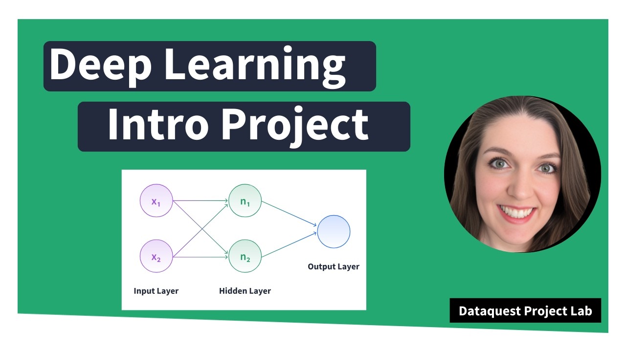
train our model and then one that we're going to use reserve the data so that our model has never seen it before and that's going to help us test whether our model is good with new information. Um so we are reserving 30% of our data for that test. setting a random state here just so our results are reproducible. So what does this mean? It means that we're going to train our model on 223 rows of data and test our model on 96 rows of data. And now for the deep learning model itself, we are going to define our model. Uh once again we're setting a random seed for reproducibility purposes. We are creating our model. We're using the sequential um model today just because it is an easier entry point than the functional model. It's a little bit um I think it's a little more intuitive because we add layers one line at a time. So, let me very quickly move over here to a visual. If you're new to deep learning, this visual on the left is our deep learning workflow, especially with the sequential model where we're going to have our input layer. So that's our data. Then there are some calculations that say, okay, um if it's this value, we're going to go to this node. And then there can be multiple hidden layers here. and then they all eventually lead into an output layer that is our classification in this case. So we're going to start by adding our initial layer and the shape of that. So how many nodes are going to be in our initial layer? it's how many um training points we have. So that's what's happening here. And then the activation function is a RLU activation function which means that if it's a negative value, it's going to convert it into one zero and anything else is going to keep at the value. And this adds in some randomness for our model to kind of play with. I was experimenting and commented these out, but let's add them back in for now. Um, so we're going to start with 32 nodes. And very common with sequential models to kind of create your layers in a funnel where eventually the funnel goes down to just your output layer. And the final thing to note here is our final activation function is a sigmoid activation function. And going back to
Analyzing and Interpreting Residuals
my visuals here, the sigmoid activation function looks like this where it's this S shape. And the closer it is to zero, the more it is going to classify it as a zero value. And then the closer it is to one, the more likely it is to classify it as the one value for so um for our classification. So for our IPO listing, these will be listing gains. So positive listing values and these will be non-positive listing values. All right, let's go ahead and run this. Got our model created. And now we're going to compile our model and tell it how we want it to be calculating things. We're going to use the atom optimizer with a very very low learning amount. And then for our loss function, we're using the binary cross entropy because it's a zero or one classification target. So that's why binary is the best scenario here. Print a quick model summary. And we can see all of our layers in our deep learning model have been created. We have the output shape and then the number of parameters it decided to create for that layer. Now here's the fun part. Notice that so far none of our deep learning model has used our data. We're technically using the shape of the data here, but it's not actually using our data. So this is the step where we say our model is created. It knows what to do. Let's go ahead and do it. When we run this cell, we're going to get lots and lots of rows of output. And here we go. So, we set our epoch to 250. And this means that the model is going to go through our data 250 times and try to learn how to improve upon it. So our first round we can see our accuracy is 47%. This is worse than a random guess. If we flip a coin 50% of the time it lands on heads. [snorts] We could predict the um target variable better than the model on this first round. But that's why it's deep learning is it's going to learn that this was not a good result. And we can see that the next round improves. That's slightly better accuracy. The next round improves and we can see it continues to improve every round. Sometimes it stalls on the same accuracy. Um accuracy multiple times in a row. Sometimes it decreases. But this is all the model trying to adjust and correct itself to eventually get the best results possible. So if we scroll all the way down, we can see the accuracy is slowly climbing up. So that by the end the accuracy is looking much better than what we started our first round at. Um, now it's very interesting that if you're following along with my solution notebook, we've done everything the same so far, but this accuracy we got live is much better than the accuracy in my solution file because you know deep learning sometimes there is a randomness factor that can't be accounted for. um especially with our data set size I think because we don't have very much data. So let's look at our quick evaluation of our training data. And this is really great results. uh our accuracy our model is correctly predicting the profitability 86% of the time on our training data and the loss it's pretty good. Um basically this first number is the loss and we want this to be low and accuracy high. So this is not bad but here's the real test. This was all our training data. So our model was created well our model was trained on this data. So it already had the answers to this test. So now we need to give it a new test using our test data. All right. This is terrible. Do we see this? Um our accuracy has dropped to 62%. and our loss is over one. Um, and this is terrible for a couple reasons. First of all, it's just it's not super phenomenal accuracy. Um, it's not super great loss, but the big problem I'm seeing is the difference between our training accuracy and our test accuracy. To me, this signals overfitting. Meaning, our model got really, really good at our training data, but it is not able to
Refining the Model
to use that narrow rigid model to generalize to data it hasn't seen before. So in machine learning and deep learning, this is in my opinion a miss. Um you can't feel very confident that your model would do well with new data. That being said, 63% accuracy on a really small set of data is not terrible. It's still better than a coin flip. So if you are hoping to invest in Indian IPO market, this model would get you better results than you know just flipping a coin. Um but I think the main reason we had some struggles here is that we're only training our model on 300 rows of data. Um deep learning in particular does really well with lots of data. that it can train on. Um, so an intro to deep learning project like this, we kept the data set small because the other thing about deep learning is the more data you have, the longer the calculations take. Sometimes training your data set can take minutes, dozens of minutes, um, even longer than that if you get very complex. So [sighs] for iteration um that's why we picked a small data set here but it did have our drawbacks. So just to see um at the end of my gist I included two machine learning models which are more simplistic than our deep learning um sequential model. So I tried logistic regression. Logistic regression is great for these binary classification problems. So, let's look at the accuracy score on that. Okay. Yeah, 68 69%. Not spectacular. Um and then a random forest classifier. So, taking a bunch of decision trees and um compiling them there. Yeah, 64%. So our data set is ultimately I think causing some issues. Um for next steps I do have some suggestions on things you can do to try to improve this. So hyperparameter optimization that means um changing things like the learning rate of the model. How many layers do you include in your model? Like that's why If you're following along with my gist, I had commented out um some of these layers we added is I was experimenting. I was trying to see can we improve our model at all. So yeah, you can optimize some of your parameters that way. Um try different optimizers and loss functions. So our optimizer and loss function, we were using the atom optimizer and the binary cross entropy loss function. Try some different ones out. Uh I also experimented with different learning rates here. So that's another thing you can experiment with. Um and then feature selection. Instead of using the base predictors in the data, try to construct new features. So thinking back to our correlation heat map up here, remember I pointed out that issue size was very low correlation value with our target variable. Maybe see what happens if you remove that. Uh there's a ton of experimenting you can do to try to improve your model's output. Um maybe you do some kind of [snorts] feature where you multiply subscription uh H& I by total or something. Um but given that this is an intro to deep learning project, there are things like that you can do to improve your deep learning knowledge without needing to add in a bunch of more complex things. Um, so that's what I got today and now we have some time for questions. So if you do have questions for me specifically, please use the Q& A box and I'll take a look at that now. What is the best way to avoid overfitting? Florine, your cat can see the Q& A box as well. Glad to hear it. I don't know if you could hear my cat earlier, but she was participating in the webinar as well. So Kieran asks, "What's the best way to avoid overfitting? " Um, what a question. So, I'm trying to think like of a concrete way to answer that. Um, I think it depends on the model you're using. In this case, um, I think that maybe the best starting spot could be the epoch count. Um, because the more rounds it tries to learn from, the more it relies on the training data answers exclusively. um and could overfit there. Um similarly, potentially the number of um nodes you have in your layers might impact things. Um another thing, honestly, this might be what? Okay, right now I'm just live going to experiment with what happens if we set our test size to a slightly smaller portion of the data so that we have slightly more data to train our model on. Maybe this is counterintuitive, but if our model has more data to train on, it sees more cases um more different scenarios of how independent can affect dependent. So, let's just take a quick look here. Um, oh, I should un uncomment these. There we go. And I'm just curious if changing the test size does anything different. Okay. So, accuracy this time around 76%. Um, and then on our test data, hey, you know what? This looks better. This already looks better. So Kieran um yeah there are several different things you can do to avoid overfitting uh if possible like making sure that the model doesn't have the opportunity to overlearn the training data. I think that's really what it comes down to. And GP asks, would I also consider not only removing the feature issue size, but also issue price low correlation was 4%. Yeah, that's another one you could try removing. Um, the reason I did keep everything like I mentioned earlier was because we have so few variables. um removing just seemed like it wouldn't have a positive impact on things. However, now I'm curious. No, I'm not going to do it. Um that's for you guys. That's homework. Um but yeah, try experimenting. Remove one, remove both. See what happens. regularization data quest is responding in the chat. Thank you. Um and Dashelle asks what about using a log transformer other transformations for the outliers? um for outliers using a log transformation I don't believe is the correct approach um because we're not removing skew the skew is going to stay skewed. um log transforming our entire data set would I think just be strongarmming things that don't need to be strong
Audience Q&A
armed and because we have skew here the log transformation isn't necessary uh because we're acknowledging that there's going to be these kind of oddball high values um and we're not removing those oddball high values we're just pushing them closer in to the rest of the data And the final thing, I do want to thank you for coming. Um, I had a blast talking about deep learning with y'all today.

![Your First Python App: Build a Food Ordering App from Scratch [Beginner Walkthrough]](/thumbnail/d7pC4H0Y_cY.jpg)