How to Make a Line Graph in Excel - From Simple to Scientific
9:04

How to Make a Line Graph in Excel - From Simple to Scientific

Teacher's Tech 21.04.2019 849 400 просмотров 4 360 лайков обн. 18.02.2026
Поделиться Telegram VK Бот
Транскрипт Скачать .md
Анализ с AI
Описание видео
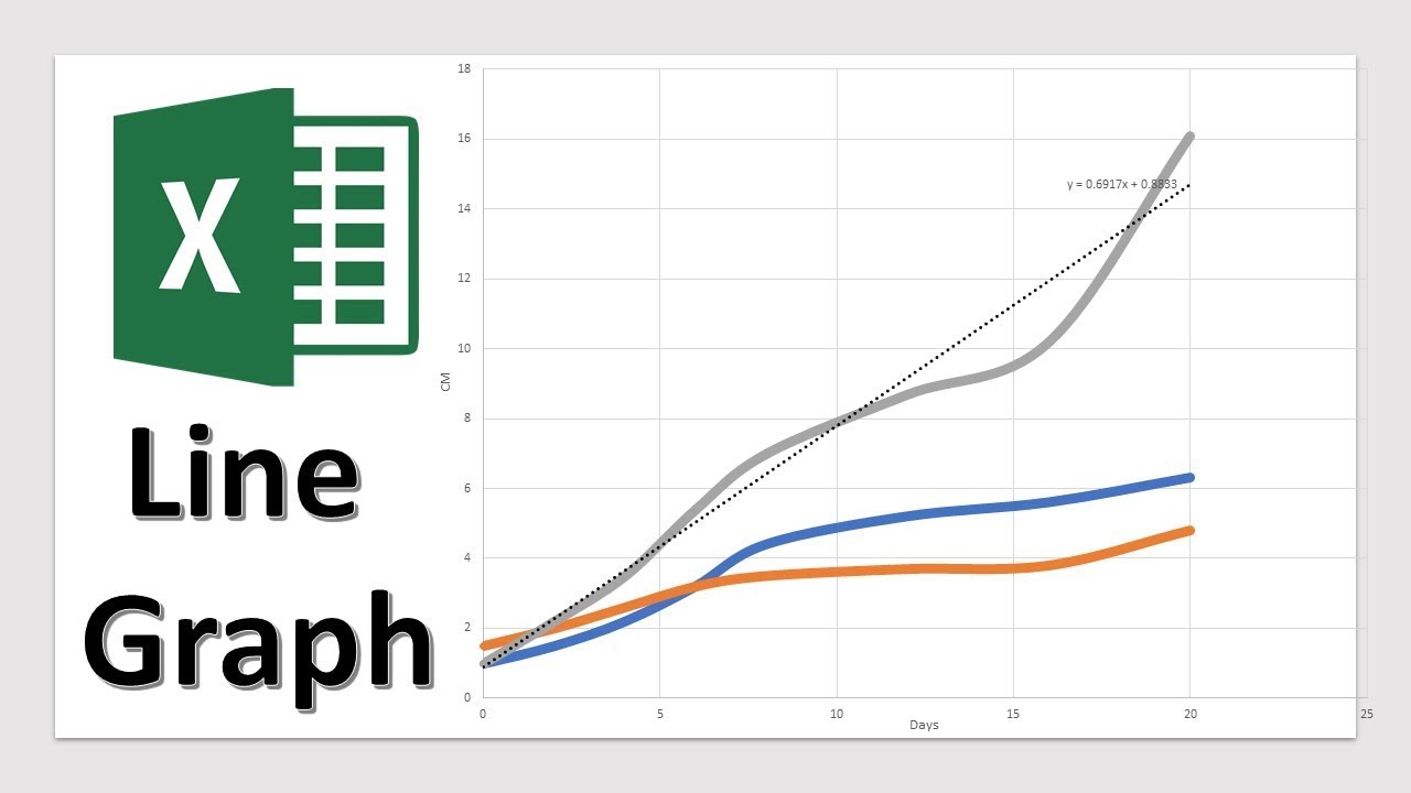
Want more Excel videos? Here’s my Excel playlist: https://www.youtube.com/playlist?list=PLmkaw6oRnRv8lAKbKbflJRqS-9wuYNWUw This video will show you how to make a line graph in excel. Charts are quick to create in Microsoft Excel. In this tutorial, I will show you how to create a line graph to show a trend and a scatter graph with scientific data to compare. Also included is how to copy a graph from Excel over to Microsoft Word for a research paper or PowerPoint for a presentation. Subscribe to Teacher's Tech: http://bit.ly/Subscribe_TeachersTech Learn how to use Microsoft Excel for beginners here: https://youtu.be/k1VUZEVuDJ8 Excel for beginners level 2: https://youtu.be/bhZckWTLkJM Microsoft Excel Tutorial - Level 3: https://youtu.be/47yu50CsH00 Learn Pivot Tables for Beginners: https://youtu.be/igSovq_H24A

Оглавление (3 сегментов)

  1. 0:00 Introduction 121 сл.
  2. 0:34 How to Make a Line Graph 746 сл.
  3. 4:14 Example 998 сл.
0:00

Introduction

hi there Jamie key here today a teachers tech are we having a great day today I want to show you how to create a line graph in Microsoft Excel so I'm going to be creating two different types a simple line graph that will show you a trend over time or if you want to do something more scientific and comparing in a relationship between different items I'm going to show you a scatter graph both are very simple to do once you have the data and you can format them very easily at the end I'm going to show you how to take those graphs and put them into something like Microsoft Word or PowerPoint let's get started today
0:34

How to Make a Line Graph

so my first example I have some data that is from Amazon for the last 10 years their annual sales revenue and I'm going to use a line graph to graph it to show that trend so to do this what I'm gonna do is just highlight so I'm gonna click in here and drag down to the bottoms on my highlighting both those columns and then I want to make sure I go up to insert here and then check for you we have recommended charts or we can hover over here for this first example I'm just gonna click on recommended charts because I like kind of when they kind of show you can check right away through here the recommended I could go to all charts to see more to go if I know something specific but this I can get an idea right away what I would like so in this case I'm just gonna go with this first one right up here and go ahead and hit OK and you can see I'm now I can move this to so if I just click this I can drag this up I can make it a little larger by grabbing the corner here too now you this automatically created this chart for this information that I selected here before so I if I change something in here so if I change this number you can see it will automatically reflect in there I'm just gonna go back a spot here and now I can customize that the customize this graph to way I want it to look so first of all maybe I want to click in here and I can put Amazon I'll just put annual sales revenue here so and then I have my title here and let's say I wanted to put on the side here my some more information maybe in billions if I go up here and click you can see I have a plus here so I can add chart elements and I want maybe the axis on for those ones so I can click on it you can see how it labels over here now I can go back to this and I can write in what I want so maybe this is I'll just write in billions here like so and at the bottom I just want to recognize that these are years on this one so I'll click in here and I'll just put years and then I have kind of the chart setup the way I want you can quickly when you click on the chart too you can change the luck so if I was gonna click on a few different ones you can see they have these pre-formatted I can just quickly change on these here so if I wanted to look like this with a little bit of shadows but maybe I didn't want these numbers being written up top I could go through and start to format these too so I could go back up to here and I could go through and click off and then I could customize keep some of the effects but then customize it myself to here so he could go through if you wanted a legend on you could click on it there or click off so you can go through and get what you want there the other thing to note you can customize the color through here too so I could go through and pick my styles just like I did before I'm just gonna keep it where I had it and you can also go through and customize things even more through here so if I click on the line here you notice on the right hand side over here I get different options so if I wanted a different color I could pick through here you can see how the line turns red I could add a different thickness to it and I can go through and just select different parts of it you can see how I can add shadows and pick the different series options on it but you can go through and customize this the way you want so that's for your basic line graph here that you can create very quickly in Excel now let's go over to a more scientific approach with comparing a few different items in the next graph so in
4:14

Example

this example I have some seedlings over 20 days just measuring the growth and there's three different ones so I'm going to be comparing it between the different ones so I'm not going to be using the line graph like I did last time I'm gonna be using a scatter graph I'm gonna highlight everything like I did before so just grab everything with my headings and this time what I'm gonna do so I go up to my insert like I showed you before I'm gonna actually just go over the type of charts and I want to insert the scatter XY so if I click on this you can see the drop down now at this point if I hover over different ones I get an instant preview of the graph below so in this case I want to use this scatter with smooth lines in my kurz I go ahead and click on this one so now I can drag it if I wanted in a different place and I can stretch it out to make this larger and I can go through and make my customizations again so if I wanted that chart title here to be watch one we have here the heights of tree seedlings like so and I can add my y and x axis again so if I go ahead and click the axis titles so I can add this could be I just want to put in centimeters I'll just put cm here and this is my over here we have in days here so I can go ahead and label this one over through heroes I like this and put days like so and like I showed you the last one the design is a quick way to adjust it so if I wanted to say in this one I could put the headings at the top or we could use the bottom I'm just gonna go with this one I like the look of this one and I could go through and customize the different line colors like I showed by using the format charge area but I just wanted to also show you how to add a trendline to any of these so if I wanted to pick one of the seedlings and add the trendline to it with a formula what I could do is if I click on will click on this top one here and you can right click on this one you can see a trend line there's a couple different ways you can add the trendline but this is how I'm gonna use it so I'm gonna select the one that I want and add my trendline and you can see right away it put this the gray so this one's pretty easy to see the dotted line over here I'm gonna make sure that this is with linear here I can go through I'm gonna go first and actually display the equation on the chart so if you're putting all this scientific data in you can go ahead and click it and you can see how it's right on the chart if you couldn't see maybe the dotted line you could go back and start to change it so if you needed a little thicker you can see I was I just the width it's a little thicker maybe you wanted to change a color bit so if I change this to white you can kind of bring out different things in this so let's say if you're done you had this graph a different thing you could do if you wanted on to put it on to a different excel page what I can do is if you right-click on this one you can see that there's a move chart here so I could go ahead and move chart I could just put the object in I can go on a new sheet hit OK and it created a new sheet with the chart as large I can still make the adjustments another thing that you can do if I go back to any of these here so my I'm just gonna go back here to my chart here I can take these from here and copy it to different things like Microsoft Word so maybe you would needed this in a research report you could copy this from here and you could go over to Microsoft Word and here's a document that I have open and I could just paste it in now you have a few different options I can paste just like how I have selected here but as you pick different ones you can see if I wanted to link the data so what that means if I go ahead and link it now if I go back to my excel over here if I change any of the data so if I go and I'm just gonna make it where it's quite noticeable and this last one will go 5 and you'll be able to see how this chart here drops off like this but when you have it linked if I go back over to my Microsoft Word it's length there so it can update if you need to make some changes you don't have to worry about copying pasting it over that way too you can also copy paste this if you have PowerPoint open if you need to didn't slide for a presentation you can do the exact same thing and put it on there so I hope you like this tutorial today of just using line graphs and scatter graphs to create your simple trend lines or maybe if you want to use it on a scientific approach let me know what other type of graphs you want to use in Excel and some other excel things thanks for watching this week I'll see you next time on teachers tech

Ещё от Teacher's Tech

Ctrl+V

Экстракт Знаний в Telegram

Транскрипты, идеи, методички — всё самое полезное из лучших YouTube-каналов.

Подписаться