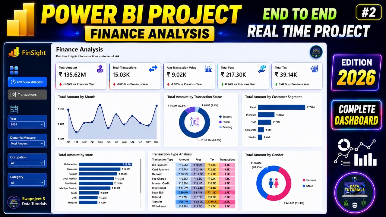
Power BI Project | Finance Analysis Part 2| Power BI | Complete Dashboard End to End #powerbi
Machine-readable: Markdown · JSON API · Site index
Описание видео
#powerbi #dataanalytics #datascience
Part 1 - https://youtu.be/xVC9GyXergs
Package Courses-
⭐Microsoft Fabric Complete Course (End to End) - https://topmate.io/data_tutorials/2082484
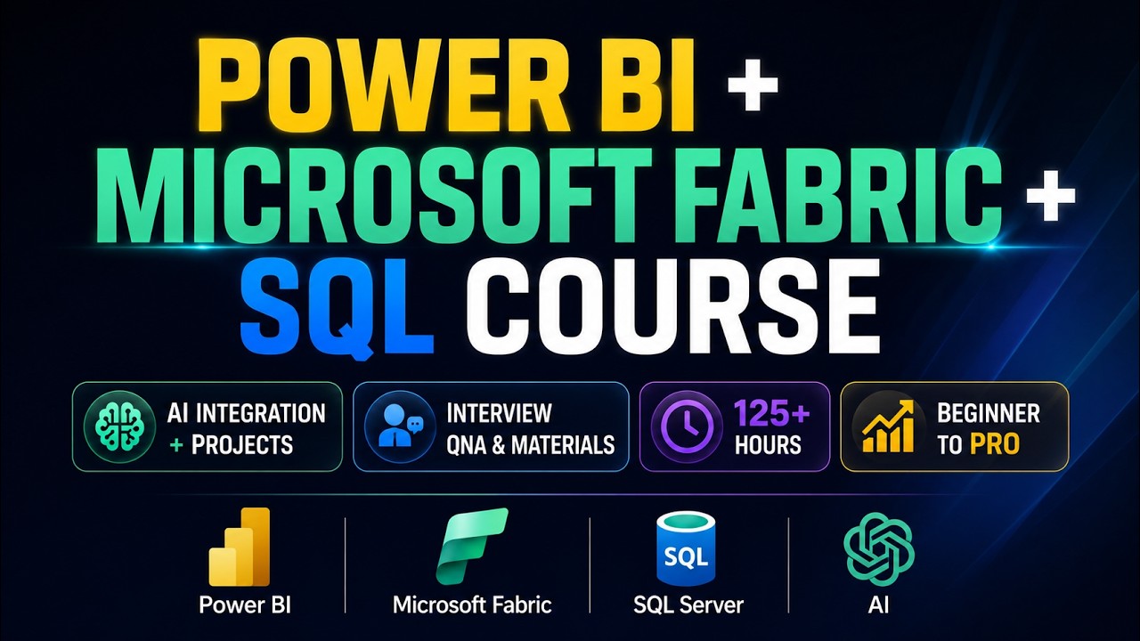
⭐Microsoft Fabric + Power BI + AI + SQL + Project Course + Resources - https://topmate.io/data_tutorials/2082770
⭐ SQL Complete Course - https://topmate.io/data_tutorials/1977020
⭐ SQL + 3 SQL Projects + Power BI + Power BI DAX + 21 Power BI Projects + All Materials - https://topmate.io/data_tutorials/1981530
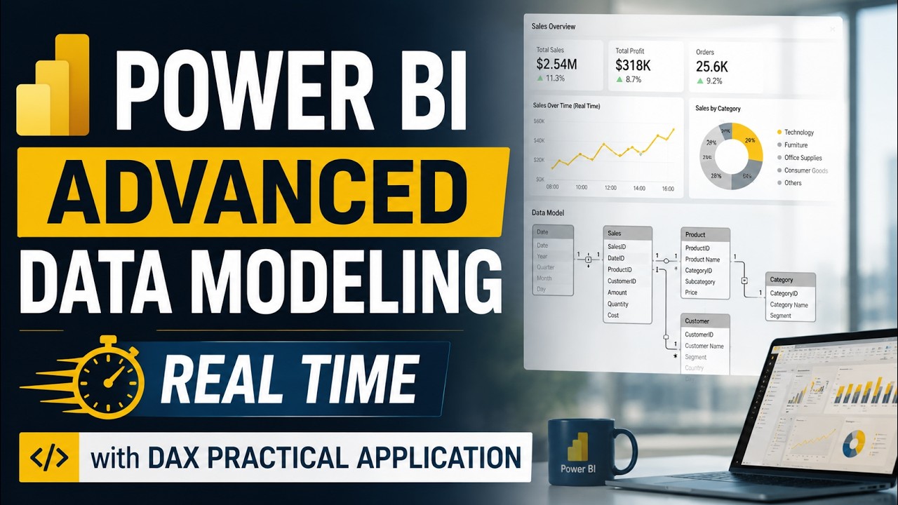
⭐ Power BI Course + DAX Course + 20 Power BI Projects Video Course - https://topmate.io/data_tutorials/1857280
Individual Courses-
⭐ Power BI Complete Video Course - Basic to Advanced - https://topmate.io/data_tutorials/1855310
⭐ Power BI DAX - Complete Video Course - https://topmate.io/data_tutorials/1842994
⭐ Power BI Project Video Course - 21 Projects - https://topmate.io/data_tutorials/1826891
⭐ Tableau Projects Video Course - 10 Unique Projects - https://topmate.io/data_tutorials/1832087
⭐ For Important more visit my website - https://topmate.io/data_tutorials/
💻 Download Data - https://drive.google.com/drive/folders/15wlZbKgQGb1qiCS4e1PPmpjsc9UGprex?usp=sharing
In this video, you will learn how to build a complete end-to-end Data Analytics project using Microsoft Fabric, SQL, and Power BI. We will cover the full workflow including data ingestion, cleaning with SQL, creating Lakehouse & Data Warehouse, building a semantic model, and developing an interactive Power BI dashboard. This project is perfect for beginners who want real-world experience with Microsoft Fabric architecture. By the end of this tutorial, you’ll understand how modern data engineering and analytics workflows work in the industry.
➖➖➖➖➖➖➖➖➖➖➖➖➖
Checkout my other videos on dashboards design in Tableau, Power BI and Excel below-
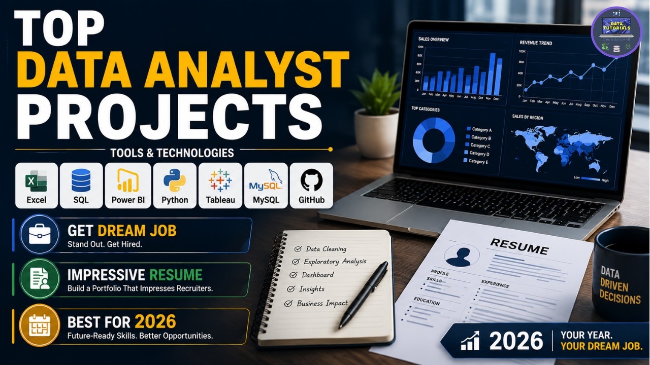
✅Data Analyst Portfolio Projects - https://www.youtube.com/watch?v=3Acmk-rqn6c&list=PLO9LeSU_vHCWpfLDRTT5nBz9Z0libOs5k
✅Power BI Projects - https://www.youtube.com/watch?v=-sOHVl_iCHA&list=PLO9LeSU_vHCWUvkE1FrGeNxSve7YtJrYl
✅Power BI Tutorial - https://www.youtube.com/watch?v=JQ9wX1d7dGE&list=PLO9LeSU_vHCWfBQjbJY-N841Ils5xwAlH
✅Python Projects - https://www.youtube.com/watch?v=RWrnqhSYUmk&list=PLO9LeSU_vHCVYLLTcTEvzWwPjpIOyz9oY
✅Tableau Projects - https://www.youtube.com/watch?v=oAIubTqg-Kw&list=PLO9LeSU_vHCU_DHaLzEvsLxFdmB3Qcao_
✅Excel Projects - https://www.youtube.com/watch?v=xHTUP1Dxu-M&list=PLO9LeSU_vHCWWRghKgAQRg_TrgtRl5-4Y
✅SQL Projects - https://www.youtube.com/watch?v=4l7GgWmaTGc&list=PLO9LeSU_vHCVbT81nMD2S_YMRJ1OpnXZi
✅Power BI Interview Questions with Answers - https://www.youtube.com/watch?v=bBYIvOytMwo&list=PLO9LeSU_vHCUAh-OkfoKUx6PlNJHAxgCK
✅Tableau Interview Questions with Answers - https://www.youtube.com/watch?v=S7ArMgAdOIE&list=PLO9LeSU_vHCUvp3KfoWQULRXAghIOh8Kx
=
➖➖➖➖➖➖➖➖➖➖➖➖➖
Reach out to me for any personal or Business related Dashboard/ Report development on my email- swapnjeet555@gmail.com
WhatsApp - +91 9579005495
Related Tags
end to end power bi project,power bi project end to end,end to end project on power bi,power bi end to end project,power bi end to end tutorial,step by step tutorial to make a dashboard in power bi,power bi project start to end,power bi dashboard tutorial for begginers,power bi dashboard tutorial for beginners,finance dashboard power bi,power bi dashboard tutorial,data analysis project using power bi,power bi project dashboard,power bi dashboard project,swapnjeet,powerbi