Why Your Designs Still Look Amateur! (And How Pros Fix It)
13:52

Why Your Designs Still Look Amateur! (And How Pros Fix It)

Satori Graphics 04.03.2026 18 502 просмотров 1 014 лайков

Machine-readable: Markdown · JSON API · Site index

Поделиться Telegram VK Бот
Транскрипт Скачать .md
Анализ с AI
Описание видео
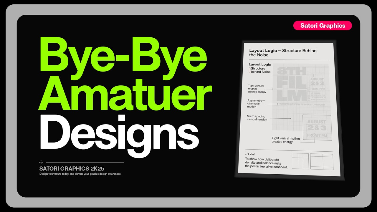
Designers who consistently apply the right graphic design tips quickly reach a point where amateur-looking work simply disappears from their portfolio. FontBase — the font manager for designers https://fontba.se/awesome?ref=satori 👉 How to think like a true designer in 2026: https://youtu.be/WFkGbyH24AY 
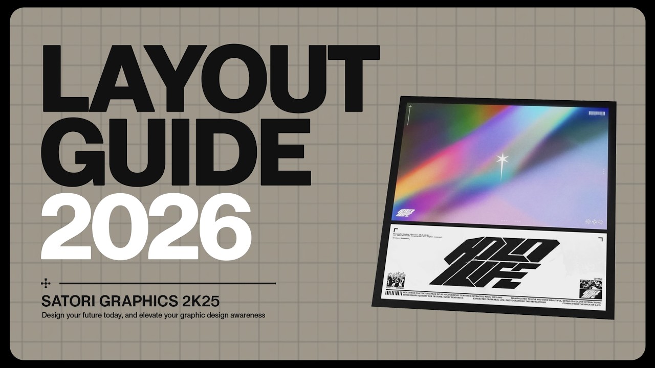
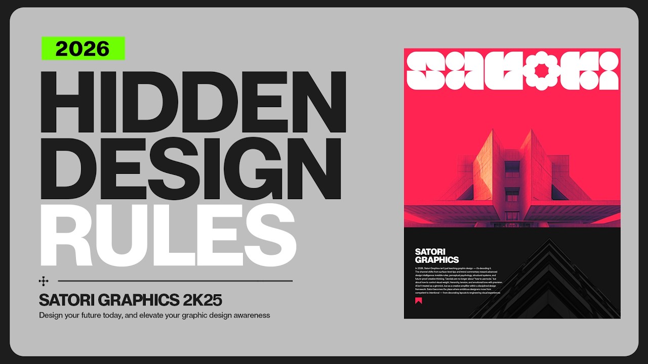
In this graphic design tutorial from Satori Graphics, you'll learn practical graphic design tips and techniques that help your work look cleaner, more intentional, and more professional. By understanding key graphic design fundamentals like visual hierarchy, layout logic, and spacing discipline, you can transform how your designs communicate and feel. This video is ideal for anyone exploring graphic design for beginners, taking a graphic design course, or trying to learn graphic design through real-world techniques. We’ll cover important areas like typography design, font pairing, layout design, and how to design a poster so your compositions feel balanced, modern, and visually confident. On Satori Graphics, the goal is to make graphic design education practical and accessible. From graphic design basics and tutorials to deeper lessons in typography, color theory, and professional design thinking, the channel helps designers develop stronger creative instincts and produce consistently professional graphic design work. ▶▶▶▶▶▶▶▶▶▶▶▶▶▶▶▶▶▶▶▶▶▶ 💯 The Graphic Design Roadmap for 2026: https://www.youtube.com/playlist?list=PL-c9Rq56P4KkKDj7t4vn1thaswZkrwJQg 👉 Watch LONG Course Style Graphic Design Uploads: https://www.youtube.com/playlist?list=PL-c9Rq56P4KmK4sVH49C4rjYh5VH6uK4o 👉 Checkout The NEWEST Satori Graphics Videos: https://www.youtube.com/playlist?list=PL-c9Rq56P4KmLkA3fasRTp3M3GIw8UN4e 😎😎😎 Skillshare is giving you one FREE month with no charge if you cancel in time and a reminder before it ends: https://skillshare.eqcm.net/aO0yGj 📌📌📌📌📌📌📌📌📌📌📌📌📌📌📌📌📌📌📌📌 💡 My Advanced Course On The Graphic Design Process: https://logodesignprocess.com/advanced-graphic-design-workflow/ 🔥 Take Your Logo Design Process To New Heights here: https://logodesignprocess.com/ or on Gumroad here: satorigraphics.gumroad.com/l/logoguide 🌳🌳🌳 SATORI LINKTREE: https://linktr.ee/satorigraphics 🔥 The BEST guide to colour in graphic design: https://logodesignprocess.com/marketing-colour-guide/ 🥇 Use ChatGPT like a PRO and elevate your design workflow here: https://logodesignprocess.com/ai-prompts/ 📌📌📌📌📌📌📌📌📌📌📌📌📌📌📌📌📌📌📌📌 🐦 Join Me On Twitter: https://twitter.com/satorigraphic2k 📸 Here's My Instagram: https://www.instagram.com/satori_graphics/?hl=en ******************************************************************** ❤️ SUBSCRIBE To My Main Channel: https://www.youtube.com/c/SatoriGraphics 🧡 SUBSCRIBE To My Backup Channel (in case this channel becomes compromised): https://www.youtube.com/channel/UCnQNh827deb9xToVxgx2LFQ ******************************************************************** ©️ Copyright The work is protected by copyright, produced by Satori Graphics® This is applied to the video recording of itself as well as all artistic aspects including special protection on the final outcome. Legal steps will have to be taken if copyright is breeched. Music is used from the YouTube audio library and or sourced with permission from the author Designed with Freepik: https://www.freepik.com 0:00 Non-Amateur Design: Using Dynamic Anchors 1:02 Design System Guides 3:08 Typography Ramps 4:33 Design Fatigue Sucks 5:54 Lacking Visual Discipline 7:34 The BEST Font Manager?? 9:24 REAL Von Restorff Placement 10:28 Font Pair Trickery 11:46 20/80 Visual Rule (typo included) Subscribe to stay updated to all of my uploads and until next time, design your future today, peace ✌️ Satori Graphics®

Оглавление (9 сегментов)

Non-Amateur Design: Using Dynamic Anchors

First, the athlete in midair is all about motion. This creates a dynamic anchor that ties the viewer to feelings of freedom or breaking boundaries. Also, it's an action shot that leads right back to the audience of Adidas, being sporty and dynamic. The modern urban backdrop features glass and steel architecture, and this anchors the viewer to the idea of innovation and progress. This somewhat sleek futuristic setting complements the branding and reinforces a forward-thinking modern identity. So you can see that the main anchor or the first thing you see and notice can be conscious or subconscious for the viewer. But it does set the stage and influences everything else from there from the first impression. And to summarize, first impressions count a lot. But on your design, the anchor is the psychological first impression that should tie back to your brief and the message.

Design System Guides

Now, a lot of designers, maybe you yourself, spend too much time building isolated layouts or entire designs over and over again. So, like one poster, one ad, one campaign, all from scratch each and every single time. That's exhausting and it's truly an outdated approach that isn't all that smart when you look at it. The truth is good designers use design systems. For example, imagine you're designing a series of posters for a film festival. Most designers will start with a layout. Then they might pick some type faces, move some assets around, and then try to repeat that for the next three posters. But a system thinking designer handles things a bit differently. Let's spend the first hour or so building a grid logic, setting some margins, organizing a kind of rhythm or layout, but also importantly spacing rules such as how much micro and macro white space will be on these posters. And this will be based around the brief, your target audience, and the knowledge of the application of the design itself. Now, when it comes to making the next poster, everything already falls into place. Of course, you will make small tweaks such as, you know, some tweaks to layout, perhaps having a graphic design bleed over a certain area and so forth. But the key thing here is that you don't start from zero each time. You're simply playing within your own framework, like building a house after the important foundations are already in place. But what's even cooler than this is that if you save this framework and you can use it again on an entirely different project. Yes, the brief will be different, but you hold your own style throughout different projects, kind of like your design signature, but then you just tailor the details to meet the brief's content. This is the first way that you can make your life a whole lot easier in 2026 as a graphic designer. You're not faster because you've been rushing. You're actually faster because you built a machine framework that keeps momentum moving.

Typography Ramps

Now, most amateur graphic design layouts die when it comes to the topography ramp. So, we need to look at three tiers here, primary, secondary, and tertiary. And we can add a hero level for those big attention-grabbing titles. So, pick a scale, just something that has consistent steps that you can use to size your text. This makes everything look and feel related and neat. So, start with the body text. And I'm going to start with 11 points. And my ratio here is going to be 1. 618. And all we do is climb the ladder by multiplying. So body text 11. Secondary subheading text 11 * 1. 618 comes to 17. 8 which we can round up to 18. And the primary the headlines 18 * 1. 618 comes to 29. 1 which we can round down to 29. And that hero headline 29 * 1. 618 comes to 46. 9 rounded up to 47. So in this magazine feature spread design here the hero headline is 47 for the maximum impact. Primary headlines 29, secondary being 18 and tertiary body text 11.

Design Fatigue Sucks

One of the biggest amateur giveaways is when your graphic design confuses the viewer with everything at once, hitting them straight to the dome. Here's the messy museum exhibition poster. We have a giant title, three taglines, two images, a sponsor wall, creator names, dates, hours, map icon, QR, social headlines, 12 micro choices. That's just too much. So, I'm going to cut things down to four decisions. What is it? The exhibition title. What to look at? One hero artwork. When the dates, everything else in a proximity group. Everything else gets grouped into a tiny footer strip. The sponsors go monotone in one line. And now for the 10-second test. Show your graphic design to a fresh pair of eyes and ask, "What is the one idea on this design? " You want something like the Bow House retrospective at the design museum October 12th to January 5th. If they say anything broader or get stuck listing extras, we cut again. The goal is fewer decisions blocking the main gist of the design. And you need to consider the CTA, which of course on this is simply to inform people of when, where, and so on.

Lacking Visual Discipline

The reason so much design feels almost good or nearly there isn't a lack of creativity. It's a lack of visual discipline. Spacing is inconsistent or contrast is weak. Scale is random and typography choices feel like they were selected by spinning a wheel. Designers jump into software too quickly and they skip the fundamentals that actually make a design intentional, elegant, professional, and well, just work. And here's exactly why this becomes a major problem in 2026 and beyond. When tools get more accessible and everyone can produce something pretty decent, especially these days of AI, the only thing that separates amateurs from professionals, is the fundamentals and the skill set of experience. Client and art directors can instantly see when spacing is sloppy or in hierarchy hasn't been thought through. These small details either signal professionalism or expose the lack of it and as the industry matures there will be less tolerance for good enough. The good news is that this is fixable. Improving your fundamentals pays off faster than anything else. Learn spacing ratios. Understand rhythm. Control contrast consciously. Limit your type choices so they become extensions of your thinking rather than random guesses. Use frameworks like hierarchy in three layers or the prospacing rule. And these things will guide your decisions on design projects. And once you master fundamentals, your work instantly becomes more professional and more trustworthy without you even changing

The BEST Font Manager??

your style. I used to waste so much time trying to find the right type face and the right font for my projects. Instinctively, the logic would say to reach for a font manager, and that's when I found font base. It is a fast, free font manager built specifically for designers, and it has completely streamlined my workflow. Whether you have 50 fonts or 50,000, the interface stays clean and smooth, and it runs on Mac, Windows, and Linux. One of my favorite features is the font playground. Now with this you can test font pairings, adjust the headings and the line spacing and even see how your layout might look in the real world. There is also font pinning which lets you keep one font fixed at the top while you scroll and compare other fonts. And if you work with variable fonts, font base lets you tweak and preview all of those custom settings very easily. And yes, Google fonts are built right into this thing. So you can activate them with a single click. But if you do go for the paid version which is called fontbase awesome, you will unlock something called super search. It is not just a tag system. Fontbase actually analyzes the contrast, the weight, and the proportions of your fonts and shows them on a visual chart. It lets you filter and discover fonts in a way that feels just intuitive and fast. There is also auto activation for Adobe apps. And that means when you open a file, missing fonts get activated instantly. I know how much of a headache that can be. And you can try all the premium features for free for 3 months using my code sati. Just visit the link in description box below and check it out for yourself.

REAL Von Restorff Placement

Next, we're looking at something so cool and yet so easy to use. We're going to create one isolation vontoff aspect to our graphic design workflow. And so on this album cover, I'll make the band name the star using exactly one isolation tactic. Option A is a unique hue. So everything else is muted, but the title is its own isolation hue. Option B, unexpected scale. So, oversize the title so it bleeds to the edge. Option C, subtle motion. And so, for prints, that could be like a motion blur or some kind of trail. Now, you can create three artboards or three canvases side by side and then lay each design out against each other. This will let you see which one works best. And doing this helps you create a clear and concise focal point which drags a viewer right into our design. But this is only the start of the journey on a graphic design.

Font Pair Trickery

So mosying over back to typography for a moment. Pairing fonts incorrectly is the quickest way to look amateur as a graphic designer. And yeah, sure, font pairing is something that is learned to become like a natural instinct with time and experience, but you can also do this on this logo design cheat sheet, which you can download for free from logodesignprocess. com, created by myself. Instead of trying to pair fonts, we could just run with one variable family. So the primary slightly wider and obviously heavier, secondary notes, regular width, medium weight, and the tertiary being a touch more narrow with lower grade so it fits small. To achieve this, we can use clear visible jumps between text rolls when you're using a variable font. So change the weight by around 100 to 200 units. An example being the body text 400, the subheading 600, and the headline here 800. This is just a quick guide, but again, having a strict system can help speed things up and breed confidence in a designer. But when someone really, really moves far beyond amateur with their skill level, a lot of this simply becomes second nature and instinctive.

20/80 Visual Rule (typo included)

Now, here's something I'm sure every designer wish they understood earlier. Most of your visual impact does not come from fancy techniques or complex compositions. It comes from a handful of invisible rules that quietly make everything feel balanced, confident, and intentional. This is what I call the 80/20 split of visual logic. It's where 20% of what you do creates 80% of the final result. It's the kind of stuff you can't always explain with words. The alignment, the tension between two elements, how the white space breathes between text and image, or the directional flow that guides a viewer's eye through a layout. These are the silent forces of design. And in 2026, if you know how this works fully, your life would be a whole lot easier. And here's an example. Imagine you're creating an ad for a luxury scent oil or perfume. In version one, the bottle sits dead center. The type is neatly aligned, and everything is technically correct. It's clean, but it's also a little bit lifeless. Now, take version two. You offset the bottle slightly. You twist it. You reorder the topography, and suddenly you have a more interesting and more memorable design. One that looks like it actually belongs in a high-end magazine. Nothing overly dramatic has changed as such. Just the logic behind the spacing, the rhythm, the flow. When you start noticing these invisible forces, so the tension, the spacing, the movement, the layout, design becomes almost effortless. You stop guessing what looks right and instead you start feeling what is right as a designer. And that's instinctively known. But if you didn't get your filler graphic design content with today's upload, just click one of those videos on screen to further your educational journey right here today. And until next time, guys, design your future today. Peace.

Другие видео автора — Satori Graphics

Ctrl+V

Экстракт Знаний в Telegram

Экстракты и дистилляты из лучших YouTube-каналов — сразу после публикации.

Подписаться

Дайджест Экстрактов

Лучшие методички за неделю — каждый понедельник