Graphic Design Trends 2026 — And How to Actually Use Them!
13:13

Graphic Design Trends 2026 — And How to Actually Use Them!

Satori Graphics 06.01.2026 90 655 просмотров 3 438 лайков

Machine-readable: Markdown · JSON API · Site index

Поделиться Telegram VK Бот
Транскрипт Скачать .md
Анализ с AI
Описание видео
Discover the most important graphic design trends of 2026 and learn exactly how to use them the right way in your own work! 👉 Use the link in my description or scan the OR code to try Ray3 Modify yourself! https://lumalabs.ai/satorigraphics 🔥 Take Your Design Process To New Heights here: https://logodesignprocess.com/ 
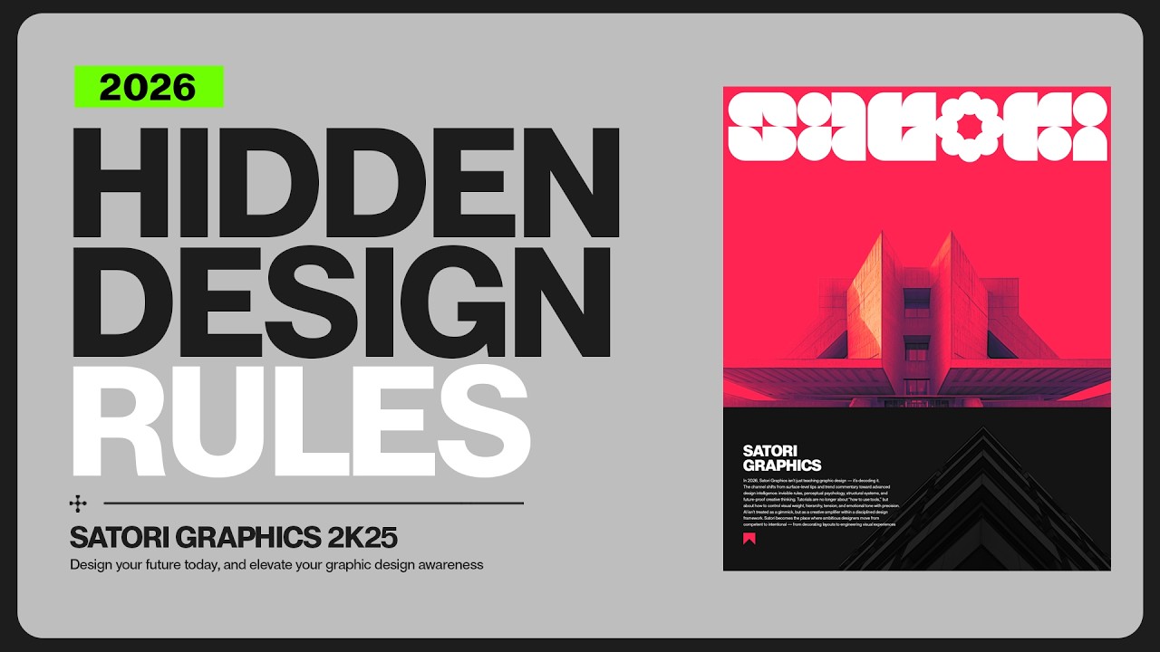
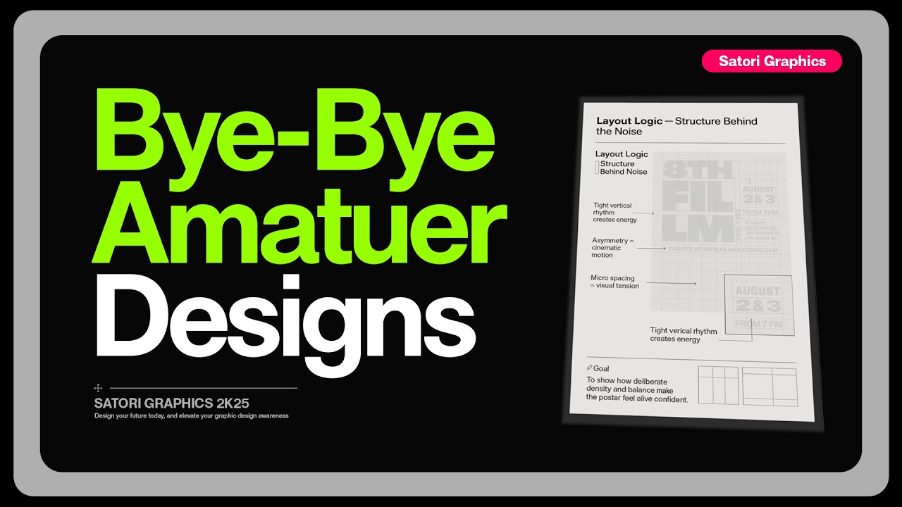
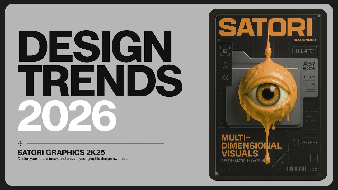
In this video I break down the key design trends that will actually matter in 2026 and show you how to apply them correctly rather than just copying surface aesthetics. We will look at why certain trends are exploding, how they connect emotionally with audiences, and what mistakes to avoid so your work does not end up looking generic or overdone. You will learn how to merge nostalgia with the future, how to bring back human warmth into digital design, how to use bold typography with discipline, how depth and dimensionality can transform your visuals, and why flexible modular branding systems are becoming essential. By the end of this video you will not just know what is trending, you will know how to think like a modern designer in 2026 and beyond. ▶▶▶▶▶▶▶▶▶▶▶▶▶▶▶▶▶▶▶▶▶▶ 💯 The Graphic Design Roadmap for 2026: https://www.youtube.com/playlist?list=PL-c9Rq56P4KkKDj7t4vn1thaswZkrwJQg 👉 Watch LONG Course Style Graphic Design Uploads: https://www.youtube.com/playlist?list=PL-c9Rq56P4KmK4sVH49C4rjYh5VH6uK4o 👉 Checkout The NEWEST Satori Graphics Videos: https://www.youtube.com/playlist?list=PL-c9Rq56P4KmLkA3fasRTp3M3GIw8UN4e 😎😎😎 Skillshare is giving you one FREE month with no charge if you cancel in time and a reminder before it ends: https://skillshare.eqcm.net/aO0yGj 📌📌📌📌📌📌📌📌📌📌📌📌📌📌📌📌📌📌📌📌 💡 My Advanced Course On The Graphic Design Process: https://logodesignprocess.com/advanced-graphic-design-workflow/ 🌳🌳🌳 SATORI LINKTREE: https://linktr.ee/satorigraphics 🔥 The BEST guide to colour in graphic design: https://logodesignprocess.com/marketing-colour-guide/ 🥇 Use ChatGPT like a PRO and elevate your design workflow here: https://logodesignprocess.com/ai-prompts/ 📌📌📌📌📌📌📌📌📌📌📌📌📌📌📌📌📌📌📌📌 🐦 Join Me On Twitter: https://twitter.com/satorigraphic2k 📸 Here's My Instagram: https://www.instagram.com/satori_graphics/?hl=en ******************************************************************** ❤️ SUBSCRIBE To My Main Channel: https://www.youtube.com/c/SatoriGraphics 🧡 SUBSCRIBE To My Backup Channel (in case this channel becomes compromised): https://www.youtube.com/channel/UCnQNh827deb9xToVxgx2LFQ ******************************************************************** ©️ Copyright The work is protected by copyright, produced by Satori Graphics® This is applied to the video recording of itself as well as all artistic aspects including special protection on the final outcome. Legal steps will have to be taken if copyright is breeched. Music is used from the YouTube audio library and or sourced with permission from the author Designed with Freepik: https://www.freepik.com 0:00 Which Design Trends Matter? 0:11 Nostalgic Retro-Futurism 2:30 Organic Imperfection 4:45 Hyper-Bold Typography 6:16 Luma Ai Updates 8:07 Multi-Dimensional Design 10:28 Modular Systems 12:20 An Important Takeaway Subscribe to stay updated to all of my uploads and until next time, design your future today, peace ✌️ Satori Graphics®

Оглавление (8 сегментов)

Which Design Trends Matter?

which graphic design trends of 2026 actually matter, but also this video will give you information on how to use the trends and how not to use them in your work. So, this first trend of nostalgic retro

Nostalgic Retro-Futurism

futurism is blowing up because it taps into two things people love. Comfort, which is nostalgia, and possibility, the future. It's warm and it's familiar, but it's exciting. It's like those VHS textures meeting neon holographics. It is retro curves meeting sharp digital glows. Old shapes, old type, old moods, new vibe. And here's how you should merge these two together properly. Firstly, you must realize you should pull things from eras that actually mean something to your audience. So, you need to understand the brief and the audience before you even consider this trend. So, maybe it's the 80s chrome look. Maybe it's 90s grunge sci-fi. Whatever it is, blend those influences with cleaner modern looks so your work doesn't look like pure nostalgic cosplay. And look at these two posters. This is retro futurism done right. They do pull from the past without getting too stuck in it. The colors, they do hit you first. You know, it's those deep purples, those neon oranges, those hazy pastels that feel like they're straight from manga covers or ' 90s sci-fi VHS tapes. There's grainy textures here. There's half tones. There's warped grids. All the stuff that reminds you that design used to be printed, used to be imperfect, essentially human. And then the future crashes in with chrome surfaces wrapping around faces, holographic lighting, fluid metal shapes that bend like liquid technology. And the layout is pretty modern as well, and that's why it works. It hits nostalgia and curiosity at the same time. It's familiar enough to be comforting, futuristic enough to feel exciting. But with this trend, it can even be something as simple as adding in an iconic nostalgic element, like on this poster design where I highlighted the Japanese toy we went crazy about in the '90s, the Tamagotchi. So, if you get this right, your audience will feel two different emotional things at the very same time. something old and memorable, but then something new and exciting, and then that becomes something uniquely yours. That mix is going to completely dominate 2026 because it gives people what AI can't. A sense of personal history fused with a sense of future possibility.

Organic Imperfection

possibility. So, moving swiftly on, I'm sure you feel this way, too. But after years of pixel perfect grids and AI polished everything, people are craving design that feels like it actually came from someone, not something. So brands are finally realizing in this day and age that perfection in graphic design, it looks too suspicious. It looks too perfect, too clean, too manufactured. And I know you can see that as well. This trend rises because it brings back texture, personality, wonkiness even. and the little flaws that make a design feel alive. Designers are tired of being told to refine, refine until the work has no heartbeat left, no kind of vigor or life. Not to mention AI just churning out slop after slop. So 2026 is swinging right back towards the things we edited out. Those loose edges, the handdrawn elements, real shadows, irregular shapes, uneven type, just things that remind people there was a human on the other side of the screen crafting this. But how do you use it? Let your work breathe. Add shapes that aren't perfectly symmetrical. Introduce handmade textures instead of just relying on glossy gradients. Use typography that looks slightly lived in, not distressed, not grungy as such, just not robotic. You can also get spicy with it and mix clean structure with one or two organic touches that break the machinemade vibe. And this is my favorite way to go about this trend personally. But here's what you don't do. Don't go full chaos mode. Don't make everything messy just to prove a point here. The goal isn't to make your work look unpolished as such. It's to make it feel more human. If your layout looks like you designed it during an earthquake, then you've probably missed the mark here, guys. Imperfection should add warmth, not exactly confusion. And please don't throw a random scribble on the page and call it organic design. Every choice you make and every design you create must be tracked back to the brief and that target audience. So, don't just jam a trend into a project for fun or for the

Hyper-Bold Typography

hell of it. Now, let's talk about the trend that refuses to go quietly. Hyperbold typography and high contrast layouts are going to be almost everywhere in 2026 and it's already heading that way now. And that's for a very good reason. We're designing for an audience that is scrolling faster than any generation before them. They rarely read more than a couple of words. They simply just scan. People don't really tend to pause on subtlety. And what they stop for often is impact. So hyperbolography gives brands something priceless in 2026. Instant recognition. This is a functional trend for sure. Bold type works exceptionally well in environments where attention is brutally competitive. So hero sections, social ads, billboards, packaging on crowded shelves, fast-paced UI moments, and any place where the message must hit in under a second. And when done correctly, typography becomes the visual identity itself. The shape, the voice, the attitude, all of it becomes that voice. And brands love that because it scales across all platforms with zero loss of clarity. But here's the challenge. The difference between impactful and messy ultimately comes down to the discipline in the designer. Controlling rhythm, scale, spacing, things like grid tension, and deciding exactly where the eye should land first. And when designers understand this fact, bold typography can be one of the most effective storytelling tools you have right now.

Luma Ai Updates

By the way, while we're talking about improving your creative process, I want to show you something that's genuinely been blowing my mind over the past few weeks. I'm sure many of you have heard about Luma AI, but I've been experimenting with their new model, Ray 3 Modify, and it's built for hybrid AI storytelling, and it's where real performances and AI enhancements work together and for full AI productions that need precision and control. But what sets it apart is that it actually perturbs the physical logic of the original shot. It is the closest thing yet to true AI post-prouction. But the reason I'm mentioning it today is because as graphic designers, we are constantly trying to visualize concepts for clients. And that can involve movement, atmosphere, storytelling, but we rarely have the time or the setup to actually film something professional. Luma AI's Ray 3 modify completely removes that barrier. And what I've been doing is starting in draft mode, which is five times faster and cheaper, sometimes just like a design I'm working on, and it gives me a moving version of that design in a few seconds. And once the vision feels right, I then run it through their hi-fi diffusion to get a proper 4K HDR output. The feature that surprised me the most, however, is the visual annotation. Now you can literally draw on an image like a motion arrow or where a character should look. And Ray 3 modify follows it exactly. It actually understands creative intent instead of guessing. And that's the part that feels next level compared to every other model I've used. And so if you are someone who wants to bring your ideas to life without needing a camera or a team or a week of production, you can try Ray 3 Modify and Luma AI for yourself via the link down below. it might just open up a side of your creativity you haven't tapped into just yet. And I'm also going to leave that link in the pin comment as well.

Multi-Dimensional Design

So, design in 2026 is breaking out of the flat two-dimensional box. And I'm sure many of you listening to this will be very, very happy about that. Multi-dimensional visuals simply means using 3D forms, layer depth, motion cues, shadows, and perspectives to make your design feel like it actually does live fully. It is about creating visuals that feel physical, immersive, and alive and often mixing up 2D with 3D elements, which I simply love and always have done actually. And this trend is blowing up because people are tired of designs that look like stickers on a screen. The depth makes things feel more real to the audiences and the designers actually. It almost evokes that feeling that people can just reach out and touch it or immerse themselves into it. And in a world flooded with AI generated wallpapers, designers are turning to dimensionality because it stands out instantly. It does feel genuinely crafted. But again, how should you use it? Keep it simple. All you need to do is to add one strong 3D element or a clean sense of layering. You can add other 3D elements behind or elsewhere on your designs, and this will create an even deeper sense of depth. But this works really well when you start to add in 2D elements. So bold topography in 2D for example. And you can use depth to guide the viewer's eye. And so one element pushing forward, another sitting back in the shadows. But it's important here to think in layers really, not just shapes. A single floating object or a subtle depth cue can change the entire mood on your project. But what not to do? Well, don't throw a pile of random 3D assets onto a layout and call it depth. What you include should resonate with the correct audience and also the brief. As I've said earlier, it is such a crucial thing to keep in mind. And also, don't animate everything just because you can. And sure, it's a flex, but don't make every element animated trying to fight for attention by popping out towards the viewer. Multi-dimensional design works when there's control, there's restraint, and there's a clear focal point, not pure chaos. Now, if you get this right, your work stops feeling like a completely flat image. It starts feeling like a scene or a moment, you know, something you step into rather than you just keep scrolling

Modular Systems

past. And so the fifth design trend is a big one, and it's a trend that really isn't a trend specifically speaking, but more of an architectural backbone of everything modern that brands actually need and what audiences really need in 2026. Nowadays, a visual identity isn't a logo or a color palette. It's a living organism that has to survive in the wild. And the wild includes Tik Tok, YouTube, billboards, packaging, app icons, dark mode, light mode, 3D motion, fabricons, and so on. You get the picture. And so a static oneizefits-all brand identity simply collapses under this pressure. And that's why modular systems are starting to take off and take over. So you're not really designing a logo anymore. You're designing every version of that logo that would be needed across 15 different platforms. From Instagram circles to YouTube banners to packaging and even tiny app icons. You're creating layouts where rules are being set for every future layout to stay consistent. You shouldn't be choosing one type size. You should be building a type system that works on mobile, desktop, print, motion graphics, and everything the client just comes up with next week. Flexible branding is all about being smart. A modular identity adapts to motion without losing its voice. It fits vertical and horizontal formats without crying me a river. And it stays recognizable whether it's a massive screen or a 24 pixel icon. And designers who can master this way of thinking will own the next decade, especially when it comes to branding. And that's because most brands, or at least the decent paying brands who have a good future, they're not shopping for logos anymore. They're shopping for systems that can live, that can scale, that can shapeshift, and actually survive the internet. So, there are some trends for

An Important Takeaway

2026, and importantly, how to use them, and how not to use them. But the main takeaway here that I want you to leave this video with is that you don't need to use a trend on your designs. You shouldn't be trying to jam a trend into your next project because you really need to have a handle or a scope of the brief, the target audience, and how your design would evoke an emotion, a response, or an action. That is what graphic design is. It's visual communication to create something happening at the other end. But if you haven't got your fill of graphic design education with today's video, just click one of those videos on screen. But until next time, guys, design your future today. Peace.

Другие видео автора — Satori Graphics

Ctrl+V

Экстракт Знаний в Telegram

Экстракты и дистилляты из лучших YouTube-каналов — сразу после публикации.

Подписаться

Дайджест Экстрактов

Лучшие методички за неделю — каждый понедельник