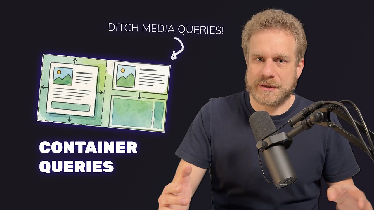
Container queries are one of these features that's supported in all major browsers. And still, not a lot of developers seem to be using container queries. Maybe also because AI doesn't really know But I wanna change this, at least for you, and you then have to change it for your AI assistants, because container queries are amazing. They allow you to define an element component once and then style it differently based on how much space it has available. Like here, where I have the same container different amounts of data even though it's the same component technically depending on how much space I give it, so how much space it has available. If I put it in a place where it may stretch the entire width, I get the large container, get the medium one for a bit less space. And if there's only a little amount of space, I get the small version, with a minimal amount of code. And as mentioned, container queries all major browsers, so there is really no reason not to use them. Now, this video is part of a little mini series some amazing modern browser features that have support in all major browsers you still might not know about, but that you should know about because they make your life a bit easier. So let's take a look at the code behind query demo here. It's actually not a React or Angular or other framework project. Instead, it's a vanilla HTML I technically don't have components here. Instead, I repeat the same article over same div with an article inside of it. So it's like a component. It's the exact same HTML code, the same markup. You will notice if you look closely that all three times, I have this detail text here, but I don't see that detail text here I only see it in the big one. That will be important. So it's the same HTML code, it's the same component, It has the same classes too, so why does it look different? Well, because of container queries. Now, container queries are super simple to set up. You take your containing elements, so in my case, that div with the class card-container, I have that around all these products, all these articles. And on that containing element, CSS property. And you can set that to various values. The most common one is inline-size, which simply means this should allow this element to adjust to the available width. If you would just set it to size, which is another supported value, it could react to width and height, but in most cases, you're interested in the available width. You'll also see that I added container-name here. This is technically not required, but it helps with making sure targeting the right containers with your container queries, because this here is just a base set up for enabling container queries. The container type is to be precise. You then write a container query by using the @container syntax, and it's done here where you can target a name, which is why it makes sense to assign a And then just as with media queries, you can look for a minimum amount of width that should be available to change some styles. And I say change some styles because I got some base styles set up here in my CSS code too, that are the styles that are applied by default. But I can overwrite them depending on how much space is available. So if I have at least 300 pixels of width available, I, in the end, switch to this medium container styling, which is defined by the styles you see here. And then I got another container query for the large look, for the large container, where I require at least 500 pixels of And here, I then, for example, then also set my product description to type block, which makes sure that this description because the default display value for the product description is none. That is why it's not visible on the small and medium-sized containers. And that is really all that's to container queries in a nutshell. I also got an interactive demo here, where you can see that real nice, but all you need to build components that are able to adjust to the