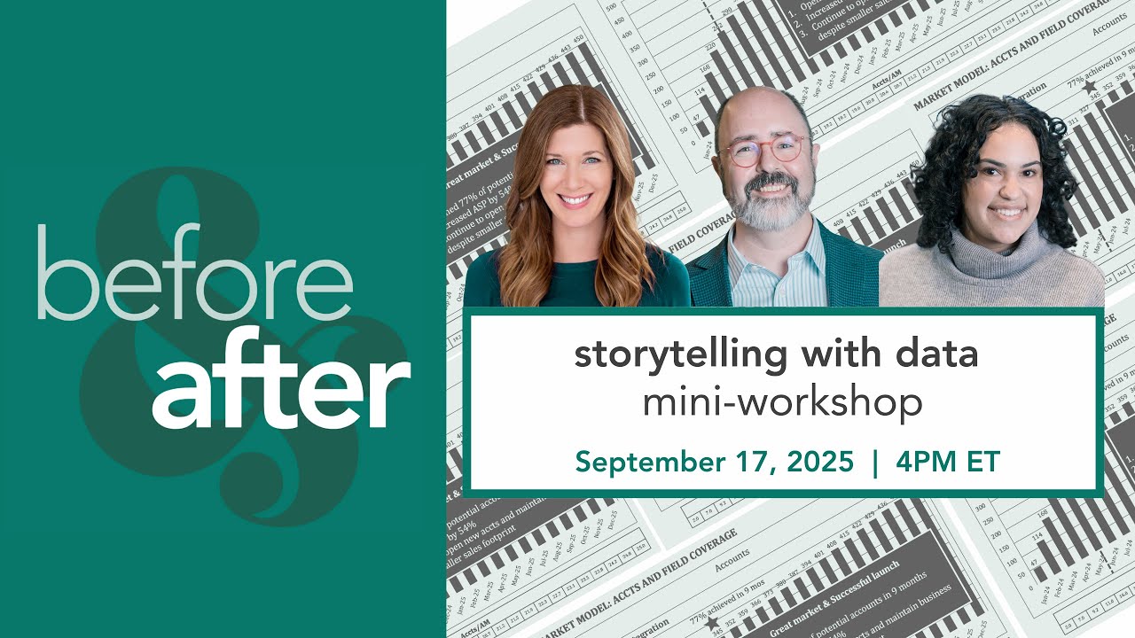
Hello and welcome. Cole here from Storytelling with Data. We have a super exciting session planned for you today. I am joined by my colleagues and co-authors Mike Cisneros and Alex Vez. And the main reason we're together today is to celebrate the publication of our brand new book, Storytelling with Data Before and After. We're going to see a makeover. There will be giveaways and so much more. But before we get there, I want to invite those joining live to make sure you have your chat window in front of you and accessible. That is how you'll be interacting with us over the course of the session today. It's also if you find yourself with questions or comments at any point where you'll want to stick those. Actually, now that you've navigated to the chat window, let's go ahead and put it to use straight away. In a moment, I am going to show you a slide. Your job is simply to react to this visual. I want you to put in chat the one word that you think of in terms of how this slide makes you feel. How do you feel about this? Mike, what word comes to your mind first upon seeing this visual? — I would say the first word that comes to mind is overwhelmed. There's a lot going on in this slide. There's a big block of text covering up what I would probably want to see. Those bars that are there all the way across from the left to the right. There is a nice big red star in the middle that catches my attention, but I'm not quite sure what's going on there. And that table at the bottom, I'm trying to figure out how that connects at all to the graph at the top. So, honestly, it's giving me a lot more questions than it's giving me answers. — Alex, what sort of words are we seeing people express in chat? — I'm actually smiling as I read a lot of these answers. So, ew, confused, yikes. A lot of people commenting that it's pretty dated. It's giving 1990s. — Yeah, some old Excel vibes, maybe. So, ew, yikes. These are not the sort of responses that we're after when it comes to putting a graph or a slide in front of our audience. But it's not surprising that this happens. I think we generally understand that we should use words together when we're communicating numbers. But when we don't think about how we do that, it's easy to mess. It's easy to end up with something that looks like this. Today, we will cover several straightforward tips that are going to help us enable our numbers and our words to be integrated and to work together seamlessly. We are going to visualize and verbalize. Visualize. Make it clear to our audience where they're meant to look and verbalize. Tell them what they're meant to see and what they should do with that information. When it comes to visualizing, we will look at things in terms of three key tips. First off, don't let important data hide in tables. Secondly, we will identify and eliminate clutter. And then finally, we'll differentiate between forecast and actual data. Let's jump in with some conversation about tables. Now, going back to the slide, somebody already visualized this data, or at least they visualized some of it. Those big bold blue bars grab my attention. So much so in fact that I may not even notice that green table at the bottom. Let's direct our attention there. If I work to process those numbers, I start scanning from left to right, I can see that they get bigger. But if we're meant to be able to understand much more than that, that's really difficult here. And that's because tables interact with our verbal system. And that means that we read them, which it takes an incredible amount of cognitive processing. It's slow. We have to scan numbers, think about what they mean, maybe hold some numbers in our heads that we can compare them to later numbers that we read. Graphs, on the other hand, interact with our visual system. Our visual system is much faster at processing information than our verbal system, which means typically a well-designed graph is going to get the information across much more quickly than a table. Here are some of
Segment 2 (05:00 - 10:00)
the graphs we find ourselves commonly using at storytelling with data. Uh you'll note bars and lines and a couple variations on these. We find ourselves most often reaching for common graphs and that is intentional. It means our audience is already going to know how to read the graph. So we don't have to spend time explaining that and can instead work on explaining the information and what it shows and what we should do about it. One thing absent here tables. So, let's go back to that visual and I'm curious if you were visualizing the data in the table at the bottom of that slide, what graph would you choose? Mike, while we give people a moment to share their thoughts there, I'm curious, if you were constrained, if your data had to stay in a table, what sort of things could we do to improve the table itself? Well, one thing I like to do is make it easier for people to read the table. Get rid of a lot of the heavy visual weight surrounding the table. If there's a lot of background shading, heavy borders, that really bums me out because I can't imagine reading tables like that all day long. And I want it to be a little bit lighter, a little bit easier to process. I want to take that stuff away. I want to think about how my numbers and how my words are aligned so that they're easier to scan down. And then maybe add a little bit of visual cues to it. Maybe some heat maps, maybe some icons, something that'll give me some guidance as to what it is I'm supposed to focus on when I'm looking at this table. — Yeah. basically pulling visual cues into the table so that we don't have to work as hard to get the information out of it. Alex, what sort of suggestions are we seeing for how to further visualize this data? — So, the general consensus here is a line chart, but there are some votes for other graph types, dots, bar charts. I think Jordan said it best. I need to know what the data is before I know how to visualize it. — Ah, yes. How do we visualize it? It depends, right? What does it depend on? What we want to show, what we want people to see. And oftentimes that means iterating through several types of different views will help us get clarity on that, which we can then use to pick a view that's going to help us get that information across to our audience. So, I like the ideas we're hearing from folks here. Uh, when it came to how I visualized this data, I started by putting it into a bar chart. This is similar to how the accounts were plotted in that original graph in the blue bars. Though I'm with what we're seeing in the chat window, all those people saying line graphs. And just check out the transition between bars and lines. Notice how the graph just feels lighter now. We're using less ink for our data, which means we now have more space to be able to potentially add other things of value. For example, we might add some annotations to be able to explain interesting nuances. We'll look at doing that in a moment. But I like a line graph for this data over time. I don't necessarily though like this line graph for data over time. It's pretty cluttered. Which brings me to our next tip and that is that we want to identify and eliminate clutter. So when we look at this graph with an eye towards clutter and decide what we might get rid of, uh take a moment to let us know in chat what you would eliminate. Mike, what's the first thing you want to change about this graph? — Lines. Too many of them. They're overwhelming the data with so many additional lines there are in that view. I don't think we need hardly any of those. I feel like I seem a lot of diagonal text there, slanty text, and I don't want to crane my neck to read. I don't see what the point is having diagonal text if there's space to do it a different way. — All right. So, we're getting rid of grid lines. We're maybe reorienting some text. Alex, what are we seeing in chat? — So, lots of votes for grid lines. reor reorienting the text. Uh suggestions for maybe keeping the grid lines but keeping them gray, rounding off some of those decimals, removing the data markers and the data labels. There's a lot of changes that people want to make to this graph. Yes. Yes. Let's do that. And I will just say before we do that, the thing that drives me nuts is the decimal point on the yaxis label. So here it's not zero every single time. Uh or actually no, I take that back. It is
Segment 3 (10:00 - 15:00)
zero. we can get rid of it. Uh let's take a look at what happens as we start stripping away some of these visual elements that don't need to be there. I'll start by getting rid of the graph border and the grid lines. There's also this strange box around my data that I'll remove. It's always amazing to me how much those steps alone do in terms of making my data stand out more. Next, I'm going to clean up my axis labels. I'll start with the y ais and drop the trailing zero. For my xaxis, I agree with Mike that we want to avoid diagonal text. Uh, it looks messy. It's slower to read and it's just more complicated than it needs to be. So, I will pull out the years as a super category. Just have them stated once each. and then my threeletter month abbreviations will fit horizontally in a way that's easier to read and just looks more organized along the bottom of the graph. Now, this next step isn't really eliminating clutter, but it's eliminating some confusion. We'll talk more about that in a moment, but I want to take that accounts per account manager title and spell it out uh and actually reorient it so that it is placed at the upper leftmost of my graph. And we think about how people take in information, how they process information without other visual cues, they're typically going to start at the top left of the page or the screen and make zigzagging z's across with their eyes. So by titling at the upper left, we ensure that our audience hits how to read the data before they get there. If the data markers and data labels have been driving you crazy, I understand. Rather than get rid of them altogether, however, check out what happens if we get rid of most but not all of them. It actually acts as a way to direct our audience's attention to certain points on our graph and maybe helps reinforce comparisons that we might want them to make. Here, for example, I've chosen to put a data marker and a data label on that very first point in January 2025. Uh, in the latest data point, September 2025, we see 19. 2. And then way out at the end there, December 2026, we see a data marker and a label of 25. But December 2026 hasn't happened yet. Which brings me to our next tip that we should differentiate between actual and forecast data. Right? The actual stuff that has happened. It's in the past. We measured it. Let's plot that in one way and make it clear where there is some uncertainty involved. So before I share some methods that I might use to visually differentiate this data, I'm curious for those tuning in live how you might choose to do so. Mike, is this an issue that you've encountered in the real world with clients? — Yeah, absolutely. You see it pretty frequently actually is folks don't remember that they have to explicitly tell their audience that the data series is going off into the future and isn't real data because to them they know the date they created it. So it's pretty obvious to them that the rest of the dates are in the future but they forget they don't know when people are going to see this data. So they just continue and show the same line as one solid line and don't do anything to differentiate between the two. And that's really what we want to do is make sure that somebody can't look at the graph and not realize that there is a difference in the data. Alex, what sort of ideas are people putting forth? — Yeah, so it's coming through. Great. A lot of people are suggesting that maybe dotted lines could be useful for the forecast. They're saying add a shaded region behind it. Uh some folks are even saying maybe just use a lighter color to show that maybe it's not all there, right? It's not complete. Um, but I would say dotted or dashed lines are probably the uh top choice for how to differentiate. — I love that idea. We'll look at that in a moment. Let's start with some other methods of visually differentiating the actual from the forecast data. Uh, first I'm going to lean back into what we were looking at with data markers here. I'll put one in September, which was our last month of actual data. can actually just label it actual and then everything from there on out forecast. Or I might take a cue from this vertical line we see that is segmenting the break between 2025 and 2026 data points. Maybe stick a line like that between the actual and forecast data as well. Again, I could label it actual and forecast. Though that line looks a little stark to me, so
Segment 4 (15:00 - 20:00)
maybe I'd make it dotted. And while we think of making that dotted, maybe instead of adding elements to differentiate the real data from the projected data, we could change the formatting of the data itself. And this is what I like best because it reinforces the uncertainty visually through that dotted line. So that when we have actual data, it's happened, it's in the past, we measured it, we're showing it in full force, solid lines, filledin data markers. As for the rest, these are projections. They will not pan out likely in the way we imagine. So let's show that lighter or with dashed lines, unfilled data markers. getting to a better point here. We have a better understanding of what we're looking at. We've visualized the data. We've started to put words around it to help with the interpretation. But we can do a lot more when it comes to that. Making it clear to people what they should understand from the data and more important than that maybe even what they should do now with this new understanding. Let's cover three more tips. When it comes to verbalizing, we'll start off by using words to clarify rather than confuse. We're going to want to define whether this is a success story or a call to action and then pressure test our assumptions. In terms of the use of words, there are some confusing things and just less than ideal approaches happening here currently. Uh, let's just point a couple out. We have accounts in a couple places abbreviated ACC ccts. We're not going to lose anything by taking the space to add three more letters and simply spelling out accounts. Uh, MOS M OS at the top there is an awkward abbreviation for months. Again, let's just write out months. ASP in the blue box is an undefined acronym. It turns out in this case it stands for uh accounts per salesperson. We should define that at least the first time that we use it. Uh interestingly uh down at the bottom accounts per account manager is actually the same metric though framed slightly differently. So be consistent. Spell things out. Don't make people guess or make assumptions about what they're looking at. That helps. But once we've done that, we want to take things further and consider what is the actual message we're trying to get across here. What do we want to have people do? Should they be celebrating this clear success or scurrying to act in a way that is informed by the data? And it turns out as part of this definition here defining whether we're looking at success or call to action, I needed to pressure test some assumptions. So, we'll tackle these together. If I look back at the original slide, and I'm thinking success versus call to action, I'm getting some mixed signals here. There's a star, which seems positive. Uh, it's in red, though, which feels like maybe it could be negative, but it's accompanied by some good sounding text. 77% achieved in nine months. That sounds like good progress. Something else that sounds positive is the title in the blue box. Great market and successful launch. That certainly sounds like success. And if we read through the bullets below that, they're framed positively as well. If I were a busy exec and this came across my desk, it would be very easy to take a cursory look at it, decide, looks like everything's okay, and turn my attention on to the next thing. that would have been a mistake because in this case I didn't have the context. So I reached out to my client to ask what was going on here and I learned some really interesting things. First off, integration actually was a downsizing of the Salesforce. And what they'd seen was rapid increases in the accounts per account manager leading up to integration and a few months of continued increases in accounts per account manager following that. But that had since stabilized and they told me they'd already seen the extent of the impact they were expecting when it came to accounts per account managers and how much an account manager could handle as a result of integration. Meaning if we go back to the graph we've been working on now I've added the point of integration and some numbers around
Segment 5 (20:00 - 25:00)
today and the target. They'd seen stabilization, meaning this assumption that we could get from 19. 2 accounts per account manager up to 25 at the end of December 2026, it's likely not going to pan out. And in fact, they told me this was well out of reach. This highlights an important way to test your assumptions, which is to make them explicit and talk to other people about them. Have a discussion, raise questions. This will help you evaluate whether they are valid or what you might want to do instead. When we take all of these factors into account, the story we tell and the story that's received looks very different than it might have from that original view. Let me just build my revised slide for you piece by piece. So start with the title at the top. Market model. Should we reassess our target or change the Salesforce strategy? can add some text below that. To hit the target of 450 accounts at the end of 2026, accounts per account manager would need to continue to increase. Unlikely given that we're already seeing stabilization after the sales team integration. To add my first graph to the slide here, we're looking at total accounts. That's what's plotted on the y ais. Our x-axis is time, ranging from January 2025 at the left to December 2026 on the right. Today, we're at 345 accounts. As we project forward, the target we're trying to reach is 450. But I'll add an annotation explaining that while we're at 77% of target today, that incremental targeted account volume is going to be difficult to ascertain, difficult to reach with the current salesforce. When it comes to that current salesforce, let's now layer on accounts per account manager. That's what I'm plotting on the y ais of the right hand graph. The time horizon along the x axis is the same. So we have up until integration, we see that marketked increase in accounts per account manager. Uh but we see that flattening out as we move from there into today. And so the marginal benefit we anticipate in the coming months means that we're expected to fall short of the 2020 of the 25 accounts that would be needed in order to reach that target of 450 accounts. My revised slide that remedies the issues we've covered, it prompts a totally different response. There is a need for change. Should we revise our target or do we need to change something about how the salesforce is approaching things? Before versus after. This is what happens when we are thoughtful about doing all of the things that we've talked about today and not just putting words together with our data, but truly integrating words with our visuals so that we're visualizing and verbalizing in an integrated fashion. When it comes to visualizing, don't let data hide in tables. Identify and eliminate clutter. differentiate between actual and forecast data. When it comes to verbalizing our graphs, we want to use words to clarify rather than confuse. Make sure we're defining whether it is a success story we're telling or a call to action. And then finally, we want to make sure to pressure test our assumptions. This example was from our new book, Storytelling with Data Before and After. This was actually chapter seven which is titled justify your assumptions. Each of the 20 chapters in the book shows a case study like this inspired by our client scenarios and we show how data storytelling can be applied in the real world when you are facing constraints, competing priorities and many other challenges of your dayto-day work. It officially comes out next Tuesday. That is the 23rd of September, 2025, though we've already heard reports of copies making their way across Europe. Uh, and we have some here at Storytelling with Data HQ. Speaking of which, Alex, I understand we may be giving some books away. We are. We are giving 50 books
Segment 6 (25:00 - 30:00)
away. Uh, so we're going to put the winners up on the screen very shortly and I want you to just go ahead and scan and see if you were one of the lucky winners. After this live event, Cole, Mike, and I, we are going to get our hands ready. We're going to start signing all of those copies. If you are a lucky winner, nothing you have to do. We uh will send that book your way based on your registration. So, kudos to everyone that won here. And if you didn't win today, don't worry. We also have a special giveaway for you. — Super special offer. So, we have worked with our publisher WY to get a special discount just for you. Uh, so this will be for anyone watching live. And this discount is going to be good for the next two days or so. So, if you're watching this shortly after the live stream, you can still make use of this discount. Simply visit storytellingwithdata. com/makeovermagic. This is going to redirect you to the before and after page on WY's website. You can add that to your cart. And at checkout, enter the promo code MAG25. That's M A25 for 25% off. WY has worldwide shipping available. And this offer will be good through Friday, September 19th, 2025. If you don't get it there, you can also order a before and after through your favorite book retailer. We are going to turn to questions momentarily. Uh Alex has been monitoring what's come in through chat. If you have questions that you haven't yet had a chance to put there, go ahead and do that. Now, for those who are watching the replay, feel free to put your questions in the comments. We'll make sure to answer those over time as well. While you take a moment to type your questions, we want to share just a few additional resources that can help keep you learning with us. On October 13th, we will be in New York City hosting a 1day storytelling and presenting data master class. Actually, fun fact, Alex years ago before she worked at Storytelling with Data attended a master class in New York City. — Yes, I did. Uh, so I attended in 2018. It was fresh off of reading the original white book and I wanted to see what it was like live in person and there's nothing like seeing you actually present an example and it made me realize that it's not just about the graph but it's also the delivery and how you animate through that chart. That's one of the nice things about this new book is that there are companion videos for all of the presentations that we have created or I should say a handful of those presentations. So, I encourage anyone who is in New York or the surrounding areas or able to travel there to join us on October 13th. You'll find details and registration at storytellingwithdata. com/capnyc. For those who can't make it to New York, Mike, I understand we have some other ways for people to learn with us coming up. — Yeah, we're always offering a number of virtual learning opportunities, virtual workshops. Our next one is coming up this November, but we generally have one once per quarter and our 2026 workshops have been announced already. We have some in I'm not wearing my glasses today, so I can't read the exact dates. I believe we have one in February, May, believe we have one in August, and then again in November of 2026. We also have an eight-week course that we run twice a year for folks who want to get the most intense learning experience, most immersive learning experience. We have one of those starting up next January and another one in the fall starting up in September. All of these are available for you to register for now. Check out which ones might appeal the most to you. — You can find details and sign up at storytellingwithdata. com/workshops. We also do bespoke team trainings where we take examples from your team's work and use those to teach strategies for communicating effectively with data. Details for that can be found at storytellingwithdata. com/team-trainings. And then finally, of course, one other way to learn with us is through our books. Uh, our new title, Before and After, is actually the fifth book in the Storytelling with Data library. You can find information and downloadable resources for all of our books at storytellingwithdata. com/books. I'll also just quickly mention that for those who might be drawn to a dragon. Uh if you have interest in helping bring the superpower of graphs and numbers to kids in your world, check out daphnedata. com where you'll find information on our exciting data detectives program as well as resources for kids, teachers, parents, and educators. And with that
Segment 7 (30:00 - 35:00)
let's take a look at some of your questions. So I think just a nice seg based on what you just shared there. One of the questions is how are we bringing this skill set to higher education. Ah higher education we storytelling with data the original white book is used at hundreds of universities worldwide. Uh which is fantastic because I remember early into my career if I had known what I know now that would have been super helpful. Uh Amy on our team spends a lot of time thinking about and working with university instructors and coming up with ways that we can support them. And now certainly if you're watching and you are a university instructor, uh the new book Before and After is going to be a fantastic resource for your students when it comes to really understanding how to apply the fundamental principles in the real world when as I mentioned you're faced with constraints and uh timelines and all of the nitty-gritty of uh the daytoday. Uh, so that will be a nice addition for those who are teaching from our other books. Mike, do you have more to say on that? — Well, there's another book that we don't talk about very often, which is the Let's Practice book, which is an excellent resource specifically for folks in higher education or in high school or really if you're teaching somebody at any level. It provides a number of additional examples, a lot more guided examples for how to put the fun the foundational techniques that you can find in the white book into practice on genuine real world examples. Some of which Cole is walking you through how to do it. Some of which we don't provide the solution for and some of which we explain how you can implement in an organization that you subsequently become a part of after you've left higher education. Let's take another question. So, this comment came up throughout today's uh makeover reveal, but people wanted to know why you used capital letters along the x-axis. — Ah, that's a fun question. Uh that one that question doesn't come up so often. So, I tend to be a big fan of and I'll get to the capital letters, but sentence case for slide titles, meaning capitalizing the first letter of the first word and then keeping everything else lowercase. I feel like that helps remind us that the title of a slide should be a complete thought. We're big fans of takeaway titles when it comes to that. When we look at things like axis labels and you saw integration on that graph all in caps, short text blocks, short text blocks are work well with all caps because they create this nice rectangular shape. And so when it comes to axis titles, I will often use and we often at storytelling with data opt for entirely caps because of the nice framing it helps create for our graphs. You want to typically do this with shorter segments. Uh too much capitalization if you've ever experienced that can feel sort of like you're being yelled at. So you want to be careful about that. But I think when there are aesthetic structural things uh having to do with how you format your text that can l lend another level of professionalism. — Mike, I'm going to give you a hot topic question that has come up multiple times. What are your thoughts on generative AI and how it fits into creating the story and the narrative? Oh, in terms of creating the story, it can give you a little bit of guidance along the way, but you are always going to be the person who is responsible for and blamed for the story that you ultimately tell. Early on in your process, the current AI tools are going to allow you to think through, refine, uh, optimize the sorts of messaging that you might want to deliver. But it still requires that you know your audience particularly well. what specific message you're trying to get across and what outcome you're hoping to achieve. So having something like generative AI on your side is a beneficial aspect of things just as it is beneficial to have a trusted colleague to have somebody who really knows the audience that you're trying to reach. These are all tools that are going to help you to make a communication work as best as it possibly can. But remember that if something goes ary, you can't just turn around and blame your colleague or blame your tool or blame the default settings. It's always going to be on you to make sure that what you're communicating is authentic and is real and is targeted towards the specific outcome, the specific message that you're trying to deliver. — One specific situation where AI can be
Segment 8 (35:00 - 40:00)
useful that's relevant to what we touched upon today is in testing your assumptions. If you can give it enough context to understand the scenario and what you've done methodology wise in your analysis, you can actually ask it to try to poke holes. You can do this with your colleagues as well. Uh but there's uh some nice back and forth I think that you can have uh with tools like Gen AI that will help you sharpen your thinking in ways that can be useful. — Alex and I have spent six years poking holes in each other's assumptions. — That works too. So yeah, — you're a highly trained person. — Some additional questions are coming around what sort of tools do we use? And specifically when we work with clients, what sort of tools are we seeing they use when it comes to visualizing data? — Mike, you want to take that? — Yeah, I will. And you mentioned that we do a lot of workshops with clients uh on a custom basis. I was actually doing one this morning and this very question came up as it often does in our workshops. The answer is we use the tools that we think are going to be the most commonly used for our client. In most cases, it's just regular bone standard Microsoft Office because that's what most companies have available to them. But we're not really keen on requiring you to use a specific tool because the best tool is always the one that you have accessible to you. It's are most comfortable in. And the things that we talk about in our workshops can be achieved no matter what tool you have available to you. It's more about thinking through what your audience needs and what you want them to see rather than making sure that you create something that exactly matches the look and feel of what we are demonstrating to you as a way to do things with more skill or with more uh success uh as a possible outcome. So just because we keep things as simple as possible doesn't mean you have to. If you're more confident using a dashboarding tool or coding in SAS or whatever it is that you want to use to generate your outcome, uh be our guest. It's going to work as long as you are able to put in the time and effort to make it work. I'm a big fan of recommending that you pick your tool of choice or your tool set of choice and get to know them as well as you can so that they don't become limiting factors when it comes to applying some of the strategies that we've looked at today. — So Mike brought up a great point that it's not always about following all of the advice we give but rather thinking about your audience and the feedback that they give. So, there's been a lot of chatter about how all caps, specifically those uh monthly labels, that they weren't as accessible to read. So, if that were the feedback that you got, what would you do? — I would change them. — Yeah, exactly. So, you've heard it here. If you're finding those labels hard to read, that's not a hard and fast rule. You can certainly adapt um and you can use something that's going to be more accessible to your audience because accessibility is absolutely key there. — And that highlights a really good reason for showing your work to someone else. and getting input from others because that's one of those things. I designed it because I thought it looked cool. I didn't talk to anybody about it, but had I shared it with Alex, it sounds like I would have gotten the feedback, eh, those all cap months are or if id shared it with some of the folks on chat, I might have gotten the feedback to change that and that would have been an easy thing to then take into account. — So, this is a question for you, Cole, since you wrote this chapter, but I somebody said, "I saw a chapter on dashboards. Can you elaborate what that's about in the book? — Oh, chapter. I mean, there's more than — uh I'll give you the a hint on the title. Explain with stories, not dashboards. — Ah, yes, that is the title of a chapter. It sounds like chapter I would write. Yes. And so, dashboards absolutely have their place. Uh my view is that they do not have their place when it comes to storytelling with data. And I should reframe that a little bit. The dashboards can help us find the story. But once we've used the dashboard to find it, the point in the chapter Alex is referencing is to take the data out of the dashboard and think about how we can walk our audience through it. Take them on a journey through the information and through the learnings and the applications. And now this can absolutely still be done with a dashboarding tool. uh it sometimes will take a little finessing in order to do so. But again, the lessons that we saw here today, the lessons that you see in the books, none of that is about trying to replicate exactly the thing that we did for the same result. Because every scenario is going to be different. The pieces of the puzzle look a little different every time. And that is one of the reasons that this space is fun. But it can also frustrate people. And I think rather than try to come up with hard and fast rules from what you see
Segment 9 (40:00 - 45:00)
and what you read, the bigger point is to step back and think about for each scenario in which you need to communicate data, what does success look like this time and how can I position myself to be able to have a successful endeavor? And that can look a lot of different ways and take different forms and you can make different decisions along the way. One of the things always to keep coming back to through that is audience and what's going to work through them. Uh because it's through meeting their needs that you'll ultimately be able to get your own needs met as well. I didn't talk about the chapter at all. though. — Well, it's funny though that we're trying to get you to remember the chapter based on the title because here's some behind the scenes. Every one of these chapters has had multiple titles throughout the development of the book. — Do you remember it was alphabetical at one point? — Yeah, — it's not. — I remember you remember us trying to backmize the names of the chapters like oo — I wonder what we can come up with for you know whatever letter it was. X. — That was a rough one. Yeah, don't worry. It's not alphabetical. — So, here's an interesting question. Eric shared, "I rarely know what my executives want or care about, so sometimes the outputs that they create are a little bit off base. How would you recommend getting to know your audience when you don't have that direct line of communication? " — Uh, I can tackle that one. Uh, which is Oh, — well, then that works out nicely then. There are certainly going to be people who know your audience. Even if you're two or three or four steps removed from the leadership team, let's say, that you're trying to communicate with, there are definitely levels between you and them who do know the answers to this. There are people that you work with who have had to present with them before. If they're that high up in the organization, there might even be published documentation of what the goals are for that leader, for that team, for that group. You can find out this information, but it does require us to talk more with the people that we work with or ask around. We used to call this officially consulting for context, which is the fancy way of saying ask around to find out the answers to these questions. I can speak for myself, which is that when I had much more of an analyst role, I was reluctant to talk to other people to get the answers to questions because I wanted to believe that all of the answers could be found in the data I was so happy analyzing and finding the answers within. However, it did not always pan out because everything that we do exists in the real world and it always involves the messy mushy aspect of having to deal with people and their own, you know, motivations, their own needs, their own tendencies. So, I can't encourage you more than to ask the people up one level from you, what do they know about this? How have they ever been successful in communicating with this person? You don't have to do it alone. Nobody ever has to do any of this alone. If there's anything that we could communicate here, it's you can get feedback. You can get help from other people within your organization because most times they're going to be willing to help you get the answers that you need because they want you to be successful. Believe it or not, people are always rooting for you. I think also if there's not a feedback loops, if you feel like you're throwing something over the wall and you don't know what happens after that, trying to follow up and see what happened. Was there a conversation? What did it center on? Did you talk about this? Anything that you can do to get some of that information back after the fact will then help you potentially modify and hone your approach the next time around. All right, I think we have time for maybe one or two more questions. — Yes, I will ask one from Lisa. Hey, Lisa. Uh, do you expect that there the charts will start to look different with some of the new generations? Are we noticing any sort of trends pop up? Well, I will say actually just talking uh about some content from the book, one of the things that I did for the first book, Storytelling with Data, was I took client makeovers and work that I'd done over the course of the year, and I categorized to see, well, how many graphs do I use? What are they? And those are the 12 visuals that you see in storytelling with data. We went through not exactly the same exercise but a similar thought process when it came to storytelling uh with data before and after. Uh so there are the 20 chapters of case studies but before that are some basics on storytelling with data and then there's also a wrap-up at the end on what's next. But in that review or overview piece, uh, we ended up with the
Segment 10 (45:00 - 50:00)
six graphs that I showed earlier today. And I will say one graph that was completely absent from storytelling with data. Uh, yeah, there's not a single one in the book that now we used regularly is — the dot plot. I actually had never used a dot plot until relatively recently, a few years ago. uh but you'll see through the chapters in before and after uh a number of them because they work very well uh in a lot of scenarios and so I think we will see new graphs maybe or new variations on the same foundational graphs come into play or become more or less popular over time. I don't know if I would foresee the fundamental basics changing though. Mike, what would you say? — We are often thinking of things in the context of within our business communications where we have roughly a captive audience who's interested in what we're going to say, how do we communicate this data visually in as clean and as clear and as fast a way as we possibly can. But I do think that the general population is becoming more literate in terms of uh data and in terms of data visualization. I also think there's more of a competition to get your visualizations seen in the public if you were not within the safe sphere of uh a businessto business communication or an internal business communication. So, I could see people becoming more comfortable with things like radar charts or spider charts that I personally think have some drawbacks, but one of the main drawbacks is people don't really inherently know how to read them. But at some point in time, people didn't know how to read a bar chart either. Over time, people are going to learn how to read charts that could today we consider esoteric and maybe 30 years from now or 20 10 years from now, they're considered more commonplace. So yes, visualization is always going to be evolving and that's because people are more interested in this I think than they ever have been and it is more prevalent in the media than it ever has been. So it just stands to reason that what we consider a baseline chart rather than a novelty is going to change as well. — I'd also throw mobile out there. I don't know that this is new um but pretty much everyone checks their work email on their phone. So, making sure you're designing with that in mind. All right, I'll wrap up with a final question here for each of you. What's your favorite chapter from the book? — Do you have one top of mind? You should start if so. Uh, I like the chapter that has to do with the um bar chart that looks simple, but once you get into it, it's actually incredibly confusing. because it really appeals to me the idea that we've grown to believe that there's nothing as simple as a bar chart except that you can in fact use it in such a way that it is incredibly confusing to your audience and that there is a way to change that into being something that is much easier to interpret. I believe that is what chapter number is it? 12 maybe. I don't know. Find out. Get the book. Find out. You You'll recognize it when you see it. It's a chapter about uh coffee shops. — My favorite chapter today that I'll talk about. Actually, it was funny because I was explaining to my daughter Eloise what we were doing here this afternoon and I told her that I was going to share a makeover from the book and she was really hoping that it was the dog chapter. Uh Eloise looked at early versions of the books with me and for by far her favorite chapters were the ones that Alex wrote uh because they are both colorful and have a lot of images and the chapter I'm thinking of has some images of dogs uh which was a fan favorite here. Uh but more than that is about pairing qualitative data with quantitative data and understanding how to effectively use words and verbatim quotes together with robust information to paint a full picture. Does do either of you remember offhand which chapter that was? — 16. Chapter 16. So check that out. — Nell's Feast. — There we go. All right. With that, I want to say a very big thank you for everyone for tuning in today. Thanks for asking your questions. If your question didn't get answered, go ahead and stick it in the main comments in YouTube or if you're watching this later and have a question, put it there. We'll make sure that we answer those over time. Uh don't forget to order your copy of Storytelling with Data Before and After today. And celebrate with us. We are
Segment 11 (50:00 - 50:00)
super excited that the book is finally here uh and that the storytelling with data library has another member. So, thanks for tuning in.