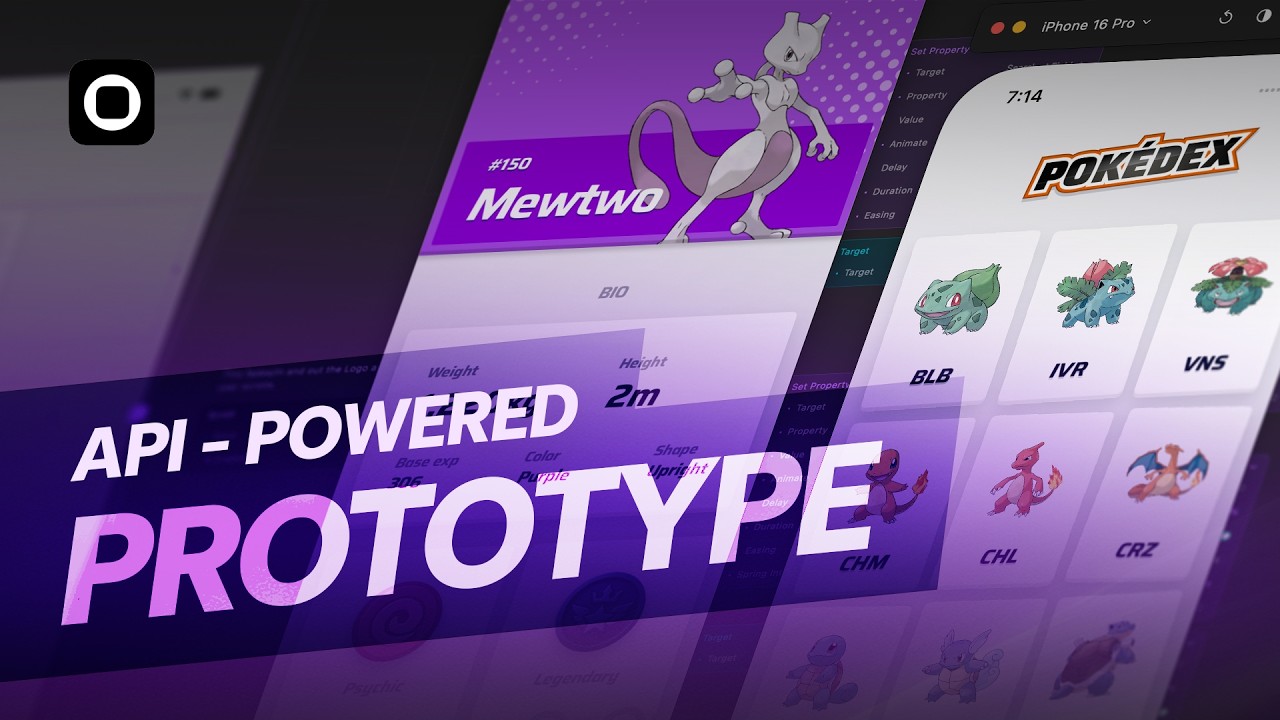
In this video, we're going to go ahead and take a look at Figma sites and Figma grids. And I'm wearing the Figma shirt that I got from Config. But anyway, what I'm going to do is I'm going to go ahead and take a small section of Apple's website and recreate that in Figma sites. And I'm going to go into the code of how Apple builds its websites. And we're going to understand every aspect of it. And it's something that's super important for designers to know in the age of AI as how websites are built. You obviously don't need to know how to code, but you need to understand how code works and how websites are built. And if Figma sites is a tool that you're going to use, there needs to be some technical knowledge that you need to have, especially today. And so what I'm going to do is I'm going to take every section of the Apple website and sort of try to see how it's built and recreate that exactly like that in Figma with the same settings and same properties. So hopefully it looks pretty similar. And then what we're going to do is we're going to go ahead and publish the website from Figma sites and then study the code of Figma sites and see how good of a job it's doing. Now spoiler alert, it's not doing a great job. There are use cases where you can still use it to create your portfolios on case studies. However, I don't think it's ready enough to be hosted on the internet so that you can search for it on Google. If you're probably sharing links with people, you could definitely share links of these websites. And yes, responsiveness, all of that works. So, it's still small niche use case where you can send links to other people for them to check out your stuff, but probably not, you know, ready to sort of use as, you know, your big portfolio. I would still, you know, use framer or web flow if you're probably interested. They do a much better job as they are really strong no code tools. But Figma sites also has its own small use cases and of course it's going to get better once it's out of beta, right? So, with that being said, let's go ahead and look into Figma sites and get started. So, we'll go ahead and create a new project file and I'm going to create it from scratch. So, I'm going to go ahead and call this Figma sites uh tutorial or let's say call it Apple website tutorial. All right. And I'm going to delete this. Uh we just need this to work with for now. Go ahead and make this black and we should get started. All right. So, I'm going to go ahead and create this section over here. So, this text, this image, uh, it's got a couple of text elements over here. And we have this as well. And I think with this, we get a very high level idea of how all of this is structured and works. So, let's go ahead and create this. Now, the first thing you want to do is obviously if you want to test out any website how it's built, you can just right click and choose inspect element. I'm going to teach you how you can go ahead and inspect every section if you're trying to find something. So let's scroll down over here and try to find the section that we need right and here you can see we have this section and this section basically contains all of this put together and it ends uh over here and if you see over here in the code it always has something called as a section over here. Now in Figma we have things like layers and frames and things like that. So if I press F on the keyboard I can go ahead and create a frame and then this is essentially what we're going to use. But that does that's not how it works in web. In web development you have something called as a section and then inside that div block which is sort of like the frame which is you know that's the best way to sort of compare both of them. And each of them as you can see just because this whole part is a section it's wrapped up in a section and this part again if I come over here is wrapped up in a section and that's basically how you want to structure a website right so every section is inside what we call as a section just to make sure that you guys don't get confused this is not the same thing as a section this is just some sort of a container and if I put this inside you can see that it you know it sort of doesn't go inside you know the frame because it's just an element to group things. It's not really an actual section. So, this is not something that we can use, right? So, essentially what that means is you can only use frames to create what we need. Now, Figma doesn't allow you to choose between sections and divs. Now, there are very few differences between section and divs, but you can still create an entire website with just div blocks and without sections. There are a lot more use cases for why you want to use section instead of divs to separate each section of the website, but I'm not going to go into that. But anyway, I'm just going to show you how Apple obviously has done it and then we're going to recreate it the same way. Right? So, in this section, as you can see over here, let me try to get that again. And if you want to select something very quickly, you can actually click on this icon on the top left and then you can go ahead and just hover select what you want. So, if I click over this, this is the section that we have and this is where we're going to go ahead and create everything. So you have this section and then inside this section you have this div block. All right. And this div block contains everything. All right. Now typically we wouldn't really need this div block. We could actually just
Segment 2 (05:00 - 10:00)
go ahead and just have these two elements, right? So this would be the first div and then second div. And this basically has 1 2 3. So if I open this up, you can see it has 1 2 three elements. This is wrapped up into one container and then this top section is a part of another container. So we technically don't need this but it's fine. We can have it. All right. So let's go ahead and create the first section. Now as you can see over here to the main section itself they've actually added some padding on the top and bottom. So they've as you can see they've added around 200 and 200. So that's typically how they've created the gap. So they usually take a section and then they add padding on the top and bottom and that's typically how you make a section. All right. But let's dive quite deep into the code over here and try to create the first section. So I'm going to go dive deep down all right until we get both of these text layers. All right. So here you can see we have two text layers. So this is the H2 class and H2 essentially is heading. So in web development we have H1, H2, H3, H4. These are important elements that help in SEO when you're trying to search for a particular website. Unfortunately, Figma doesn't have any of these features. So that's pretty, you know, sad. And of course, when it's out of beta, I'm pretty sure they're going to go ahead and have all of these features. But for now, everything just comes as a plain text layer, and that's not really helpful for SEO. You obviously want the search engine, you know, to pick up all of these text elements and then help you rank the website, right? So, here you can see it's H2 and then here you have P, which stands for paragraph, which is just a basic piece of text, right? So, let's go ahead and sort of create this first of all, right? So, I'm going to just click on this one. And then you can also see all the typography settings. So, I'm going to go ahead and press T on my keyboard to get the text tool. I'm just going to type in design. All right. And here you can see uh we have a font size of 24, line height of 1. 16, font weight 600, and then this is SF Pro uh display. So, I'm going to go ahead and choose SF Pro display. Uh this is going to be 24. I think that was 24, right? Yeah. So 24 and 1. 16. So 24 into 1. 16 that gives us 27. Let's just round that off to 28. And then uh 600 is actually semi bold. That's fine. They do have a little bit of letter spacing which is around 0. 2 pixel, but I'm not going to really add it. We can keep it as zero. All right. Then let's go ahead and create another text layer. And this is going to be called survival of the toughest. So, go ahead and call this survival of the toughest. Oh, okay. So, this one is um a lot bigger. So, this is just a paragraph text. So, this one is a H2 and paragraph text. So, this is 80 uh 1. 05. We can just keep it as 80. And then the same things as well, right? So, going to be 80. And then we can make this also have this I have to add a dot at the very end. All right. Now how is this constructed? So we have these two elements. And if you see over here they have actually added a bottom padding to the text element. Now that is not something we can do in Figma. Like you can't add a padding or a margin. margin or gap or a padding over here just to a text element. you have to put this into essentially an auto layout and then this gap is essentially what this margin is. So that is a little bit of a difference between how you would do it in Figma versus doing it in web flow or framer or you know building it from scratch on with code. Right? So here it's around um 9. 6 and you can also see that the margin bottom is 4 um 0. 4 em that's 9. 6. I'm just going to, you know, bring that to 10 and then finish it up. So, I'm going to go ahead and make this 10. Right? So, we will actually be using an auto layout, but in code, you will have to use margins to create it. All right. Next, if you go one level above, you can see that this auto layout that we just sort of created. All right. What is the size of this? Now, you can also see here that there is some margin on the left and right side. And if I move this a little bit inside, you can see this. So we have now how is this value actually being calculated? Now if you see here the margin is set to auto. Now what that means is that this value is automatically being calculated some way. All right. Now how is that being calculated? So if you see over here when I click on this element you can see that it has something called as a maxed width of 66%. Now if I go ahead and turn both of these off you can see that it just falls into one line because now it's taking up a lot of space. And so now that margin ended up becoming 78. Right? So if I put these on, we're essentially defining something like a maximum width.
Segment 3 (10:00 - 15:00)
So we can actually go ahead and apply this maximum width over here. All right. Um and so we can go ahead and click here to add a maximum width. Now the problem here is that this is something that's super important when designing websites is that you need to be able to add these percentage values. Now this 66. 6% translates to what exactly? And it is of what? Is it of some container? Is it of the section? browser? What is it? So if you try to do some math over here, you can see that this is actually 653 pixels, right? So it's around 653 pixels. So 653 pixels is 66. 66%. If I select the parent div block, as you can see over here, I selected the parent div block. You can see that here it has a width of 100%. All right. Now, essentially what we need is a fixed value to understand what does 66. 66% stand for. So this is 100%. So we're going to go one level even above. And here you can see that it has a fixed width of 980 pixels. So if you do the math which is 980 into 66 um 66% that gives us 653. 28. And you know we can just you know round off numbers pretty easy. You can just say 66%, that gives us 646. So if I now come back over here, you can see that 646 653 is pretty much the same value just because of the, you know, 66 decimal, we have a difference over here, but this is essentially what it is. So now over here, if I go ahead and call this text wrapper. All right. And then I'm going to press shift A and put this into an auto layout. And over here, this is the bigger one. All right. This is where we can set the maximum width of this to be 980. All right. And I can go ahead and call this parent container. All right. And I'm going to add some uh fill over here so that we can actually start differentiating things. All right. So I'm going to select this and first of all move it to the center. So then this is essentially what we have. We have this text wrapper as well. And now if this is 980 and I'm going to just move this to the center. If this 19 if this parent container is 980 I want this text wrapper. Let's add in another color. I'm just going to add like you know 10% over here. I and if you see if I move this you can see we have two colors over here. I want this text wrapper to be 66. 6% of its parent. Now, when you're designing websites, that's a very common approach and pattern. But unfortunately, if I select the text wrapper, I can add a maximum width, but I can't really add a percentage. So, if I say 666%, it doesn't let me add it. And that's a functionality that should exist when designing websites. So now, unfortunately, I have to add an actual value in order to reduce the size of this text. So essentially now if I come over here you can see that this piece of text is around 653. All right. So now I can select this text wrapper. So max width and I can say 653 which is one way to do or maybe I don't even need a max width. I can just go ahead and remove max width. And here I can say 653 itself. Now the problem with saying 653 is that when we choose responsiveness on multiple break points we might not want it to be fixed. So it's better to always say fill container. All right set a maximum width of 653 so that it can be less than 653 also on multiple break points. Right? So that's the difference of when you should use a fixed width versus a maximum width. All right. So now essentially we can take this and just click here so that we can get this into the center of the screen and this is how we create the first section. Now what this also means is that we may not even need this parent container because we just added 653 pixel. If we were following the approach where we had the 66 uh let me try to get that. If we follow the approach where we could have a percentage based width, then we would need a parent container to define what should this percentage be of. But in this case, we're actually just using the maximum width over here directly. And so we don't really need this parent container. We can rip it. But for the sake of this video, I'm just going to still keep it. All right. So next, moving on, we have some bottom padding over here. Now, the weird thing here is that they could add the bottom padding or actually margin, all right, of 125. You can see they've added a bottom margin of 125. They've created a new div block on top. So you can see this is what we just you know used and then we could add that 125 to this itself but they added it on top. And the reason they did this is because of the concept of classes. Classes are sort of like styles um which have preset properties. And I'm not going to go into
Segment 4 (15:00 - 20:00)
classes. If you don't know what they are then it's going to be too big of a video to complex of a concept to explain that in this video. But if you know classes then you probably know what I'm talking about. And for easy management of classes and reusing these classes, they ended up creating multiple div blocks. But in our case, we don't really have to build it like this. We want to use as less elements as possible. So if I click on this text wrapper, I can add a bottom margin of plus 125. So here I have to add a padding which will then get translated to margin because you can't add margins in Figma with an auto layout, right? So here I have to add um 125. So I'm going to say 125 or actually 0 comma 125. So 0 is the top and 125 is the bottom. And then this is essentially what we get. So it's pretty much similar to what they have done. They've gone ahead and created 125 pixel of margin. I've padding which is inside the container. So this one is outside the container. This one is inside the container. All right. Next, we need this image. Um, so I'm going to go ahead and let's see how this looks. First of all, before we get the image, so we created this part. All right. And now you can see the child element is basically this one which has the image. So I'm going to go ahead and just quickly grab the image first. Right click and choose copy image. And then I'm going to go ahead and just paste that over here on the side. We have this super huge image. We're going to see how to fit that in. All right. So go back to inspect element again. And let's go back over here to this image. All right. So, as you can see, they have multiple versions of this image. Um, and this is essentially to load uh the highest quality image depending on your internet connection, but don't worry about they're all the same images. As you can see, images just in different resolutions. So, nothing to worry over here. And as you can see here, here it's called a picture because obviously this is an image. Now, as you can see, if I hover on this, you can see there's something weird happening over here. You see these purple lines, you see this blue. What is happening over here? So the image is actually pretty big and it is going beyond the container which is fine which is how a lot of websites are built. But what is this part? All right. Now if you see over here if I click on this div block. All right. This one is essentially for the image and the one above is for the text. So this is we're on the right one. If you see over here this width is set to 980. But where is this 980 actually coming from? All right. So if we see this one, the parent one is the one that has 980 pixels. So the one that we created over here is actually the parent one which has a width of 980. And so over here when I click on this one, this is just as you can see it's called display flex and it is just you know flexing and you know expanding to how muchever content there is. So this image has to fit within that area. But obviously the image is overflowing. So if I bring in this image over here and then let me go ahead and just cut that and then paste that over here. You can see this is basically what we get. So what should be the width and height of this? Because if you see here that this image is going to get cropped as I sort of you know reduce the width of the screen. So you know on a normal device of let's say um you know 1250. All right. You can see that it's the image is going to get cropped, right? But it's in the center. So, but then what's the height? What is this area, right? Go ahead and set this back to 1920, right? And so, over here, if I click on this um image, we should probably see it's somewhere over here. You can see that it actually has a width and height defined over here on the image itself. So, it has a height of 644 pixels. Now, because this is an image, we will, you know, maintain the aspect ratio. And so I just need to set either the width or the height. In this case, I'm just going to pick the height. So 644 pixels. So I'm going to click on this. Um in the height, set this to 644. And then this is basically what we have. And then this looks perfect. All right. So I'm going to go ahead and then we can remove these colors. So I don't need these colors. And click this as well. Open this as well. And uh basically this is what we have. Right. So we created the first section. And as you can see this is our parent container which has a width of 980 which is also very similar to how they have constructed it over here. This is the parent container which has 980 pixels width over here. So the next section is constructed a little bit differently. Let's see how that's created. So we have these three sections over here which is you know the first the three sections over here. Now if I open this up you can see that we have this option or not actually an option it's there's a button that says flex and if I turn on you can see like some sort of grid and this is essentially using what we call as a flex box in web which is very similar to auto layout uh as you have in Figma. If you take the second one, all right, this one, if you if I turn this on, this one is also uh flex. If I can click on this, you can see this is also flex. All right, it's using a
Segment 5 (20:00 - 25:00)
flex box. All right, and the last one, if I open this up, you can also see that it's using flex. This is a little bit uh different because you have two separate containers. All right, so all of these are constructed with flexbox. Now, we're also going to look at grids in a moment, but I want to show you that these three are constructed with flexboxes. So, I'm going to go ahead and just close this up, and we're going to focus on this one for now. Let me just zoom in a bit over here so we can see what's happening over here. Now, there's a lot going on over here, and we don't obviously want to construct it like this in Figma. Now, I'm going to show you how to take this and construct it in Figma pretty much the exact same way, but we'll do it a little bit differently to make things simpler in Figma. So, let's open this up. This is where we have most of our content. All right. Now, for this section, we already have some sort of padding of 50 pixel. All right. But I can sort of add that to that entire content container that we have over here. But we'll add that towards the end. We'll just focus on creating these smaller sections right now. So, I'm going to open this up and I'm going to turn on flexbox. And then under that, we have two elements. So, this is one element on the left. And then we have right. Now, the let's look at the element on the left. So inside left, we basically have just a piece of text that you can see over here. All right, we have this piece of text. It seems to be inside another div block because this is actually the paragraph. All right, and then it seems to be inside a div block which we don't really need because you know these two are sort of pretty much uh the same. But anyway, doesn't matter. I'm going to select this one. All right. And as you can see, this information is just the text layer because P stands for paragraph. It's actually the text layer. So it doesn't really have too many things over here. Right. But then this one, this is the layer above. Now above here, there doesn't seem to be any information of paddings or spacings or values. So we're going to ignore this as well. So I think this also could have been removed. All right. And so we will obviously not have an additional frame or auto layout in Figma. We're just going to keep it normal. And this is where we're going to focus because this is where most of the values are. All right. So over here in this one, you see we have the max width which we had sort of seen earlier. All right. And this max width is around 41% and again 41% of 980 pixels right because this entire width is around 980 pixels. Now if you see over here this is 408. All right. So 980 into 41 uh. 67% gives us 408 which is this. So the text element or the text container cannot be more than 408 pixels which is essentially 41. 67%. 67%. Now, we also seem to have this blank margin on the left side. Now, when you're using Figma, depending on whether you're using flexbox or you're using grids, things will work a little differently. And so, I'm going to show you how to achieve both. And very similarly, you can see here that this one has a left margin of 16. 67%. So, the margin here is not auto. It's actually defined as to what it's supposed to be. So what that means is that this part has a fixed value or a max value. Let's say in this case it's a fixed value. This one has a max value which means this is actually then expanding freely. All right because if I remove this margin then you can see that this area just expanded because this is actually filling the container. Right? I can turn this on to enable it again. Right? So now let's check if that is true over here. So now if I go to the second one. All right, let's click on the second one here. It has a maximum width of 33%. So this one 33% the blue color. All right, and then the margin is actually on the left side is auto. So this is actually just increasing. So this one is 81 pixels. So if I go back to this one and then turn off the margin inline start, which is whatever we had 16 uh%. Then this is going to just expand. All right. And as you can see, this part on the right is going to stay exactly as it is. Now, this is how they've constructed it. Now, as I start designing this in Figma, you're going to realize that there's a lot of things to actually think about and understand as to and know how to design what in what use cases. So, let's go ahead and get started. The first thing I'm going to do is I'm going to go ahead and just copy this piece of text. All right, I'm going to copy that. Come back to Figma and I'm going to paste that over here. All right. Um, I think this is white color, so I'm just going to add white. Actually, it's not white. It's actually some shade of um gray. So, let me just bring that in. Uh, and this one. Oh, there should be some uh color value over here. Yep, there we go. So, 134, and 139. Right. So, I'm going to go ahead and select this, and I'm going to choose 134, and 139. All right. And also going to choose the right font sizes. So 21 pixel 1. 4
Segment 6 (25:00 - 30:00)
uh% uh 1. 14 line height. All right. So 21 and 1. 1 sorry 21 into 1. 14. That gives us 23. I'm just going to set that to 24. All right. So this is basically our text. All right. And then this value um was white in color. Right. So as you can see over here uh that value let's click away. Yep. That value is white in color. So I'm going to add that over here. So now if I close all of this up, let's just focus on this one. Right? So this one. So this is our paragraph text. All right. Now I'm going to go up to the container over here. So this container which holds the paragraph text has a maximum width of 41%. So first thing I'm going to do is I'm going to select this and press shift A to put this into an auto layout. All right. I'm going to go ahead and call this left uh text wrapper. All right. And over here I'm going to set give this a maximum width. All right. And of course in Figma we can't go ahead and add a percentage value. All right. So we have to have a fixed value. Now in this case the fixed value is 408. So I'm going to go ahead and set that to 48. All right. So this is basically what we have. And it looks perfect. All right. Now, the reason this is actually max width and not fixed width is that as the screen size reduces, all right, this should actually shrink down and compress on smaller screen sizes. If you have a fixed width, then it would actually be the entire fixed width for any break point. So, in order to keep it dynamic, you set it to fill container. All right, which takes up the entire space. But then you give it a maxed width so that it stops expanding after a certain point in time. So that it can contract and expand up to a certain point depending on the screen size. All right. So this is what we have. Now I'm going to go ahead and put this into an auto layout because we want to create the whole thing. So I'm going to press shift A again. I'm going to go ahead and call this parent container. All right. And I'm only renaming the layers over here so that it's easy for you to understand how everything is working. Um or else I usually don't really rename my layers. So, I'm going to go ahead and add some backgrounds to this so that we can see what's happening. So, I'm going to click on this, add a small fill, and then uh just add a little bit of color over here. Now, this parent container, obviously, we want it to be 980 fixed width because that's basically what we want. All right. And then I'm going to add some color here as well. Um add some fill and then maybe add a color like this. Okay, perfect. Now here we have this left margin which is around 16 uh%. Now either we could add that over here all right inside the left text wrapper itself. So we could probably add 160 comma 0 right that's one thing that we can do but that doesn't really make sense because this itself is needs to be 408 pixels wide right which means we need to have an additional gap over here. Now to add that additional gap we can add that to the parent container. All right and we can go ahead and set this to 160 minus 0. Right? So let me recap. There are two ways to do this. This is the first way. And the second way is to actually set this back to zero and select this one and put this into another auto layout. All right. And then we can add 160 uh to this. All right. So both of this gives us the same result. So this one is with an extra parent frame. All right. Uh frame. And then this one is not with an extra frame. We just added left padding to the whole parent container. So if you see over here, the reason they added that extra div block, all right, is because this div block contains just the text and then the it was put into another div block which has the left padding. They didn't add it to the main parent container. As you can see, this is the main parent container. They didn't add it over here. They added it inside. Now, there's no right or wrong way. Whatever works works. So in this case, I'm not going to go ahead and use uh this option. um actually this option with the extra frame. I'm just going to keep it simple where the left padding is over here on the parent container. Okay, now moving on to this section. I'm going to go ahead and just create all of this first and then we're going to see how to put all of this together. Now, one thing to note over here is if I close this up, we're going to focus on this one now. All right, if I open this up here, you can see that this is actually in a grid. Now obviously we could use flexbox here as well which would just be lot layout but here they've chosen to use grid. So we will also use the all new Figma grids and see how this works with that. So let's get started. I'm going to open this up and as you can see we have three elements. Going to turn on grid as well so that you can see the grids that we have over here. All right. And the grid has a gap of 30 pixels. If I turn this
Segment 7 (30:00 - 35:00)
off uh it should go away. Yep, there we go. Turn this on. Right. So perfect. So, I'm going to go ahead and just first of all uh just get these values or actually maybe just uh let's try that again. Inspect element. Um click on this. All right. So, this one is 48 and white. All right. So, I'm going to press T 30,00 uh nits. So, this is 48 and 48. And then here we have this piece of text. This is the brightest Apple display ever. I think this is the same font size as this. I'm going to copy that, paste it over here. Um, the brightest Apple display ever. All right. And I'm going to put these two together inside an auto layout. Now, here, if I select this one, as you can see, this is in a flexbox, which is essentially an auto layout, as you can, you know, clearly see by the yellow lines over there. All right. However, this text has a bottom margin. As you can see, it has or actually it has a padding. Now, in web development, you can actually add paddings to text layers, but we can't really do that in Figma because you can't add any padding and margin. You have to put it inside an auto layout. So, here instead, we will just use this as an auto layout and then add 8 pixels padding. And uh that should be good to go. Uh make sure that we double click so that it's hugging all the contents. Now I'm going to go ahead and just call this uh stats block. I'm going to make two duplicates, right? Um and then this is going to be uh WR 100 IP6X. Oops. IP6X. All right. And then dust resistance. I'm going to go ahead and call this dust resistance. And then this one is going to be water resistance 100 m. So, m. Perfect. So, now I'm going to select all of this, press shift A to put this into an auto layout. All right. And I'm going to set this gap to 13. And then next, we're going to go ahead and click on this grid option to put that into a grid. All right. So now you can see here that this is actually in a grid. So I'm going to go ahead and call this write content wrapper. Okay. Now, there's one weird issue with grids, which is that if I come over here to the height, I can actually choose any random height that I need, right? And because I choose a random height, each block is going to take up as much space as it can. And then obviously split that by three. So, as you can see, these, you know, blue boxes or these grid lines is one box each. Now, for me to actually make sure that the height of this fits everything properly, there isn't really a way to do that. And that's a little weird because I just want it to hug because if I had chosen, for example, flexbox or normal auto layout, then I can just set that to hug contents and it works. But that's not the case with grids. And with grids, you have to like manually place stuff over here, which is honestly very weird. And I would not and I would say this is something that's not common because if you use framer and web flow you should be able to hug grids as well. So in this case what I'm going to do is to make to sort of like a hack. I'm going to click on this to set that to normal and then double click on the height to make sure that it's perfect and then click on the grid so that now the height of the grid is the exact height of all these elements combined together. Now I'm going to go ahead and take this and then drop that inside over here. All right. Um, obviously we need this one to be on top, right? And then now this is top to bottom. We just wanted to move this to left to right. Okay. So, we're going to go ahead and add some color here as well so that we can see um what see things a little bit more clearly as to what we're dealing with. Right. Uh maybe different color. There we go. Okay. Now, here's the thing. If you see over here, uh let me just close this up. um is I just remove the grid over here. This content that we have is what we just created. Now this for some reason is aligning to the right side of the edge. And over here you can still see we have some space. All right. And here this area is actually some sort of a gap which is set to auto actually. And not just that this section has a maximum width. So, this blue content needs to have a maximum width of 33%. And that is actually 326. So, I'm going to click on this. I'm going to go ahead and set this to fill container. Okay, I'm going to set that to fill container. However, I'm going to add a maximum width of 33%. Now, this is a feature that I think again Figma should release where you can add percentages. However, we're going to use a maximum
Segment 8 (35:00 - 40:00)
value. We're going to add a pixel value over here. So, this is going to be 326. So now this is what we're going to have. Now again we need to move this to the right side. Now how do we side? Now there are a couple ways to do this depending on what we use. Now I'm going to go ahead and just call this parent container um flexbox you know auto layout. All right. Now if I do this what I can do is I can click on this and then press X and set that to space between. So essentially what I've done is I've set that to space between I don't know how to how you can check space between. I sort of forgot between but as you can see over here I basically set that to space between right and this gap now as you can see over here has become auto which is exactly what is over here which is auto right all right this gap is autoc calculated that's one option now the other option is if I take a duplicate of this and I go ahead and call this grids right and I'm going to click on make sure I have the parent container select I'm going to click on this and set that to grids. And so now what happens is we have this 2:1 column. We have two columns and one which is sort of what we need. Now this grid still has that left padding of 160. This one all right now does not seem to have a maximum width anymore. Here I was able to add a maximum width. But now here even though this was a grid as you can see over here this is a grid. I was able to add it. But now here I'm no longer able to have it. So I can add like a fixed width or a fill container which makes no sense. So now what I technically have to do is I have to take this and shrink this to make it matched exactly how I need it which in this case is 326. I'm going to set this also to 326. All right. And this is pretty much how I have to do it. Now here's the thing. How do I move this over to the right side? Because now with grids things are a little different. All right. And so now what we can do is when you select grids you have these two boxes you can see with the lines over here. So this is box number one box number two right? This whole thing is the box. What I can do is I can click on this and I can then come over here and position this to the right side and then I will still get that same gap. So around 86 pixels and 86 pixels. So this is how you do it with auto layout. You basically have to use space between. You can do this with grids and you can move this over to the right side and ensure that if you want this to have a fixed width that's fine and then you can just move it over to the right side. So basically we have two options. I'm going to keep this over here so that you know you guys can refer to this. I'll leave a link down in the description for the file right and I'm going to go ahead and take this copy that and then I'm going to paste that over here. Now this is one parent container. We want to put this in another container which will have all the three sections. So 1 2 and three. So I'm going to go ahead and call this uh press shift A to put this into a container. I'm going to go ahead and call this uh call this parent section. All right. I'm going to call this also Uh parent section. All right. And this parent section is going to have a width of 980. And then this inner container we'll just set that to fill. Right. So there we go. So now over here I'm going to take this parent section and I'm just going to drop it inside uh this the desktop over here. Paste that over here. So I'm going to just select this one. Uh just section select these two. Okay. Press shift A. Um set any gaps to zero. And then I'm going to call this design intro main section. Okay. I'm just going to call this maybe main section. All right. And then here we have the parent container. Instead of call this, I'm going to call this uh section container. And maybe I can say underscore hero. And then this is just going to call section container. All right. And under that we have parent container um flexbox. All right, which is the first one. And then if for example, if I go ahead and duplicate this, then we would have another one here as well. All right. Perfect. I'm going to go ahead and just remove all the colors. We don't need those colors. Uh so just uh remove and remove. There we go. Perfect. Now let's move on to the next section. So I'm going to go ahead and just remove all this flex. We're going to close this up. We're going to be done with the section. We will move on to the next one. Now there seems to be some top padding over here. All right. Um, but we're going to come back to that later. Or in fact, I don't even think we need to add it because if you see over here
Segment 9 (40:00 - 45:00)
it's actually, you know, going above the section content. So, it's actually going above. Um, and this is basically because they have a parallax effect. So, you know, you can totally ignore all of this. But, uh, in this case, it's just that it thinks to seems to be aligning well for us. So, here it's you know, no problems really. Anyway, next we have this one which is the next section or basically a next parent container. All right, which has two things. I'm going to open this up and this should be again simple, fairly simple. We have a flexbox. All right, and then we have two elements inside. One is the image and one is this. Now, if you if I zoom a little bit closer, all right, on this flex box, you can see that the image is actually going outside. And I'm going to tell you why that's happening and how we can avoid it. And I don't know, Apple has done it for some reason, but we know we don't really have to do what Apple is doing over here. We can come up with our own thing, but I'm going to show you how to do both. So, this is what we have. And this is essentially our flexbox. All right, they've used another div block, but I think I could just use this itself and then add the top and bottom padding of 120 they have. So, um, let's use this one itself. Or maybe, you know what? Instead of confusing you guys, let's just start make it from scratch. So, I'm going to right click and I'm going to just copy the image first. I'm just going to go ahead and copy image and then I'm going to um paste that over here. All right, we've got this image and we've also got this piece of text um which I'm just going to copy. Copy that. It's the same font size as this. I'm just going to duplicate this and then paste that over here. There we go. And this action on the spot is supposed to be white in color. There we go. That's it. And uh I'm going to set this to be normal. Okay. So, let's go back and set this to inspect. Uh, and then get this to block. All right. So, this is the parent container. Um, and this also It's just that you know we could apply the 120 pixel top and bottom padding to this one itself, but it's fine. So, here we have the image. All right. Now if you click on this you can see that this one again has a maximum width of 58. 33% which comes up to 570. So the left section is 570. However the image isn't that the image has a different width that has a width of 601 and a height of 675. Now one other thing that you can notice over here is that this one which is basically both of these combined is a flexbox. However, just the element on the left alone seems to be in a grid for some weird reason. Now it doesn't really have to be in a grid because it's just one item. You don't really need a grid because this is the first one item. This is one item and then this is the one on the right. For the left one, they seem to have put it in a grid. So we can completely ignore that. So what we can do now is we can take this image that was there. All right. And the image has a um height of 675. All right, 675. As you can see over here, it's going beyond. So let's start with that. So go ahead and select this and set the height of this to 6 um 75. All right. And then we have this piece of text. All right. Now, this piece of text again, let's uh grab that piece of text uh over here. All right. Now, this piece of text, as you can see, uh actually this one. All right. This doesn't seem to have any width information, and that's because that's there in the parent one. So, this one has a maximum width of 33. 33, which gives us 326. All right. So, we're going to go ahead and put this into an auto layout. Set this max width to 326. All right. And so then this is exactly sort of what we get. And it looks perfect. And this is going to call this uh text wrapper. Okay. And then I'm going to select these two and put this into an auto layout. All right. And I'm going to set this one to um just going to cut that. And then click on this and replace it. So shift command R. That replaces it. I'm going to set this to fill container because we want it to obviously have a width of 980 pixels. Now if you come back over here and we click on this you can see that this padding is auto right so this is exactly is like what we had before. So here there seems to be a gap of I'm just going to set this to zero. All right and in order for us to actually get that gap we need to go and set this to space between. So now that moves off to the right and I'm going to go click on this and then just move this up. All right. and to this parent container itself, we can add 120 pixel top and bottom padding to get this gap. All right. So now if you see over here, let me collapse everything and open everything again.
Segment 10 (45:00 - 50:00)
So we have parent uh container again. All right. So in this parent container we have an image and then we have the text on the right side. Right? If you were to do it exactly how they have done it where this you can see this part of the watch is coming out of outside. I can click on this image and press shift A to put this into an auto layout and we'll go ahead and call this image wrapper. So the uh this is the auto layout. Now this auto layout has a width of 601. All right. And that's because it is hugging the image. But what we will do is we will do what Apple has done is we will select this div block. All right. which is defining what is the width of that container which is 58. 33 which comes up to 570. So now I'm going to select this set this to 570. All right. And now you can see over here that this is sort of getting cut. Now in order to move this image to the middle we just have to um select the auto layout and set that to center and then this moves over to the middle. And this is basically how we can create the same section over here. All right. Now why did they do this? I don't really know. They could have just taken the image itself and you know made it 570. All right, which is basically 53 58. 33%. But they chose to do something else. I don't really know why but this is how it is, right? And then this is our second section which is done. Now moving on to our final section. Let's close this up. This is our final section. We have 70 and 90. All right. Now here they've not used a flexbox or a grid because in web development when you put things they usually go from left to right and then top to bottom. In this case they're just going top to bottom because this section is taking up the entire width. So things are just going to stack one below the other. Right? We don't really need to say flex auto layout or flexbox vertical. It's just going to you know go one below the other and take up as much space as it needs. So here we just have two pieces of text uh content. So we have one on the left and one on the right. Right now, as you can see, one on the left. Let's see how this is built. So, it has a width of 100%. Which is taking up the parent container. And the parent container also is just a display block, which means it's not grid or flexbox. And essentially, it's going to take up whatever space it has, which is 980 pixels. And over here, this one is 100. All right. So, what is this purple gap over here? Let's see what's happening. So, inside this, they actually have the main content. Now, they could have removed this itself. They could have, you know, they didn't really need this div block. All right, they've called it flex. And the reason they've called it flex is because they have a flex box for these two elements. All right, so that's why they just have a flex, you know, for these two elements. All right, and then if you click on this, you can see this one again has a maximum of 580 pixels and then a padding on the left. All right, so we can add this padding or actually margin on the left to the entire thing. We don't really have to add it to this section individually. We can add it to the whole thing itself. And then this area is essentially what is autoc calculated because there is a maximum width of 58. 33%. So let's go ahead and quickly create this. Um I'm also going to go ahead and copy off the icon. So I'm just going to right click and choose copy image and then paste that over here. All right. And then I'm going to copy this text and then bring that over here. We need this text. All right. And then right click and then choose inspect. Um, and then uh yeah, let's just zoom in over here. Actually, I'm going to go ahead and just copy this once. So, copy and paste that over here. Uh, double click on I'm going to remove the maximum width. So, yeah, just set this like this. Um, we're going to choose this color. Copy this color. And then the second part of the text will be that color. Okay. So, I'm going to put this into an auto layout. This is essentially the flexbox. All right. This is going to be called uh text wrapper. Okay. Right click and go to inspect element again. Let's zoom in a little bit. Now here in this flexbox you have this image. Now for some reason this is 42x 48. All right. So if I zoom in a little bit more you can see that there is some gap over here at the bottom. But if I see the image is actually perfect. It's 42x 42. But for some reason there's this extra 48. 5. I don't really know why that is, but we can just ignore that and make it 42x 42. So I'm going to select this image and set this to 42x 42. All right. And of course this is a lot of gap. So we will reduce that. And I think the gap they're using is 20. So here they've used a bottom margin for the image. Now we can't do stuff like that in Figma. We can't just add bottom margin to elements. So we need to put them into an auto layout. So then I'm going to take this auto layout. I'm going to set this to 20. Uh, add this gap to 20. All right, perfect. Now, this text wrapper
Segment 11 (50:00 - 55:00)
all right, now has a maximum width of 50 58. 3, which comes up to 570. Now, again, we can't really go ahead and add percentage values um in Figma, which is a feature which I think they should release. But let's go ahead and do it with pixel values. So, we'll go ahead and set a maximum width of 570, uh, which is 58. 3. Now, for some reason, I'm not able to uh, you know, have three words at the bottom because over here, I'm only able to have one. So, instead, what I'm going to do is going to go ahead and just reduce this until it cuts things off. So, we get 564 just for pixels to the left. And then this is basically what we are going to get. All right. Now, I'm going to press shift A and this is now going to be our parent container. All right. Because here is where we will have that gap, right? which is over here which is of 8. 33 which comes up to 80 uh pixels. I'm going just add 80 pixels to the left 80 comma 0 so that we add it only to the left side. Right. There we go. Now I'm going to select this and then move this inside. All right. And I'm going to set this one to fill container. There we go. This is what we have. And so now this is basically that purple area that or basically this area that you are seeing over here. And then this has a maximum width of 564 which is 58. 3. All right. And uh this is the first section done. Now um then we have the next section which is this one. Now this one is also in a flex box as you can see over here. I'm going to turn this off. So this one is in a flex and then grid. Now why is this one in a flex? Again I don't really know because the elements that are making it go one beside the other is actually the grid. So the flex box is actually pretty useless over here. Now they could have made this display block instead of calling it display flex, but they've created it. Doesn't matter. All right. So I'm going to go ahead and just copy this one because this is basically the same thing. All right. And I'm going to bring that over here. Oh, just uh bring this down. Okay. I'm going to make duplicates of this. So this one is um 36 hours. This one is 72 hours. And then this one is 17 hours. And then we have um off normal use. Then we have off normal mode. Off normal use in low power mode. And then over here is off outdoor workout in low power mode. Okay. Uh I'm just going to go ahead and make sure that we set it like this. So we have this three pieces of text. Now this we're just going to go ahead and set that to hug. All right. So we have, you know, just three pieces of text like this. And we'll go ahead and make this put this into a grid. So I'm going to press shift A. All right. And now here's a weird thing now with the grid. All right, let me actually first add this top padding. So we have this top padding of 80 uh pixels. We're going to go ahead and add 80 pixels to the top. 80 comma 0. So that we add it only to the bottom. And then I can select this and we can also add that left one that we have which is 80 over here. So 80 comma 0, right? Oh, uh 80 over here. There we go. And then we'll take that and then put that inside over here. So this is basically what we have. And this one I'm going to set that to fill container so that it takes up the entire width. Now this is the grid area. All right. This basically is the grid. How do we go ahead and set this up? Now also one more thing. Let me just update the colors here quickly so we have the correct representation. Now if I click on the first one, all right, this piece of text and if I just type in width over here, you can see that there is actually no property for width. So essentially it is just hugging the content. And the same thing for this as well, right? There's nothing over here. So then how is it breaking into two lines? Now what they've done here is they've actually taken this piece of text and then they've broken that up into two lines. And also we have this additional piece of text which says up to. So let me just quickly add that. All right. So up to copy that paste that over here and paste that over here. There we go. Okay. I'm going to select the second one. So if I double click on the text. All right. It says off normal use in low power mode. If I remove the word or basically the words off normal and just have off. All right. And I press enter. You can see that instead of this low power mode going on over here, it's actually still saying in the second line. So essentially what I've done is I've just created two lines of text. Now if we want to do that we can do that. We
Segment 12 (55:00 - 60:00)
can just you know press enter and we can do that ourselves. All right or we can add a width to this. Now we can just add enter and make it simpler for us. All right. As you can see we can make this simpler for us. Okay. Now the next thing now how are all of these spaced out? All right. So let me close up all of these elements. So if I click on this you can see that there is a top margin of 80 pixels and then they have justify content which is space between. Now justify for grid space between is a little weird. All right because in flexbox you can add the space between which is essentially a regular auto layout. Right? So because this one right now is a regular auto layout. I can press X and set that to space between and then now we have this which is basically you know what we need. And there's also um the gap of 80 pixels over here. So I'm going to add 80 pixels on the right side as well. And then so this is essentially what we have. Now this is one way to do it. All right. And I can call this also call this parent container. Okay. And I can call this parent container uh auto layout. And then this one we can call this parent container grids. All right. And uh here I just need to align this to the top. There we go. Into a grid. Now we have this issue as you can see over here. And what I can do is to compare this. I can just put that over here. All right. And let me just remove the padding on the top on this. So we can see this right now. If I make this one into a grid. All right. This is the problem that we have. it it's not going to go and set to space between as we want over here, right? Because in space between the elements are going to touch the edge, right? But here it's not. Here you can see we still have this additional space. All right? And so with grids setting space between is not something that is actually possible to do. We could go ahead and click on this one and then move this to the right side. But then this one is not going to align because this gap 168 and this gap 168 has to be the same. But here this is 175 and then this one is 160. Right? So with grids this system is not really going to work because each of these have different widths over here. So the only way to make it work like they have done on Apple's website to set space between is to use a normal flexbox even though they've used grid for some reason. I don't know why. Maybe you can use space between with grid as well, but I'm not really sure. But anyway, for us in Figma, we can go ahead and set it up like this with a flexbox. So, I'm going to delete the one with the grids, right? And this is basically how our website looks like. Okay. So, now let's go ahead and publish this website and see how this actually looks. Now, I've already gone and published this um as you can see over here. So, um here is the actual website. Now I already see a couple of issues is that it's for some reason not getting the right font weight. It's but it's not getting the right font weight. And I've tried using multiple font and there is some issue. So I don't know if this is only with me or it's with my project or what it is. Um and as you can see you know things are breaking over here and I think this has something to do with the font. So I'm not super sure what's happening over here. Um but anyway let's go ahead into the code and see how this looks. So first of all there is a lot of noise. So just to create this one section you see over here which has the main content you've got one two three you've got yeah you've got a lot of things going on right. So two additional div blocks and for this main section again you've got 1 2 3 4 5 I mean you've got a lot of things going on over here right and I think we could definitely simplify this and you could remove a couple of boxes over here and also the classes is something um that's obviously not done well and it's just using random classes and you know having random classes like this is not really a good structure for a website and so Figma should somehow allow us to rename name layers or use text styles and things like that so that we can have consistent font sizes and font weights and things like that, right? And I think there's a lot of work that needs to be done because if you're using framer or web flow, it does a much better job of organizing things for you, right? So I think that's something that is super important to consider here if Figma wants to get into websites. Right? So that's the first thing. Now we can also look at the image and let's see how it did the image. So you can see here um I have a div and as you can see all of these are actually divs and sometimes we want to use sections like we saw before um in the actual website and right now everything is div technically there is not much of a difference between dev and sections but there are a few differences and it's too complex to explain them so I'm not going to get into that but that functionality also should exist and um let's look at that image and let's see
Segment 13 (60:00 - 65:00)
what it is and here you can see it says image and it's actually rendering the image um I think multiple versions of the image. So it's automatically you know creating images in multiple sizes which which seems interesting which is I think good because of course depending on your internet connectivity you want to load um a respective resolution of the image so that's fine that seems to be doing okay um and yeah let's look at this section here so here we used a grid so it's created the grid as usual which is fine and then for the other one did we create this as a grid um I'm Not sure if we created this as a grid. Let me quickly check. Right. So here, um, yeah. So we created this as a grid. So this is also a grid, which is nice. Um, so let's go ahead and check a couple of things, right? So first one is the padding between texts, right? So if we were to take this section, um, here we had added an auto layout. And so if I were to explain this, we added an auto layout over here. And then there was a gap of 10 or 10 pixels. Um, and essentially that should translate to bottom padding. But here, okay, so they've actually not done it as bottom padding. They've actually created a flexbox and they've added a gap of 10 pixels. So I guess that's fine. Um, that works. Definitely not a problem. So they've not really used margins. They're using actual flex boxes, which also to be honest works really well. So that's the first one. The next is we can look at this text that we created. So this is the span and I think it's also doing this correctly. So we have the first piece of text over here and then it spans to the next one and here it has a separate class and this class actually is the white color that we have. Um and then you have another one. So this is also pretty good. And then moving on um we have this piece of text where things are breaking into two lines. So as you can see over here um if I double click over here it seems like it's one line but let me see if I go ahead and remove some words how it looks. Okay so here um I had pressed enter and I broke it into two lines and that's not happening over here. So I guess in Figma if I come over here just typing uh enter is not going to work right. So oh actually you know what maybe I'm wrong. If I go ahead and now press enter and let me publish the site again. Uh because if I increase this oh okay actually I was wrong. So we need to press enter um so that when I increase this it doesn't um you know the characters don't go one beside the other or actually the letters don't wrap properly. So we want to press enter. So let me go ahead and publish this again and then see if this fixes the issue. So this was my issue. So let's try this again. All right, let me just uh reload the website. All right, and yeah, I think here as you can see it it's working. Um it's correctly done. Okay, so there's a break as you can see. But I don't know why this is not, you know, sitting properly like this. I think there's some issue somewhere. So if we click on this, um there seems to be some weird issue. All right. Uh I'm not entirely sure what's happening. Maybe this has something to do with the font size or the font weight or something like that, but I don't know what's really happening over here. Um, the rest of it seems to be pretty good. And we can quickly check the grids as well. So, if I turn on the grids, um, it's given a height for some reason, but ideally there shouldn't be a height because the height should be, you know, sort of automatic. So, maybe let's try to do something over here. Let's come over here and click on this. So here instead of setting a height, well it looks like I can't. So I can either choose fill container or I can choose a height. I'm not sure, but I would set this to auto and set this also to auto. And uh we have each of this items. We can set all of this to auto. So I think we can set it to fill container. And now let me publish this and see how this is. So let's reload this quickly. All right. And yeah, let's check this again. So here now um yeah the height is now set to 100% which is fine and I think overall everything looks fine and decent over here. So it does a decent job but of course there's a lot of work that they have to do in order to clean all of these things up because as you can as I mentioned there are a lot of extra you know div blocks and you know sections um and we definitely need to clean up this classes cuz this one is a little bit too messy and how they do that is something that they definitely need to figure out because here you can see one div block this one is also another div block which is pretty much the same thing there's no change here and then here they're adding the padding so they could have sort of just removed, you know, these two div blocks and just lived with this one and, you know, it would have worked pretty well. They ended up creating a lot more things for no reason, right? Um, so yeah, and maybe we can test out one more thing is we can actually check if the um
Segment 14 (65:00 - 65:00)
classes are the same, right? So if I click on this one, you can see that this has a class of CSS ng3, which should pretty much be the same as this one also. Um, but here because both of these are the same font sizes and colors, it should have the exact same class. But here they're using a completely new different class altogether. And um, I don't think that's uh, pretty good. So I think with that being said, we can sort of somehow say that Figma sites does an okay job. I don't think it's there yet, and I think there's a lot of work that Figma needs to do before they put it out to the public. But anyway, hopefully this gives you a really good idea of how to build websites. So, that's pretty much it for this video, guys. Thank you guys so much for watching. Hope you guys really enjoyed it. If you did, let me know in the comment section down below. Make sure to leave a like and subscribe to the channel for more amazing, awesome content. I'll see you guys in my next video. Till then, take care and bye-bye.