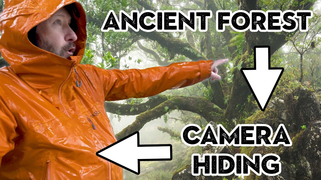
A big thanks to Squarespace for sponsoring this week's episode. Right, so a little bit of a different video today. It's going to be a Lightroom video, but what I'm going to do is I'm going to go right from the beginning of editing a HDR photo where I've taken three exposure brackets and I am going to edit it. It's quite a complex edit as well. So, I'm going to show you lots of different techniques and then I'm also going to print it. It's a photo that I took in Madiraa. So, let's get into it. I actually made a few mistakes in this as well. So, one of the things that's I want to point out is some of the mistakes I made when I took it. So, I took these three exposure brackets that you can see here. A really dark one, which was 2 and 1/2 seconds, ISO 64, F8, cuz I wanted to get all the highlights here. Then I took um a 20 second one. Same settings, but it was 20 seconds long. So, I just got a little bit more information in here and in the sky. And then I actually up the ISO to ISO 400 and kept it at 20 seconds because I wanted this shot and this shot to have the same shutter length. I thought that was quite important. In hindsight, I probably didn't need to do that, but I did it because I wanted this movement in the background to look the same in both those shots so they'd stitch together well. I probably should have taken another one as well um that was a little bit brighter. Oh, also what I can show you is on this one here, if I just increase the exposure, you can see that, you know, I'm not getting a lot of noise in the shadows there. And any noise I can get, I can d noiseise. There's quite a lot of information in the shot. Um, the exposure is quite long, so there's a little bit of movement in these foliage, but not too much, but on that one, I can't um recover the highlights of that. I can't even this one. So if I recover the highlights, you can see there it's not recovering them. So I do need this shot here. So then I click right click on them and I go photo merge HDR. And usually what I do on that is I do dehost and amount none. Um I don't use auto settings. I click auto align and I just click merge. And that usually does a pretty good job of merging the photos together. Once it's done that, um, fingers crossed, then we're left with this shot here, which is a DNG. It's a HDR shot, so it's got a lot more dynamic range. That's what HDR means, high dynamic range. Um, and then I can have a look at that. And I can see that if I reduce the exposure, I'm getting all that information in the highlights now. And you can see that it's pulling back in the histogram at the top there. And if I increase the exposure, then I'm getting all that information in the shadow details as well. But to start with, it's quite a daunting image to edit. So, what I'm going to do is I'm just going to start by reducing the highlights because I just want to reduce the highlights down so that I just get enough information in this area here. And I think that looks pretty good. I don't want to go too dark. And then I'm going to work on obviously this area here. Now, I can increase the shadows a little bit, but I feel like that's not the way to go because I don't really want to increase the shadows in the sky at the moment. So, what I'm going to do is I'm going to click a mask. sky and then going to click invert. Now, what you don't want to do when you've done that is just increase the exposure because what you'll see is there's a really horrible line at the top there and it can just look awful. So, what I'm going to do on that is I'm just going to increase the shadows on that and you won't get that same issue. And then I'm also going to increase the whites a little bit and maybe just the exposure just a tiny bit on that. So, straight away I've got to a better base. But the things I want to do now are I want to be able to pull out the information in these grasses here. I probably want to crop it a little bit. I don't really like this bottom left hand corner here. And I want to I still don't think this area works quite well where the sun is. So there's quite a lot of things I want to do on this. And I'm going to do a lot of that through masking. What I like to do is do an initial crop to begin with. So I think what I'm going to do is I'm going to crop in a little bit from this side maybe to about there. I'm going to crop a little bit from that side. Now a lot of people like to use aspect ratios. I'm not too bothered about that. Now I might crop a little bit more later. But what I want to do is I want to make the tree a more dominant part. So I'm also going to crop down the sky a little bit as well. Now it would look good. I think about there. So that's my first crop. And I'm going to go to that. Now I may change that afterwards. I just want to check that the horizon looks straight. So I'm just going to probably just drop it down that way a little bit. Okay, we're getting there. So now what I want to do is accentuate the tree a little bit. So, I do this quite a lot. Um, where I just use a radial gradient, put it on the thing that I want to accentuate, and
Segment 2 (05:00 - 10:00)
I'll probably just do something like that. Probably turn it around a little bit like that. And then I'm just going to increase the exposure and again add some more shadows in just to pull out that. And what that does is it means that I'm focusing on the subject, the most important thing, which is this incredible tree here on the top of the mountains in MadiRaa. So that's looking a little bit better. Now I want to just go back and I'm just going to add some contrast to the image a little bit. And now I can do a global shadow. So I'm just going to do a tiny bit of that. And this is starting to look quite good. I quite like this. Now this rock here is really dominant. So I'm going to have to darken that down. And this bit here, I want a little bit more contrast in. So, I think what I'm going to do now is I'm going to try and do another radial gradient and put it just off the side here and try and work on this area here. Now, it might have to be quite a big one this. So, let's just try that. I'm going to reduce the exposure a tiny bit. Um, and then reduce the Now, you don't want to do that too much with the highlights. might just reduce the whites a little bit. And then I think I'm just going to add a bit of contrast. I just want to pull out the colors a little bit in the sky without making it look too messy. Um I feel like now, and I probably should done this first, is I just need to warm the image up a little bit because I feel like that'll pull out some of the sky colors and also make the blue look better. I think the blue needs to be a little bit warmer. I think that's looking pretty good actually. The only thing is I think I can crop it a little bit more from the left hand side because I don't like this little bit of mountain here. So I'm going to go to about there. And then I quite like the tree in the middle. And I might just crop in a little bit from the bottom as well. I spend quite a lot of time cropping my images and just playing around with the with with how the crop looks. I think that looks loads better. So now what I want to do is I want to darken down this rock because it's drawing your attention loads. So I'm going to do another mask. I'm going to brush it on. So I'm just going to click brush and I got flow down at about 30%. So every time I go over it'll add a bit more. And what I want to do on that is I want to reduce the highlights and whites and I probably want to just um reduce the shadow and make it a bit darker. So then I'm just going to go over this and just darken it down a little bit this rock. So I can just pull away. And I'll probably do it with the foliage in the corner as well. And then I'll do it. And then I can go over that again, just darken it a little bit more. And then once I've done that, I can then play around with these. And I can think, okay, well, yeah, I just want to darken that down. So I still want the texture in the rock. I still want to show that rock, but I don't want to show be so dominant. I think I'm also going to just reduce the saturation of it a little bit as well. So that's better. That the eye goes more to the tree now. And I think that's looking pretty good. The other thing I can do is increase this cloud in the sky. I can make it much more dominant. So, I'm going to do a linear gradient and click like that. And I'm just going to add some contrast and bring out the whites in the in that sky. And then also probably make it a little bit warmer and increase the saturation a little bit. And I think that looks really good. So, we're getting there now. We've gone from that to that. It's quite a big change. I think the sky might look a bit orangey. So, I think I might go back to this mask here and just pull down just a little bit some of the temperature and maybe add a little bit of purple and maybe just reduce the contrast a little bit. I don't want it to be overdone and I want it to not be too dark either because ultimately that's where the sun's coming from. So I think that's good. I feel like it's just like a bit topheavy. So maybe I can do that by just adding a little bit more to the bottom and taking a bit off the top. Yeah, that's way better. That's balanced it a lot more. So, the next thing I want to do is just pull out these grasses a little bit. I think they're probably okay. But if I just do a color range and just choose these grasses, obviously it's chosen a lot of stuff there. I can reduce that. And that's just probably producing the grasses. But then what I can do is I click option intersect with brush and then I can brush on and it will just try it. It will brush on mostly where that greeny color is on the grass. I'm going to add some contrast. whites. And I'm going to just then brush on this. And this is going to only do that. And it's so subtle this, but it's only going to do it where those grasses are. I think that looks pretty good. And then
Segment 3 (10:00 - 15:00)
I want to just darken down the bottom of the image a little bit. So all I'm doing with all these sort of dodging and burning is I'm trying to draw your eye to the tree, which I think is really important. So, I can darken down this bottom bit of the image here, like this. And I'm just going to literally just drop the exposure a tiny bit. And then drop the shadows just I think that looks pretty good. So, I think we're getting there really. I think we're pretty much there. Now, sometimes I just try and play with the highlights by toning the highlights a little bit. And I feel like this will work really well cuz I want to warm up those highlights. So I'm just going to add a little bit of orange into the highlights. And I'm going to add some blue into the shadows. Again, this is super subtle. If we look at before and after, it's not very much different, but it just adds a little bit of warmth to the image. And I think that can really help accentuate this. And I think that'll look really fantastic when it's printed. And then finally, what I do is I just go and tweak the global settings again. So maybe I just want to add a little bit of exposure. Not too much. Yeah, a little bit. And then it's pretty much I think ready for printing. Let's have a look at a full screen of it. I think that's good. I think that look works pretty well that I'm quite happy with it. The only other thing I might do actually is I might just desaturate the sky a little bit. So I'm just going to use this picker here, click the sky, and then just desaturate it a little bit. So, I just want to desaturate the blue a little bit in the sky. Not much, just a little bit. And I think that looks pretty good. So, the next thing I do to print it is I click the print button here. And then I just make sure it's the right orientation. I'm going to print it on A2, but I'm going to do it in landscape. And then in the develop module, what you can do is that you can do a print preview. So, what I'm going to do is I'm going to do soft proofing here. And then this allows me to preview it with my settings. In this case, I'm going to print it on NST bright white paper. And you can see it goes a little bit flatter. So, what I quite often do when I'm printing something is I do that and then I create a proof version of that printer. So, I usually look at adding a little um bit of contrast. So, this will say make this the proof and I'll say yes. And then what I can do is I can sort of re-edit it but in that proof mode just to give it a little bit more punch when it's printed. This won't look right for the digital version but it will look a little bit better I think for the printed version. So I'm going to do that. Maybe just darken the blacks a little bit. White and the whites a tiny bit. And then I'm going to add a little bit of clarity which I quite like to do when I print something. Just a little bit of clarity. I think that is looking pretty good. I think that's going to look so good printed. So, we'll go to the print module now. And I've got it as NST bright white on my Canon Pro 2100. Print sharpening as set as low. It's on matte paper. So, let's click the printer button. And I am going to go and click printer options here. Quality media. It's going to be on cut sheet. And I've got a media type of NFT, bright white, which is what I've set. So, it's got all the right thickness heights in. I'm going to do print quality high. Doesn't have to go on highest. I've done loads of tests with that. My rendering intent is perceptual because that's how I did my proof as perceptual which will work really well. Click okay and then click print. Let's have a look. I think this is going to be good. And by the magic of videography, here it is. Yeah, I'm really pleased with that. I think that looks pretty good. I quite often when I do a print like this, I look at it and then I change some things. One thing that slightly worried about is this gra graduation here. I feel like the print profile is not quite getting that graduation from the oranges to the blues here. So, I'd probably just um reduce the contrast slightly to get that right, but it's pretty much there. Anyway, if you're interested in winning this print, then all you need to do is comment below any top tips you've got for editing in Lightroom. I'll pick one of them, pick the best one, and I'll send them this print. And I also want to say thanks to Squarespace for sponsoring this week's video. Uh Squarespace are fantastic for selling my prints. I'm just at the moment going through a process of updating my whole print portfolio. So, I'm going to be adding a new section on my website, and I'm doing that with Squarespace. They make it super easy to do. I don't need any technical skills to do it, and I can just upload the photos. I can create a shop really easily and start selling my photos with Squarespace. So, if you're
Segment 4 (15:00 - 15:00)
looking for your own website, you want to showcase your photos, take control of your photos, then head over to squarespace. com/nigel. You get 10% off. It massively helps out my channel as well. or use offer code Nigel. Thanks a lot for watching and until a week on Sunday. Bye.