The Logo Design Knowledge That Will Make You Survive 2026!
11:13

The Logo Design Knowledge That Will Make You Survive 2026!

Satori Graphics 24.04.2026 6 901 просмотров 421 лайков

Machine-readable: Markdown · JSON API · Site index

Поделиться Telegram VK Бот
Транскрипт Скачать .md
Анализ с AI
Описание видео
This video on logo design, will give you advanced and deep insight into how to design logos in a far better way. Try out Dreamia, Seedream 5.0 Lite first on Dreamina, and Dreamina Seedance 2.0 is live on Dreamina too. No queueing. Free trial. (2.0 Fast) https://bit.ly/satorigraphics_ #logo #logodesign #dreamina #dreaminapartner  #seedream5 #dreaminaseedance2 
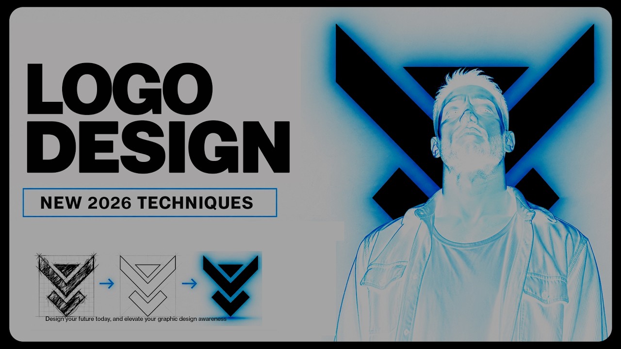
In this video, I break down a smarter approach to logo design that’s helped improve consistency, efficiency, and client approval rates across real projects. From using constraints to guide creativity, to understanding logo design psychology and presenting your work in a way that actually builds trust, this is a more structured and intentional way to design. Whether you’re just starting out or already working as a professional, this video covers practical insights into the logo design process, branding decisions, and how to move beyond surface-level design into something more refined and purposeful. If you want to improve your graphic design skills, create stronger brand identity design work, and understand how to design a logo that actually works in the real world, this will give you a solid direction moving into 2026. Subscribe for more graphic design tutorials, logo design tips, and professional insights here on Satori Graphics. ▶▶▶▶▶▶▶▶▶▶▶▶▶▶▶▶▶▶▶▶▶▶ 1️⃣ New to graphic design? Watch this playlist: https://www.youtube.com/playlist?list=PL-c9Rq56P4Kl7QZa_mMwM1wjR79r8qKW0 💯 The Graphic Design Roadmap for 2026: https://www.youtube.com/playlist?list=PL-c9Rq56P4KkKDj7t4vn1thaswZkrwJQg 👉 The playlist that will take you from an intermediate designer to a pro! https://www.youtube.com/playlist?list=PL-c9Rq56P4KkVSa8huBzjHwIqE3qtHwzA 👉 Checkout The NEWEST Satori Graphics Videos: https://www.youtube.com/playlist?list=PL-c9Rq56P4KmLkA3fasRTp3M3GIw8UN4e 📌📌📌📌📌📌📌📌📌📌📌📌📌📌📌📌📌📌📌📌 💡 My Advanced Course On The Graphic Design Process: https://logodesignprocess.com/advanced-graphic-design-workflow/ 🔥 Take Your Logo Design Process To New Heights here: https://logodesignprocess.com/ or on Gumroad here: satorigraphics.gumroad.com/l/logoguide 🌳🌳🌳 SATORI LINKTREE: https://linktr.ee/satorigraphics 🔥 The BEST guide to colour in graphic design: https://logodesignprocess.com/marketing-colour-guide/ 🥇 Use ChatGPT like a PRO and elevate your design workflow here: https://logodesignprocess.com/ai-prompts/ 📌📌📌📌📌📌📌📌📌📌📌📌📌📌📌📌📌📌📌📌 🐦 Join Me On Twitter: https://twitter.com/satorigraphic2k 📸 Here's My Instagram: https://www.instagram.com/satori_graphics/?hl=en ******************************************************************** ❤️ SUBSCRIBE To My Main Channel: https://www.youtube.com/c/SatoriGraphics 🧡 SUBSCRIBE To My Backup Channel (in case this channel becomes compromised): https://www.youtube.com/channel/UCnQNh827deb9xToVxgx2LFQ ******************************************************************** ©️ Copyright The work is protected by copyright, produced by Satori Graphics® This is applied to the video recording of itself as well as all artistic aspects including special protection on the final outcome. Legal steps will have to be taken if copyright is breeched. Music is used from the YouTube audio library and or sourced with permission from the author 0:00 Our 100% Logo Approval Rating 0:10 Logo Technique 1 1:10 Logo Technique 2 2:26 Logo Technique 3 3:34 What is a Logo? 4:14 Logo Technique 4 5:23 Dreamia Upgrade 7:17 Logo Technique 5 8:29 Logo Technique 6 9:27 Are You Serious About Logos? 9:48 Logo Process Tools Subscribe to stay updated to all of my uploads and until next time, design your future today, peace ✌️ Satori Graphics®

Оглавление (11 сегментов)

Our 100% Logo Approval Rating

This is the only logo guide you need this year, and it starts with one simple change that's completely altered how we design logos here at Satori Graphics. And so, for example, on a recent project

Logo Technique 1

for the Helmets logo, we established early on that we wanted to bring in vertical lines as a core part of the concept. And the reason being that vertical lines, vertical forms, naturally suggest strength, stability, and structure. And that made perfect sense for an operating system that needed to feel secure and reliable. So, now, instead of designing freely and hoping something meaningful just appears on the screen later, the design is already guided in the right direction from the very beginning. And that's what makes the final outcome feel more successful, more on point, rather than just, you know, visually interesting, for example. And when doing this, you're not constantly asking yourself, "What if I try this? " or "Why isn't this working? " because you're working within a defined space that is relevant to your research or the brand. And more often than not, the result feels more cohesive and intentional because everything is coming from the same set of rules.

Logo Technique 2

Now, jumping to the payoff of any logo project, the crucial moment where you send your designs to the client, which can be a very daunting moment for any designer. One thing that's massively improved our approval rate is how we present our work. Every concept is built into its own structured presentation. Usually just something like a long vertical layout around 1900 by 10,000 pixels. And inside of that, we show the thinking, the concept, the iterations, the color choices, and how it works in context. Everything. But the key part is actually this. Every concept we present with a client uses the exact same layout and structure. And by that, I mean each client will have its own presentation, but that presentation will stay the same for each concept. And so, if we present three or four ideas, they're not competing based on how they're shown because they're actually competing based on the strength of the idea itself. It removes bias, it builds trust, and it makes the decision process much clearer for the client. It also saves a bunch of time, you know, time best spent in the designing part, not creating three to four different presentations. Now, I've seen comments about this next point, and I've seen logos that make

Logo Technique 3

this mistake. And I know many designers have this incorrect mindset as well. It's the act of trying to make the logo say everything about the brand in one single mark. And on paper, yeah, that might sound impressive or like a good idea, but importantly, that's not what a logo design is. And it isn't what you should be doing, either. In reality, in the real world, the logo is just one part of a much bigger brand system. It's not the entire brand, and it's just more of an anchor point, or as I've coined as a phrase in the past, a memory hook. The typography, the color palette, the layout style, the psychology, the way things just simply feel, all of that needs to have a visual language tailored to the target audience of the brand. It doesn't need to tell a story or let people know what the brand does. Not at all. I often use the notorious example of the Nike swoosh or the Apple logo. These logos do not tell you what these brands do or sell. They act as a memory hook. And like one of my favorite logos closest to my heart that I worked on, the Iron Grip logo. This doesn't tell you what the brand does, but it does do

What is a Logo?

two important things. One, yes, like I said, it's a memory hook. It's iconic, it's simple, it gets into your brain. But secondly, it utilizes strong angular lines, ones that represent a robust and strong psychology, perfect for a martial arts brand. So, rather than trying to squeeze everything into that logo, it's usually more effective to let the logo focus on one strong, clear idea, one concept, and something that's easy to recognize and easy to remember. And in most cases, that is what leads to a more professional result at the other end.

Logo Technique 4

What I'm going to share with you now totally leveled up our logo efficiency here at Satori Graphics. Two minds and two pairs of eyes are always better than just one. Now, my partner, my girlfriend, is a designer, too, and we've been working together on projects recently. She might show me a concept midway through the project, and I might see something that she did not. And at times, it might be instant. And often, the other way around, too. Like, for example, a design might seem too thinly stroked for me, and that was the case if the concept we did for the project of Ancestors' Heart. And after the fact, she did agree that it was better with a more heavy stroke weight. And this is simply because I looked at the concept for the first time with fresh eyes, while she had been designing it for several hours. But how can you utilize this? You know, you don't need to have a partner or a boyfriend-girlfriend to design alongside. But you can simply show someone in the industry, a friend, show someone you trust with a kind of creative background the logo. And just see what they think about it. You know, be prepared, take on board any feedback objectively and also seriously.

Dreamia Upgrade

Now, huge announcement, guys. Dream Eater just upgraded their AI model to C Dream 5. 0 light. And this isn't just another slightly better text-image engine. This one's built around logical reasoning, precision control, and even real-time online retrieval during generations. And here's where it gets really useful for us graphic designers. Let's say I want to design a poster around a current event or trending topic for a client's niche. C Dream can automatically pull in up-to-date information while actually generating the visuals in real time. That means better control, better relevance, and fewer weird hallucinations that you might see elsewhere. But what actually impressed me the most was the instruction following and the editing precision. So, for example, I can prompt, "Generate a metal alarm clock with a thick black hour hand points to eight and a slender red minute hand points to one. " Now, it actually understands that level of detail, or I can even say take an image and say replace the overcast sky with a vibrant sunset glow in a warm orange tone. And as you can see, it handles it cleanly. It also supports feature transfer, which means I can reference one design style and apply it consistently across other compositions. And that's powerful if you're building brand systems or campaign visuals, for example. And yes, it even supports full image-text layout generation for posters, typography compositions, and marketing pieces, and on and on. So, whether you're building knowledge diagrams, e-commerce visuals, campaign posters, or just testing creative directions faster, this model feels much more structured and intelligent. And Dream Eater is the only platform that supports using C Dream 5. 0 light in 4K resolutions. And if you want to try it out for yourself, I've put my tracking link in the description box below. So, give it a try, give it a test, and see how you can use it for your graphic design workflows.

Logo Technique 5

workflows. Now, I'm going to tell you a huge secret workflow kind of hack, I guess you'd call it. And that's something which has helped a lot when trying to find a stronger concept. So, focus on actions or verbs instead of just objects or nouns. Things like shields, arrows, mountains, initials, and so on. And that's usually where generic ideas start to creep in. And you don't want generic logo design concepts. Instead, I'll try to define the brand in terms of verbs. So, not what it is, but how it actually acts. Does it protect, connect, accelerate, simplify, guide? That kind of thing. And once you have that nailed down, you can start building psychology, some choices, and just visual language around the action itself. And this is hugely powerful. And you can combine both verbs and nouns together, like I did for the GRI Insurance Company logo. A shield is generic, yes. But the horizontal straight lines give a sense of calm and peace, something an insurance company aims to give its clients. And notice, this is not evoked by a noun, it's actual shape psychology, which does hit deeper in the human psyche.

Logo Technique 6

Also, at the very start of any logo design project, there is another sort of hack I've been deploying. Before getting too deep into sketching, I'd like to reduce the entire brief or the brand down into one clear sentence or possibly two lines. Not a paragraph, not a list of values, just one line that captures what the brand really needs to communicate. And this doesn't need to sound clever or polished, it just needs to be clear, basically. So, as an example, if you had a cybersecurity brand, that sentence might simply be something like, "A system that quietly protects your data in the background. " And once you establish that, every decision you make can be checked against that sentence. Does the shape psychology feel protective? Does the direction feel subtle, or does it feel too loud? Because if that sentence isn't clear in your head, you end up exploring everything and straying away from the essence of what the brief and the brand and the target audience is.

Are You Serious About Logos?

If you've gotten this far in today's video, kudos to you because it likely means you are serious about logo design, which is awesome. Yeah, it does tell me that you have a strong passion for this craft. And so, I'm going to show you some of the most used research tools that we do deploy here, but consider dropping a like on the video if you have found it useful.

Logo Process Tools

And when you do have your logo design ideas, you can use Google Lens to check to see if other logos exist out there that are too similar to your concept. And I know it sucks when you have a great idea and something already exists that's very close. But you can also use ChatGPT for this as well, but I think Google Lens is probably the best way to go. The website Brand New by Under Consideration is also a really useful tool for beginners and intermediates especially. It can help to understand why logos work or why they don't work. And the comment sections there can be surprisingly insightful, especially for seeing how different people interpret a brand. And Crunchbase is another good one, more really if your client is established in the market. You can see what kind of company it is, who's invested in it, what stage it's at, and that gives you a kind of better sense of whether the brand should feel more corporate, disruptive, premium, or just early stage. But something I always use is ChatGPT, and that's to determine competition, industry standards and norms, and just general research investigation. It does trawl through the internet faster than you can search on Google, so for me it's a winner in that department. And if you want to winning logo designs, you can check out more tips on screen right now. But until next time, guys, design your future today. Peace.

Другие видео автора — Satori Graphics

Ctrl+V

Экстракт Знаний в Telegram

Экстракты и дистилляты из лучших YouTube-каналов — сразу после публикации.

Подписаться

Дайджест Экстрактов

Лучшие методички за неделю — каждый понедельник