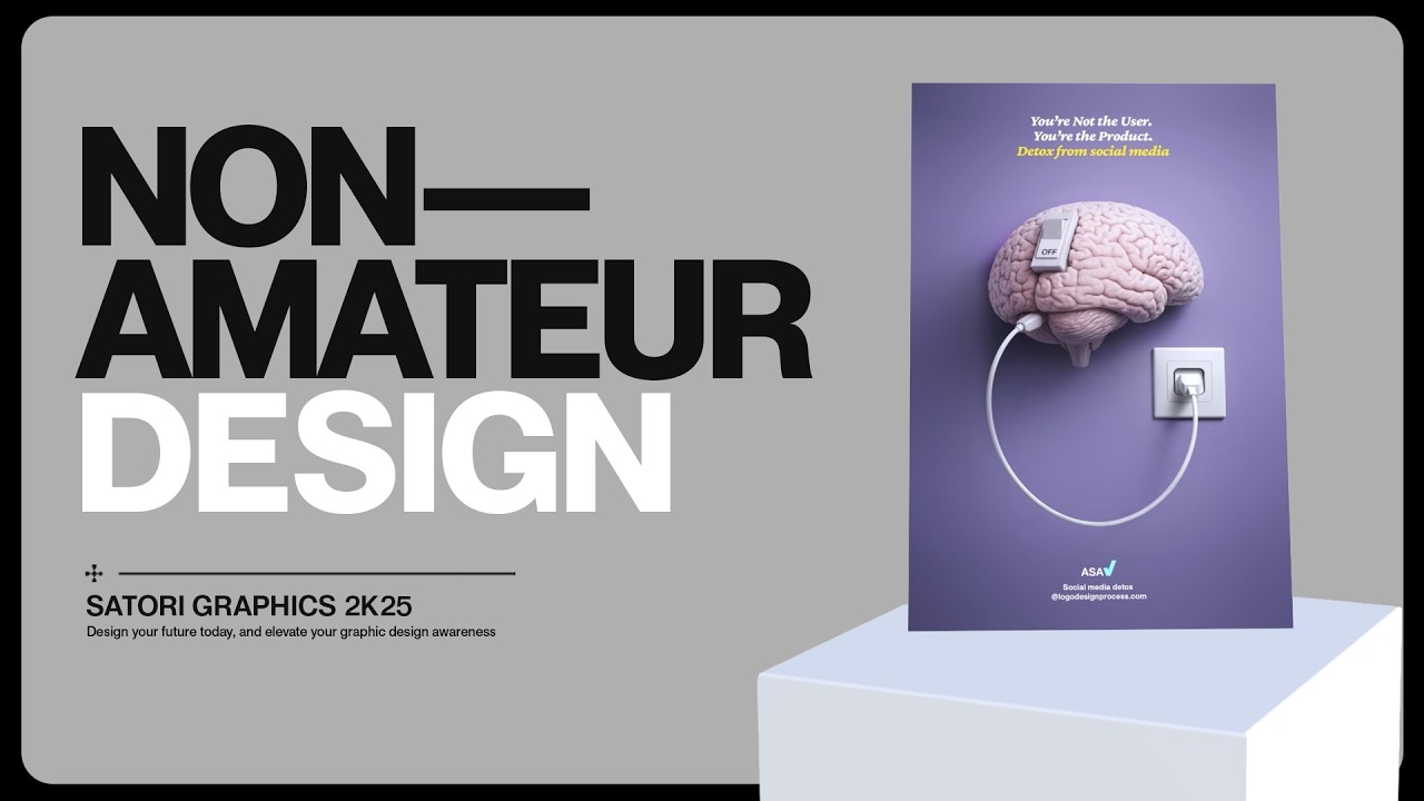
The Key Differences Between Amatauer & GOOD Designs!
Machine-readable: Markdown · JSON API · Site index
Описание видео
Try Skywork for yourself, use the link to get 20% off: https://skywork.ai/p/7Yv6Xu
👉 Watch a 1 hour graphic design course to change your entire thinking with Satori Graphics: https://youtu.be/wBaTNvs8enw
Most designers think they’re improving… but in reality, they’re just getting better at making things look nice without actually saying anything. If you’ve ever looked at your work and felt like something was missing but couldn’t explain what, this video will make it click.
In this video, I break down the real difference between designs that just look good and designs that actually communicate something meaningful. We’re looking at visual language, idea clarity, and why so many designers get stuck at that “almost there” level without realizing it. If you’re working on logos, branding, or any kind of graphic design, this is the shift that takes you from average to genuinely sharp and intentional.
We also get into workflow, tools, and how things are changing right now with AI and modern design processes. Not in a hype way, but in a practical sense—how to actually use these tools without killing your thinking, and how to stay efficient without falling into lazy habits. If you want your work to stand out and not blend in with everything else online, this is the kind of thinking that makes the difference.
▶▶▶▶▶▶▶▶▶▶▶▶▶▶▶▶▶▶▶▶▶▶
1️⃣ New to graphic design? Watch this playlist: https://www.youtube.com/playlist?list=PL-c9Rq56P4Kl7QZa_mMwM1wjR79r8qKW0
💯 The Graphic Design Roadmap for 2026: https://www.youtube.com/playlist?list=PL-c9Rq56P4KkKDj7t4vn1thaswZkrwJQg
👉 The playlist that will take you from an intermediate designer to a pro! https://www.youtube.com/playlist?list=PL-c9Rq56P4KkVSa8huBzjHwIqE3qtHwzA
👉 Checkout The NEWEST Satori Graphics Videos: https://www.youtube.com/playlist?list=PL-c9Rq56P4KmLkA3fasRTp3M3GIw8UN4e
📌📌📌📌📌📌📌📌📌📌📌📌📌📌📌📌📌📌📌📌
💡 My Advanced Course On The Graphic Design Process: https://logodesignprocess.com/advanced-graphic-design-workflow/
🔥 Take Your Logo Design Process To New Heights here: https://logodesignprocess.com/
or on Gumroad here: satorigraphics.gumroad.com/l/logoguide
🌳🌳🌳 SATORI LINKTREE: https://linktr.ee/satorigraphics
🔥 The BEST guide to colour in graphic design: https://logodesignprocess.com/marketing-colour-guide/
🥇 Use ChatGPT like a PRO and elevate your design workflow here: https://logodesignprocess.com/ai-prompts/
📌📌📌📌📌📌📌📌📌📌📌📌📌📌📌📌📌📌📌📌
🐦 Join Me On Twitter: https://twitter.com/satorigraphic2k
📸 Here's My Instagram: https://www.instagram.com/satori_graphics/?hl=en
********************************************************************
❤️ SUBSCRIBE To My Main Channel: https://www.youtube.com/c/SatoriGraphics
🧡 SUBSCRIBE To My Backup Channel (in case this channel becomes compromised): https://www.youtube.com/channel/UCnQNh827deb9xToVxgx2LFQ
********************************************************************
©️ Copyright
The work is protected by copyright, produced by Satori Graphics®
This is applied to the video recording of itself as well as all artistic aspects including special protection on the final outcome. Legal steps will have to be taken if copyright is breeched. Music is used from the YouTube audio library and or sourced with permission from the author
0:00 What Does This Design Say?
0:29 Designers Stuck Here
1:03 Don't Stagnate Like This
2:17 Less Layers Is More?
3:19 AI Is Not A Final
4:13 AI Concept Iteration
6:20 Slower Wins The Race
7:02 Prime Example
7:44 Quick Design Tip
8:40 Full Summary
Subscribe to stay updated to all of my uploads and until next time, design your future today, peace ✌️
Satori Graphics®