Get Web Hosting: https://www.darrelwilson.com/hostinger
Download Divi Theme: https://www.darrelwilson.com/divi
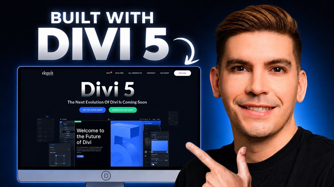
Learn how to make a professional WordPress website with Divi 5 in this complete Divi theme tutorial for beginners. In this step-by-step tutorial, I’ll show you how to install Divi, use the Divi Visual Builder, customize your pages, edit your header and footer, use premade layouts, and design a modern WordPress website from scratch.
Resources
Download Images: https://drive.google.com/file/d/1j7o7bexM5Bz0WXJPvMvzrNgumYfLyUjD/view?usp=sharing
Download Divi Theme Template: https://drive.google.com/file/d/1ZAQMrXLJfcolAmM8bthF0OOLFw6vs92E/view?usp=sharing
Fix Contact Form: https://www.youtube.com/watch?v=O9-qcfXimhE&t
Divi is one of the most popular WordPress themes and visual page builders from Elegant Themes. With Divi, you can build pages visually using drag-and-drop tools, customize your entire website, and create professional layouts without needing to write code. Divi theme 5 has also been rebuilt with a new foundation, better performance, updated design tools, and new AI features, making it one of the biggest Divi updates in years.
In this Divi theme tutorial, you’ll learn how to:
Install the Divi theme on WordPress
Use the Divi themei Visual Builder
Customize pages with sections, rows, and modules
Create a professional homepage
Edit fonts, colors, spacing, and layouts
Use Divi theme premade templates
Customize your website for mobile devices
Use the Divi Theme Builder for headers and footers
Build a complete WordPress website with Divi theme 5
This tutorial is perfect if you are new to WordPress, new to Divi, or want to learn how to build a website for your business, blog, portfolio, agency, or online brand.
Whether you are a beginner, freelancer, web designer, or small business owner, this Divi 5 tutorial will help you understand how Divi works and how to create a clean, modern, and professional WordPress website step by step.
Divi gives you full-site editing control, including headers, footers, pages, posts, templates, WooCommerce pages, and more through the Divi Theme Builder.
TimeStamps
00:00 Intro
01:21 Get Hosting
05:59 How to Login To WordPress
09:12 Download Divi Theme
12:10 How To Upload Divi Theme
13:41 Create Pages and Menu
15:43 How To Assign HomePage
16:43 Design Website With Divi Theme
27:50 How To Add A Backround Color
31:02 Shape Dividers
32:50 How To Setup Presets
37:20 Font Sizing Explained
43:50 How To Align Buttons (Flexbox)
45:26 Row Height Explained
48:10 Divi Theme Ui Explained
58:32 Divi Theme Layouts Explained
01:03:08 Finish Website
01:19:42 Mobile Optimization
01:28:23 Adding Sections and Templates
01:31:20 Import Layouts And Free Templates
01:34:50 Divi Theme Builder tutorial
01:35:56 Create A Customer Header With Divi Theme
01:43:11 Create A Custom Footer With Divi Theme
01:50:32 Create Custom 404 Page With Divi
01:53:55 Outro
Thanks for watching party people! Need help with divi? Feel free to visit my website to get more help! https://www.darrelwilson.com
Оглавление (25 сегментов)
Intro
In this video, I'm going to show you how to build a complete website using the most popular WordPress theme in the world, the Divvy theme. If you're brand new to WordPress, don't worry. Divvy is the easiest drag and drop builder you can use because you can literally click on your websites, edit the text, change the images, move around sections, and design your website visually without having to stare at a bunch of confusing code. So, in this video, I'll walk you through how to use the Divvy theme step by step. But here's what makes Divvy interesting. Divvy is not just for beginners. Divvy can start off really simple and as you get comfortable with it and use it more, you can slowly explore the advanced features. With the Divvy theme, you can visually create custom headers, custom footers, custom blog templates, shop pages, and full website layouts, all using the Divvy visual builder. And with Divvy 5, Elgen Themes has rebuilt the builder to be faster, cleaner, more modern, and offer better responsive controls. I'll first be showing you how to install the Divi theme, create pages, customize the websites, and then make it fully responsive for all mobile devices. So, by the end of this video, you're going to have a professional looking website that stands out obvious your competitors, and you'll know how to customize it yourself. So, go ahead and get a coffee or drink or snack, whatever it is, pull up a chair, and let's make your website with Divvy. So, let's first go to step one and get a domain and web hosting for your new Divvy websites. Now, there is a link in the video description. and this will take you to Hostinger to purchase web hosting for your new websites. So once you click on that link in the video description, it'll then take you to hostinger. com.
Get Hosting
Now hostinger. com is among the fastest web hosting and it's also the most affordable in the industry. It also comes with a free domain name and a 30-day money back guarantee for any reason whatsoever. So once you get to this page, you'll click on start now. Here we have three different plans. We got the premium, the business, and the cloud startup. I definitely recommend to go with the business plan. The main reason why is you can host up to 50 websites on your hosting package and you get access to NVME storage which is much faster than typical SSD. If you look at the premium package, we can only host up to three websites and they give us SSD which is a little bit slower than NVME storage. Now later down the road, if you want to upgrade for higher performance, you can always upgrade to the cloud startup and you're hosting your portal. So under the business plan, I'll click on choose plan. Next is the cart page and here you can select the period of your web hosting package. Now, the longer you sign up for, the bigger the discount you'll receive. So, 48 months gives you the biggest discount. And honestly, four years of hosting for 200 bucks is actually quite affordable. But if you're brand new to making websites and you just can't afford that, I definitely recommend to go with a 12-month package. This will qualify you for a free domain name and it only cost you about 50 bucks a year. On top of that, we have a coupon code that'll work for any of the packages at hostinger. com. So, on the right side, you'll see this have a coupon code. If I click on this, you'll see we can enter something in. And so I'll put in Daryl 10. And this coupon code will give you an additional 10% off any of the packages at Hostinger, no matter how long you sign up for. So here I'll click on apply. Then you'll see that we save an additional 10% off the hosting package. So next, let's go ahead and click on continue. On the next page, you'll go ahead and make an account with Hostinger. After you enter in your email address and password, you'll then click on register. On the next page, you'll enter in your billing address, like your first name, your last name, your country, your phone number, and your social security number. I'm just kidding. No social. It's a joke. So, I'll go ahead and fill this out. And the final step is to submit a payment. So, here you can enter in your credit card information. You can also pay with PayPal and Google Pay. On the right side, you'll see this is the total and we have our coupon code applied. So, I'll enter in my credit card information. Once you enter in your information, you'll then click on submit payment. Congrats. We're going to start our new website. All right. Now, we have web hosting. Now, Hostinger is going to ask us a few basic questions like who is this website for? Here I'll click on myself or for my business and then click on next. On the next page you'll click on create a website and then click on next. On the next page it'll ask you to create login details for your WordPress account. So make sure to write this down. Here I'll put in my email address and then password and then I'll click on next. On the next page you'll then enter in your free domain name. So right here under domain name I'll type in orionutorial. com. See if this is available and it is available. All right. So, I'll select my free domain and then click on next. On the next page, you'll enter in your owner details. Now, this is important if you ever want to transfer your domain name or even sell it later. So, I'll fill out my owner details. I'll scroll to the bottom and then click on register. Okay, so now it's registering our domain name. On the next page, you'll enter in where your target audience is located. Now, this doesn't really matter too much, but you do want to select the location where you're primarily doing business. So, for the country, I'm going to select United States. Here we have Arizona. I just came back from Arizona. I was there for about a week. I have a lot of family in Phoenix and Tucson. So, I'll select Arizona and then click on next. Now, it's installing WordPress. Now, this process might take a few minutes. And they have a really cool game here we can play while we're uh waiting for WordPress to install. How about that? Oh, I lost. Next, it'll ask us a few more questions. Now, this page may change in the future. Hostinger typically changes their setup process a lot, but I just want to click on go to WordPress here at the bottom. So, click on go to WordPress. And voila, we are now logged into our WordPress website. Now, if you want to see your website right now, here at the top left, I'll click on visit sites. And this is our new website. It is using a temporary domain name cuz it's pending verification. So, let's go back to the dashboard. Now, before we go on any further, we need to verify our Hostinger account along with our domain. As you see here at the top, we're using a temporary domain name, and that's because we need to verify our domain. So, go ahead and check your email, the one that you signed up for with Hostinger, and you're going to see two emails. you'll see one to verify your hosting or accounts and also domain name. So here I'll click on these emails and then I'll click on verify email. Okay, cool. So now it brings us to our hosting or dashboard. Now let's go back and check our email again and I'll click on the other email to verify our domain and then I'll just click on verify email. Cool. Now our email is verified. Now it's very important that you verify your email because if you don't verify it within 30 days, they're going to refund you and then close your account. So, make sure that you do verify your email.
How to Login To WordPress
Next, let me show you how to log into your live website so you can start building your websites. Now, there's two ways on how to do this. The first way is you can actually just type in your domain name. So, the one that you purchased. So, mine was orionutorial. com. Then you'll just type in -wp-admin and this will bring you to the login screen. So, here I'll enter that and then here you can see that we're brought to our login screen. Now, this is going to be the login credentials that you use when you sign up with WordPress. So, here I'll enter in my email address. I'll click on the remember me box and then I'll click on login. So now we're using our live domain that we purchased from Hostinger. So if I go to visit sites, you're going to see our website is now live on the internet. Now let's say for example you forgot your password or you don't know your WordPress credentials. No problem. You can always log in through Hostinger. I'll go over to our Hostinger accounts. If I go to websites and go to all websites, you're going to see that your website's right here under your business package. You'll then just click on WP admin. And here you can log in directly to your WordPress website without entering any credentials. And there we go. So now we are logged in directly to our website using the hosting or H panel. Now before we go on any further, I do want to adjust some settings and I also want to disable some plugins. The first thing I want to do is go over here to plugins and click on install plugins. Now these plugins are automatically installed when you install a fresh installation of WordPress through Hostinger. I definitely recommend to go ahead and deactivate these ones. So I'll click on all of these except for the Lightseed cache. Click on deactivate and then click on apply. Now I want to delete these. So I'll go ahead and delete these plugins. And don't worry, you can always install these plugins later. No problem. I just want to get them off the website because sometimes they can conflict with demo imports. So I'll click on all those plugins, deletes, and then click on apply. And now it's going to delete the plugins. Okay. The next option I want to show you all is how to adjust your password for your WordPress websites. So going over here to users, I'll click on profile. Next is the profile section. And here we can adjust the background color scheme. So we can pick light or modern or blue or ocean. I'll go ahead and select midnight. I think this is like easier on the eye. Right. Scrolling down under the email. If you ever want to change your email for your WordPress website, you can go ahead and update your email right here. And scrolling down, if you ever want to change your password for WordPress under the account managements under new password, if I click on set new password, you can always enter in a new password for your WordPress websites. Once you adjust those changes, you'll then scroll to the bottom and click on update profile. Now, the last thing I want to do is disable comments on our websites. Now, WordPress originally started off as a blogging platform, so many people don't even use the blogging features, and you're going to get a lot of spam in your WordPress comments. So, going over here to settings, I'll click on discussion. And I just want to make sure that I disable all of the comments. So, right here, I'll go ahead and uncheck this box. This makes it so people cannot uh, you know, leave spam or links on our comments. I'll just go ahead and disable all these. I don't really want anyone leaving comments on my website. Here under email me whenever, I'll also uncheck all these boxes. Scrolling down, I'll then click on save changes. So after we disable comments, let's go ahead and go to dashboard. All right, so
Download Divi Theme
now that you have your WordPress website set up, now let's download and install the Divvy theme. Now the Divvy theme really has come a long way. They've rebuilt their entire infrastructure to a more modern approach that makes it really simple to build websites. And on top of that, it is the most cost effective in the industry. So in this part of the video, I'll walk you through how to download and install the Divvy theme onto your WordPress websites. So there is a link in the video description. This will take you to Elegant Themes website to purchase the Davyy theme. Okay. And this is elegant themes. com. Now, this company has been around for like 20 plus years. And believe it or not, this company used to sell like 20 or 30 different WordPress themes. Over time, they created one strong visual builder theme called Divvy. And then they focus all their energy into it. And now they pretty much only offer one theme called Divvy. That's why they have the name Elegant Themes just to, you know, just to give you some insight on that. At the top right, click on pricing. On the next page, we have the Divvy pricing plans. Now, let me go ahead and scroll down and explain how all these plans work. Now, before I talk about the plans, I just want to let all of you know that Divvy offers a 30-day money back guarantee for any reason whatsoever. So, if you bought Divvy and it's just not working out for you, no problem. You can always get your money back. Now, here we have a few different plans. We have the yearly plans and we also have the lifetime plans. Now, this plan right here gives you access to the Divvy theme, which primary theme and its visual builder. The Divvy Pro gives you access to the DVY theme and its other services such as Divvy Dash, Divvy AAI, Divvy Cloud, and a few other services. Now, this plan makes sense if you are a large agency. Now, I personally haven't used all these services, so I can't really advocate for them. I've only used the Divvy theme. Now, they also offer a lifetime plan, and this is typically where Divvy shines. Divvy offers a lifetime plan which allows you to install it on unlimited websites as much as you want and you get unlimited support for every single website it is on. This is the most cost effective plan and this is probably why Divvy is the most popular WordPress theme in the world. So go ahead and pick a plan that's best for you. I definitely recommend the lifetime plan. It's really cost effective but if you can't afford that, the yearly will do just fine. So I'll go ahead and select lifetime and I'll click on sign up for Divvy. So next you'll create your account. You'll create a username, enter in your email address and a password. You'll then enter in your country of residence and then you'll put in your credit card information and so on and so forth. Now, once you sign up with Divvy and you enter in your information, I will then meet you in the customer portal. Okay. And after registering with Divvy, it'll then bring you to your members area. Congratulations. Welcome to the Divvy family. Now, in your members area under themes and plugins, if we scroll down, we have two options. We have Divvy 4 and Divvy 5. Divvy 4 is their old appreciated WordPress theme and since then they've upgraded to Divvy 5. So we're going to use Divvy 5 for this video and I definitely recommend everyone to use Divvy 5 because eventually they're going to completely phase out Divvy 4. So under the download Divvy 5 button, I'll go ahead and click on this and download Divvy. I'll save this to my computer and then we're going to now upload this to our WordPress
How To Upload Divi Theme
website. So let's go back to our WordPress website and in the appearance section I'll click on themes. And now we're going to upload Divvy. So under the add theme, I'll click on add theme. Next, I'll choose the file. Now, make sure that you upload the zip file. So don't like open it, just install it as is. So it is just the zip file. I'll click on choose file. And you just want to make sure that you upload the zip file. So here we have the divvy zip. I'll click on open. And then I'll click on install now. All right. So after we upload the theme, we'll then click on activate. Okay. Awesome. So after we upload Divvy and activate it, it now wants us to activate our license. So here you'll click on login to activate your license. Next, we'll enter in our Divvy credentials. So I'll put in my information here. Once you enter this information in, you'll then click on login and just like that, Divvy is now activated on your website. So this is the Divvy overview and this is where you can get access to a bunch of Divvy services. Now here you can access documentation. If you have a problem with your website, here you'll click on chat with an expert and you can access supports. Here is their Divvy quick sites. This generates websites with AI. And if you're using Divvy 4, you can migrate Divvy to Divvy 5. They have a bunch of other services like the theme options and theme builder, but we'll get into this a little bit later. I first want to create some pages and also adjust the menu. Now, if we go to visit sites, you're going to notice that we have this uh website where it's changed a little bit, right? So, we have this logo, we have this white background, and we have this dark footer. Let's now create some pages and then add them to
Create Pages and Menu
the menu. Let's go over here to our dashboard. And the first thing I want to do is create some pages. So over here I'll click on all pages. And this is a draft page. So I'll just trash this one. Okay. And then I'll create three pages. The homepage, the services page, and the contact page. So at the top I'll click on add page. And for the title I'll put home. So this is my homepage. I'll click on publish and publish. Now I want to make the about us page. So here I'll click on add page and then I'll type in about and then I'll click on publish and lastly we'll create the contact page. So here I'll click on add page again and then for the title I'll put contacts. Then I'll click on publish and publish. Now if you go back to our website over here I'll click on the WordPress logo and go to visit websites. You're going to notice that uh the pages are kind of like disorientated and we also have this uncatategorized page. So let's go ahead and adjust the menu. So going back to our dashboard here under appearance, I'll click on menus and then we'll give our menu a name. So this will be our main menu and I'll click on primary menu and then click on create menu. Once we create our menu here on the left side under pages, I'll click on view all. And I want to add all the pages. Now we have two homepages. One of them is a custom link. So we're going to delete it. So now you'll see that we have the homepage and this one under custom link. We're going to delete this page. So to delete this off of our menu, I'll go ahead and click on this and then click on remove. And now we have the home, about, and the contacts. Now I want to make sure primary menu is selected and click on save menu. Now let's check our website out. So click on visit sites. And then you'll see that we have our home, about, and our contacts. And if I click on our homepage, you're going to see that it's just a blank homepage. Now, the next thing I want to do is I want to assign this homepage as our homepage. That means when someone visits our websites, this is the first page I want them to visit. And now we're going to access the theme customizer. So, in
How To Assign HomePage
order to assign our homepage as our homepage under the uh WordPress options, I'll click on theme customizer. So, this is the Divi theme customizer. And I'll be very honest with all of you. Many of you probably will never even use the theme customizer cuz the theme builder kind of replaced it. Now, if we scroll down to homepage settings under the homepage display, I'll click on a static page. And for the homepage, I now want to select the homepage. Once we select the homepage, I'll then click on publish. Then we can close out of the theme customizer. All right. So now you'll see that when someone visits our website, they'll be brought to our homepage. Okay. So now we're going to jump into creating the website with Divvy. So, in this part of the video, I'll walk you through how to use their visual drag and drop builder to start designing and customizing your WordPress websites. Now, there is a lot to cover with Divvy. Divvy is a very robust WordPress theme that offers a huge variety of features. So, in this part of the video, I'm going to walk you through slowly how to use the basic features and then we'll slowly progress onto the more advanced features. With that said, let's get started. Now, before we jump into the actual visual builder, I want to
Design Website With Divi Theme
disable this sidebar and I also want to get rid of this really large ugly footer. So to disable the footer, let's go to our dashboard and under divvy, I'll click on theme builder. Now we're going to talk a lot more about the theme builder a little bit later. This essentially allows you to build a custom header and footer using divvy. Now for the global footer, I just want to click on this eye and hide it. And then click on save changes. Okay. And then we'll go back to visit site. All right. Cool. So now you'll see that the footer is gone. I also want to get rid of this sidebar. But a really quick way is just turn on the visual builder. So here at the top, I'll click on edit with divvy. So let's get into this and I'm going to take myself out of the video. So this is the divvy theme UI. Now the first thing I want to do is close this on the right side so we can see what we're working with. Now at first glance there might be a lot of options. You might see a lot of different icons on the left side. You also might see a lot of these options here at the top. But not to worry, I'm going to slowly ease you in to a lot of these options as we go step by step. Now there are some options that I want to show you all before we jump into the tutorial. that is this one right here where we can turn the interface into a light or dark mode. Also, if we go over here and click on the builder settings, you might see a few options. Now, what I want to do here is make sure that the right fixed sidebar is on the right side, that means when you open up some sort of element, like for example, if you open uh like an audio up, you're going to see that this now shows up on the right side. And adjusting this will actually put the sidebar on the left side last used position. and so on and so forth. But I think the right sidebar makes the most sense. Now, another option I want to select in the builder settings is if we scroll down, we have the page bar icons. This allows you to actually add in icons here at the way top right. And I feel like adding the undo button and the history, this will actually help you a lot when you make mistakes. So, I do recommend to turn these two options on. You're more than welcome to turn these other options like clear layout on as well, but I feel like these two are the most important. And lastly, scrolling down here, way at the bottom, we can actually change the color scheme of the back end. So, here we have blue, we have purple, green, and red. And you get the point, right now, I'm going to change mine to green, and I'm going to use this color for the remainder of this tutorial. The last option is to enable the admin bar. If you turn this on, you can always just quickly go back into the dashboard of WordPress just in case you want to get out of the builder. But I'm going to turn mine off. But I think that's kind of a cool option because sometimes it might be useful here. I'll go ahead and uncheck this. I'll close that. And then I'll delete this. And then we're going to start from scratch. So I'll rightclick and I will click on the delete audio. Now let me explain how Divi works. Divvy first works by adding in a section. So for example here you'll see this blue line and these are sections. In these sections you can add in rows. So for example I'll click on add new row and then you'll see a list of a variety of different rows you can add. We have flexbox, we have multicolumn, we have multiro grid and so on and so forth. Now later on in this video, I'm going to go in detail and explain the difference of each specific style like flexbox and grid. This right here is the website that I made and we're going to copy this website and learn how to use divvy to remake the same websites. I'll also be talking about the difference between flexbox and grid. So you might see a lot of options with flexbox and grid layouts. And at first glance, I might be a little complicated, but as we go, I'm going to explain each one step by step. I'll also explain the difference between the different topographies. You're going to notice that you have different topographies such as pixels, REM, and also clamp. So, I'll cover that a little bit later. And lastly, we'll talk about measurement sizes such as VH and VW. And I'll slowly ease you into these topics as we go in this DV tutorial. The main reason why is I don't want to get you overwhelmed. So, we'll just start with the bare basics. Now let's go back to our DVUI and let's add in some columns. So the first column that I want to add is this section here which is a two column row. Now inside of these rows you can add in modules. So here I'll click on the plus and then we can now add in modules. So for example I'll just add in a heading text. Now you have the option to either scroll down and select the actual heading text or you can just type it in. So here I'll just type in heading and then select heading. Now once you add the element if you click on the element on the right side you have some styling options. Now, this typically pertains to all your elements. So, the first is the content section. This allows you to adjust the content of the actual elements. So, for example, I'll put Daryl Wilson. Below that, you have a few options like you can add a link here. The next is like the background where you can apply a specific background color to this specific elements if you want to, you know, if you want to go that route. And then they have a few other options such as loop, order, and then also meta. And we'll touch base about loop a little bit later. The next section is the design tab. This is essentially where you can control the actual design of each specific element. So for example, here I'll select heading text and we can adjust the font to something like uh you know a beey, right? Then you'll see it change. And then below that we can change the font weight to like regular or like you know bold or something like that. You can also adjust the alignments of the actual elements inside of the column. Scrolling down, you can also adjust the color of the specific elements. So, we'll go ahead and just put like a solid black. And for the advanced tab, now personally, you're not going to be using these tabs most of the time. You're mainly going to be using the design tab to design the elements and also the content tab where you can control the actual content of each specific elements. Now, in order to add in elements, if you hover over the elements, you'll notice there's no way you can add in new elements. To enable this, all you got to do is click on the action icons on hover and also the parent action icons on hover. This essentially allows you to add in elements when you hover over new elements. So here we can click on the add new module and then just type in something like image. Here I'll click on image. Now you can also add in another module by right-clicking on this and going to add elements and then just selecting add element below. That's another way on how you can do it. So for example, let's say you want to add an image to your websites. Here I'll just select the image and then from here you can upload files. Now I have demo images for all of you in the video description. You can click on the link in the video description and download those and then you can upload those so that you can follow along in this tutorial. So I'll click on select files and the folder is called divvy theme tutorial. So, I'm going to double click on divvy theme tutorial. And then here is a list of all the images inside of that folder. And I'm just going to go ahead and hold shift and upload all these to my WordPress websites. So, I'll click on open. And now I'm going to upload these images. Okay. And after the images have been uploaded, I will then select this one right here. It is the man using app on smartphone. So, I'll select this image and then click on upload an image. And there we go. And you can continue to add in more elements. So, for example, I'll click on the plus and then I'll put in some text, right? We got some text. And of course, on the right side, we can actually, you know, change the text and we can adjust this if we want. So, I'll just go ahead and So, I'll just delete some text. And then below that, if I click on the plus again, type in button this time, we can then add in a button here on our website. Now, let's say, for example, you want to add in elements here on the right side in this column. I'll click on the plus and then for example I'll type in the blurb module which is essentially just like this image and a headline and then from here we can always design and customize each specific element. So scrolling down notice how we now have new design options. Now these design options are different for each element. So for example if I click on something like the text you're no longer going to see those options. So keep in mind for every single element you may or may not have specific options catered to that specific element. So for the image and icon, I'll just go ahead and select uh I'll just use an icon for now. And then I'll just select one of these icons. There we go. Now on the design tab, if I click on image and icon, we can actually go ahead and further adjust this. Like I can put this on the left side and then we can adjust the color of the actual icon. Now I'm going to click away. I'll go ahead and click off this box. Now many of you are probably familiar with other page builders like Elementor and other builders like BeaverBuilder and so on and so forth. Now if you right click on an element you have the option to either delete the elements and you can also duplicate the elements. So I can rightclick and duplicates and so on and so forth. Now I can also delete elements. So here where you see that trash icon I can delete the module and also you can see this duplicate module which produces the same exact effect. And then of course you can take these elements and you can drag and drop them to any part of the website where you see that little black line. you can, you know, drag in elements wherever you want to put them and then just drop them and there you go. But I want to go ahead and undo that. So here at the top right, I'll click on the undo. And I think that's really helpful. So that's why you want to add those there at the top right. Now, just like we can duplicate elements, we can also do the same thing for columns and sections. So for example, I'll go ahead and delete these modules. There we go. Delete. And delete. There we go. And then let's say for example I want to duplicate this entire uh row. So I'll click on the row setting go to contents under elements and then here we can see column one and then also column two. Now here I'll go ahead and hit the duplicate item and then we can also now duplicate entire columns. And this last one is empty so I can just get rid of that. So I'll delete that column there as well. Now let's say for example you want to add a background color to a specific column. So over here under the middle column, I'll click on the pencil icon. Now we are only controlling the actual middle column. For the backgrounds, I'll select the background color of like, you know, whatever. And you can see that we are now only editing the actual middle column right there. Now notice how we have this background where everything is way too close to the corners and looks really ugly. We can add in padding. So in the design tab, if we go over here to spacing, we can now add padding. So, for example, I'll add in 20 pixels of padding to the top, to the bottom, to the left, and to the right. Wow, that sounds like a song. To the middle, to the left, to the right. So, yeah. Now, you can see this looks a little bit more structured because now we added space in that specific column. Now, I'm a lazy guy, so I don't want to do this for every single column, right? That's a lot of work. Now, there's two things I can do. I can copy all the styles and apply it to a different column. So for example, I'll right click on this, click on copy attributes, and then I will rightclick on this column, and then we're going to now paste the attributes. So paste attributes here, I'm going to select all column attributes, and there you go. Now, there's another way on how to do this. So going over here to the actual row, if I click up here, uh what I can do is I can rightclick on the second column, click on copy item styles, and then go to the first one and then paste the item styles. This is going to be very helpful when you have a bunch of same elements like buttons and blurbs. And this will really speed up the design process. Now, let's say, for example, you want to add
How To Add A Backround Color
a background color to this entire background. Here I'll click on the section settings. Go to backgrounds and then we can just add a background color to this. So here we have like a, you know, we have a black, right? Looks pretty cool. Now you can also add in things like a gradient background. Now if you want to add in other types of colors, you first must go ahead and delete the original color. So here I'll add in a gradient. So we have like this uh we can do like a purple, right? And then also this really cool blue. And then for the gradient type, you can adjust this as something like circular where it starts from the circle. We have elliptical and then we have conicle. I don't even know how to pronounce this I guess. Oh, there we go. Okay. All right. You guys get the point? Okay. So, yeah, but I think linear is probably one of the more uh you know the more common ones. And then here you can control the gradient direction. Now, there are a lot more options for the gradients, but I'll let you go ahead and mess with this on your own free time. You can also add in a background image. So, for those of you who want to add in an image, maybe you want to put in like uh let's just go ahead and put in this dude right here. Now, we got that image of this background. And then also, you can add in a video background. And then you can also apply a pattern. Now, here I'll click on background pattern. And then we can apply like polka dots on top of the image. And you can also style the actual pattern color. Now, if I click on this little drop down arrow, you're going to see that there is a lot of different patterns that we can add on top of the image. So, uh, you know, that's pretty cool. You can also, you know, add in color, you can kind of, you know, transform it, you can flip vertically and so on and so forth. And they have a lot more styling options for this specific uh pattern style. And if you actually go over to the image and you delete this, this will actually apply on any background that you've applied. So for example, I'll also delete the gradients by clicking on the trash can. And then the background is just like that. Now also we have background masks. So I'll go ahead and turn off the background pattern. And background masks are actually really unique. So you can actually add some really cool styles. So for example, I'll first change the mask color to like a black color. And this will actually like let you know what you're working with now. So here we have different styles on how we can you know add in a really unique style to our backgrounds. There is a bunch to choose from. You can also flip vertically and then you know you can adjust the options here as well. So that is how you can add in a background color and image and then sort of you know get really creative with divvy and add in like a mask with a combination of gradient images and so on and so forth. Now earlier I showed you all that you can basically duplicate columns and sections. Now, you can also do this with full-on rows. So, over here, I'll click on the duplicate section. And then you'll now see that this entire section was also duplicated. And of course, we can go over here to the uh section under elements. And we can actually just do it from here as well if you want to go that route. Right? So, you can do it from either this control or over here. It produces the same exact effect. So, I'm going to go ahead and get rid of that. All right. There we go. Okay. And get rid of this one here. And there we go. Now, the very last thing I want to
Shape Dividers
show you all before we create a landing page is shape dividers. So, what I want to do is go over here to section settings, and I first want to get rid of this background. So, I'm just going to go ahead and delete this. Now, shape dividers, everyone loves shape dividers. They're a lot of fun. Over here under the design tab, if I go over to dividers, we can add in a divider to the top and the bottom of our websites. Now, these are really cool, and there's a lot of different ways on how to use dividers, but for example, let's just say I want to put in like a blue divider here. You guys can see that's divider. And then also we can add one to the bottom. So we can put it like uh you know this one this style. And then we can just throw in a quick color. And there you go. So now we have this divider here at the bottom. And you can basically you know control this. You can flip it around. You can increase the heights. Right? See how I'm making it larger behind this behind these boxes. So for example, I can use this and just make it really long. So, this is another way on how you can basically style your websites if you want to use shape dividers for your websites. And then going to our demo websites, if I scroll down, you're going to see this as a shape divider. So, I added this on the bottom right here. And then I put this on the top of this section. And I'll walk you through how to do that a little bit later. So, that was basically a quick crash course on how to use the Divvy theme and to use some of their unique options. Now, let's go ahead and jump into the more intermediate stuff like how to create a landing page that looks just like this. Now, by looking at this page, we have a two column row. We have a blurb module, a heading text, we have a text, and then we have two buttons, and then on the right side, I just put in an image. So, let's go ahead now and recreate this and create a landing page. And now, let's delete this section. And let's start from scratch. So, here I go. I'll delete this section. Now, before we jump into building the website, I now want to create presets
How To Setup Presets
for our elements. Wouldn't it be nice if we can just select a preset color and style for all of our elements? We're now going to add in presets for our styling options. Now, on the left side, you're going to see variable manager, and we have colors, fonts, and a few other options. I want to select colors. Now, what you can do here is select a specific color palettes, and then apply it to all your elements. Now, I found this website called colorhunt. co, and this actually introduces a lot of different color palettes if you want to use this to sort of get inspiration for your websites. But all you would do is just go ahead and click on the actual uh color code right here. And then you can paste this onto your website. So for example, I'll click on the color and then just go ahead and paste this. There we go. And then this is going to be your new color. Okay. So for my primary color, I'm going to leave this as this specific color. I actually did use this for our demo websites. However, I want to change the secondary color. So for the secondary color, I'm going to type in 425393. and I decided to use this specific uh color. For the heading text, I want to make sure that this is black. So over here, I'm just going to make sure that this is black. And for the body text, I can go ahead and select not really like a pitch black, but just kind of like a more subtle black. Something that looks just like that. Now, we can also add in more global colors. So here, I'll select add a global color. And I'll just type in subheading. And then for this color, I'm going to select this one. So it is 55F290. And this is like a more of like a pink color. And I'm going to add one more. So I'll click on add a global color. And this will be backgrounds. Okay. Backgrounds. And uh generally you might want to select a specific color for backgrounds on your websites. But I'll click on the color icon. And I'll type in D A F5 FF. Okay. Yeah. So it's a very soft, subtle white. And I want to use this for our backgrounds. So I'll be using many of these colors for the remainder of this video. So, you might want to pick a color palette and you can use these to apply to each specific element. Next, I'll click on the colors and then we'll click on fonts. Now, for the fonts, for the heading, I'm going to change this to a beey. And then for the body, I'm going to select DM Sands. So, type in DM Sands. And there we go. So, I want to use these specific colors and fonts for the remainder of the video. So, then I'll click on save variables. Next, I'll click on apply changes. Okay. And then I'll just go ahead and close out of this by just clicking on the variable manager. So you may want to select colors and fonts to accommodate your website. So now that we have our variables, now let's create the section. Now the first thing I want to do is apply a background color. So for section settings, I'll click on backgrounds. And then for the background color, now you'll see that we have those global colors available. I want to select this one right here called backgrounds. And this is like a very subtle soft sort of like blue. Then I'll click on the plus and then select two columns. And for the first one, I'm going to select icon list. Okay. Now, here on the right side, I'm going to delete these other icon list. And I'm just going to then I'll just select the icon list. And then I'm going to add in an icon. So, for the icon list, I'll put in video. There we go. And then for the text, I will put in something like play video. Now, we can't really see it cuz it's covering it, but once we hover past it, you can now see it. Next, I want to adjust the icon size. So for the design under the icon settings, so I'll change the icon size to maybe like 40 pixels. And then for the body text, I will also change the font to our uh you know to our presets here. I'll adjust the weight. And then I will change the text size to something like 18. Next, let's add in another module. So I'll click on add module. And then I'll type in a heading module. Here we go. And this will say something like welcome to uh you know welcome to cyberguard or you know any business you want to put. So welcome to cyberguard. And then for the design I'll go ahead and style this. So for the heading here we have the heading font. I'll change this to azy. And then for the uh font weights I'll just make this ultra bold. Then I'll pick a heading text color. And I want to select this one here. And then we have the heading size. Now you're going to see that you have the option to click on pixels. And here you have a variety of options where you can select pixels, rem and all these other options. Now, if you are using text, I definitely recommend to use rem. So, go ahead and click on rem. And as you can see, it's quite big. And I'm going to change this to five rem. Now, I bet you guys are wondering
Font Sizing Explained
why didn't you select pixels? So, for example, what is rem and why does it matter? Well, let me go ahead and explain. So, going back to our demo websites, you're going to see that we have four different types of fonts. We have pixels, rem M, and then we also have clamp. Now, going back to our demo websites, you're going to see that we have four different types of text. We have pixels, rem M, and then we have clamp. Now, at first glance, these all look the same. However, if we go over here to the settings, and if I change this appearance for accessibility, you're going to notice something. So, for the font size, I'm going to put this to very small. Now, if I go back to our website, you're going to see that the text has changed. Now, why have they changed? Well, when you deal with pixels, you're dealing in absolute, meaning pixels will never change. It will always be 46 pixels, no matter what screen size or accessibility options the user selects. That's why this is the incorrect method for text on your websites. Now, here we have REM. Now, REM is the most optimal and correct method to use because with REM, it's going to adjust the screen sizes and also to accessibility settings. Next, we have M. Now M is also not the correct method because this is heavily influenced by the column and container that it's currently in. So this can actually give you unpredictable results. So make sure to stay away from M. And lastly, we have clamp. Now clamp is actually the most optimal way to adjust the text, but RAM will also do just fine. Now let me explain clamp a little bit more in detail. So going back to our website, if I click on the option for the text, we can select clamp. Now what clamp does is it basically sets a minimum and maximum size and this can adjust on different screen sizes. So for example I'll go ahead and say I want the minimum to be three rema and I want the maximum to be five rem. Now if I select that option this can actually change depending on the screen size users are on. However just to keep it simple if you're using text just make sure to use rem. You can't go wrong with it. So for my heading, I'll select five rem. There we go. So that's the difference between the variety of different text sizes. Now let's keep going. So over here, I'm going to enter in the subheading. So I'm going to put text. Okay. And then over here, obviously, we can adjust the contents. I'll just make this a little bit more smaller. And for the design, again, you just want to make sure that you always change the text to rem. So over here for the text size, we're going to put rem. Okay. So that looks really cluttered. And all you got to do is just change this to one. Okay, so my standard is one. And for my headings, I'm going to change it to maybe five or three, just depending on where I place it. And the last element is the button. So I'll go ahead and click on plus and type in button. And then I will click on the button. Now notice here how we have one button. And if I decide to duplicate this or add another one, you're going to notice that these stack on top of each other, but I want them side by side. If I go over here to our demo websites, you're going to see that we have a button and then I also put a button here without a background. And these are stacked neatly side by side. Now, this is where the flexbox and group module come really in handy. Now, over here, I'll click on the plus and I will select the group. Okay. Now, this is a little messy, right? And when you're working with Divvy, things might get messy. That happens all the time. I want to click on the wireframe view. Now, what's really cool is I can actually take these and drag them inside of the group. Okay. So, this way it's a lot cleaner and easier. So, there we go. We got two buttons and they're inside the group. And then I will click on the wireframe view. And now they're inside the group. Now, real quick, I want to style these buttons. So, over here under the module settings, I'll just quickly go ahead and style this button. Over here on the design tab, we have button and then we have backgrounds. For the background color, I do want to select my standard background color. Okay. So, there is my background. And then for the text, I will change this uh to a different font. So, I'm going to select my uh I'll just select DM Sands. And then I'll make this I'll just make this maybe like thin. Now, I want to change the text. Now, I know it says it's white, but you actually have to like select it again. It's really annoying, but hopefully they fix that in the near future. And notice here how this has a border around it. So, I want to take off this white border around the button. So, if I go up here and click on border, I can actually get rid of this border. So, they have a border of two pixels. And I'll just change this to zero. So, now we have no border. Now, the last thing I want to do is if I hover over this button, you're going to see that we have that animation. And I want to get rid of that. So, to do that, all we got to do is go over to the icon and then right here it says only show icon. I want to go ahead and disable that. Okay. And I also want to just get rid of the icon altogether. So I'll just click on the show icon button and then it's gone. Now for those of you who want to integrate a hover option. So for example, if I hover over this, it would be cool if it changes to black. Right? So up here you'll see this computer symbol. And if I click on hover, we can now design the button if someone were to hover over it. So for example, I'll click on the background color. And I want to change this to black. Okay, there we go. And if you go up here and you click on the arrow and click on preview on front end, you can get like a quick preview. So, for example, when I hover over this, you will now see it turns to black. Pretty cool. Now, it would be really nice if every time that we added a button to our website, it had these same exact presets. And that's what we're going to do. We're going to select preset options for this. So, every time we add a button, it'll look just like this. So to do that here at the top right I will click on this little uh assign presets and then I'll click on new presets from current styles. Now what this is going to do is every single time I add a button it's now going to use this specific preset. So here I'll put uh main button and then I'll click on assign as default and then click on save presets. You're going to see that every button now that was on the page will then change to this specific style. Now, if I add a new button on the actual websites, for example, here we go. It will now have that specific style. So, that's how you can select presets for your websites. And we'll talk more about that a little bit later. Now, here I'll delete this. Now, let's talk about how to stack this side by side. So, here I'll click on the gear icon in the group
How To Align Buttons (Flexbox)
settings. And then we'll go to the design tab. Now, if I click on the layout, you probably saw all these options. And at first glance, this looks really complicated, right? But it's really not. Now, we're going to use flex. Now, flex is typically used if you want to stack elements side by side. Everything else you can just use grid and block. And I'll give you more examples of this a little bit later. But here, I'm going to select flex. Now, you're going to see this layout direction. And you'll see column, row, reverse, and then row. So, see here how we have this little arrow. It's going to force these elements to go side by side. And I'll go ahead and change this color really quick. So, I went ahead and gave the other button a different color. Now, over here, you're going to see that we have a horizontal gap. And what this does is you can see that it now adds a gap between the buttons. So, if we put something like zero, it's virtually going to have like no gap, right? So, I just want a little bit of gap. So, we'll just put something like, you know, 10 pixels. That looks good. And then here we have justify contents. I can put this in the center uh the end space between space around space evenly and you know you get the point. Now align items does not work in this situation because it's already aligned in this specific column. So this is how the flexbox come really in handy. Typically you use flexbox if you want elements to stack side by side in a really nice clean format. Next let's add an image. So over here I'll click on the add new module. I will select image and then I will select an image and I believe the one I used was this one here. I'll click on upload an image. So adding that in was a really
Row Height Explained
good touch. Now the next thing I want to talk about is the actual row height. So how do we control like how wide this height is right now here at the top I'll click on section settings and then for the design I will go to sizing. Yep, sizing. All right. Now, scrolling down, you're going to see min heights, and then max heights. Now, here I'll go ahead and select the heights. And what we can do is put something like 800. Okay. Now, 800. Here I'll select pixels. Now, there's a big problem with pixels. So, remember pixels deals in absolute. So, depending on the screen size, it's not going to adjust. It will always be 800 pixels no matter what. If you want to use proper web design practices, always select VH. So, VH and we're going to select 90. Now, 90 is not full width, but it's almost full width. If you want a 100% full width landing page, you're going to select 100VH. Let me give you an example of how this is very different on different screen sizes. So, going back to our demo website, let me demonstrate the difference between VH and pixels. Now, this is VH, right? And below that, we have pixel heights. Now, at first glance, these look identical, right? But let me change the screen size. Okay. So now I changed my monitor to 2K. So as of right now my resolution is 2K and I'm going to make this website bigger. Okay. So now you'll see that this covers the entire landing page. So that's what VH does. It fully optimizes the background for all devices. Now if we scroll down to pixels, here we go. You're going to notice that we have now all this white space because remember pixels deals in absolutes. It's always going to be a specific pixel size no matter what the screen size. So if you select something like VH, it will automatically adjust to all screen sizes. So when dealing with heights on your backgrounds, always use VH. Now going back to our website now, let's finish the landing page. Now, one big problem here is you're going to see that we have all this space, and I want this section to be even and centered in the middle of the page. So to do that, I'll click on the row settings, and you're going to see the sizing options, and then you have this option called grow to fill. This essentially will take the row setting and it'll spread it evenly inside of the section. And then from here, we can now use the flexbox and control these elements. So, here we go. I'm going to go over here to the row settings. And we're going to go to layouts. And now we can use the flex box and manipulate these elements inside of the row. So, for example, I want this in the centered. And I want this align in the center just like that. So, after I close that, you're now going to see this align center perfectly for our landing page. So next, let's save our changes. Here at the top, I'll click on save.
Divi Theme Ui Explained
Now, before we go into the next section, let's quickly go ahead and talk about some of these settings now that we have some stuff to work with. On the left side, we have layers. Now, here you can see that we have this section. And if I click on this arrow, you will then see all the elements inside of the row and then also the column. So, this is just a way on how you can view all the elements just in case like maybe you didn't see it or something went wrong or if it got a little glitchy. This is a way on how you can see all your elements. And if you right click on something, you can also control these elements like you can duplicate it, you can delete it and you know design this normally as you always would. So for example, I'll click on duplicates. And there you go. Now we have two icon lists, but I don't want to. So I'll just right click on this one and I will uh I'll just cut it out. There we go. So in order to close out of this, I will click on the layers. And now let's talk about the inspector. Now the inspector is pretty self-explanatory. It inspects any element on your website. If you click on maybe this heading text, you're going to see that we have the heading text color. It tells us the text size. font and also the weight. And you can do this for any element on your websites. So I'll click on the button over here. And again, it tells me the font, the um the size of it, the color, and everything else. If we click on content, it just explains what the content is on the button. Pretty self-explanatory. So to close that, I will click on the inspector. And then we have the variable manager. Now, we touched base on this just a little bit, but let me explain this a little bit more. Now, here you can see that we can apply specific colors, and you can go ahead and click on any elements and then apply those colors to any elements. So, for example, I'll go over here to the design and click on the button backgrounds. And over here, if I click on this color, you'll now see that we have all of our global colors right here available from the variable section. Now, you can do the same thing for images, links, but let's talk about numbers. So, here I'll click on numbers. Now, with numbers, you can assign specific preset options that you can always select when you're building your websites. So, for example, I'll click on add a global number, and this will be large. And for the value, I'm going to select five RAM. Okay, five ram. Next, I'll put in medium. And this will be something like uh maybe three RAM. Okay, three RAM. And then for the next one, I'll put text. And text will just be one RAM. Okay. And then I'll click on save variables and apply changes. Okay. Now, if I decide to click on any element right here, I can then select from these specific options. So, for example, I'll click on the heading text, go to the design tab, and if I scroll down, and you're going to see right here under heading text. If I click on the little like I guess it's a trash can or something, it's supposed to say variable. But here, you can now see that I can select these options. So, I can select text, right? or I can select medium large. So essentially you're just creating dynamic presets while you're building your website. Now the last option is text. So here I'll click on text and I'll click on add global text and then for the name I'll put company and then for the string I'll put divvy theme tutorial and then click on save variables. Now this is primarily used if you're going to enter this a lot. So, if you have a company name that you're consistently entering on your websites, adding a variable might make things a little bit more simpler. So, for example, I'll click on this heading text here. And if I go over to this little dynamic content symbol, if I click on this, I can then just select company, and it'll automatically change to that specific preset. So basically what this is used for is if you are entering this a lot on your website like your company name, your phone number, or just something that you're going to enter in repetitively, it makes sense to add it as a string in your preset options. And if you go over here and you type something in, like for example, I'll type in welcome to Cyberguard. It's going to use that same preset. So whenever you assign this, it'll dynamically update if you select the dynamic option. So I'll go ahead and click on save variables. Now I'm going to save my progress. So here at the top right I'll click on save. So next let's close this and let's keep going. So I'll go ahead and close the variable manager. And here we have preset manager. Now presets are a little different. So this means anytime that you add an element you can create preset options. Earlier we created a button and then we assign that as our presets. So I already covered this a little bit. So for example if you enter in any sort of element it's going to be styled a specific way. So there you go. So my button looks like that. If you want to adjust that preset, all you got to do is here is my main button. And when you see that star, that is the default presets. I'll click on edit presets. Then over here, you're going to design the button. So, in order to design the presets, I'll then just click on design button background. And then I can change this to like a gradient. Right? There we go. And if I click on save presets, and if I add any button in the future, it will have that same exact style. So, here we go. plus button. It has that same exact style. The next option is the page manager. And this allows you to pretty much just edit between pages. So, for example, if I want to edit the about us page, I'll just click on this pencil icon and then it will redirect you to the about us page to start designing that specific page. But I'll go back over here and go to my homepage again. So, I'll click on the home and then we're brought back to our homepage. The next option is the command center. Now, if you want to do something very quickly, like if you want to create a quick page, if you want to clear a layout really quickly or you want to do any of these commands, all you got to do is click on these. Now, for example, if I type in something like clear, here we have clear layouts. I can just go ahead and clear the layout instantly and delete my websites. Or, for example, maybe you just want to add a module here. Click on add module and then it opens up the module window. So the whole point of the command center is trying to work more faster and more efficiently. So I'll go ahead and close the command center. And next we have wireframe view. This essentially allows you to build your website in a wireframe view. Sometimes with divvy things can get a little glitchy when you're really getting in the nitty-gritty. And by doing it this way, you'll have no problems. But it's really simple. All you got to do is just click on something. just maybe put in like an audio module and then you can go ahead and click on the module settings and then design this module from the back end instead of doing everything visually from the front. If I close this, you will now see that we have the audio module right there. So you can design it from the front end or the back end. It's actually quite funny. This was the original way of how you would design websites with Divvy before 2016. So this was literally how you build a website. But today things have drastically changed. So, I'll go ahead and delete the module. Go back and close wireframe view. And then you'll see the module's now gone. The next two options are actually very important. If you hover over any sort of elements, you're going to see that you have these specific options. Now, if you turn these off, you're going to see those options disappear. So, always make sure to have these two options on so you can see the controls over every single module. The next option is the X-ray. Now, when I click on X-ray, you're going to see that we have these bars. This essentially lets you know how much space every single element is taking and also where the effects will be applied. For example, if I click on this icon list item and if I add a background color over here, I'll click on background color and I'll select black. You will now see that it covers the entire section that the X-ray is showing. And this applies to every single element. It's also letting me know how much space that we have in the actual box. The next option is the builder settings. And we did cover this a little bit earlier, but here I'll go ahead and make this bigger. And this is just basically how the builder looks, right? So you can add in specific bar icons. You can put the builder on the right side or as a floating icon. You can also adjust these other settings. You can apply dark mode, change the color scheme, enable the admin bar, and so on and so forth. So this is basically only applying to the actual builder. To give you an example, just in case you forgot, if I go over here and click on the uh fixed right sidebar and put this on the left sidebar, you will now see that the sidebar is on the left side. And over here, uh if we select floating minimum size, it's just going to be this like floating box, right? But I do like it on the right side just like that. The next option is the canvas. This essentially allows you to create a different workspace. So, for example, if I click on this grid view, you can see I can select another canvas. And this can be something like uh you know maybe you want to create like a different section or you want to just work on a different workspace but not on your main page. So this be like practice here. Click on add canvas. And then from here we can just go ahead and you know work on something. Now this is actually really useful if you want to install a template and then use parts of templates. So for example over here I'll click on pre-made templates. And let's say for example you want to use some of Divy's pre-made templates right? Maybe you like specific sections, but you don't want to use the entire design. So, for example, I'll go ahead and select the butcher shop and then I'll click on use this layout. Okay, so the template has been loaded and let's say, for example, you want to work on like different parts of this, right? So, I'll go ahead and delete some sections here. Go ahead and delete this also. Delete this. And maybe you just want to use this section and kind of work with it. Maybe you want to, you know, design this and then add it to your primary website. So what you can do is you can practice on something and then just go ahead and click on save. Okay. And then later over here under the other canvas what you can do is you can work on different projects. So your about us page, your homepage or you can just create a page if you just want to mess around with stuff and just play with stuff and then just see where everything takes you. Now next we have responsive controls. So these three dots right here allow you to actually view your website on various devices. So today, I'm sure you've noticed that there's a lot more devices than there was 10 years ago. So if you want to see your website on all these different devices, you can click on those break points and then click on save. So here at the top, this is what our website looks like on desktop. Here we have the tablet view and then we have the mobile point of view. Now, as you can tell, the controls that we used made the website very responsive, but we'll get more into responsive settings a little bit later once we add a little bit more content. And obviously these controls is exits, preview, and save. So that's a quick overview of the DV UI and all of its settings. Now before you
Divi Theme Layouts Explained
start building your websites, it's very important that you know the difference between flex block and also grid. Now at first glance, a lot of these blur modules, they look the same, right? I mean, it looks pretty much identical from one another. However, things start to really change once you view these on different devices. So, for example, if I switch to tablets, you're going to see that uh you know, we have elements, but they don't look the best, right? So, for example, these are really scrunched, kind of ugly looking. But then we have grid layout, which is a really nice clean format. And then we have block, which the elements stack neatly on top of each other. If we click on the phone and look at block, it's also fully optimized. So, you'll see this looks great. And this section right here, we possibly could make it work, but it doesn't look the best. And then obviously this just looks terrible. So it's really important that you know the difference between each specific section. So let's dive into it. Now for this part of the video I'll jump to a new canvas. So over here I'll just click on add new and this will be practice. I'll click on add canvas. And then let me explain the difference. Now the first thing I want to do is just select a flexbox. So here I'll click on the uh column. And then what I'm going to do is I'll just go ahead and put in a few different blurbs. So here we go. And then here's my blurb. Now, what I want to do here is I want to go ahead and duplicate this. So, I'll duplicate this and I'll duplicate it one more time. Now, if I go to the content section under elements and click on the row settings and go to the design, then I'll click on layouts. And here I can adjust the actual blurbs. So, for example, I'll put this in a directional uh style like that. And then you see these stacked side by side, which is really clean. Right now, you can also go ahead and center align this. And you can't really see it cuz these are full width elements. But if you're using smaller elements, it'll go ahead and rearrange the actual position of each specific element. So we have this section. And at first glance, this might look correct. But if I go over here to save and if I view this on something like a tablet device, you're going to see that it looks like this. And obviously on mobile, it's going to look a lot worse. Now, if you're using the flexbox and you want these to stack neatly next to each other with a very optimized style, you're going to go over here and adjust the layout wrapping. So here I'll click on wrap and now the elements will wrap on top of each other making them more optimized. So you'll see here that these are optimized and this looks very clean. This is one way how to do it. If you want to use the flexbox you must use the wrapping method because if you don't you're going to have this really scrunched ugly method. If you click on reverse wrapping this will just reverse the elements. So it's the same result. So this is how you can use the flexbox the correct way. Next let me show you the next method. So next let's talk about grid. So let me walk you through this. So the first thing I can do is I can add in gaps. So for example 40 you can see that we can actually adjust the gaps between each section. And then obviously we can do the same thing for vertical gap as well. Now here we have column width and I want to make sure that my column widths are equal. You can actually go ahead and create different column sizes if you want to go that route and you can adjust different column sizes if you want like a you know like a very unique style or something like that. But I'm just going to put equal with columns. The next is the number of columns. Now, this is kind of where like the grid shines. So, for example, if I just want two columns, it's going to take that next module and put it on the next line. And if I duplicates the modules, it's just going to stack them like that. But if I change this to something like three columns, it'll then adjust it to three columns. Next, let's talk about block. And block is probably one of the more typical standard ways on how to build websites. Now, over here, I'll click on add new row, and I'll select a three column row. And what I want to do is I'm going to put an audio module and then I'm going to design this and I'm going to add each one inside of each column. Okay. So here are my three different audio modules. Now what I want to do is under the section under row I'll click on row under edit item. And then for the design under layouts I'll then change this to block. Now here I can actually control these elements inside of each section. So for example, if I want to reduce the gutter width, which is the space between each specific block, I can reduce the space. Right? Now, if you want to use the align columns, you just need to make the teal section, which is the row, uh, larger. So over here under sizing, I'm going to change this to something like maybe like 60vh. And then going back to layouts, alls I got to do is now I can align those just like that. So that's how you can utilize the block. You're typically going to use block the majority of the time when you're adding in elements because you can always have the row control all the elements inside the blocks. And that is pretty much it between each three styles of layout. Okay, so coming back to our demo
Finish Website
websites now, let's finish the rest of the page. Now going to our demo websites, we've already completed this section. Then I'll show you how to add in images. I'll also this really cool shape divider. We're also going to add in these blurs, which is going to be pretty popular on most websites. And then I'll show you how to create this section here. After this, I think you'll have enough experience to venture off on your own and learn how to use Divvy. So, let's go back to our websites. Let's now create the next section. So, down here, I'll click on the add new section and then I'm going to select a five column row. Okay, I'll close that. And then here we have these little like uh you know, add module and I'm just going to add in some images. So, add module here. I'll type in an image. There we go. And then for the image, I will select this one here. Okay. And then I'll go ahead and do that for the next four. Okay. So, I added in those images. Now, here's a pro tip. If you notice here, it's really like hard to like look down at the bottom of the screen when you're building. If you click on the add a new section and just like add a new section, it'll give you like more breathing room. So, now we can, you know, sort of see what we're working with right here. Now, what I want to first do is I want to click on the row settings and I can adjust the width of this. So for the design under layouts we can go over here and I can adjust the width or I'm sorry sizing right sizing and if I want this to be like something like 90% then you'll see that the width increased just a bit. Now this is for those of you who want to make this really small. So if you want to actually remove the space above and below this because maybe it's too much white space you'll go to the section settings and then go to the spacing and then you're just going to add some padding. So here I'll just put like 10 pixels and then 10 pixels. So that's if you want to achieve that look, but I'm not going to do that. I just want to sort of demonstrate how to do that. So I'll just go ahead and refresh that. Now I want to implement the use of shape dividers. So over here under the section settings, I'll click on dividers and I'll click on bottom. And now I want to add in a divider to the bottom. So which one should we add here? I'm going to select this one. Okay. And then for the color, I'm going to select that blue color that we're working with. There we go. Looks good. And the height is a little too tall. So, I'm just going to sort of reduce it a little bit. All right. Maybe like a 75. Okay. Now, let's add the shape divider on the other side. So, for this section, I'll click on the shape divider. And this time, I'll click on top divider style. And then, we're going to pick that same exact style, which was this one here. And there it is. And all I got to do is just click on the color, and then change the color to the same color. And voila, we now have that really clean structured look. So, let's keep going here. Add new module. I'm going to put text. Okay. And this time I'm just going to h get rid of all this and I'll just enter in something. Now, obviously here you can see that we really can't see what we're working with. So, I'm going to add another section here so that we can sort of scroll down as we go. Okay. And then I'll align this to the center. So, design text and then we have the centered. Where is it? There it is. Text alignments in the center. And then I'm going to style this a little bit. So I do want to change the color. So for the text color, I'm going to select this pink. And I'm going to adjust it a little bit. You know, we're going to give it maybe like a some rim. Okay. So one rim. And I also want to give this some space. So it's too close to the top up here. So over spacing. I'm going to add some padding. So I'll put something like 100 pixels of padding. All right. And then I'll add in a heading text. So here, plus heading and I'm just going to go ahead and center this as well. So the heading text, I also want this in the center. And then for the actual text, I'm going to put data loss prevention. And then for the weight, let's make this ultra bold. There we go. It's crazy how just that simple little change made this look much better. Then I'll just make this text a little bit larger. So, I'm going to change this to like three REM. Okay, there we go. And then let's add in some columns. So, over here on our demo website, you're going to see that we have four columns. So, let me show you how I did this. Now, keep in mind, uh, this design is fully mobile responsive, and we will talk more about mobile responsiveness once we finish the actual page. So, for example, if I go over and switch this to a small windowed mode, you're going to see that it fully adapts to basically all screen sizes. So, let's go back to the websites and let's go ahead and add those columns in. So, here we go. I'll click on the add new row and then I will select four columns. Okay. And then for this one, we're going to put in an image, right? An image. I will select one of those icons that I uploaded. There we go. Okay. The next is a heading. A heading. And then this can be like uh you know data security or something right? Data security. Below that I want to add in some text. So here we go. Plus text. Just a little bit of text. You know just to There we go. And then lastly I'll throw in a button. Now I want to actually style this a little bit. So the first thing I want to do is I want to make sure that this buttons in the center. So I'll go ahead and click on the button. And then for the alignments I want this in the center. Now I want to go over here to the row settings and then click on contents elements and then I'll click on the first column edit item. Now I want to add some padding to this because you can see it's it needs some breathing room right it's way too cramped. So for the design tab under spacing I'm going to put in 30 pixels of padding on each side. 30 pixels 30 pixels and 30 pixels. Maybe that's too much. Maybe like uh 15. Let's try 15 here. There we go. All right. Yeah, 15 pixels. That looks much better. And for this title, I also want this to be center align. So, for the design tab, heading text centered. And then also this one here as well. We can also center align this as well. Okay. Now, the next thing I want to do is add a border around this specific column because it's kind of empty, right? Uh it doesn't really there's nothing around it. So, if we take off X-ray mode, you're just going to see it's just like standalone. And I want to create like this structured column. So to do that, I'll go over here to row settings, contents, elements, the first column. And then for the design, I will go over here to border. And there's a variety of border styles. Now here, I'm going to put maybe like, you know, uh let's just do three pixels of padding. And then if you want to make it like circular, you can add a border radius. And this gives it that circular kind of style to it. Now, notice here how this text has a lot of white space above and below it. I'll click on the actual heading text. And then we'll go over here to spacing. And I just want to make sure there is zero padding on the top and the bottom. Now, over here, you might have noticed how things are kind of far apart from each other. And I might want them a little bit closer. And to do that, all I got to do is go over here to the content section and just make sure that column is selected. I'll then go to design layouts and then under the flexbox style I can actually reduce the vertical gap here, right? Make it a little bit more, you know, a little bit shorter. There we go. And since we're using the flexbox, it's fully optimized inside the column. So, at this point, I think I like what I see here. And I'm kind of lazy, so I don't want to have to redo all of this all over again cuz that's a lot of work, right? So, what we can do is we can just duplicate the columns instead. Let's go over here to design. We'll go back to row. Okay. And then here we have the column. Now I'm going to delete these ones. And I'll just duplicate these ones. There we go. And then obviously all you got to do is just change the picture, change the title, and you pretty much made this section in about a few minutes. The next section is going to be this section here where we have this image on the left side. We have this text and then we have this divider. And believe it or not, this is actually an icon list. Now remember, there is no right or wrong way on how to use elements. You can use them any which way you want. So, let me show you how to recreate this section. So, the first thing I want to do is delete this section. And I want to select a two column row. All right, there we go. And I'm going to add a section below that just so that we can see what we're working with here. All right. And I'll click on this plus. On the left side, we will select an image. And I will select an image of the robot. Here we go. And on the right side, since we've already created a lot of these elements, what we can do is we can just duplicate these and drag and drop. But tell you what, let's use the wireframe mode and get you used to this. So for the wireframe mode, here we go. I want to take this title up here. And then I want to drag it down here. If you hold the scroll button, you can scroll while you're holding the actual elements. And then for this one as well, I will duplicate that module. Hold the module settings. Drag it down. Wait, where'd it go? Oh, it's still there. All right, here we try it one more time. Here we go. All right. Okay, now let's take a look at this. So, I'll exit the wireframe view. And there we go. Now, over here, I will just simply type in a text module. Okay. And basically, what I did here was I just hit a space and then I just put in more text. So, I just, you know, added in more text. I'll just copy this. Obviously, this is just, you know, demo text, but you guys get the point. And then below that we have a divider. So I'll click on new module divider. Okay. Now I don't like the color of this. So we're going to change the color under design uh line color. And we'll make this a very subtle gray, you know, very subtle gray. That's not really subtle gray. It says it's gray or black. I don't know. That's kind of black, but I'll just go ahead and leave that. And then below that, I'll click on the plus. And then we will select the uh which one was it? Was it the icon list? the icon list. There we go. And then I will just delete those. There we go. And then obviously from here we can just add a bunch more text, right? And then I'll throw in an icon. So I'll put like a little light bulb. A bulb. There we go. Now notice here at the top how I want this to be closer here. Now there's a few ways on how to do this. And this is where margin may come into play. Now I'll go over here to design. And now we have spacing. Now what I can do for this specific element is I can add negative margin which essentially will bring it closer to the other modules. So there we go. Now we have minus 35 pixels of margin. Now I want to be very transparent when using margin. Be very careful when using margin. Um on most devices it doesn't really play well. So if you're using like a tablet device, let's go and take a look here. It looks great here, but on some devices it may come out really distorted. So just use margin very sparingly. Now, the last thing I want to do is just go ahead and put this text to the left side. So, the text, we're going to put this to the left. There we go. All right. And maybe we can even like design this or style it more. You know, maybe we can give this like a background color. So, for section settings, for the contents, I'll give this a brief color, right? Just like a very subtle color. There we go. And beautiful. There we go. And lastly, what we're going to do is we're just going to make sure that this image is in the center. So to do that I will click on the row settings elements and I want to select the first column. Okay. And then for the design we'll go to layouts and then I will justify the content in the center. Perfect. So now that looks really good. Now the very last section that we're going to make is this section here. Now this is where things get a little kind of wacky, right? Where we have advanced options where we can create animations, we can rotate images and a whole lot more. So, let's go ahead and dive into the more advanced options now. So, going back to our websites here, I will go ahead and click on the plus. Well, first I want to make a new section. I really wish they gave us more like room to work with. Maybe I'm not using it right, but I'm pretty sure they don't really give us any room to work with down here. So, I'll click on the plus and I'm just going to select an image. Here we go. And for this image, I'm just going to select this uh let's go ahead and pick one here. I will then select this image here and click on upload an image. Now, if you want to add in some background patterns, if you go to section settings, go to design. I think it's actually no background. I'm sorry. Uh background patterns. I added some background patterns just for fun. But obviously, you know how to do this already. So, I'm just going to uh skip this for now. So, I'll just go ahead and delete that. And let's just focus on the actual animation. Now, the first thing I want to show you all is if you go to the design tab, you can go to animation and you can actually give every single element on your website an animation, right? Pretty cool. But if you want to get even crazier, if you go to the transform, you can actually transform the image, right? So here you can see that we can rotate this. We can go ahead and rotate this in a circular motion, right? So essentially what you got here is like your own built-in Photoshop. You can even skew it like that and you can go ahead and adjust it like this. So there's a lot of different ways on how you can use these controls to, you know, animate your images. Uh, one of the more common ones is probably just scaling it larger, right? We can scale a little bit larger. And then next we have the filters. So over here, filters. Think of filters like your own built-in Photoshop. So here we can actually apply uh different types of filters. We can make it brighter, darker, contrast. We can also invert it. Uh Sofia, whatever this is. And I'll be very honest, guys. I never ever use these to be honest. But there are people out there, you know, I know you guys, there's some people out there that use these features. I'm just going to uh put this back to the stock style because uh yeah, I think this is a little bit too crazy, but you know, it's nice to have those options. Now, in order to get the scroll effect for this image, you're going to go over here to advance, click on scroll effects, and you can make this scroll. So, I want to enable a vertical motion. So, that means when I scroll up or down, you can see the image starts to move as well when I stop my mouse. See that? Pretty cool. You can also explore these other options like horizontal motion as well, where you see now it's like going like that. I'm kind of getting sick, but you get the point. Now, I personally don't use a lot of these transform effects to be honest. They did a lot of work making this, but I just got to be honest, like I've never really had a use for images rotating. There might be a lot of reasons. In fact, text might be better than an image, but these are just ways on how you can further customize your modules. Okay, so let's quickly go ahead and just give this a background image just so that we can see the actual image. So over here, I'll just make a quick background color. Okay, so we got this quick background color. Now over here, I'll click on the plus. Now, if this ever happens to you where things are overlapping because maybe you move something around, there's a few fixes. You can just always go to wireframe view and then for the image, you can just add the module in here. So, I'll click on the plus, type in button. Okay. And then I'll go back to the website. Okay. So, there we have the button. Now, what I want to do next is I want to use some really advanced options here. So, I'm going to go ahead and click on the button. And what we'll do is I'm going to go over to the advanced section. Then I will scroll down and I'll click on position. And then for the position, I want this to be absolute. Now absolute positioning basically puts this image anywhere. Now be very careful when using absolute because if you're using it for a lot of your sections, you can make things look really tacky. Now for this one, I want to put this in the center. So basically what's happening here is that we've actually put this button in the center of this actual section. So I can put it to the top right over there like that. And I like this because we can give this section a really unique style really quickly. And just make sure to link your button. So over here under contents, I didn't really talk about it too much, but just make sure that you enter a permal link, right? Like you know, www. durbson. com. Okay. And then yeah, after that, uh, that's pretty much it. So what you can do here now is just close this. And if we scroll up or down, you're now going to see that button sort of shifts in place there in a really nice unique style. Now, I realize there's a lot more to talk about with Divvy, like conditions, interactions, attributes, and a lot of other options. And I'm going to save a lot of this for another tutorial because obviously I think at this point you guys have a basic understanding of how to use the DVY
Mobile Optimization
theme. Mobile optimization. Guys, I cannot stress how important mobile optimization is. I know when you're building your website, people tend to neglect mobile optimization, but just remember this, there are more mobile users than desktop users today. So, it's very important that you utilize your website for mobile optimization. So, in this part of the video, I'll be walking you through how to fully mobile optimize all parts of your website for all devices. I'll also be showing you how to hide specific sections and also some tips and tricks that I personally use on my own website, durable. com. So, with that said, let's now optimize your website with Divvy. Okay, in this section, we'll be talking about mobile optimization. Now, in order to optimize your website for all devices, the first thing I'll do is select the tablets. So, here is the tablet view. And as you can tell, it's not perfect. I mean, this could work potentially, but there are some things that I might want to adjust, like for example, the size of this text. Now, in order to design this for tablets, you can go ahead and customize anything that you normally would, and it'll automatically adjust for tablets. So, I'll click on the design heading text. And then for the text size, I'm going to select mine to three rim. So, something that looks just like that. Also, for the image, we could make this a little bigger if we want. I mean, I think it's fine the way it is to be honest. But if you really want to get creative here, we can go ahead and go to the transform option and then make these like a little bit bigger, right? Something like that. Now, you can edit any part of your websites while you're in tablet view. And just remember, it will only affect tablet users. Next, let's scroll down. So, here we have this section. Now, I kind of think this is taking way too much space. So, let's make these align to the left and to the right. So, I'll click on the actual row. And then for the layout, what we can do is we can adjust this. So the first thing I want to do is take off the wrapping. So for the layout wrapping, I don't want this. So that means it's going to have that clean like line like that. Now over here, if I click on edit responsive values, it'll actually tell you with where the wrapping is being applied. So for example, there was no wrapping on desktop. And then here, you can adjust it for each specific device. Pretty cool. I'll go ahead and close this. This section right here, I think this looks standard. I do like that. And then we have these uh columns. Now, I think these columns look just fine, but the only thing that we probably want to do here is maybe align the actual image in the center. So, I'll click on the image and then click on center align. Do the same thing for this one here. here and this one here as well. Next, we have this section here. And I think at first glance, I think this looks just fine. I mean, maybe we can make this image a little bigger, but overall, I would say this looks pretty standard. What we could do here is in the section setting, maybe we can just reduce the padding. So under the spacing section, I'll change the padding to the top to zero and also the bottom to zero as well. And then for the actual heights, what we can do is maybe just, you know, adjust the height a little bit so it's not so like uh cuz we got a lot of space here at the top and maybe at the bottom. So for the sizing, I'm sorry. Yeah, sizing. We'll go ahead and change this to something else. Maybe like 60VH. And I think that's a little bit more compact. I do like that better. And scrolling down, now we have this section here. Now, this section totally fine. Nothing more for us to do. So, I think this looks great. Okay, so now that we optimize our website for the tablets, now let's go ahead and select the phone. Here, I'll select phone. And I think there's a little bit more work for us to do here. The first thing I want to do is align all this in the center. So, for example, the alignment center, this text right here, the heading text, we're going to align this in the center. Okay. So, I think this looks much better. We can also center align this group setting by going to the advanced section under design under layouts and we can justify it right there in the center. Now, I personally like the way this looks, but the problem is maybe some of you don't and maybe you want to get rid of this. We can disable specific elements and rows for specific devices. Now, if you go over to the advanced tab and go to visibility right now, when you're in editing mode for mobile, you cannot adjust the visibility. To fix this, all you got to do is just change this to desktop view and then click on the actual elements that you want to hide and then go over here and hide this for phone and also phone wide. Now, if I go back to the phone view, you're now going to see this element is grayed out, meaning this element will no longer display for mobile devices. You can also do this for sections. Maybe you think that your visitors just won't like this. So, what we can do is go to section settings. I'm sorry. Go to the desktop and we can actually disable this entire section for phone and going back to phone. You're now going to see this entire section is grayed out. So just like that, these sections will not display for mobile devices. And scrolling down, let's just say for example, you want to make this text bigger. I'll go to design heading text and we can make this a little bit bigger. Just give it just a slightly touch. There we go. Okay. Now this part uh I want this in the center. So for the alignments, no not the alignments, sorry, the uh layouts, justify content in the center. And the same thing for this one, justify content center here. Same thing, justify content align in the center. And this one here as well. Okay, so overall, I would say this section looks pretty good. And just remember, you can basically make any changes you want for each specific background or anything else for specific devices. Now, scrolling down, let's take a look at the last section. So, this looks kind of like a disaster, you know. So, uh we got to fix it. Now, there is one quick fix here that we can do. And what we can do is we can just make this section larger. Now, you're going to see that this text is overlapping to the bottom. I'm not really sure why it's doing that. It really shouldn't be doing that, but if this did happen to you, no problem. All we're going to do is go to section settings, and then I'll go to sizing. And then for the height, we're just going to make this larger. Okay? Okay, just like that. And I think that looks much better. Now, another strategy you can do here is you can see how this image, it's kind of small. It doesn't make a lot of sense. You can completely remake new sections for specific devices. So, what I'm going to do here is I'm going to duplicate this section. Okay. Now, we got two of the same sections. And the first thing I want to do is I want to go back to desktop. I don't really want to build it like, you know, in that small wireframe. So, here I'll go ahead and delete this module. Maybe even also delete this column. And then now we have this section. And feel free to like add anything here or adjust it to your liking. I'll make the width a little bit bigger. So for the width, I'm going to increase the width size. Okay, just a little bit. And then also the max width, I'm going to put 1300 pixels. And then I'm going to take off the grow to fill and shrink to fits. And I think this is just like a little bit more compact. And we can always put like an image or a button here, but I'll just go ahead and just put in like a I don't know, I'll throw in a button. Why not? Let's go ahead and put a button. All right. And I'll also align this in the center. So, design alignment and the center. Okay. And the last thing I'll do is I will just make sure that I reduce the size of this. So, this is a little bit too big for a small section. We'll put 50. No, I'm sorry, 60. Okay. 60 VH. All right. Now, what I'm going to do here is I'm going to click on section settings, go to advanced, and then go to visibility. Now, I want to disable this on desktop and also tablets. So, that means this is only going to display for phones. And for this section, I'll do the exact opposites. I'll go to section settings and I want to disable this for the phones. So, basically what that means is this section will only be displayed for desktop and mobile. I personally use this same exact practice on my website, derblesson. com, because I do want to create sections that are just optimized for specific devices. It's a lot easier and it works a lot better. So, let's now open up the actual phone. Here we go. And I'll scroll down. This section, I'll delete that. So, this section does not display. And then we got our section. And it needs a little bit of work. No problem. Uh, all I'm going to do is center align this. So for the row settings design layouts here I will justify the content in the center. Now of course you can modify this and adjust it but I'm just demonstrating how you can create different sections for different devices. And lastly if you scroll down we have this section which I think looks just fine. So make sure to go throughout the entire website and make sure that your website is fully optimized for all devices. In 2026 there are more mobile users than desktop users. So, you really want to make sure that your website is fully optimized for all devices. Once you're done, you'll then click on save at the top. So, next, let's get to the
Adding Sections and Templates
fun stuff. Let's say, for example, you want to design the about us page, right? But starting from scratch, well, it's going to be kind of a pain in the butt. What we can do is we can actually take bits and parts of our current homepage and we can apply that to other parts of the website. So for example, the first thing I want to do is I want to click on the page menu and exports. And here I'll just put home. All right. So there we go. There's a copy of my uh homepage. Now what I can also do is I can actually add this entire section to the library. So this can also be homepage. So this is two ways on how to do this. So here I'll add this to the library. Okay. And then I'll go to the about us page. So here's Now instead of doing everything from scratch, we can actually import that layout. So over here I'll go to the uh add layout section, click on saved layouts and then here we have home. So I'll go ahead and use this layouts. And now you can see that we have this layout now applied on the about us page. Now what I can do here is I'm going to click on the plus go to the uh you know go to the equal column section and I'm going to start dragging in elements and kind of using bits and parts of the homepage for my about us page. So, for example, I'll take this section here, drag and drop it. Also take this little blurb. Okay. And then here, maybe I'll just throw in this text, right? Throw in this text. All right. And then I'll adjust this a bit. So, for the sizing, I'll put this in the center. I'll change this to the about us page. Right. This will be about us. And then for the design, I will put this in the center. Okay. And then obviously for the text, we can, you know, write some text and then also put that in the center as well. So for the design, we're going to put this in the center here as well. Okay. And what I can do is just, you know, click on section settings, contents, background, and then apply this specific background. And then I can just delete this. I know I no longer need this, right? So this is like the header now for my about us page. And we can keep going here. So what I'll do is I'll just uh I'll leave this. I'll get rid of this. Actually, all this. Right? And then for this section, I'll just go ahead and change the background. So, here we go. Image. We're just going to swap this with like a team or something like this guy. Okay. And then obviously adjust the text. And then maybe duplicate this. And then we can use the flex box here to switch the columns. So for the design layouts, I'll just reverse the columns. Whoops. There we go. And then I'll put in like another member or something like that, right? Something like uh somebody else. This guy, he's having a good time. Yeah, there we go. So, we got this guy. And then obviously we should probably style this differently. Maybe add a call to action. But, uh, the whole point I'm making here is that you should actually take bits and parts of your landing page or your homepage or any part of your website and then use that for the rest of your website because you're going to use the same color scheme and the style anyways. Now, earlier we actually
Import Layouts And Free Templates
exported a layout. Let me show you how to import layouts and then I'll give you this template for free. So here I'll click on exit. Click on the contact and then I'll click on edit with divvy. Next I will click on the gear icon and this time I'll click on import. I'll click on choose file. Now earlier you saw that we exported the homepage. I'll click on the home JSON. Click on open and then click on import layout. And voila. Now we have that same exact page. And then we can repeat the process by just changing the contact page and then adjusting it for your contact page. Now, in the video description, we actually have a zip file. So, I'll go ahead and minimize this. And you're going to see a zip file called Cyber Guard. And believe it or not, we're going to give you this entire website for free. Now, here we have all the different pages. We have the builder template, which we'll be talking about in the very next section. So, we have the home, pricing, and all these different pages. And all you got to do is import them onto your Divvy websites. Now, in order to use the layouts, all you got to do is go over here to page settings, import, and then just select the file. So, here we go. We have CyberGuard. Okay. And then I will just import the contact here. I'll click on import presets and click on import. And look at that. You now have a beautiful contact page automatically created for you in just a few seconds. So, we've included that in the video description so you can actually import the entire website on your own and practice at your own leisure. Now, since we're on the contact page, let's quickly go over the actual contact form. Now, in order for you to receive emails from your contact form, sometimes you may or may not need to set up SMTP. It really depends on the server settings. However, you'll click on your contact form and then click on email and then for the email address, you'll just go ahead and put in your email address. Okay. Now, there's other options. So, if I collapse this and click on redirect, if someone were to fill out this form, you can actually redirect them to like another page and you can enter in that link right there if you want to go that route. enable recapture, this will greatly help reduce the amount of spam you get on your website. Now, the contact form is pretty robust and all you need to do is go over here to elements and you can keep adding in all the elements. So, essentially elements are fields basically. So, here we have the name, email, phone number and message. Now, what I'll do is I'll go ahead and just save this. Now, I'll be talking more about the contact form probably in a whole another video. It probably deserves its own dedicated video because there is a lot you can do with the actual contact form, but I'll just go ahead and click on save. All right. So, here's my message. I'll fill out the recapture and then I'll click on send. Okay. Now, I'll select my email inbox. Now, it may or may not send. It may send it to spam. I'm just taking a random gamble here. I'll go ahead and uh oh, it looks like it I got it right here. So, here it is. New message from Divvy theme tutorial. And here it is. Hey man, I love your tutorial. Now, if this ended up in spam or if you did not receive it whatsoever, that is a very common problem with WordPress. I have a video right here that will actually show you how to this will walk you through how to install an SMT plugin. This will essentially reroute your emails to your server and force it to go directly to your email inbox. I use a free plugin. It is not a paid service whatsoever. So, all you got to do is just configure some settings and you'll be good to go. So, I'll leave this video in the video description. So, making your website with Divvy, it's a
Divi Theme Builder tutorial
lot of fun, right? You know, it's very fluid, very simple to work with, and it's actually really fast. Now, in this part of the video, I'll walk you through how to use the theme builder. The theme builder allows you to create various parts of your website like the header, the footer, uh the 404 page, a shop page, and so on and so forth. So, with the theme builder, you can create different parts of your website utilizing the divy builder. So, in this part of the video, I'll walk you through how to use the theme builder with Divvy. With that said, let's get started. All right, so in this part of the video, I'll walk you through how to create a custom header and footer for your website. Now, this section here was created only using the Divvy Builder. So, we have a really nice custom header. And if we scroll down, we have a really unique looking custom footer. Now, this appears on all parts of your websites. So, these are global. So, I'll walk you through how to create this for your websites. So, let's go back to our current websites. And you'll notice here how we have this like standard stock theme customizer header. Really ugly, really bland, really boring. So, let's go ahead and change that. Let's go back to our dashboard. And then we'll scroll down to divvy and then click on theme builder. Next, I'll select add a global header.
Create A Customer Header With Divi Theme
Then I'll click on build global header. Now the first thing I want to do is create a top section. So to do that I'll click on the plus and equal columns and I'll just select text and this will be something like my phone number. Right? So I'll go ahead and put this in. So I adjusted my text and I want to put this in the center. So for the design for the text I'll place this in the center. Now I want to change the settings here really quick. So, for the design, I'm going to go to text, and then I want to change this color to white. So, we're going to make white text. All right, there we go. Now, we can't see what we're working with here. So, we're going to add a background color. So, I'll click on section settings. Then, we'll go over here to the um content backgrounds, and then I will add in a background color. So, here we go. All right. Now, we can see, you know, what we're working with. Now, notice here how we have too much space. So, I want to get rid of this space. So to do that I will get rid of the top and the bottom padding. So go to design spacing and then for top I'll put zero. And also for the bottom I will put zero as well actually. Hold on. Let's put like maybe like two pixels. It's a little too tight. There we go. Okay. Just a little breathing room. Now uh this right here looks good on desktop and also tablets. However, for mobile maybe you don't want this. It's really up to you. But I'll just go ahead and disable for mobile. So for the desktop, I'll go to the design visibility and I want to disable this for phone devices because I just don't think this is really necessary. Next, let's create the menu section. So over here, I'll click on the plus, and I'll select a one column row. Now, there's really no right or wrong way on how to do this. There's various ways on how to build your header. I'll just give you an example using the flexbox. So the first thing I'll do is click on plus and then I'll select the menu. And then for the menu, we can insert a logo. So I'll click on the logo, add image, and then I will select my logo. Here we go. Now the next thing I want to do is I want to add a button. So over here I'll click on plus and then put in a button. All right. So it looks just like that. And if you want to see the structure, it looks very similar to this. So we have the uh menu and then we have the button below it. So let's go back to our wireframe view. Now the next thing I want to do is align these. So I'll go over here to the section settings under elements. And for the column, I'll make this layout flex. And I will make this one direction. So it's like that. And then I'll also align the items in the center. Now, this logo is a little bit too big. So I want to reduce the size of this logo. So to do that, I'll click on the actual menu, go to the uh the logo. Then I'll scroll down. And then for the logo heights, we'll go ahead and put like a 100 pixels. There we go. Okay. We can make it a little bit smaller. What's really cool with Divvy is that it'll actually optimize it for various devices. So, you can see how it basically is like a built-in Photoshop. It reduces the total size. I'll just put something like maybe 50. I think 50 is good. The next thing I'll do is I'll go back over here to section settings and just like we did with this top bar, we will reduce the padding. So, for the design, I'm sorry, design spacing. And then for the padding, we'll select zero and zero as well. So, it looks just like that. Now, I want to add a little bit of depth to this. So, I don't want this to blend so much in the background right here. So, I want to add a box shadow. So, for the box shadow, I'll just select like maybe like uh this one here. And then I will reduce the uh the color here just a little bit. I just want to give it a little bit more like depth. You know, I want people to actually know it's like not part of the actual website. So, it looks something like that. Now, you can also, you know, switch between other styles if you want to go that route. I think three is good. Two is good, right? Three, two, same thing pretty much. Okay, just make sure that uh the shadow color is just a little there. Okay, good. All right, cool. Next, I want to spread all this out. So, there's a few ways on how to do this, but the menu actually has a built-in grow to fill. So, I'll click on the menu, then I'll click on the sizing, and then they have an option called grow to fill. So, that basically will just force everything to go to the right side, and it gives the menu a little bit more breathing room. Now, you can also adjust the position of the actual menu. So, for example, I'll go to menu text. Scroll down and then here we can adjust the alignments for the actual text. If you want like a middle menu, you can go that routes or you can put it on the left. It really depends on, you know, you. But I think the left looks pretty good. You can also style this. So, make sure to go ahead and style this. So, we'll put something like uh I think we'll put like maybe one rim. There we go. One rim. And then here we can adjust the color. Now, after looking at this, I think I applied the box shadow to the column. And we need to do that to the section. So make sure that when you add the box shadow that you're adding it to the entire section over here just to give it some depth. Now the next thing I want to do is I want to make this full width. So over here under row settings under the sizing I can make this like larger, right? So maybe like 95 or 96. And then over here I can adjust the max width to something like 1500 pixels. And then obviously you can tinker around with like how you know how large you want your menu or how wide you like it. And then the last thing, don't forget, is to adjust your button. So maybe just change this text to like contact us. And then for the link, you can put in your contact page. Now, the last thing I want to do is I just want to make sure this is optimized for all devices. So I'll first click on the tablets. And I think we need some more breathing room on the tablet, right? It's too close to the actual top and bottom. So to adjust this, I will go over here to the U. Well, actually, I can use the section settings. So, I'll use section settings, go to design, spacing, and then for the padding, I'll put like maybe 10 pixels, right? So, now it has more breathing room and it looks a little bit more cleaner. Also, let's check out the uh the phone. And for mobile devices, it also looks really optimized. So, I'll go ahead and save my changes and take a look at our menu in the front end now. And voila, we now have a beautiful menu. Look at that. Now, let's test out our menu really quick. So, I'll go over here and make this smaller and you can see that it is fully optimized. So, there you go. The top bar appears, but on the phone it disappears. So, yeah, it's that easy to make a header with Divvy. Now, if I click on any of these pages, like the about us page, you're going to see that the menu stays with us for the entire website because we made it global. You can always adjust conditions in the theme builder to create specific headers for specific pages, and that may be appropriate if you have a large e-commerce website, but most websites typically use the same header. Now, let's go ahead and talk about how to create a custom footer for your websites. So, here we got this really unique style, right? Look at this. So, we have our logo here and email signup, and then we have our four boxes here. So, I'll go ahead and walk you through how I created this. Let's go over here to our dashboard and let's go back to Divvy and go to theme builder. Next, I'll click on add global footer. Then I'll click on build global footer. Now, before we continue, I just want to sort of pick your brain for a little bit. So, this is my current footer. Now, you can make this in a variety of ways, right? Like I said, there's no right or wrong way on how to do this. For example, here we have these four columns and these are actual columns. However, what you also could have done is make one column and then make the flexbox align each specific column. A lot of designers are going to
Create A Custom Footer With Divi Theme
have their own specific theory on how things are supposed to look, but I've been in this industry for a long time and they're just crazy people. So, let's go ahead and click on add new row. And I'll select a two column row here. And for this one, I'm just going to select an image. Okay. And then I'll put in an image of my company. So, here we go. Right. Cool. And then I want to make this smaller. So I'll go to design and then I'll go over here to sizing. And then here we can adjust the heights. So I'll put like 100 pixels and 100 I'm sorry 100 right here. Right. Got it. Okay. Maybe like I don't know 65. 65 is good. Right. Looks cool. And then over here I will add in an email optin. Okay. Now I'm gonna get rid of all this text because this looks really crazy. In fact, I'm going to get rid of all the text and also get rid of the header. Okay. And I want to get rid of these fields. So, I'll go ahead and collapse this. And then I will go to the say the fields. There we go. And I want to get rid of those as well. So, I just want the email and subscribe. Now, if we go over to the email accounts, this is where you can go ahead and sync up any of your provider. Now, in this video, I'm not going to do this. I'll probably save this for another video cuz this is going to get a little bit off topic. We're going to go to another platform, you know, teach you how to make an email. and so on and so forth. So if you do use an email provider, you can actually just go ahead and sync it up right here. And then obviously you'll just select the list of once you integrate it. And then I want to adjust the background. So to do that I will go ahead and cancel out of this. Go to backgrounds and I want to use like a you know my color. So over here primary color I'll select the heading color. You know I think that looks pretty cool. Now also in the design tab you can fully design this. So if you want to you know change the actual checkbox or the text this is all the styling options. I'm not going to go too much in detail on this because I think you guys get the points. But I do want to add a border radius. So over here under border, I just want to make this like a little bit more circular, you know, just so it's not so like pointy, you know? I like that much better. Now the next thing I want to do is add in those columns. So I'll click on add new row. I will select a four column row. Now the next thing I'll do is design the column for our footer. So over here I'll first start with a heading. All right, we got a heading and this will be like our company. Okay, so our company. Now below that, I'll click on the plus. Now, here's a unique trick. So, I'm going to select the text module. Now, at first glance, you're like, well, that's kind of cool, but like, you know, but I want to add in links. So, we can actually use the text to add in links. So, for example, here I'll put home, the about, and the contact. So once I added that in, I will then double click on this text and then I will click on the insert link. And all you got to do is insert the link of your website. So this is Orion tutorial. Orionutorial. com. Okay. And then I'll click on okay. Now once I do that, this now becomes a permal link. You see that? So essentially you can link like social media websites. You can link different parts of your website, your email form, anything that you would like. Now, also if you want to change the color inside of the actual text module, all you got to do is highlight the text and then right here you will select the color. So, I want this black. Now, you can't do this through the design because unfortunately uh this section here controls the color. So, uh yeah, that's how it works. And then over here for the design, I want to make this a little bit like uh I want to make these wider. You know, I want to give these some breathing space. So, I'll go down here. And for text line heights, I want to just distance these away from each other just a little bit. And then for the text size, I just want to make these a little bit larger. And then for the text font, I will select DM Sands. And then maybe make this like bold, you know, ultra bold. Yeah, something like that, right? Pretty cool. So now that we designed this, now the next thing I want to do is I want to give this a background color. And I also want to apply a border radius. So to do that, I will click on the actual row content. And then for column one, I'll click on edit for column one. Now I want to design column one. So the first thing I want to do is apply a background just so that I can see what I'm working with here. So apply a background color. Now the next thing I want to do is apply a padding. So notice here how you know it's just way too cramped. So let's go over here to design the uh spacing. And then for padding I'll put 25 pixels on all sides. And the next thing I want to do is apply a border radius. So notice how these are really pointy and I don't like that. So for the border I want to apply a border radius like a very large one. like make it almost like a circle. So I'll apply like a 20 border radius. Now also I want to stretch out this section. You know I just want to make it a little bit larger. So I'll click on the row setting and then for the layouts I'm sorry for the sizing I will change this to 90 width and then maybe like we'll do a max width of 1,600 pixels. The one thing I want to do here is I think this uh this our company you know I'll just put company because I don't want it to elapse on the next line. Something just like that. Now, all you got to do here is we're just going to go ahead and duplicate these. Now, now I know I made a four column row, but uh we're just going to, you know, we're just going to use this one section and we're just going to basically make sure that uh we can just duplicate it. So, clicking on the actual row right here under content under elements, I'll delete these and then I will duplicate these. And at this point, all you got to do is style these to your liking. So, for example, I'll just go ahead and quickly style this background. And then after I style them, you'll see it looks a lot better. Now, there's also another strategy here. So, in the row settings, if we go over to the design and go to layouts, we can actually change this to block. And then you can actually have a little bit more control. You know, if you want to go ahead and utilize this to your advantage, you can, you know, add a little bit more style. So, I think maybe like doing like a block with like a two gutter width. I think that looks really clean. So, I'll go ahead now and save this. So, I'll click on save here at the top. And also make sure that you uncheck this eye. We checked that earlier. So now we can see the global footer. And then I'll click on save changes. All right. Now let's take a look at our website. And if we scroll down, you will now see that we have our footer. Now this section appears like this because we did not sync up an email provider. So you can always go ahead and just replace this with anything that you choose. Now here's a quick hack. I'll enable the builder. Next, I'll save this section here. So I'll go over here to more options and then I will go to save to library and then I'll just put like section. So going back over here I'll click on the plus and click on add from library. Now make sure that you select the row because uh we want to import a row. So I want to use bits and parts of this since we don't really have an email. So what I can do is just go ahead and take this drag and drop. drop and also take this and drag and drop. And then this section I will delete. And there you go. And we can give it a little bit more style. Maybe you can add like a border to it or you can add something else. But I'm just demonstrating that you can take bits and parts of your website and apply it anywhere you'd like. Now, I want to give this a quick background, too. Why not? You know, it's kind of too white for me. Here we go. There we go. That's much better. But this section, we got to add like a background. So, this is how you can create a custom footer using the Divi Builder. Next, I'll click on save and then exit out of here. Now, I also
Create Custom 404 Page With Divi
want to create a 404 page using the theme builder. Now, if I go to my website and I enter in the wrong URL, like something like this, and press enter, we're brought to this page here. And this is really ugly. You know, it doesn't make a lot of sense. So, we can create a unique 404 page for our websites. So, let's do that. Let's go over here to add a templates. And then I'll click on build new templates. Now, here you have a variety of options. Now, I'll be covering the theme builder in detail in another video cuz obviously there is a lot to cover here, but most of you probably will never use most of these. Here at the bottom we have 404. I'll select 404 page and then click on create template. Next, I'll click on add custom body. Then I'll click on build custom body. Now, I'm kind of lazy here, so I want to pick from Divvy's pre-made templates. And then I'll select a pre-made layout. And what I'll do is I'll just go ahead and just click on one of these templates. And all you have to do here is just select a template that you basically like. So, for example, I like this landing page. The gradient looks pretty cool. So, I'll go ahead and use this layout. So, for landing, I'll click on use this layout. All right. So, here's our page. Now, I'll click on the trash can and I just want to use this text. So, I'm going to delete all these elements. I don't know like the structure of this, but I'm going to just kind of wing it here. Okay. And then I'll delete all this other stuff down here below this. So, I'm just basically kind of like nitpicking here. I just want to use this specific color, you know, because I just like it. Now, uh this section here I don't really want. So, I'm going to delete the second column. And then I'm going to center align this. Design heading text center align. Well, it looks like they have some options here that I didn't really see for the layouts. We'll just put flex. There we go. All right. There you go. Now, this will be like uh are you lost? Okay. And then I'll click on the plus and I'll just put in a button. There we go. Plus. Okay. And then I will click on the add a new row. And I will add a button in here. And then we can center align this. You know, put this in the center. I'm sorry, the uh alignment center. There we go. And then I'll just change the style of this button really quick. Then I will click on the button and go to the uh button text and I'll put go home. And then for the link, you'll just put your homepage. And then for the last step, I will just make this 100v. So section settings design then I'll click on sizing and then for the height I'll put 100 and then we're going to select VH. Okay. Now the last step is to basically make this like a flex box so that we can align the contents in the center here because we got a lot of space down here. So scrolling up I'll go to layouts and click on flex. And it looks like here they have some oh here we go. Hold on. the column right and then yeah justify the content so it's in the center just like that. So obviously you should basically recreate this to fit your you know your website style and everything but I'm just demonstrating that you can use bits and parts of templates to quickly create sections on your websites. Now I'll click on save here at the top. Now let's try this one more time over here. I will hit the dash hit some random gibberish and it'll take us now to this 404 page that we created using the templates. So, that is a quick rundown of how you can use a theme builder with the Divi theme. All right
Outro
party people. Make sure to like this video. Now, I spent a long time strategizing and really, you know, putting a lot of thought into these tutorials cuz I want to make something advanced really simple for you. So, as you guys saw, I really ease you guys into the basics and we slowly progress into the more wacky advanced options, you know. So, I do hope this video helped you learn how to use the Divvy theme step by step. If you guys have any questions for me about Divvy or if there's anything that you want to ask me about Divvy, let me know in the comments below. With that said, I will see all of you party people in the next video.