My animated look at uppercase letters, possible caps-like parallels in otherwise uncapsed writing systems, and how to add uppercase to a script that lacks it.
Read my sources: https://docs.google.com/document/d/1lI6JpnYsIwUhjZPxoI5cu5Aqz7C7jpqhg31Vp3CzH-c/
Subscribe to me: https://www.youtube.com/subscription_center?add_user=NativLang
Become a patron: https://www.patreon.com/NativLang/
Tip me one time: https://www.ko-fi.com/NativLang/
~ Briefly ~
Start with a lettercase fairytale, the story of upper and lowercase typography. (Familiar to anyone who caught my old summary of capital letters ~ https://www.youtube.com/watch?v=zO6r_Hqi0Ak )
We'll extract three criteria from that story: (1) prominent signs and (2) plain signs are brought together as (3) sign variants in one and the the same system. If your script does this, we'll say you have lettercasing.
That in hand, we'll meet "monocase" scripts that lack prominent letters, alphabets that have them, and then uncapsed parallels that still manage to share some features. Finally, wrap up by revisiting our starting fairytale and turning the first monocase script mentioned in the video into a bicameral one.
~ Credits ~
Art, animation, narration, music and sounds are homemade by me. The sources document linked above gives details and links on the Creative Commons images used, along with page after page of other helpful resources.
Оглавление (4 сегментов)
Segment 1 (00:00 - 05:00)
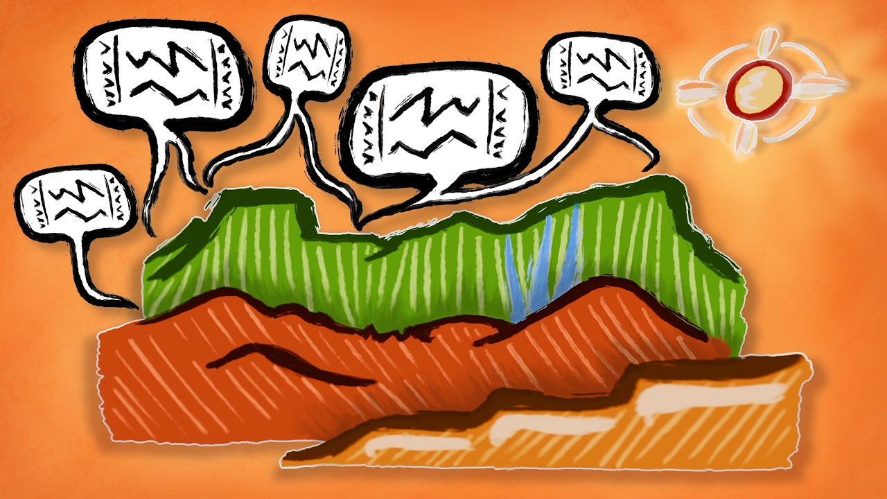
Uppercase doesn't work the same way everywhere at all. Like, do you capitalize the first letter of every sentence? Just every paragraph? Or go big on one illuminated initial? Do your large letters ascend or descend? Could you also have capital numbers? Here are the sometimes eyebrow-raising ways scripts around the world use and ditch capital letters, plus some intriguing not-quite-caps parallels. And by the end, one script on the verge of uncapping itself will make me rethink the story of how a writing system goes about obtaining uppercase in the first place. Call them capitals, majuscules, versals, or some word for big, typographers tell this prevailing tale of how scripts gain upper cases. Once upon a time, large symbols stood tall, their forms well-defined in brushwork or chiseled in stone. Over the ages, trained writers streamlined these into dynamic shapes for writing running texts. After congratulating themselves on their accomplishment, they weren't ready to ditch the old script and wanted to find a new use for it. Well, why not join the two hands? The smooth workhorse lettering for the main text, the complex imposing lettering for visual prominence. At last, typesetters came along and sealed this decision when they put regular symbols in a lowercase and the standout symbols in an uppercase. So, uppercase for prominence, got it. But that leaves a lot of room for, riffing on one of those same typographers, the way each uppercase becomes its own culture. To animate those cultures, which is my goal today, I think I'll drop maps and focus my art on papers and pens, remembering to slow down sometimes so we can take in the visual ink. This is as much of visual as a narrative exercise for me. I looked around for examples that fit three criteria distilled from our opening story. One, a bunch of text is written in mostly plain characters. Two, some characters are prominent variants of those same characters. And three, the prominent and plain unite in a dichotomy of distinctions together within one and the same script. Many, even most of the scripts we've met over this channel's history, never made their way through our letter case fairytale, routinely shirking anything resembling uppercase. Tifinagh in North Africa still sees its old shapes stand tall. Even those scattered tiny Os stamped among their static forms are, despite their look, not lower anything, just full letters. Similar to me are the foregoing of capitalization in finger spelling systems in sign languages. And the feeling I had while browsing an Ethiopian manuscript collection of a kind of aversion to scaling up letters at all. Imagine beautifully illuminated work after work, but nary a larger title or decorated initial in sight. Lacking a lower to be upper to, these get labeled monocase, as if to remind us of what they are missing. Missing, if you're the most complex, though most familiar, of today's upper cases. All the Latin letter case conventions you know and love and can surely teach me more about. There are just so many language-specific norms and adaptations. Behold, compare three, a proper noun, a proper adjective, and a common noun in three Germanic languages. In one, no nouns are capitalized. In another, proper names are, whether they're nouns or adjectives. The third capitalizes only the nouns. We get a window into arbitrariness, where English arbiters capitalize semantically common or proper, German printers famously instill in their written language the use of uppercase as a grammatical signal, capitalizing every last noun. In all their iterations, the ABCs bend prior conventions. Throughout Polynesia, glottal stops, whether curved or straight, show how a letter can be immune to caps. Dutch and one of the two standards for Chamorro extend caps beyond one single letter to capitalize a diphthong or capitalize an affricate. Turkish alphabetists, in their search for more vowels, split dotted I from dotless I, and cleverly realized this implied that uppercase I had long been dotless, and thus needed a dotted counterpart. And that's the one at the start of Istanbul.
Segment 2 (05:00 - 10:00)
And Saanich is now entirely in caps, apart from one solitary dangling morphological S. I'm beginning to realize that even if we limited our scope to Latin letters, we could fill out a robust taxonomy of the whys of upper cases, but we'd be left sorely understudied on the hows of upper cases. So just one more. In a vintage hand, printed for long enough that I was gifted a not too old dictionary typeset in it, Irish spelling can leave capitals delightfully deeper into the word after grammar slaps a lowercase letter on the front, or two, via a process of eclipse. It even falls third from start if that last one's printed in Roman type. Not to be outdone, here's a prominent letter delayed further down the line. I forgive you if you can't spot it. Balinese and Javanese employ special letters as sigils of respect. By swapping one or more within a name, you honor the person. Their unique shapes still stand no taller than regular letters for reasons viewers of my last C scripts journey are 13 minutes too aware of. Said audience may be disappointed to hear there are no leader forms, but they do include one joint consonant. Here are three titles. French books and films tend to use sentence case. Start upper, go lower on the rest. And then two of the most successful of West Africa's invented scripts. N'ko where there is no upper lower difference. And Adlam script for Fula, in which I've seen titles printed all caps. For contrast, months and days of the week are in full lower case. Modern printing of ancient Greek may capitalize just the start of paragraphs. Or nothing if it's not a proper noun. But contemporary Greek made its way through its own version of our opening story from totally mono case to the familiar sentence case. And along that journey, speakers of Egyptian dialects picked up an earlier version of the alphabet and made it their own. On full display in this Coptic illuminated manuscript. Despite their old-timey uncial flare, most letters remain transparent to Greek readers. Not this one. This decorated initial comes from popular Egyptian cursive. Coptic gives us a glimpse, a vision of what had once been seven hieroglyphs refracted through the relatively more modern distinction of upper and lower case. The Nubian version of the alphabet then adds a couple more. Old Hungarian upper case is read from right to left. Notice how capital letters go all in on upsizing with little to no reshaping. I wanted to bring it up mostly because I like how letters can float along the center line. But that's a tiny adjustment compared to what's up next. This is plain text written linearly in a script created for Southern Bantu languages. I should give us a moment here to catch up to the unique use of rotated triangles for different vowels and the markings on them for consonants. Okay, and now a prominent name is tessellated. Playing with geometric arrangements to account for the way shape and rotation work in the script. Cyrillic's uppers and lowers are distinguished mainly by scale. Ever since it gained its casing ability in the early 1700s. At least that's true in print, but cursive is another story. Caps now apply across the many languages written in the script. Just a smidgen earlier for overlapping languages, Glagolitic ah, I can't mention without pausing for effect. After soaking up its distinctive look, consider that despite being put through the printing press, its angular and curved variants were not combined, only resized. Georgian has historically used three scripts, but today you get off easy. This one is all you'll need. And from what I can tell, large letters are mostly ditched except in all caps text to get your attention. Where Georgian has all but given up on them, Armenian goes hard on capitals. Letters in both print and handwriting often take on differences that are sometimes as much shapely as they are sizely. Here, maybe you can spot two uppercase letters I'm told are unusual in a way that's visually striking to anybody in typography. This script, Bété is inspired by camel herding. The starts of proper names and sentences sit at the same eye line as the other letters, but they hang lower. More like lower case lowest case. That difference has knock-on effects. If text is underlined, like in a link
Segment 3 (10:00 - 15:00)
where does the line go? Culturally, I predict most of us would say here, at the baseline. No, their community prefers here, below the descending caps. And those are all of the encased examples that this is definitely upper cases I have to bring to your attention today. Really? But if, like me, you're curious what's on the other side of the line, uncapsable parallels to uppercase, hang around for a stretch. Remember the seven letters Coptic capitalized when hieroglyphs were couldn't? Getting into the reeds, the hieroglyphic parallel I can come up with is the cartouche that bounds names it treats with reverence. Cuneiform names might step even closer to a visual prominence system, and this name shows how, determinatively so. It starts with a determinative that marks its categorical meaning. At least one guy does consider this way of marking off a name to be a parallel to capitalization. This is Ainu in characters that represent full syllables. Make them small, and they shrink to individual sounds. Big ku, little ku. Or e down to y. Classroom Japanese will teach you to mix that same syllabary with two other scripts, using it to set apart foreign words, names, outbursts of ideophones. Okay, yes, but also some authors use it in ways translators think is best rendered in uppercase. So, a good dictionary will spell the word that, adi, in the curvier common script. But, one novelist chooses the sharper script to refer back to a character's trauma. Chinese lacks capitals, but does have a term for them, dasu letters. The same word that's used for uppercase numbers. Financial or bankers numerals take the preventative step of picking a complex, hard-to-modify character with the same sound as the number. So, yi is one if you're in it to minimize strokes, and this yi is one if you're wary of duplicacy. Here's a headline in Korean. — Approximation thereof, it's an article to — Mostly made up of an alphabet famous for its invention and structure. Side-by-side, there still barely hangs on a limited use of Chinese characters as a sort of iconic abbreviation. Three classic Maya examples come to mind from my practice. For numbers and dates and for titles, but none really felt like a fit. I won't get into them. These, further west, are the real surprises from Mesoamerica. How do they come so close to passing my uppercase checklist? So, I've animated the dual nature of books in Mixtec and Nahua scripts. This large-scale schema is read as the plain text of an event, while precise places, people, dates, and quotes are written segmentally. Even directly strung and tied to the participants or speech scrolled out of their mouths. On this page, a person with the name Yac Soso Loca rebuffs a debt-collecting overlord, declaring with speech scrolls that the rabbit tribute has ended. Flowing down the page in connected ink runs, this is Mongolian. Letter shapes differ at the start or mid or end of a word or when the letter's written alone. Wouldn't this make for some exciting letter case instead of sticking to an upper lower case dichotomy four distinctions? Yet of all the things that remind me of but are not caps, this is not caps the most. Similar behaving scripts include Sogdian and here, watch as I flip them horizontally. Spot any resemblances to Syriac or Arabic? Now, in my detours for this, I was intrigued to meet a theory that trims these four forms down to an elegant two-way distinction, letter hearts versus secondary parts. But regardless, it's all done for cursive connecting reasons, not to showcase prominence. That one time Egyptian attempted uppercasing Arabic in the 1930s notwithstanding. One final pause. Help me wind down. As laid out this way, I felt the current of these multi-case systems pulling against the ways I've always been inclined to describe uppercase. Did you manage to detect it? I had to have it pointed out to me. My opening letter case fairy tale was scripted to be simple. Static big develops into dynamic little.
Segment 4 (15:00 - 16:00)
Then the two combine. A dedicated typographer says I missed an intermediate step, a bit of nuance that comes into sharp focus when he takes on the challenge of speed running adding letter casing to the first script I mentioned today. The task required treating the existing letters as tall, static, monumental. Then develop a cursive, literally a running hand with a quick, efficient flow. Not yet a lowercase, but just one that invites the eyes to follow its speedy shapes throughout a text. By analogy with that cursive, develop a type to lowercase for the main body of a text. Side by side with the older letters you started with, used sparsely as standout uppercase. Isn't that kind of what we've seen throughout? A dichotomy of prominent and mundane, and a throughline of cursive. It's less that monocase scripts lack caps, or that uppercase is inherently special, more like scripts need to develop cursive to unlock their latent inner uppercase. Speedrunning inventing cursive so you can have uppercase. That gets Okay. Thank you for joining me as we uppercase the world. On our way out, let me take a moment to appreciate my patrons who make my work possible. Of course, check out my sources document, and stick around and subscribe for more about our world full of languages, cultures, and writing.