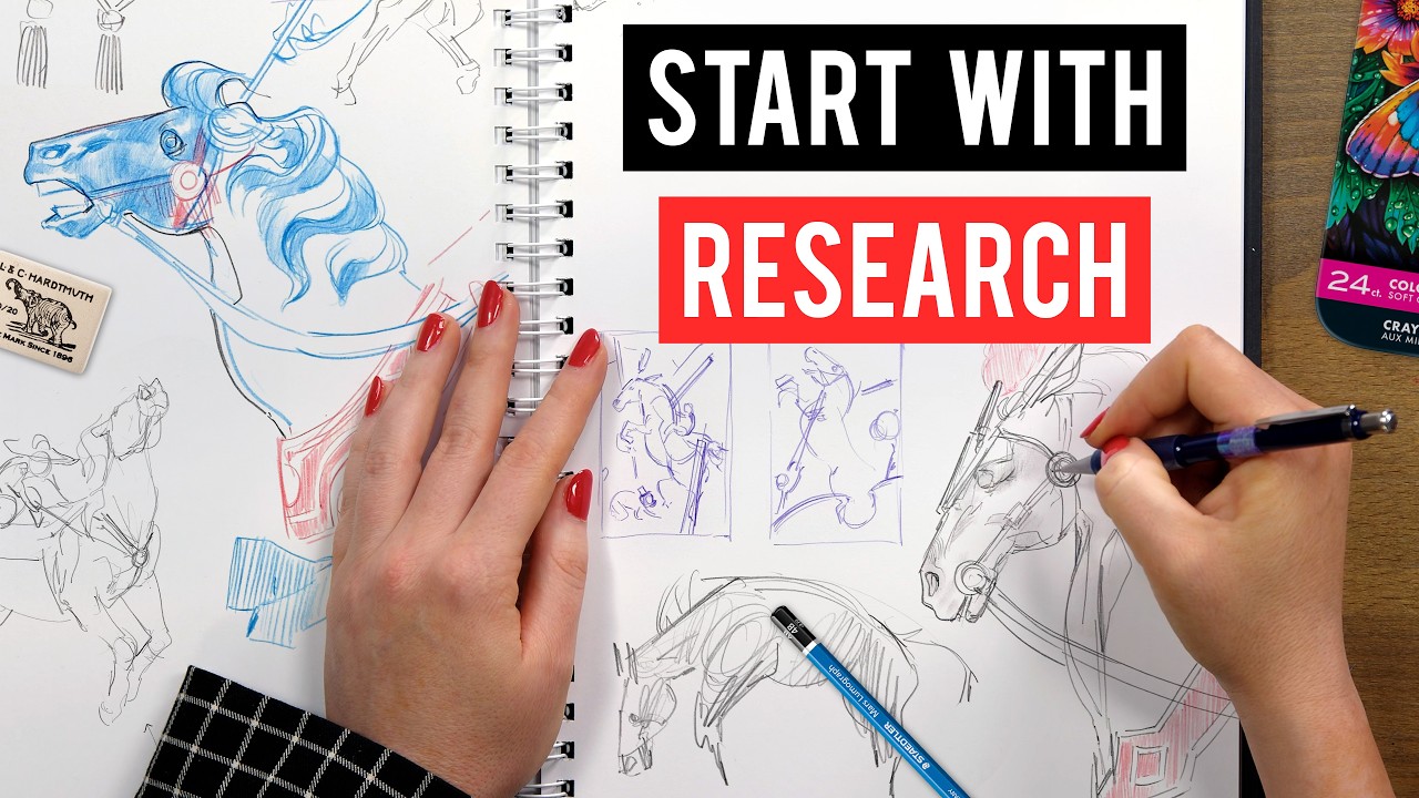
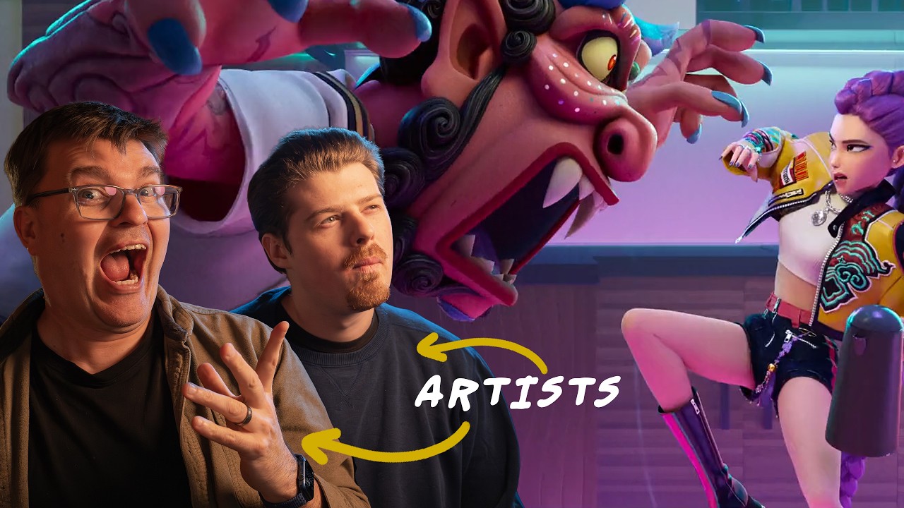
Get Tiffanie's course 20% off during the presale - https://www.proko.com/course/essentials-of-cinematic-lighting
Get ready to learn with @TiffanieMangArt! She'll be demonstrating some ways to paint and answer questions lighting/cinematography during the stream.
#painting #digitalart #artstyle
Subscribe to Proko: https://bit.ly/SubProko
Don't miss new tutorials - Hit the BELL!
Premium Videos - https://proko.com/store
Course Package Deals - https://proko.com/package-deals
Pose photo sets - https://proko.com/poses
FOLLOW TIFFANIE:
@TiffanieMangArt
FOLLOW PROKO:
Email Newsletter - https://proko.com/subscribe
https://instagram.com/prokotv
https://twitter.com/prokotv
https://tiktok.com/@prokotv
https://facebook.com/prokotv
WATCH MORE PROKO:
Latest Uploads: https://www.youtube.com/watch?v=-Pu1uGh1-Y4&list=PLtG4P3lq8RHH0YGMCXa4uWsHVwTDkDcpN
Figure Drawing: https://www.youtube.com/watch?v=74HR59yFZ7Y&list=PLtG4P3lq8RHGuMuprDarMz_Y9Fbw_d2ws
Art of Caricature: https://www.youtube.com/watch?v=FOURPIkpPXk&list=PLtG4P3lq8RHEkeRGn6aFRct0kq4oDwwTa
Popular Videos: https://www.youtube.com/watch?v=1EPNYWeEf1U&list=PLtG4P3lq8RHHR_SKsGtufNd8uo2L7_vTQ
ABOUT PROKO:
Instructional How to Draw videos for artists. My drawing lessons are approachable enough for beginners and detailed enough for advanced artists. My philosophy is to teach timeless concepts in an entertaining way. I believe that when you are having fun, you learn better. I take pride in producing high quality videos that you will enjoy watching and re-watching.
Оглавление (21 сегментов)
Segment 1 (00:00 - 05:00)
Hello everyone. Welcome to another Proco live stream. Today we're joined by Tiffany Ming, a person that you have definitely seen on the channel before. uh whether that was teaching you about all the mistakes that you're making in painting, how to use uh layers and blend modes or you've seen the work that she's made in the past uh when she worked on Mighty the Mighty N or Marvel's what if uh among so many other things. Um so today we're gonna be talking about a brand new course that Tiffany has. I believe this is called the essentials of cinematic lighting. — Yep, that's it. — Okay. It should be a fun one. this some of the things that we're going to be going over today are going to be uh rapidly iterating on the lighting inside of a composition a piece that you've got. It's something that I think that people kind of underell the importance of getting early on in the piece because we've all been in that spot where you've made these lines, you've made this composition, you're like, "Oh, they look so cool in here. Wait, how the heck am I going to color this? " — Yeah. getting those things in nice and early before you really spend time rendering something is really good. So, we're going to go over some of that. — Awesome. Yeah, thanks everyone for joining. Super excited to be in this live stream and yeah, I'm going to be showing you guys um how I would take in this case uh a film study because the composition is already there. So, it's really nice and how I would take it from a matrix study and think about relighting it from the original lighting that um from the original film still. So, I'm definitely going to be showing you guys some cool, I guess, tricks, quote unquote, some shortcuts, and also how to um color, I guess. It sounds kind of funny, like a coloring book, but how to add color to that value um value study so that you don't have to start from scratch. So, this is kind of a method where um if you work on Adobe Photoshop or any honestly any program for that matter, um you can use blend modes and things like that like what Stephen was talking about — and really get a quick iteration of color before just then doing some good old painting um you know with just the painting skills that you have. So, I think I'm going to be talking about all that and yeah, super excited that my essentials of cinematic lighting course is out now. Um, I put I spent um a lot of time making that course and it's basically everything I wish I had learned being a color key artist and animation and kind of distilling all that information into this course to provide you guys with the next steps of okay, you feel like you know how to paint, you understand composition, technical lighting. Now, how do you push that further to really sell the story, mood? Um, and how do you use color more psychologically, more symbolically, um, more deeply, more intentionally to be able to make the viewer feel something? Because — I think a lot of times it's like, um, at least what I see when I teach students like they develop those really technical skills of being able to copy something really well. And I was like that for like 11 years. And so when I went to college, I had no idea how to make up something. I was like, what? I only knew how to copy master artists and that's that was my training in art school like what my mom sent me to — and so this course really teaches you how to invent things more um in terms of um lighting and color and um which is a really different skill from I think being able to copy an image or copy a still life or you know render something really accurately. So, — absolutely. Yeah, I think that's it's a common one that comes up a lot where someone's built up these skills that let them do the what are the fundamental things like they've learned how to render something. They've learned uh how like they've learned about anatomy, you know, what they know all these different things and then it's just what you do with that next. — Exactly. — One thing I wanted to bring up here at the start of it uh is a thing that's come up before when we did a live stream. What do you mean by matrix study? Oh, okay. By Matrix said, "Yeah, that's a really good thing. " Um, I I won't be showing that in this demo, but I'll talk about it because it's something I talk about in both courses on, excuse me, that I have on Proco
Segment 2 (05:00 - 10:00)
essentials of uh painting and essentials of cinematic lighting. I love to start off with matrix or no tan studies, which is basically two value studies. It's a fancy word for saying two values like what you see there um with my messy lines as well, but basically you're exploring light and dark harmonies. And sometimes no tan studies uh or matrix studies. I heard matrix Bill Perkins call them matrix studies but then I've also heard them called no tan studies. No tan studies is um light dark harmony dominant. So for example um instead of being light shadow dominant, it's light um light dark p dominant. So you're really focusing on those light dark patterns which is something I talk about heavily in the cinematic course because as a color key artist or any really as in any artist in general whether you're fine artist or working in the industry I honestly think this applies to anything being able to see the light dark harmonies is paramount and important and fundamental because you're able to basically go back to the abstract and see those underlying patterns of shapes that are making up your composition that weave together regardless of the detail, the light and shadow and things like that which all comes into play after um — I think it helps them. — Yeah, I can show a really helpful sheet in Photoshop later actually if anyone's in that and I talk about that in the course as well. And then there's also like no tan cheer scar dominant which is you're still doing two values but it's light shadow dominant. So think of like Rembrandt um you know like very cheer girl like very um contrast and light and shadow. So it depends. Some paintings you'll study, some film studies you'll study are very um light shadow dominant and then some are more light dark harmony pattern dominant. And I think being able to distinguish that is important. And from starting from that then you can build up to value studies right three five value studies or you know multip or multi value studies and then going into color. But I do believe the basis starts with no tan studies. — Yeah, absolutely. Yeah, I think it's those things that you can do early on to prove whether a composition or a value structure or color structure is going to work later so you don't have to try to reinvent or save something later. — Yeah. — So, all right. So, you said we were going to go through some of the demos that you have inside of this course that's on sale right now for 20% off over on pro. comm. Uh you can also buy pretty much anything on the website for 20% off, but we'll talk about that later. Uh so how do you want to start today? What show us? — Yeah. So today I'm going to show you a two-part demo. The first part I'm going to show you how I take a matrix study that I did and relight it um from the original film study. So we'll talk about that first. So, we're going to first be dealing with value in the first part and then the second part I'll show you how to add color to that film study and what I'm thinking about in terms of color and mood and all that. Um, and then feel free to ask questions guys um in between and then if we have time later on I can pull up my Photoshop as well and go through the PSD files and talk about any extra stuff and show any extra helpful sheets that might be helpful. Um, — heck yeah. All right. — Yeah. — Let's see some art. Let's go. Let's start it. Start it up. — Okay. Wait. So, do I share my screen? — Yeah. You just um bring what you want to have on your screen for the video or Photoshop. Uh, and then I'll add your screen in here. There we go. — Okay. I have it up. Do Can you see it? — Yep. — Good. We're good. — Yeah, we can all see it now. — Okay. Perfect. Okay. So basically before I start um so basically this was um this is not the full this is like part of my demo on the course so you'll see a little snippet of it but basically before what I did was I started with a value study um of this peiquey blinders film still which it's not the film still on the bottom this is a reference I'm using to relight this film still um hopefully you'll see it later um but basically I am now going in. Let's take out the music. And I'm going to start re-editing my matrix study to kind to reflect the lighting that I have in mind that I want to change up. So basically in the original Peiquey Blinders film still, by the way, I love the cinematography in that show. I think it's absolutely beautiful. So I was like, I need to do a film study of this. — I was like, perfect. I'll do it for the course. Um I right now before actually let me just go back. So before the lighting was coming from the top left
Segment 3 (10:00 - 15:00)
right? So understanding where the lighting is coming from is really important. Sorry, top right. Mommy brain top right. Um and so they're casting these long shadows. Sorry if I don't make sense, guys. Um and which I love. It creates a very dramatic composition. Um this you're seeing this is it's like half matrix half value because I turned off some of the layers in my dark copy. So basically um if you watch my previous live stream of proco I actually go over how I go from matrix to value. So definitely watch that previous live stream I talk about — but after this one you guys hang out for this whole one first and then go watch that. — Yeah. Go back to that one because I talk about how to do matrix to value and it's the basically the same process as this. So, I like to have my darks, as you can see in my layer panel. I don't know if you guys can see my cursor. Can you see that? — Uh, I don't believe I can. — Oh, dark. I should be able to. — Okay. Well, — where is your Yes. Yes, we can. can. — Okay, cool. So, in my layers panel in the right, you can see that I have a dark layer. That's basically all my blacks in my noan study. And then all my whites, because the no tan is two values, so I like to do black and white, I have underneath that layer. So um I had values in this but I deleted them because I just want to start back with a matrix study to figure out the overall um light shadow composition in this case. In this case I will say this peer blender film sill is light shadow dominant because we have a really prominent light source. The characters are mostly in shadow and their rim lit from the right and so you can see these long cast shadows being cast. So, um, so, so I would say even with a no tan study, I was focusing on light shadow shapes, if that makes sense. So, with that in mind, what I'm going to do now is I'm starting to edit this. And what I'm picturing is that now the lighting is coming from the front. So, like basically as a viewer, we're looking at sorry, the light is coming like from where we're looking at them and it's kind of lighting them from the bottom half. So, my reference on the bottom from a killer's kiss, I really like that soft lighting that's on her face. And then what I also really like is this nice crisp rim light hitting the top right of her head and her um and her shoulders. So, it creates a really nice hierarchy, right? There's like a soft gradient on her face and then you also get this crisp rim light. This kind of like Yeah. almost back rim light. So, there's kind of two light sources going on, which I really like. What I also really like is how the shadows are h dang it, my cursor thing is showing up, but how um the left side of her head, those shadows are really grouped in with the background and there's a hierarchy in the film so reference that I'm using, whereas her right side of her head has more contrast. So, these are things that I'm analyzing in references that I use for my own paintings. I'm not just kind of being like, "Oh, it's pretty and I like it and let's see what happens. " It's like I'm actively analyzing what I like about the reference that I'm bringing in and what I could take into um you know, my own paintings. And so, I kind of want to utilize that. Um this was the main black and white reference that I have. I don't often have like a ton of references. Like sometimes if I find that one or two images can reflect what I'm going for, I have I guess enough in my visual library to be able to kind of make the rest up, quote unquote, or just be able to go from there. Because sometimes if you have too much reference, I find that it can be confusing and you're trying to copy everything at once. — So um sometimes I'll just have, you know, one to two main references. I just want to point out so that there's a thing that that's happening since this is a recorded video. This is you working on this — that some people when they see that you're working on something and you zoom out super far away. — Yeah. — This is a useful functional thing. It's not just like this person recorded a video and I can't see it because it's small. That is also how you would recommend working on this as well. — Oh yeah, for sure. I know. I always need to say that in all my demos because I literally work zoomed out three4s of the time and so you're really seeing me how I work in real time. I don't ever work zoomed up. Um another helpful unless I'm really working on detail then I will but in the beginning stages no. Um so you're really seeing how I work in real time. Um I think zooming out is really helpful to see the big picture. And another helpful thing is to have a navigator, which I don't have at this point, but having a navigator would can help you see your painting as a thumbnail as well. So I believe — like the little smaller window version turn on turn off.
Segment 4 (15:00 - 20:00)
— So I believe if you go to Windows navigator that will pop up. So now what I'm doing is I'm changing the value key a little bit more. So talking about value keys which is another lesson in the course value is everything to do with mood right a lot of people think oh it's color but it starts with value first which is why I'm showing you how I would approach a value study before coloring the study um this value study that you'll see later. So what I'm picturing is that their silhouettes at the top are almost kind of blended into the background. I want the background to be a little bit darker, a little more ominous. And so I'm going for I'm changing up the whole thing to feel a little bit more artificially lit, but also ominous, a little bit more foreoding. Whereas the original one, which I wish I had the I will show the original film still later on, I think, but not now. Um, it's a little more natural. It's um maybe not as foroding, I would say. And so I gave myself a word that I wanted to emulate and I was like, let's see if I can um make that feeling come with a value study. And — foroting or — yeah, kind of like forboding or a little um ominous or tension was kind of what I was thinking. Um kind of like I was imagining these guys emerging into the light like something, you know, fight's going to happen or something. They're coming towards the audience. And so, um, that's kind of what I had in my mind. And so, what I'm trying to do right now is I'm just trying to, you can see I've clipped my layer to my dark copy. So, everything in my dark copy, everything I clip to, it's only going to affect the dark copy, which by the way includes this for this wall, these shelves right here, and the characters. I just like to have everything in one layer because it makes it easier that way. And so, those are the things that I have. And then everything else is in the background. So like whatever the cargo in the back, the lights, that's all in the background. So whatever I do underneath this dark copy layer won't affect my dark layer, right? And so that's just a simple way for me organizing without having a ton of layers because I'm not a fan of having a ton of layers. Um it tends to slow me down. So, um, so yeah, that's kind of in terms of technical organization. That's kind of how I'm organizing everything. And so right now you can see I'm just getting the basic initial value study or sorry, value arrangement in. I'm just kind of seeing, okay, how would that look if they were starting to be lit? Now, I'm going to soften the edge of that shadow light to shadow a little bit because I want it to be softer like the reference. And obviously now the characters are getting a little bit lost in the to the background, but that's okay. We're going to add some backlight later and things like that. So I'm still building up and yeah, the piece little by little. Now here's original reference. So here's original reference. You can see how different it is. It's basically all naturalistic lighting. Naturalistic in a sense where they still really push the atmosphere, which I love, right? like they separate the characters by just adding a bunch of that kind of atmospheric misty light coming in from behind them. And what I love is that there's still this beautiful rim light hitting the characters that just separates them. So, there's beautiful hierarchy in the film study that I'm noticing as well. Um, and those are things that you should learn to develop your eye as a painter. Honestly, whether you're a landscape painter, a portrait painter, it doesn't matter. I think all these things can apply whether you're working in the industry or not working in the industry. I think that's what separates good paintings from great paintings is be able to build up your eye this way. — And so, yeah. And so, noticing those little things like the highlight on his face right there, like that tiny little highlight, and then like all these shapes that are describing the planes of their face and their hands and things like that. Um I think that is — really good to notice. — Yeah. — I was going to say so this is also a thing that for a person who's not necessarily working from let's say like the most ideal reference. — Yeah. — Um this would apply even to a person who's out in the world doing some sort of like plain air kind of painting. um maybe not plain air directly, but something where they're working from reference that doesn't have the exact lighting that they're looking for. Whether that's them making something for a comic, whether it's just for fun. Um — they can use those skills to start from reference and then depart from that as — That's such a great point, Stephen.
Segment 5 (20:00 - 25:00)
Yeah, like um and yeah, exactly. Like if you understand how lighting works, but also know how to push it, you're not beholdened and a slave quote unquote to the reference, like you can depart from it, right? And that's a really powerful skill to have, right? Like it's not like a lot of times when I go planer painting, the light has changed, right? Like if I go in the sunset, the light is gone in 20 minutes. I'm often painting after the light and I'm making choices. This is planer painting. I'm making choices based on my painting and based on what I know works and doesn't work even though the lighting has completely changed to twilight or something, you know. — And so I'm able to do that because one, I've built up a visual library in my head. And two, I'm basically working with my painting now to determine, okay, does those light shapes work? Do these shadow shapes work? How can I group things more? How can I Yeah, how can I group things? Make things more dramatic or maybe soften things up a bit, whatever. And so, yeah, that's a really good point. And I think um even though this course is focused on studying cinema, which I think is a great way to elevate, not elevate, I'm sorry, but go from plain air, master studies, and to cinema. And I talk about this in the first lesson of my course. Um also my train of thought, even though I lost my train of thought. Dang it. — That's okay. you were saying um about how when you uh you have to work from kind of like the memory of what the lighting was uh and then after that you get to use the knowledge that you've built up to then uh make the lighting as you remember it or you want it to be even when lightning has changed — drastically. Yes. And oops. Oh, sorry. Oh, no. Did Sorry. — Oh, you're okay. — Did you Wait. Oh, no. What did I do? Sorry, guys. — I don't know. I I'll uh take your screen away for a second while you sort that out. — What the heck? — Where did it go? — She's going to find her. Yeah, her uh the video that she was playing the demo from the course. — It just like totally deleted itself. — In the meantime, I will show you guys uh that over on Proco right now. Uh I'll add this in. Everything on Proco is on sale for 20% off. So, even if for some reason you've been eyeing one of these courses that we've been talking about, uh, but it just wasn't quite cheap enough, you can do it now. They're here for cheaper. And, uh, if you guys want a little bit of a hack, don't tell everyone I told you this, but you can get a greater percentage off of things if you bundle stuff. I know it sounds like I'm just selling you on something, but if you find a free product like let's say the Proco free course sampler and you add that into your bundle, that will also increase your sales as though you had bundled normal products. So, you can save a little bit more uh for not paying any additional money. That's my tip to you guys, okay? Don't tell anyone at Proco that I told you guys this. Um, okay. — I'm back, by the way. — You got it. Okay. — Yeah. I don't know if you guys can see it. — I will bring it back up now that I've told everyone the secrets to how to save additional money on Proco. — And I've got a bundle, too, guys. So, if you want to bundle the essentials of painting with this course, essentials of cinematic lighting, — they go hand in hand. They're designed to So definitely take advantage of that. — I'll put that link here uh on the screen and then I'll also drop that in the chat because a bundle is a very good way to save. — Yeah, I agree. Let me know when it's back up. Sorry guys. — It is up now. — Oh, it is up. Okay. So, I remember what I was saying because um someone asked a good question and um when I was gathering questions and they said, "How does studying a movie scene different from a master study? " And I think that's a great question because I talk about this in my in one of the beginning lessons in the course where I say for me personally the three tenants of being able to build up your understanding of light and color and all that is plain air painting which you know I'm a big proponent of u master studies fine artists um and you know digital artists all that stuff and then cinema and studying films and that's so fun because you basically get to watch films and do film studies and value studies and whatever. I mean, there's no better homework than that. Um, I think it's different in a way because I think movies, it's like they take the na the way that light works naturalistically and they push it in terms of color and value structure
Segment 6 (25:00 - 30:00)
contrast ratio, value arrangement. And so, you can just have a variety of ways to light a night scene. you can have a variety of ways to um do a day scene, an interior scene, right? And it really depends on the context of the movie. And so I really think when you have those understanding of how light works in the natural world from plain air painting and also from studying the masters and how they designed their compositions and how they used color and also push color, then when you study films, it kind of makes sense in that tiered way. And so I think that's how it's a little bit different because I feel like if you just went straight if you didn't have the foundationals and you just went straight to film studies, it might be a little bit overwhelming and you might not understand like why is this night so blue here and then this other night is so dark and grayscale, you know, or whatever. And so when you don't have those foundations of oh okay maybe the cinematographer is making these choices stylistically or you know psychologically or story-wise you it might be a little bit confusing. — Sure. — So I think that's why I like to encourage students to kind of study in that way to be able to build up the fundamentals properly. One person in the chat here mentioned the thing that you have recommended and I think many people recommend because it's so it's such a good tip um was using shot deck. com. — Yes. Yes, exactly. I use shot deck every day for work. Um it's honestly really fun to just kind of type in some brief keywords and then go down a rabbit hole and just explore a bunch of films, not just one film. I'm really bad at thinking of films at the top of my head, so I need to just pop in keywords and just kind of see where it takes me. But yeah, shot deck is a great way to gather reference that way. For sure. Yeah. — Yeah. It you just you get to see all these things and study the why and the how of the images. — Yeah. — It's an infinitely handy resource. — Yeah. And actually another person asked like are there is there some keywords for searching in Shot Deck regarding the lighting? Um, honestly, sometimes it's a hit or miss for me. I don't think I'm the best at typing in keywords, but I just type in I find like actually when I type in something more generic, it helps when I when I'm too specific, it doesn't show me anything sometimes. I don't know if I'm doing something wrong, — but I'll be like backlit or sunset, you know, just like one or two words and some and then it'll give you a wider range of things. And then if you find one film still that is like, oh that really matches the mood that lighting that I'm going for, then it'll show you more similar things to that. And then you can start to narrow down that way. So that's kind of my personal experience with shot deck — because I'm not the best at typing in specific keywords. So I'll sometimes be like quite loose and then it will actually help me find more interesting stuff that way. — Yeah, I think it's a great way to do it. — Yeah. Um — All right. So, it looks like you're you've now decided to start pulling out some information in the background. — Yeah. So, now I'm going back to the background. I'm not quite done with the people yet. Um, I'm going to add more stuff later, but I'm right now what I'm doing is I'm just bringing some of those layers forward, but then I'm toning down the value a little bit so there's not as much contrast. So, I'm cli I'm whatever this um I don't know what that icon is called, but whatever that icon well my layer panels disappeared, but I can just affect that layer. And so, that's the benefit of having Oh, what happened here? there you go. of having certain things on different layers is that you can adjust them independently. And so, you can see I called them light rails just cuz I don't know what to call them. And now I'm just playing with some rays. And the direction I'm gonna see I'm gonna play a little bit around with that. It doesn't make sense right now what I'm doing, but I'm going to rotate it a little bit and play around with that. So I'm just using the lasso tool to add some rays or atmosphere. And I have this other reference from Piquey Blinders that I really liked. And so I'm just going to play around with that. And then what I'm going to do is I'm going to soften it so you can't see, but I'm going to go to window blur. Uh what is it? Let me see. I have Photoshop open here. — Motion blur. — Yeah. So filter. Yeah. Filter and then blur and motion blur. — And then that just really softens the edges a little bit. And then — I have that on a separate layer. So now I can lasso it out and then independently rotate it and kind of see what works and doesn't work. I'm kind of going by feel at this point um to see — kind of more compositionally like does it — does it match? Does it look okay? Um so I'm just kind of playing around with that a little bit, but I don't want it to be as prominent as the bottom
Segment 7 (30:00 - 35:00)
reference. I just kind of want it to be a little bit more subtle. And then now I can skew it and then I can erase what I don't want. So I often use masks a lot to erase because it's not supposed to go over the cargo in the back. So I'm just going to erase them — and match it up. So masks is another really powerful way. So I'm going to use a mask right now. I messed up. I need to not have that. — And that for that one, that's the layer mask. — Yeah. — For that one, — I messed up. — And the one before was clipping masks. — Yes. So I love masks. — Both of which are things that you have access to, not just in Photoshop. For anyone out there who's a Procreate user, you can do clipping masks by having the one layer take the opacity of the other or the alpha of the other. Uh, and layer masks are also a vi a thing that you can do in there. Don't think this is just Photoshop. — That's awesome. I didn't know that. So, that's great to know. Yeah, all these stuff you can do and not you don't need to pay for Photoshop. It's frankly expensive. I need it for work, but um most programs have access to this and so you can, you know, clipping mask is kind of a really nice basic thing to be able to, you know, clip things to a layer and get clean shapes. So I definitely use clipping mask as part of my everyday workflow. Um and so and then masks, those are my two things that I probably and gradient tool. So like what I just did, that's a gradient tool. Great for adding gradual atmosphere. I like to have it around 19 to 30%. You saw me just adjust that. And so, — um, I use gradient tool all the time. I learned it when I was working at Marvel and my art director showed me and I was like, never used it before and then now it's just — part of my workflow. So, um, you if you don't have the gradient tool, you can use a soft brush like what I'm doing now. So, there's always alternatives. Uh the gradient tool is just a fast way to sort of get a gradient with a color. So — yeah. Um so now I'm just let's see what I'm doing now. Yeah, I think I'm probably going to go back to my people now and start uh adding a little bit more. Oh yeah, I'm playing around with the shadow there, but I take that out. So there's a lot of things you'll see me like play around with. I'm like, nah, that doesn't work. Um, I thought what the shadow casted in the — in the back, but I kind of decided to take that out. I thought that was really distracting. And I'm kind of keeping the back pretty abstract, too. I'm not going to really render anything. Although, now I see there's a line right in the middle, and it's really bothering me. But I don't think I take that out. But you'll see me playing around a little bit. And so, and then in the end, I will just end up doing some good old painting. Um, but yeah, none of this is working right now. to just kind of ignore all this. I'm just playing around and taking out. But it's important. — That's how it's going to go. It's You will do it. It's important. — Exactly. Yeah. — I did have one question from some people here in the chat. — Yeah. Ask away, guys. — Okay. So, uh just one I think I'll do one that is about the course. Uh but first, we'll talk about one that people just wanted a specific tip. Um, so trickier crab 59 in the chat asks, "Uh, could you give uh could you give a pro tip for developing the painters's eye? They struggle with accurately seeing shapes and forms and feel like they're copying instead of creating. Uh, is there a way or a mindset that helped you to learn and simplify subjects the way a painter does? " — Yeah, that's like basically the thesis of my other course, Essentials to Painting. I want to teach people to see first. I believe seeing accurately and intentionally will help you paint better. So, it's not just the skills that you need to render whatever, it's actually first seeing. Um, that's a great question. Um, you know, I'm going to say planer paintings. I think planer painting forces you to just get out there and um you know with the time restraint just to simplify shapes and capture the main statement instead of copying something. You can't copy something in planer painting. You just can't you don't have the time and the lighting is changing. So it's almost impossible to sit there for hours and just copy unless you're going back there for days at the same time and then working on that painting which usually most people will not do. So I would say planer painting is another one. Another thing is I liked timed exercises. So for example my other course essentials of painting I give a lot of timed exercises where I say do master studies with one brush in 40 minutes. that's gonna naturally force you to simplify and um to really focus on the biggest most important masses instead of going into each little area and rendering. So I think timed exercises and quantity over
Segment 8 (35:00 - 40:00)
quality is going to be — really helpful in kind of forcing you to change your mindset and change the way you see things, right? Um, and the more you do of those, then the you'll start to notice that you'll just start to see things differently. It'll just happen, right? But that comes with the thing that people don't do enough is that comes with quantity. People focus a lot on quality. Like, oh, is my picture beautiful enough? Can I post it on Instagram? Whatever. — Yeah. — Forget about all that, you know? It's about just making a bunch of crappy stuff first and then you'll start to see improvement. So, I have to say those three things are really important. Yeah, I would say those are my biggest tips. — I agree. Yeah, I think learn working at scale and working quickly, those two things alone, even outside of the idea of making a bunch of bad things uh and thinking that you're just making a bunch of bad things, you'll end up doing that as a product of work working smaller, working quicker, — working smaller. I forgot to say, thank you. The last thing I say, work in thumbnail size. So, some things um sorry, I didn't mean to interrupt you, but some things like for example in Photoshop, try not to zoom in. So like work at that size what I have right now or smaller. — Um if you're doing traditional cut tape out your paper into four quadrants and do small painting thumbnails, things like that will really help. — Yeah, very much so. They're important. It's the way that you learn quickly rather than you spend, you know, however many hours on something — and at the end of it you're like, — "Well, I made some really nice hatch marks, but the composition sucks, so this means nothing. " — Exactly. Yeah, — actually here. If you find yourself going to post the things that you made on Instagram, but you zoom in and you crop in on something first because you like that one area of the thing more than the overall thing, you should probably do more simple studies and thumbnails. If you find yourself posting your entire piece more often, you can move on more. Uh the one other question that I had here was actually about the course, and you kind of already addressed this a little bit. Um, but this was uh Emway. I don't know how to say this name. I'm so sorry. Um, but uh do you recommend taking your previous course, Essentials of Painting, before taking this course? And what certain skill level should they have before taking this course? — Yeah, a beginner, could a beginner or an intermediate student jump straight in on this one? — Um, so here's the thing. I think it depends on your skill level. If you've been working in the industry or you're you know you're um you know intermediate painter I would say chances are you you don't have to take the first course. Although I will say I've had a lot of advanced painters take my first course and they say it's actually hard because it the exercises themselves are not easy in my essentials of painting course. So, I cover fundamentals that I think every painter should have, but the exercises themselves are quite challenging, even if you are a uh experienced painter. So, I've gotten that feedback. I've I've had people in the industry take that course. I've had beginners take that course. And so, I would say regardless, it's just a great course to have even if you think you're intermediate. I will say for my essentials to cinematic course, I was, you know, looking at the homework and everything. I will say I don't want you I will say it is definitely you know I would say intermediate just because some of I think the in the beginning the lessons you know about no tan and value it's like everyone you know probably has heard of value at least and so it's like oh that's nothing new um but then the later exercises in the homework can get a little bit more difficult if you don't have the fundamentals instilled so because of that reason I would say it is just more of an intermediate course. But with that being said, I mean it doesn't mean that you can't get it and then challenge yourself and then see what you struggle with, right? — Yeah. — It's really up to you. — A really common thing that we found is that there are more people who think that they are beginners while being intermediate students than you would ever expect. There's so many people who like uh there are plenty of student or uh plenty of artists out there who definitely have mastery over the medium that they're working in, but they talk about themselves like the you know the I'm learning every day kind of way. While someone else who looks at their work is like, "No, you're incredible. Like go have a solo show. Like this is amazing. " So you're probably — that Yeah. the thing that you can't be trusted on, people at home watching us right now, is to know what are what you're really good at and what you're really bad at because you're probably not judging it correctly. Um, — exactly. Yeah.
Segment 9 (40:00 - 45:00)
— Yeah. I think that's a really good point. Um, you know, you're you know your skill best. You know, be honest with yourself and um and I think that's so true. Like Yeah, exactly. Some people are like, "Oh, I'm beginner. " But I'm like, "No, you're pretty good. " And then some people like, "Oh, I'm intermediate. " I'm like, "No, you need to go back to the fundamentals. " So, it like goes to both ways. — It happens so often. Um, there was one other question that I'll just answer real quick here. Uh, someone had asked, oh, I don't have the name. Uh, this was uh America 999. They asked any classes for Clip Studio Paint. Um, we don't have one that is specific to Clip Studio Paint, but one thing that we don't have on Proco in general would be like, let's say, a Photoshop masterass or Clip Studio Masterass or Procreate Masterass because no one on ProCo is teaching exclusively things that are specific to the software in that kind of way. uh they're teaching you concepts, but very rarely is there something that is specific to that software that they're going to show you that you will need to have that software for. You can apply all of the ideas of not value studies, uh of color theory, um blend modes, even things that are specific to digital software, uh like blend modes or um clipping masks and things like that. those are going to be the things they'll talk about and those are in all of the software that you're going to use. So don't think that just because you see someone working in another piece of software that those things don't apply to you. Uh it's going to be more like you are translating the skills that you have from traditional to digital more than you having to just be totally in the dark because you're using a different piece of software. pick up a course if you want to, but also feel free to just look at the YouTube channel uh and see if you when you see someone working in Photoshop, if you can be comfortable translating that over to the software that you use. So, um Tiffany, we are now at our 40m minute break that we had pre-established. Do you want to take that? — Yeah, sure. Um I can just run through um before I do that, I'll just Should I just run through this a little faster? Sure, if you want to. Yeah. — Okay. And then I can pull up the PSD because there's some things I worked on after that I didn't record. Um, so I can pull up the PSD and then kind of talk about that. But I'll just Is there a way to run through this faster? Oh, okay. Pull play button. — Yeah, just on the timeline there if you scroll through. — Cool. Okay. I have it at 1. 5 speed now. Um, just some things um that I'm thinking about. I'm What am I thinking about? Yeah, I I'm starting to Let me see where it is. I'm starting to just see if I can bring out a little bit of the underlight in their faces because um there was another film still that I didn't bring up that I thought was really cool to just to give a little bit more light to their face. And you know, even though I don't have a lot of information about their coats and everything and the original reference image, I can kind of make it up and kind of go, okay, the interior vest, the coat, and kind of just put on some shapes like that. Um I'm not trying to focus on detail at this point. is just kind of trying to get the overall mood in. And so I'm also trying to bring them out and separate them a little bit more with that kind of harsher, stronger rim light coming from the left side and kind of separate them a little bit more. And then once I get to a certain stage, I'll just start playing with little nuances. I fix up the shadow on the ground a little bit more, but a little bit of the nuances um such as should I darken the background a little bit more? How much contrast do I want between the characters and the background? I can play with those things infinitely. And that's kind of the fun part. But you can see now all these highlights that I'm putting on way too bright. They don't work. And so I'm kind of just adjusting and just subtly making them a little bit darker, zooming out constantly to see is the rim light on the right on the left too strong, etc., etc. And so um I'm constantly assessing things in terms of value relationships, which is really important because that's going to feed into the believability of uh of the lighting. Even if we push it a little bit like so there's some things that a lot of you know stuff you'll watch it's like oh that might not make sense. It's like where's that light coming from but it creates such interesting shapes you don't really second guess it when you're watching a movie or something right so that's also what I learned in some other class it's like you can cheat the lighting a little bit if it's helps to serve the mood that you're going for. Um and so that's another fun thing to Let's see. I think someone
Segment 10 (45:00 - 50:00)
asked, "What are my top movies? Black and black can be black and white. What to pay attention to? Is there some hints on when to pause the movie and observe something? " There's so many great movies to watch. I think watching a variety of genres is great from like crime and thriller to even comedy because comedy is going to have really different lighting — than let's say drama. Comedy has a lot more soft lighting and quality of light is another thing I talk about in the course. — I'm not talking about the brand of lighting. I'm talking about hard versus soft lighting. — So, you're gonna see much less harsh lighting, contrast and I like to site one of my favorite ones as Bridesmaid. That that's comedy movies. — That's a nice flat soft light. — Yes. Flat soft light because they don't need that drama. It's a very heartfelt, you know, dealing with every day versus something like Star Wars or something like Pey Blinders, dealing with crime and I don't know, um, things like that or Breaking Bad. I always reference that because I love that show. Um, Bladeunner, you know, I would say — good. That's a good one. — Yeah, I would say. Okay, so this is the final. And then I didn't toggle it correctly, so I'm like, wait, what's happening? Um, I need to turn off the other layer. I can share my Photoshop screen. So, here's the original one. Original. And then here's the relighting. Um, but I do touch it up a little bit in Photoshop. So, I'll show that really quick and then we can take a break. Um, — the thing that I like about what you did with the new version of the lighting is you had that part on the top of them where their faces would be obscured, you know? So, let's say it was the end of the season or something and there's a character that you thought was dead, but when this whole group of people walk up and you see them approach and you're like, "Oh, it's probably like, you know, the guys that I expect to see. " Wait, there's five guys, not four guys. It's Tommy. Oh my god, Tommy's back. — Tommy's Did you watch it, too? Yeah. — And is there a Tommy in Pey Blinders? I've never watched it. — Yeah, there is. The main charact Yeah, the main character is Tommy Shelby. Wow. No, I had no idea. — Oh my gosh, that's so funny. Yeah. Um, I would also I really love the movie Immortal Man. Uh, the story was okay, but I love the lighting. Like the I thought every scene in that paint in that movie felt like a Turner painting or a Frederick Casper Frederick painting. Like I just thought the lighting was so cool. So I think it's on Netflix. Picky Blinders Immortal Man. I you have to kind of watch the series first to understand what's going on, but if you don't, it's so cool to watch it for the cinema. Um I'm kind of trying to figure out why it's not showing. Hold on. It's I shared my screen, but it's not showing. Oh, entire screen. Okay, there we go. — Yeah. — Can you see my Okay, there you go. Now you can see my layers panel. — There we go. So, um yeah, here's here is the um the relighting I did and then here's the original value. Here's the original matrix that I did. So, then I took that matrix and then I turned it into this by editing um by changing up the shadows a little bit. Right? So, you can see from this I also darkened some of this stuff a little bit just to create a little bit more interesting raking lighting. Um and then the next thing we'll show after this break is um how I would take this and add color to it. And also here's a navigator that I was talking about. So if you go to windows — navigator that will pop up and this is just a really helpful way to see your film sill smaller or not your film sorry your painting smaller or bigger. — Um so that I think is a really great thing to have. Um, but yeah, you can see it's very loose up close. Honestly, I could clean up a lot of my shapes. It's super loose, but hopefully it's supposed to be. — Yeah, exactly. Hopefully it just kind of gets the mood across. Um, and — and yeah, um, that's kind of what I want to show in the PSC. Yeah, I think it's nice to get to see the what that original one was and then how it turned out at the end because during it you were trying to find ways to make sure that it made sense for the most part in a physical way while also changing the intention of it. — And so getting to see both of those things so directly against each other, it shows the purpose of the exercise. Um, there was one last question that I think we want to make sure and get in right now since we're talking about it. — Uh, Chadoko in the chat had asked, — "Tiffany, do you ever Oh, wait. Um, I'm sorry. Trick your crab 59 asked, uh, do you do matrix no tan studies in a plain air scenario? " — Yeah. Um, sometimes if I have time, I will do a really quick scribble, the no tan study. That always helps me. Um, I
Segment 11 (50:00 - 55:00)
can't tell you how many times, especially even for gouache paintings that I do in a studio, that if I start off with a no tan study, I always go back to it like — because I always get stuck with something when I am in color compositionally wise. And so the no tan study always helps me go back — and kind of be like, okay, what are my important patterns again? What am I now losing? And now that I'm adding color and so it really helps. Um, I can show some examples later if we have time of paintings that I've done where I've done no tan studies. There's one particular gouache painting I remember where I was just I started out with a no tan study, then I kind of forgot about it and then went straight to color and the color was falling apart miserably and I was like, "What the heck is wrong? " — And then I showed my friend and he was and I showed him the no tan study. He's like, "You have the answers in your no tan study. Just go back to that. " And then once I did that, I basically sprayed down my whole gouache painting. Didn't start from scratch, but I just re moved the shapes around and the shadow and light shapes and that helped tremendously. And I was like, how did I do a no tan study and then forget about it? Like — I'm so stupid. So that's helped. Yeah. Yeah. — All right. Uh, and then when we come back from the break, uh, I do have a question from another person in the chat that we'll start off with before diving into the next topic here. — Awesome. I love the questions, guys. Thanks for showing up and asking them. — Yeah. So, I'm going to remove your camera for right now and then I'm going to talk to these people. — Okay. — All right. — I'll be back, guys. Bye. — All right. So, now you're just stuck here with me. But don't worry, I also brought with me. Uh, so for those of you guys who are out there watching this thing and you're thinking, "Oh, I can't buy these courses. They're on sale. That's great, but I still have no money. " It's okay. If you go over here to proco. comfree, oh, it'll take a second to load it barely. Uh, we actually have a whole course sampler on ProCo that has some lessons from different courses. Uh, what like So, there's a few different courses that are in here and you can see there's a bunch of them. Uh, and so there are different lessons from each of those courses to let you know what a course actually looks like uh on Proco because obviously you see people on the internet talking about this or that course that they're selling you and most of them are just terrible grifters on the internet trying to teach you how to like I don't know post more at 9:00 a. m. on Instagram or I steal money from other people. Uh that's not the thing that we teach at Voggo. All the stuff that we teach, uh, these are actionable skills with assignments for you to have a guided way to learn art rather than having to do those things on your own with the free resources that are available on YouTube, but that maybe you need to have them structured in a way that takes you through those materials with uh more direct assignments and with something that feels more like um like something that just feels intentional rather than watching the 1 millionth video that you've seen that month about how to paint under a grayscale, you know. Um, that being said, if you are on Proco and you want to uh I actually don't know how this is this will look, you guys will see my playlist as a person uh logged into Proco with their secret playlist that I have. Um, but yeah, so on Proco on the YouTube channel that you guys are on right now, you guys can actually follow along with free versions of our courses where we have a bunch of different lessons that we've put on YouTube. Some of those still have assignments. Some of them still have the feedback lessons where we go through common mistakes that people made inside of when they um actually submit their work for the courses uh in those free videos that we posted. Uh so depending on what you're looking to learn, you can learn in some different ways. Uh so like right here, concept art playlist, there's a dynamic art playlist. So if you're just trying to get your composition up and get crazy, uh there are uh there's many videos from different courses on Proco. If you guys really want to see the one where we have the most free stuff and that you can follow along with the playlist on Proco, that's going to be down here. Uh, and that is, oh my gosh, where is that one? It's the Proco Anatomy playlist is the one that I'm trying to find. It's just so hard to go through this stuff. Make it better, YouTube. Um, here. Control F anatomy. There we go. Anatomy of the human body for artists. That's 121 videos of uh 121 lessons right here under an ad for you to follow along with on Proco. So, you can learn entirely for free on here. If you don't want to or can't pay for a course right
Segment 12 (55:00 - 60:00)
now, it's totally okay. That's not what we're here for. We want you to learn. And if you can help uh support the people who are taking the time to teach by paying for a course, great. If not, that's okay, too. Uh so, I'll close this now. Take you guys back to YouTube. Um a little bit more about the resource that Tiffany was talking about earlier with shot deck. com. There are some other free resources that are available out there, but because they are dealing with subject matter uh and stills captured from films, some of those free resources change, move uh and go away. But check out Shot Deck. It's a great option. Uh and no matter what, remember that you can get Tiffany's courses over pro. com/tiffanym or pro. com/tiffany bundle if you want to get more than one. Uh it looks like Tiffany's back. Welcome back. Awesome. — I'm gonna There There's a whiny dog at my door. I'm let him in real quick. Uh, — go for it. — So much. — You bring this thing back up on this side. All right, let's see about this guy. — What's up, bug? — This is my pug, Sid. Come on, bugs. All right. This is the one of the joys of doing the thing from home. I have this guy here with me. So, — sorry I had the link up and I think it was playing. Okay. Oh, so cute. — He is also, as you can see, he is a no ten study. He is exclusively two values. — Yes, he is a light dark pattern. There you go. Perfect example. Like a soccer ball without hexagons. — He's so fat. You go in there, mom. — A so cute. — There you go. All right. So, uh, I'm going to bring up your screen if you have things that you want to go through. — Yeah, I just have the second video. Um, oops, that's not it. Sorry. — Yeah, that is now. — Let me share um let me share back my other entire window. Okay, hold on. Wait. Oh, okay. Yeah. Okay, I'll just share the entire window. — Great. Uh or no entire screen. Okay. — Mhm. — It's going to see us, but then Can you see my other one video now? — Yep. — Okay, — there we go. All right. And I promised that I had one question to start us off with. — Yes. — Section. — All right. So, Chessoko in the chat had asked, "Tiffany, do you ever run into a situation where you can't find a reference for the lighting that you want? And what do you do in that kind of situation? " I want two answers for this, Tiffany. — Okay. What do you do now versus what did you do before you had the skills to be able to just invent the lighting based on what you know? — Oh yeah, that's a good question. Um, wait, so what did I do then and what do I do now? Yeah, because right now I think that largely you would be able to maybe work from a reference that's close enough and then just to understand the planes of something uh and other things like that to be able to invent with experience and knowledge, — right? — How would you do that in the past? — In the past, — I didn't I just sucked. I didn't know how. Um in the past Um, so I just I'm trying to think back. — If you were to recommend a way for little baby Tiffany who doesn't have the skills to necessarily uh invent from whole cloth, would you recommend something like testing out from the reference that you have and trying to invent some stuff with something like a not study? — Yeah, I here's the thing. There's always a quote from David Dibble that I always like and it's like and I think Armen Serrano says those too. It's like research is so important and I think David Dibble also said um he's another fine artist. He also worked in animation at Blue Sky but now he's a fine artist and he always said you can't invent something that you don't understand. So, I think if I were to go back and tell myself, it'd be like take lots of reference pictures yourself. Um, and just I know I sound like a broken record, but it's like study from life as much as you can. Take your own reference pictures because a lot of the stuff you find online, it's edited. It's, you know, not great. Um, and so I think being proactive, I would say I wish I had taken more reference pictures — and been more organized with my visual library. I'm not like the most organized. My husband's way better at that. And luckily, he's a photographer, so like he can take a lot of great pictures as well. — So your tip is marry a photographer. — Marry a photographer. Yeah. I'd be like, take a picture of that. I'd be like, okay. Um because oftentimes like you know I'll take out my iPhone and I'll
Segment 13 (60:00 - 65:00)
see something with my eyes and then you I don't know if you guys have had this. I take out my iPhone and it just darkens the shadows, blows out the lights. I'm like this is not what I'm seeing. Yeah. — And I just get super unmotivated to take a picture. Um and so that's why a lot of times it's like okay I will record it with my eyes or do a study, a sketch, whatever. Anything is helpful. Take notes — um — and things like that. Have a sketchbook. I think those are things that I wish I had done more proactively before. — Um, that would have really helped me now. Um, and being organized with your references that you gather, whether they be film stills, fine artists. So, I have like a folder of fine artists, I have a folder of film stills, and like illustrations. So, I categorize and things like that, and that helps. Um, and if I don't find a reference, I never find anything that's exactly what I'm looking for. Let's just put it that way. Like, it's kind of hard to do that. — So, I think then being able to have those skills where it's like, okay, I have an approximate idea of this is like the mood I want to go for, but then I know that from the reference, I want to tweak this. I want to accentuate blah blah that, then you're you have the best of both worlds, right? So, um I think that would be the answer to that. — No, I agree. The one thing that I do, cuz I'm with you, when I take a photo with my phone, all the post-processing that happens — sucks. I don't need to have all of the the value structure that I'm looking at and liking where it'll have like real like dark shadows and stuff. I don't need that to all be kind of like met in the middle. — I want the shadows and the light, the punchy light. So, — right. I don't know if it'll hold true forever and it's not perfect, but uh if I really like what I see, one thing that I'll do is take a video with my phone instead. — Oh, cool. — A couple seconds and it doesn't get as much applied to it to do that HDR kind of post-process. — Oh, okay. — Uh and then uh Aladdin in the chat had pointed out the game photo modes is also a great way to do that. Um — what is it? So — like take you they have the photo mode they'll put into mini video games. So if you're playing a game and you're like, "Oh, I like what I see right now. " You just hit a button and it switches you over to you basically using a camera. You can even increase uh and lower depth of field. Uh move the camera around. — So there are a lot of games. Uh I think Control has a really good photo mode. Um that game um they specifically mentioned Cyberpunk 2077. Uh, I think Red Dead uh, Red Dead Redemption might have also had a photo mode. — But yeah, all of these are also good ways to take some reference, but you just do that if you're not busy already uh out there making art and uh, observing from the world. If you're finding yourself playing video games and not making art, uh, go ahead and pause every once in a while and take a picture inside the game. — That's really cool. I didn't know about that. So, yeah, thanks for sharing that. Mhm. So, — super cool. — Now that we've figured out how to uh idealize and try to collect some reference, what have we got here? — Yeah, over now. — Yeah. So, basically, um the previous value study that you saw me do, I'm going to now add color to it. So, I'm going to be talking about blend modes that I use, which is this up top here. There's a dropown menu. In this case, I'm using overlay and oh, sorry, need to turn off the music. Um, and overlay what I found is it lets you keep the value structure while adding color. This is my method. Not saying it's the only way at all. I just stumbled across this. Um, I do this a lot for color key sometimes when I'm given a layout or I'm given a background and I this is the first step that I kind of do so I don't have to start from scratch and repaint stuff. Um, I will say this method Oh yeah, go ahead. I just want to put out there anyone again who's thinking that what you're going to see here is specific to Photoshop, blend modes are not. If you use digital art software, this is in all of them. Okay. Even the exact language that you're going to see where it'll say like overlay or anything like that, those are also going to be the terms that are used inside the software you're using. — Yeah. Very good point. Yeah. It's not just specific to Photoshop. Um, and you can see basically in my layer organization, I have this whole thing underneath my dark grouped layer. So, it's only affecting the background um and whatever I — My camera died. Uh I'm aware, guys. I'm gonna uh get this connected again, but Tiffany just changes nothing that you're doing. Feel free to — Okay. I can't even see you, so I'm just staring at my screen. Um I'm just going to keep talking. I have my navigator open so I can see. And just a little bit about the color. What I'm thinking is I want to go something very
Segment 14 (65:00 - 70:00)
different from the original film still, right? The original film still is very naturalistic looking. We have a lot of um things in shadow, a lot of those neutral grays that I love. Um and with this one, I just kind of wanted to try something different and I wanted to just have this really hot red lighting coming from the background. Who knows where? And I wanted to play with red, more red lighting in the back, a warmish lighting them from the front, and then maybe like a secondary cooler lighting coming from the top right. And so that's kind of what I have in mind. And the references are what I have on the bottom. I'm not sure what movies are from, but I just pulled some from Shot Deck. And I liked the sort of um contrast that they had. I like the kind of haze in the bottom right. And none of these references are exactly the lighting that I have, but they kind of capture the mood of what I'm picturing. And so I pulled those in for that. And so I'm able to take the sensibilities of them and hopefully incorporate them in this color study. Um, now I will say this method, this is a specific method that I go over. This is not usually the method I will employ for my personal paintings. For those of you guys are wondering, sometimes I don't start off with value studies in my personal paintings. I go straight to color. And when I do that, I have a completely different method where I just start throwing on color and I work from masses and um I don't use blend modes until later on in my process. So this is just um this is one method and then I show another method in my course where I just do film studies all prima no blend modes just lassoing out shapes and painting like a nor like a I mean not a normal painter but like just more naturalistically I guess without using blend modes. So blend modes are very powerful in this way. And I think blend modes are great for when you understand the fundamentals of painting so that you know how to use blend modes to elevate your painting but you're not reliant on them to create a painting if that makes sense. And so when you're reliant — on blend modes I find that students are like they're stuck after a certain time. They're like okay I added color now what do I do? I don't know how to push it. you know. So, yeah. And so, I feel like if you what I like to do with this method is that I don't show it in this demo, but after I do all this stuff, I just like to I would just go painting on a normal layer, all prima, whatever you call it. That's what I like to do. So, I like to set this up. This helps me set up the tone and with blend modes. And then I always do good old painting on top because that's just me as a painter and that's just a method that I like. Um so yeah you can see though very quickly the benefits of this is that when you have an established value study and this method I at least the way I've tried it works when you have a clean value study. If you have something where your values don't work then just throwing color on top is not going to solve anything. It's just going to make it more — more unreadable. So make sure you have a clean value study first. And now what I'm playing around with is I'm adding color. You can see I'm just clipping a solid color to a lot of these individual elements like the light rails shafts in the back and things like that. Um, and I'm aware that I have a gradient my shadows right now casted in the characters. That doesn't make sense. I'm going to fix that um right there because I just added a gradient and it just kind of put over everything because I have everything on one layer. But I'm going to go into that and just play with that a little bit later. But um yeah, you can see just kind of quickly how I'm establishing color this way. And it's kind of a triadic color scheme. So I'm kind of going for reds, yellows, and blues. So it feels tensiony because they're not next to each other like an analogous palette. And that's something we talk about in the course as well, different color palettes, different color schemes, and things like that. and — you know knowing how to — look at films uh from that angle as well and what colors do psychologically. So I think — I actually have a thing. So uh I designed my office with the idea of colors in — Yeah. So uh I actually personally I'll solo myself here. So here's the space most of the things that are behind me. Um, so this is trying to do the what's it? The 603010. I'm kind of out of focus a little bit, but whatever. Um, so everything that's behind me pushes warmer, but then what I wear in this room is cool.
Segment 15 (70:00 - 75:00)
— Look at you, Steve. I'm just thinking about that. That's cool. — I push off of it, you know? So, I think planning things like that makes you look in different places. — So, think about that — when you're doing your compositions. Like that's what's happening in here as well. Like the red that's on top, it's it is similar to the yellow that's below, but then there's all this like bluish green that's happening at the bottom of the shadows uh inside the composition that you've got going. — And so you look there because those are pushed separate away from it because of the implied color temperature, you know? — Right. Temperature is so important, right? Like even within a hue, do you have a warmer red, a cooler red? That can denote something really different. This is like a hot cadmium red that I'm using which can sense can you know convey alert or alarm and things like that but something like a maroon red would be very different and that to me is directly dealing with hue but then when you're changing hue you're also changing temperature a little bit — um so thinking so they all work together kind of simultaneously that way and um and the other thing I was going to say what was I going to say um oh But I will say this method um the thing is you are kind of in a way like mixing all your colors with black. So that's something to keep in mind with um which is not something I do when I paint planer. I don't actually have black on my palette. And that's yeah that's another reason why not that black is bad. Black is great and you can mix lots of different shades with black. I just prefer to darken a color by mixing like a darker color um that's not black so that I can mix a little bit of temperature in it as well. Uh and so that's another thing I will say a lot of times with when people do this approach they tend to they might think oh my painting might look muddy because of that. And the first thing I have to say to that is because someone asked that question, how to avoid muddy comps is check your value structure first before anything because a lot of the times when something feels muddy, it has to do with the value and then sometimes um and then after that I would say it can do with either hue, saturation and temperature. So checking those things. — Um is it too cool? Is it too warm? Is it the value to dark or light in relation to where it is in the painting? — So, um I think thinking of those things will really help you to avoid muddy paintings. But for example, I mean you could say this film still is all muddy colors right on the bottom. — It's like browns, right? But it doesn't feel muddy. The value structure is very controlled. There's no saturation in that bottom film still. It's all grays. I guarantee if you color pick any part of it, it's all brownish, bluish, whatever, all different kinds of grays, which is why I'm trying to do something kind of different uh just for fun, but — it's not muddy, right? It feels controlled. So, think about how your value structure is being how you how you're organizing your value structure in your painting. If something doesn't feel right, — yeah, — it's important to check. Do you and would you say would you still check something by throwing it into black and white or grayscale after you already started coloring it? — Yeah, sometimes. So, sometimes um the fast way to do is um command Y, especially if you have your thing set up to do gain 20, which is something I go over in the course. So, if you set it to if you set your whole Photoshop to um and I can show this I can share my Photoshop screen and show you guys after this. Sure. I think that sounds cool. — Yeah. Yeah. It's just a really fast way to check black and white. Usually I can tell without turning black and white if something is working or not. — Sure. — So, it's another way to train your eye to be fast at that. Right. It's like if you can zoom out and see it right away, then you're like, "Okay, something is — not right. " Right. Um, and so hopefully you can train your eye to do that. Sometimes you won't see it right away. That's okay. You step away and then you come back. Sometimes I don't. A lot of times I don't see things right away and it's like I have to step away and then come back. But I know for example that red in the back even though it feels very saturated I know that's a mid value. So I know that it's not too dark or light. — Um and so that's a thing that your our eye plays tricks on. It's like oh it's so saturated. Does that mean it's too dark? — I know that red actually lies at a mid value at its highest saturation. So I know that it's not going to be a super light value in the back. Um and I can that as well. Yeah. — When you look at it, do you think of it that way? Do you think I know that red li red at its highest saturation
Segment 16 (75:00 - 80:00)
lies at a mid value or do you look at it and you just like basically like see the value? — It's both. Do I have that knowledge in the back of my mind? Um for example, like I know reds and greens light. It depends on what green, right? Like the green — like this green right here. I don't know if you can see my cursor. Actually, no. That's a pretty light value. But if you pick a this green but a darker value. Um that's why if you turn rose bushes black and white like a red rose bush, they're kind of similar in value sometimes. — Uhhuh. — Um and — and so with certain that's helpful knowledge and that's something I do go over. I do go over it in this course. I do have a lesson that's the basics of color but I do go over that a lot more in my essentials of painting course and it's basically like understanding oh like the different complimentary palettes for example red and green complimentary palette um they're complimentary but they actually have a similar they can have similar values so if you do a red and green complimentary palette it might be a little more difficult to separate value-wise versus yellow and purple that's the highest amount of contrast you can get in that complimentary scheme because yellow is one of the lightest colors and violet's actually one of the darkest colors you can get. So in terms of that complimentary color scheme, you can really play with value contrast depending on what yellow and what purple you pick, right? — Yeah. — Um and then blue and orange are kind of in the middle. Like blue is obviously a darker color than orange, but then again it depends on the level of saturation you pick for your orange. — You know, there's so many different factors um the value of that orange. And that's also um I forgot what else there was, but yeah, it's just understanding those kinds of differences in these color palettes that can help you make faster choices, I would say. And then also being able to see with your eyes as well. Yeah, — there was one question that came up here in the chat. This is from Cass Art, and they had asked, "Would you say that there is a certain tolerance within the concept of value structure? I feel like it is such a thin line to walk on and it quickly loses readability. — What I don't understand the a tolerance. What does that mean? — I don't know. I don't know if they're thinking of someone making a much more complicated value study because that's what the second part of their question leads me to believe because they said I feel like it uh it it's such a thin line to walk on it and quickly loses readability. it if you're working with something like this where you have um a more a value structure with less steps in it. Um I don't think that there's a way that you lose the readability. So uh do you think that there Tiffany I guess we'll I'll rephrase the question a little bit. Uh hopefully I'm saying something that makes sense to what they were asking. Do you think that there is a weakness to using value structure as a starting point? Oh. — Or do you think that this is almost like inherently strong? — Oh, I see. Like building color on top of a value study — possibly. — Um, I don't think it's a weakness. I do think it can become a crutch. I I will never say don't do a value study. Um, I think that's always helpful whether you want to build directly on top of it or just start from scratch. Um, I do think sometimes, you know, it's like I said, it's kind of like mixing black into all your colors. And so I feel like if you don't understand now how to add color on a normal layer, that's where the um what's the the what's the word? The the stuckness can happen. I'm making it word now. — Yeah. Because like what you're saying is like they can end up uh unintentionally causing complications or problems because they just tried to make something darker with black rather than something else that has — Yeah, I would say something like that. Um that might be something to pay attention to. Like I don't really touch the shelving on the left. Um, I could be and there's probably so much more nuance I can add. I could also take out those lines that I have and things like that. — Um, but right now it's just kind of like a gradient on top. And there's definitely I could definitely paint on top of that. I don't show that, but I could definitely paint on top of that and add a little bit more nuance to that. And so I think if you know how to do that, that's great, right? then you're building on top of your value study and you can add all those interesting mark making things and things like that. Um and so what in this course what I recom recommend doing is just doing film studies from all pre and I can pull up examples on my Photoshop. I'll do that. — Um and just like I don't do value
Segment 17 (80:00 - 85:00)
studies I go straight to color. I just time myself 5 10 minutes color study. In fact, at Marvel, that's what we did. Our art director would give us a daily study, a film still, and he'd be like, "Everyone do this in 10 minutes. " And it was a film still that kind of reflected the lighting of that particular episode. It was really fun to see everyone's interpretation. — Um, that's just going straight to color, not doing value first. — Um, and then there's this method that you can try out as well. So, I think trying different methods is just going to help you kind of be exposed to different ways. I was like, if someone does want to see some of what you mean about going straight to color, you don't frame it in direct opposition to doing studies like this, but there is a video of you on Progo where you are doing those quick studies uh for doing um the smaller studies that you do and you're not doing black and white. — Yeah, because th because those are you doing traditional painting. Uh, so I'll go ahead and I'll grab that and I'll put that link here in into the chat if someone does want to see that. — Yeah, that's right. I did that little mountain study, right? Yeah. — Yeah, I do that in traditional and digital. Yeah, that's a great one to reference how I would just go straight to color and then um and then yeah, I can after this demo I can pull up some stuff from Photoshop to show you just the PSD of to show you exactly how loose my film studies are and how those look like. Um but again, I do have demos in this course showing how I tackle this another method. So this is just one method that I'm showing now. Right now I'm just playing with the saturation the back. I do end up toning it down. But at this stage, what I like to do is like I like to push things to their max and just play around and see what how what I can get away with. And then I'll kind of be like, h I don't know, come back to it. Maybe it does work, maybe it doesn't work. And so this is just I think that playing around is really fun and important because then if you don't know how much you can push stuff, you'll never really know if you don't do it right. And so that's just me kind of — playing around with see how much saturation I can get away cuz I — I don't usually paint with a lot of saturation. I'm more of a tone down kind of person. And so I was like, "Oh, I want to see what I can do and push it just a little bit more. " Um, and so we're just playing around with that a little bit right now. And I'm just adding some rims and things like that. Um, but let me see where we are at the demo. Okay. Yeah, we're almost at the end there. So, now I'm just going to add a little bit more detail just using the lass. So, I like I say detail, but it's really not even. It's just shapes just to imply separation from their — vest. Detail, — right? Just a little bit of that coolness. Might tone it down a little bit. So you can see what I like to do is I'll make a sharp shape and I'll use a mask to soften a lot of edges. So I do that a lot um when I want to kind of soften the edge of something, I use masks a lot for that. So the lasso tool right now, this lasso tool gives you a hard edge. And I hardly ever use the eraser tool. Like I never use the eraser. I'm just um I'm just using the mask for softening edges. Now that I look at it, I'm kind of I did tone down the saturation in my but now I want to kind of bring it I don't know. I'm just playing around with — I'm looking at the actual Photoshop file in my PSD um in Photoshop on the left. So I'm like comparing the two right now so you can see. Yeah, — you can see that blue is way too light in the guy in the back. The value is wrong. So I know I'm going to need to tone that down. So, I'm essentially um quote unquote erasing it with a mask until the value kind of blends in a little bit more. I'd say the blue is a little bit saturated, so I do desaturate that blue just a teeny bit in the final. I don't know if I do that here, but uh it's like little things like that can kind of make a big difference in terms of saturation and temperature and things like that. — Absolutely. — Yeah. This is I don't know for other people but the stage where you're exploring and pushing things when you are in a place where you can invent the color the lighting uh lighting effects you know where something is hazy or glowy — um or has hellation on it. I think this is personally my favorite part of any piece ever. I think — for sure — it's all sauce, you know, like every everything at this stage is just — making it that much tastier. — Exactly. Yeah. I like to say that's the marination phase where you have gotten
Segment 18 (85:00 - 90:00)
past like okay the block in then now you can really soak in and play around and experiment. So I like to say like oh that's the marination phase and that phase takes the longest — because you're like marinating in your painting and letting certain things. soaking or I guess not soaking. Um, — they're not quick changes. They're the long changes. — Long changes. Yeah. — Yeah. So, my what I — Yeah. Go ahead. — You just you pulled out curves to specific and switched to red in there specifically to play with the red. So, right now you're subtracting red. — Yes. So, curves I'll pause it really quick here. Curves is another way that I learned working at Warner Brothers as a background painter to really quickly affect color. Um, sometimes with the So, you have the normal, let me see, RGB. And if you play with this, this basically plays with just the value contrast and sometimes it can blow out things too much. So, I really barely adjust this. But what I like to do is then I like to go specifically to red, green, or blue. In this case, red. And then this is another trick that I use to push color. Okay, so I'll do this and I'll do something extreme. Then you're gonna see me turn the mask off and then only brush in the parts that I want this extreme red to influence. So I work in a reverse way. This way I do this with color balance. As you can see, I do this with a lot of So this is right here. If you can see my cursor, that's adjustment layers. So these are all adjustment layers. Curves, color balance, things like that. And so you can see if I pull the other way, it brings it to opposite color green. And I'm like, that's kind of cool. Maybe not. I don't know. — And so I'm just playing around and seeing which way I want to go. And that can be another really powerful way to affect the color palette. That's me, you know, just playing around with, oh, what if I drag this part up? Um, and then maybe I play with green, lift up the greens a little bit, or bring the greens down, making it more red and things like that. And so play around with that because that can be really fun. And so I'm just toggling on and off to see what I did and I'm like, "Okay, I don't know if I keep it or not. " Sometimes I'll turn down the opacity if I like it, but I'm like, "Oh, I don't want it to affect it that much. " And so there's many, many ways that you can adjust adjustment layers that way. You can turn down the opacity. You can erase parts of it with a mask because it comes with a mask. So it comes with that mask right there. Oops. Uh, but — I like the in the chat. So, I asked people if they use curves in their digital art ever. Um, 78% of people said yes. 22% said no. — So, great job on using this incredibly handy tool. — Uh, the other thing that I liked here was that we got an answer from a person who said they haven't used curves — yet. So maybe this inspired them to go try using curves because you can use curves inside in Procreate in uh inside of Photoshop. All of the software has this. Uh the thing that I like doing with it is trying to bring up the shadows and bring down highlights with a little S — curve. Yeah. — Uh just to try to push the focus the most. Uh I don't use it for color too often, but I should. what you're showing here is something that I should be trying to do more often. — I didn't use it for color either until earlier this year or last year to be honest. Um I didn't even know you could do it. So that's something that I learned as well. Um so even if you've never used curves, it's just fun to try it out. Not it's, you know, it's there. Oh, I think it's done. Okay. So, um yeah. So, I'm gonna exit out of this and then uh what h Oh my gosh. Okay, let's stop sharing. Um and then — mirror looking at a mirror. — Yeah. And then let me see if I can bring in um — you said a Photoshop document. — Yeah, let me see if I can bring in some stuff. Hold on. Uh, so this was uh, love you little waffle in the chat saying, "This is so cool. Reminds me of how pro artists painted backgrounds for the classic Batman animated series. " Peak. — Uh, and yeah, I agree. Yeah, the it was a super intentional choice for them on that animated series to make it look really like noir and the backgrounds being more s uh simple to push the mood. And so, yeah, I fully agree. I think this is a technique that you can leverage for that. — So, we're now looking — we're now looking at your Photoshop document, right? — Yeah. And if you get the course, you will get the um like the painting download for this. Um — Oh, and that course I think that's on sale for 20% off right now over at poker. com. — Yeah, it is. Yeah. So, you can see from
Segment 19 (90:00 - 95:00)
this to this. Um and if I turn it black and white, I did tone down the saturation a bit. You can see, you know, I still more or less you can see how that red doesn't really stand out that much even though it's really bright. It just it's a mid value. It's not like a super light value. So, I made sure the lightest values were still hitting the people here just to think about that hierarchy. Um, and then the other thing I wanted to show, here's another painting I did that used the same method of just overlay layers and then I just did some painting on top. This is for another thing. And then um here's some film studies that I did just to show you what I mean by being loose. These are like five like 10 to 30 minute study. So you can see — for example here it's really fun. I'm going to take this out because there's just not a lot of space. Um and I'm going to exit out a bunch of stuff. I don't need it. I'll just exit so you can see here. um just close up they're almost abstract and what I'm really trying to do is capture the main shapes and the main value hierarchy right so where is the area of highest contrast where the main shadows raking and if I can capture the mood through that then I'm happy because I'm not trying to create a rendered painting so I'm just going to show you closeup how scratchy they are but hopefully it gets the main things across um and I'm picking all kinds of film studies to do um of different lighting, different color schemes. Um this one was really fun because it's like how do you convey that complexity in like 10 minutes and that would be an idea of like okay you need to be able to see first before painting. If you can see that you can block in the shadow and just pull out the highlights that's a lot faster than actually painting each archway. So you see the method in which you perceive something is greatly going to affect how you approach a painting. So with this one, it's like I just blocked in this color right here and then I just sort of used these strong rims or highlights to bring out the shapes of those arches. Um, — I like if you guys are watching this right now, I don't know if you're watching it small on a phone screen or something, but if you're watching this on a larger screen, if you look between each of these and just squint at them, you can see how they're essentially the exact same thing. There's going to be like a slight difference here and there, but if you squint at them, the way that you should compose something is by starting with that idea almost on the right. make sure that it works and then all the detail that you would put in there where there's all these like super small differences and everything, — right? — That's the stuff that you put on top of it afterwards, — right? So, I always like to say, and this is something I go over in my course, essentials of painting. Um, I like to start with the masses first, starting from masses and then breaking down to shapes. It's almost like a funnel. — So, you're like going from big to small. — Um, and this applies to everything from pler painting to master studies to film stills. Um, here's some more. I did this in a color my color scripting mentorship class. I don't know if I can mention that, but um, yeah, absolutely. — Okay, cool. Yeah, because I work in color key. I I'm a color key artist in animation. I run my color scripting mentorships, which is I have another one running this later this year in September. So, if you think you're um, have the skills to apply, definitely do so. I look at all the portfolios, but this is something — where should they apply for that, Tiffany? — Um, it's on my website. So, Tiffanymang. com and if you click learn with me, there should be a drop down and you can see uh all the courses I offer and I have links to my proco courses as well there and you can find all my other more active like mentorships where I work with people. Uh and so definitely check that out if you're interested. And then if I can also plug in, I have the guided track course that's coming up, which is basically essentials of painting with combined with meeting with me once a month for four months. — So it's like combines the flexibility of you learning and watching the lessons yourself and then I meet with the students once a month and for two hours going over all the homework, doing paintovers and things like that. So that's coming up um in August as well. And so that's also at tiffanym. com. — Yeah, tiffanym. com. And then um if you go to learnwith the tab, then you can see all that stuff. — Okay. Yeah. So that's the link is on the screen there and that's in the chat for you guys who want to just click on it there. Go check it out. — So much. Yeah. So that was just Oh. Oh, cool. You have Yeah. So these are just more film cells. These are like five minutes. And I remember every time I do this with the students, they're it's so fun because they're like, "Oh my gosh, it's so
Segment 20 (95:00 - 100:00)
fast, but then they find that they actually get better each time they do it. " And so, um, I was just doing it with them and it was really fun. Um, and then these were some other ones. Here's a reference that you see I have. — Um, and — I like you had the movie Ready or Not in there. Yes. — On the previous one, that's a good one for lighting. They they pushed colors. They use color relationship really nicely in that film. That's good. — Yeah. And of course, Lawrence of Arabia. That's a really great naturalistic film. Oh, yeah. Lawrence of Arabia is a great one. — Um and I'm recently rewatching Star Wars with my husband and I was just like I really like the original ones in the 70s. I really I was really impressed with the lighting and color because it's really intentional, you know, with the interior of the, you know, of like the color schemes. It's — I the lighting is it feels very naturalistic but also cinematic, which is really cool. — Sometimes I find films nowadays it's like really — they get way too crazy. — Yeah. Sometimes too artificial. No, no one walks around looking like they're inside of John Wick. Like it's ridiculous. Yeah. Sometimes you want a film that just looks like existing. — Yeah. And I think I was like, "Wow, Star Wars does this really well. " So I would say those films, you know, those classics are great as well. Um, black and white films, film noir, you know, — that's those are great. Like Casablanca, uh, Wonderful Life, like those are all great movies as well. And I would say just watch a bunch of different genres. Um, and just to expose yourself to different things. But you can see how loose some of these are. So like this one's crazy loose. I didn't finish. But some of these are just like, how can I get the main stuff but still capture the essence? Sounds — easy, but it's hard. So yeah, doing a lot of these is what's going to help you get — better and faster. Um, — but yeah, that's what I wanted to show. — That's perfect. Yeah. So I think that the main takeaways we would have here would be do a bunch of studies. Uh do the two value studies to try to up your understanding of something so that you can train your eye then build on top of those things. Um work small like you said at one point. Um, work small, work in simple value structures. Um, then try to reinvent things, relight something, push it around, uh, and then see what works and doesn't work as you try to just kind of like trust your brain to reinvent. U, whether that's to change the mood of something or to purely do the exercise of relighting just because. Uh, and then some other things that we got in here. You still you recommend going through shotdeck. com, — which is a subscription, but don't worry if you look around on the internet and look up stuff, you know, like shot deck alternatives or whatever, uh, there's going to be something that pops up that works for you. Uh, and the other things that we that we've mentioned um were previous videos that you've had on Proco. There are a lot of different ones. There are some on color theory for people who are just starting to learn at the very beginning. Um, but there are also videos that are for more experienced people that you can learn with for free. But if you do have some money, you should pick up Tiffany's course. Uh, you can pick up her course and give her a little bit more money if you use the link that you see on screen right now, broker. com/tiffany bundle. That's actually her affiliate link. So if you liked what you've seen here so far, give her a little bit of extra money. Uh, we're doing okay at Broco, use the affiliate link and give her just a little bit more. — Yeah, I really appreciate that. Yeah. — And if you find yourself wanting that one-on-one learning with Tiffany that she had mentioned earlier, if you go over to her website at uh tiffanymang. com and the learn with me tab, uh, you can take some of her courses, but then check in with her once a month and get more bang for your buck with that direct mentorship, which I think means so much. — Thank you so much, Stephen. You just summarize everything so beautifully. — I'm sorry. — Dang. — But no matter what, uh Tiffany is also a person who is very active online posting different uh tips if you can't buy anything. Uh she just posted a whole screen um a whole carousel of images about some of what we talked about here uh and some other things. So on Instagram, you can learn for free by following her there. But no matter what you do, do it for cheap. Uh during the summer sale is happening on proco. com right now. That's 20% off whether it's Tiffany's courses or anybody else's. Tiffany, thank you for taking the time today. — Yeah, thank you guys. Um I will say I might be a little bit more quiet on Instagram starting in the next couple weeks because I am expecting my first baby
Segment 21 (100:00 - 101:00)
baby any time now. So, um I'm officially full term which is really exciting today. So, we're going to go celebrate this weekend. Um, but like I said again, I will be a little bit more quiet, but if you but I'm running those courses later this fall. So, if you want to learn with me, talk with me, and things like that, definitely check those out. And really love doing this, Stephen. Always enjoy doing the live streams with Proco. They're super fun, super casual. And thank you everyone for showing up and asking your questions. — Wait, let's end with one thing that people can go act on right now. Let's give them one film that we think that they should do some studies from. — One. Oh, that's so hard. Oh my god. — Yeah. I mean, you already had some great ones. You have a whole PSD of options. — I'm just going to say Piggy Biners is I really like this cinematographer. — It's a great choice. Uh, and then I'm going to give you guys the hard mode answer of a movie that's a recent one that was shot, I believe, with entirely natural lighting — called Train Dreams that's on Netflix. — What's it called? — Train Dreams. — Oh, I'll check that out. Okay. — They work with the natural lighting, so you're not going to have like hard edge lighting unless it happens to be sunset or something. Uh, so yeah, have a good one, guys. Thank you so much for being here.