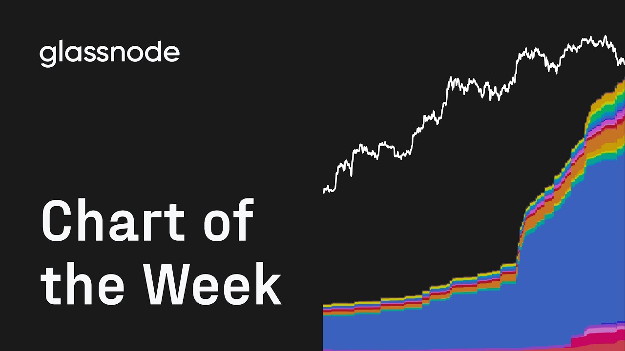
Welcome to "Chart of the Week" by Glassnode. This series offers bitesize insights into the market via different charts each week.
BTC Options Premiums: https://glassno.de/42ZWTOA
Follow us on X: https://glassno.de/47SbyNA
Follow Colpy on X: https://glassno.de/4r0VocQ
Follow us on LinkedIn: https://glassno.de/3WNCMQF
Join our Telegram channel: https://glassno.de/43pLZ5g
Visit Glassnode Studio: https://glassno.de/4hW2k7T
Visit Glassnode Insights: https://glassno.de/3JKuoOY
Disclaimer:
This video does not provide any investment advice. All data is provided for information purposes only. No investment decision shall be based on the information provided here and you are solely responsible for your own investment decisions.
Оглавление (1 сегментов)
Segment 1 (00:00 - 04:00)
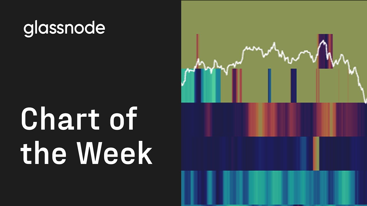
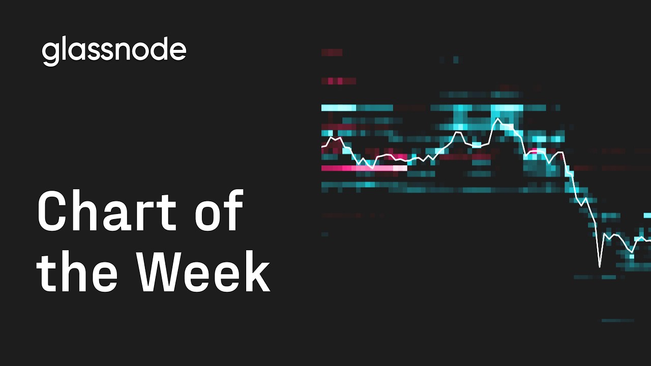
Hey guys, welcome back to chart of the week with Glassnode, where we run through some of the most important charts in crypto. Today, we're going to be taking a closer look at BTC option premiums. So, these charts track the daily premium paid and received across Bitcoin option markets, including Deribit, OKX, and Binance. So, first, what do we mean by premium? A premium is simply the price of an option. If you buy an option, you pay premium. If you sell one, you receive premium. And this chart is especially interesting because it tracks the taker flow. In option markets, market makers continuously quote bids and offers on both sides of the market. They make the market by providing liquidity. The taker is the participant crossing the spread and hitting those quotes. So, the taker [snorts] is usually the one expressing the actual conviction. They are the one willing to pay for upside, to pay for protection, and to pay to express a volatility view. That's what's make this chart much more informative than raw options volume. In traditional finance, for instance, option flow can often look like a black box. You may see large volume, but not necessarily who initiated the trade or what type of positioning dominated. Here, we can separate call buying, put buying, call selling, and put selling through premium flows. So, let's break that down. When traders buy calls, they pay premium for upside exposure. That usually reflects bullish positioning or traders looking for convex exposure with limited downside risk. When traders buy puts, they pay premium for downside protection of bearish exposure. On the other side, when traders sell options, they receive the premium. That is often associated with yield generation strategies or traders selling volatility because they expect realized movement to remain contained. Now, looking at the chart itself, the first thing that stands out is uh how reactive those flows are. Premium spikes and tend to appear during period of stress, acceleration, or large sports moves. Then, quickly fade afterwards. Option demand is highly tactical. Traders step in aggressively around movements, but the market uh rarely sustain elevated premium demand for long period. So, in this area, for instance, you see that puts uh put buying spikes at the local bottom. So, when you reach that kind of spike, usually it's uh when the market is more stressed and the market then reversed. You can also notice that call premium paid and put premium paid behave very differently depending on market conditions. During strong rallies, call premium paid tends to expand sharply as traders chase upside exposure, but during stress periods or sharp downside move, like the one we've just talked about, put premium paid can spike aggressively as the market reaches for protection. That distinction is important because it tells us how the market is expressing risk in real time. But maybe the most interesting part is the interaction between premium paid and premium received. If call buying rises while call selling also rises, it can mean traders are willing to chase upside, but volatility sellers are equally willing to take the other side and monetize that demand. So, the same applies to puts. Heavy put buying shows demand for protection, while elevated put selling can reflect traders underwriting downside risk to collect premium. So, this chart is not showing whether activity is high. It helps us understand who is paying for optionality, who is supplying it, and how aggressively the market is positioning around volatility. And that gives us a much cleaner read on sentiment on volume alone. A market aggressively paying premium is usually seeking exposure or protection. A market aggressively receiving premium is often more comfortable selling volatility or warehousing risk. That balance between premium buyers and premium sellers tells us a lot about the market regime beneath the surface. So, thank you very much for listening. The chart of the week, if you've enjoyed this video, give it a like, and we will see you next week.