Exponential growth and epidemics
8:56

Exponential growth and epidemics

3Blue1Brown 08.03.2020 6 013 762 просмотров 167 692 лайков

Machine-readable: Markdown · JSON API · Site index

Поделиться Telegram VK Бот
Транскрипт Скачать .md
Анализ с AI
Описание видео
A primer on exponential and logistic growth Help fund future projects: https://www.patreon.com/3blue1brown An equally valuable form of support is to simply share some of the videos. Special thanks to these supporters: http://3b1b.co/covid-thanks Home page: https://www.3blue1brown.com Excellent visualization of this kind of growth from Minutephysics and Aatish Bhatia: https://www.youtube.com/watch?v=54XLXg4fYsc 
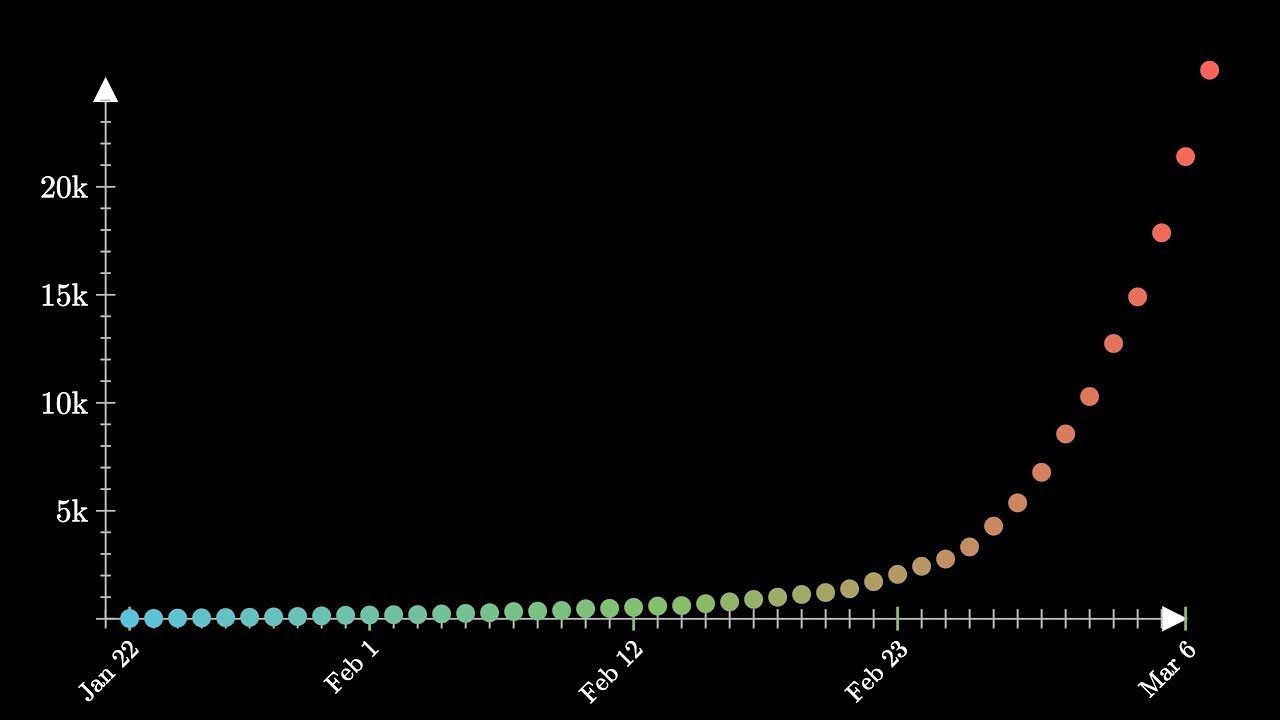
Data source: https://www.worldometers.info/coronavirus/coronavirus-cases/#case-tot-outchina Some have (quite rightfully) commented on how you shouldn't look at the R^2 of linear regressions on cumulative data since even if the changes from one day to the next are completely random, the totals they add up to wouldn't be independent of each other. Since the derivative of an exponential should also be an exponential, we could instead run the same test on the logarithms of the differences from day to day, which in this case gives R^2 = 0.91. While this video uses COVID-19 as a motivating example, the main goal is simply a math lesson on exponentials and logistic curves. If you're looking for a video more focused on COVID-19 itself, I'd recommend taking a look at this one from Osmosis: https://youtu.be/cFB_C2ieW5I Extrapolation xkcd: https://xkcd.com/605/ Thanks to these viewers for their contributions to translations Hebrew: Omer Tuchfeld ------------------ These animations are largely made using manim, a scrappy open source python library: https://github.com/3b1b/manim If you want to check it out, I feel compelled to warn you that it's not the most well-documented tool, and it has many other quirks you might expect in a library someone wrote with only their own use in mind. Music by Vincent Rubinetti. Download the music on Bandcamp: https://vincerubinetti.bandcamp.com/album/the-music-of-3blue1brown Stream the music on Spotify: https://open.spotify.com/album/1dVyjwS8FBqXhRunaG5W5u If you want to contribute translated subtitles or to help review those that have already been made by others and need approval, you can click the gear icon in the video and go to subtitles/cc, then "add subtitles/cc". I really appreciate those who do this, as it helps make the lessons accessible to more people. ------------------ 3blue1brown is a channel about animating math, in all senses of the word animate. And you know the drill with YouTube, if you want to stay posted on new videos, subscribe: http://3b1b.co/subscribe Various social media stuffs: Website: https://www.3blue1brown.com Twitter: https://twitter.com/3blue1brown Reddit: https://www.reddit.com/r/3blue1brown Instagram: https://www.instagram.com/3blue1brown_animations/ Patreon: https://patreon.com/3blue1brown Facebook: https://www.facebook.com/3blue1brown

Оглавление (6 сегментов)

Intro

The phrase exponential growth is familiar to most people, and yet human intuition has a hard time really recognizing what it means sometimes. We can anchor on a sequence of small seeming numbers and then become surprised when suddenly those numbers look big, even if the overall trend follows an exponential perfectly consistently. This right here is the data for the recorded cases of COVID-19, aka the coronavirus, at least at the time I'm writing this. Never one to waste an opportunity for a math lesson, I thought this might be a good time for all of us to go back to the basics on what exponential growth really is, where it comes from, what it implies, and maybe most pressingly how to know when it's coming to an end. Exponential growth means that as you go from one day to the next, it involves multiplying by some constant. In our data, the number of cases in each day tends to be a multiple of about 1. 15 to 1. 25 of the number of cases the previous day.

Viruses

Viruses are a textbook example of this kind of growth, because what causes new cases are the existing cases. If the number of cases on a given day is n, and we say that each individual with the virus is exposed to, on average, e people on a given day, and each one of those exposures has a probability p of becoming a new infection, then the number of new cases on a given day is e times p times n. The fact that n itself is a factor in its own change is what really makes things go fast, because if n gets big, it means the rate of growth itself is getting big. One way to think about this is that as you add the new cases to get the next day's growth, you can factor out the n, so it's just the same as multiplying by some constant that's bigger than 1.

logarithmic scale

This is sometimes easier to see if we put the y-axis of our graph on a logarithmic scale, which means that each step of a fixed distance corresponds to multiplying by a certain factor, in this case each step is another power of 10. On this scale, exponential growth should look like a straight line. Looking at our data, it seems like it took 20 days to go from 100 to 1000, and 13 that to 10,000, and if you do a simple linear regression to find the best fit line, you can look at the slope of that line to draw a conclusion like we tend to multiply by 10 every 16 days on average. This regression also lets us be a little more quantitative about exactly how close the exponential fit really is, and to use the technical statistical jargon here, the answer is that it's really freaking close. But it can be hard to digest exactly what that means if true. When you see one country with, say, 6000 cases and another with 60, it's easy to think that the second is doing 100 times better, and hence fine. But if you're actually in a situation where numbers multiply by 10 every 16 days, another way to view the same fact is that the second country is about a month behind the first. This is of course rather worrying if you draw out the line. I'm recording this on March 6th, and if the present trend continues it would mean hitting a million cases in 30 days, hitting 10 million in 47 days, 100 million in 64 days, and 1 billion in 81 days. Needless to say, though, you can't just draw out a line like this forever, it clearly has to start slowing down at some point. But the crucial question is when. Is it like the SARS outbreak of 2002 which capped out around 8000 cases, or the Spanish flu of 1918 which ultimately infected about 27% of the world's population? In general, with no context, just drawing a line through your data is not a great way to make predictions, but remember, there's an actual reason to expect an exponential here. If the number of new cases each day is proportional to the number of existing cases, it necessarily means each day you multiply by some constant, so moving forward d days is the same as multiplying by that constant d times. The only way that stops is if either the number E or P goes down. It's inevitable that this will eventually happen. Even in the most perfectly pernicious model for a virus, which would be where every day each person with the infection is exposed to a random subset of the world's population, at some point most of the people they're exposed to would already be sick, and so they couldn't become new cases. In our equation, that would mean that the probability of an exposure becoming a new infection would have to include some kind of factor to account for the probability that someone you're exposed to is already infected. For a random shuffling model like this, that could mean including a factor like 1 minus the proportion of people in the world who are already infected.

Logistic Curve

Including that factor, and then solving for how N grows, you get what's known in the model. ss as a logistic curve, which is essentially indistinguishable from an exponential at the beginning, but ultimately levels out once you're approaching the total population size, which is what you would expect. True exponentials essentially never exist in the real world, every one of them is the start of a logistic curve. This point right here, where that logistic curve goes from curving upward to instead curving downward, is known as the inflection point. There, the number of new cases each day, represented by the slope of this curve, stops increasing and stays roughly constant before it starts decreasing. One number that people often follow with epidemics is the growth factor, which is defined as the ratio between the number of new cases one day and the number of new cases the previous day.

Growth Factor

Just to be clear, if you were looking at all of the totals from one day to the next, then tracking the changes between those totals, the growth factor is a ratio between two successive changes. While you're on the exponential part, this factor stays consistently above one, whereas as soon as your growth factor looks closer to one, it's a sign that you've hit the inflection. This can make for another counterintuitive fact while following the data. Think about what it would feel like for the number of new cases one day to be about 15% more than the number of new cases the previous day, and contrast that with what it would feel like for it to be about the same. Just looking at the totals they result in, they don't really feel that different. But if the growth factor is one, it could mean you're at the inflection point of a logistic, which would mean the total number of cases is going to max out at about two times wherever you are now. But a growth factor bigger than one, subtle though that might seem, means you're on the exponential part, which could imply there are orders of magnitude of growth still waiting ahead of you.

Fractal Pattern

Now, while it's true that in the worst-case situation the saturation point is around the total population, it's of course not at all true that people with the virus are randomly shuffled around the world's population like this. People are clustered in local communities. However, if you run simulations where there's even a little bit of travel between clusters like this, the growth is actually not that much different. What you end up with is a kind of fractal pattern, where communities themselves function like individuals. Each one has some exposure to others, with some probability of spreading the infection, so the same underlying and exponential-inducing laws apply. Fortunately, saturating the whole population is not the only thing that can cause the two factors we care about to go down. The amount of exposure can also go down when people stop gathering and traveling, and the infection rate can go down when people just wash their hands more. The other thing that's counterintuitive about exponential growth, this time in a more optimistic sense, is just how sensitive it is to this constant. For example, if it's 15%, like it is as I'm recording this, and we're at 21,000 cases now, that would mean that 61 days from now you hit over 100 million. But if through a bit less exposure and infection, that rate drops down to 5%, it doesn't mean the projection also drops down by a factor of 3, it actually drops down to around 400,000. So if people are sufficiently worried, there's a lot less to worry about. But if no one is worried, that's when you should worry.

Методичка по этому видео

Структурированный конспект

Экспоненциальный рост: как увидеть конец эпидемии

Поймите механику экспоненциального роста, лежащую в основе эпидемий. Научитесь распознавать признаки замедления и прогнозировать дальнейшее развитие событий, используя математические модели.

Другие видео автора — 3Blue1Brown

Ctrl+V

Экстракт Знаний в Telegram

Экстракты и дистилляты из лучших YouTube-каналов — сразу после публикации.

Подписаться

Дайджест Экстрактов

Лучшие методички за неделю — каждый понедельник