Matt shows you how designers use simple techniques to guide the eye, beginning with the focal point. Breaking down classic design examples before showing how this works on contemporary websites.
Want to master design fundamentals? Let us know how we can help in this short survey 👉 https://flux-academy.typeform.com/to/nVAQWdaf
📱 Find us on SOCIAL MEDIA
Matt's YouTube channel 👉 @MattBruntonUK
Flux Academy's Instagram 👉 https://www.instagram.com/flux.academy/
Flux Academy’s TikTok 👉 https://www.tiktok.com/@fluxacademy/
Оглавление (4 сегментов)
Segment 1 (00:00 - 05:00)
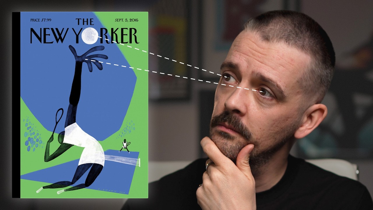
Good designers are deliberately controlling your attention, deciding what you see first. Because good design isn't decoration, it's direction. And once you understand how this works, your layouts will instantly improve. In this video, I'm going to show you how designers use simple techniques effectively to guide the eye, beginning with the focal point, a point of visual interest that will bring the viewer into your layout. We'll break down classic design examples before I show you how this works on contemporary websites because these concepts can help you generate ideas, make your layout stand out, and teach you how to separate the good from the bad in the age of AI. In this magazine cover, the subject and the background seem quite intertwined, but a focal point is established by a couple of things. Number one, we have a human face, and that's something that we're always drawn towards. So it always makes a suitable focal point. And secondly, that face is placed right in the center of the composition. That technique is applied as well to this artwork by Jeremy Reed and different variations of this were used by the Sex Pistols. And we're drawn to the face. And so there's a face at the center. It's the center of the composition, but also then to the features, the eyes in particular. So the text has actually been placed right where we would be drawn to that focal point of the eyes and having that placed there creates much more impact to the image than if it would be off to the side as well as it suiting the tone of the piece. This ad from 1951 does the same thing. We're drawn to the face. So if we would have put this headline somewhere else, it wouldn't have made sense. Why is this head cut into different pieces? But because we have the headline, so it is all within that same area, the focal point that we're drawn to. It's just above the eyes and it's within the area of the face and we can actually see almost the two things together straight away and we can get the joke. Whereas if we the focal point wouldn't have been thought about here in the headline placed somewhere else, the viewer wouldn't get that joke in a second. And that's really important for communication for it to be like a nancond for them to get it. As well as the face bias, we also have an eye gaze bias. So if an eye is looking at something, we want to look over and say, what is this eye looking at? So I've even employed that deliberately by putting myself in this side of the frame in this edit so I can look towards the work. And that's what happens uh in this poster here. Also in this classic Apple poster here with the director Alfred Hitchcock, he is looking towards this top left corner. So that is where they've placed the logo and the line. Other techniques here to establish a focal point. We also have a contrast. So the face is the best lit element and then we have him wearing black clothing that's kind of sinking into this uh black background uh behind him. So it's very clearly drawn into the face. And then we follow it secondly through the eye gaze towards the logo and the line. This ad from 1950 uses contrast again and value in terms of the color, the weight that's placed on the page in this top area. So this illustration of the hands holding the globe is much stronger, a heavier weight than the rest of it where we've got white and then we have tie which obviously has less weight on the page because all the space is in and around it. So we're drawn to this weighted part and then again using this central alignment, the radial composition, we're drawn right into the center of the globe and that is where they place the large logo. so that we are really drawn uh to that company name so it becomes memorable. Another New Yorker cover here this time by Kristoff Neman who's done many covers for this magazine and we have a lighter portion at the top uh which pulls us in versus the dark at the bottom but within that light portion we have the ball which is just represented by this black circular shadow. And this is a really clever example that to have a focal point or something that draws the eye in general. It doesn't necessarily need to be the largest item. Scale is not the only tool that we can use. In this case, it's the smallest item that really our eye gets pulled towards because of the negative space around it and the contrast that's employed here. The advertiser wants us to remember the location. we need to want to ski at Lake Placid and not go skiing somewhere else. So value is used in that we have this bright red. So it's the hue and the saturation of this contrasted with this off-white background, but also we have the benefit
Segment 2 (05:00 - 10:00)
of leading lines. So this very clever typography which is you know the wake of the skiers, the marks they're leaving on the ground is actually made to write the word ski. But those lines that are all moving diagonally downwards towards the name Lake Placid is a really clever use of leading lines. That brings us down to the bottom of the composition. If this is resonating with you and you'd like to master design fundamentals that are not only going to survive the rise of AI, but help you succeed as a designer in this new age, then let us know via the survey linked in the description. We're working on new learning resources at Flux Academy and we want to make sure that we're hearing exactly how we can help you thrive in your career. So, let me know. This government post there could easily be forgettable. If it just said America's answer to production and then we had kind of a naturalistic view of a worker turning a spanner or wrench I think they call it in the United States, that would just be totally forgettable. But what we have here is something very graphical and we are led around the composition by we have this intersection where the spanner is going down at one angle and then the word production is going along perpendicular to that. And at that point where they meet that intersection point we have the O the first O in production is actually this nut and that's what makes the thing memorable. It it's a graphical little trick where having the O of production being the nut, it becomes something now which kind of sticks in the brain because it's strikingly visual. Whereas if that was just kind of set in type at the bottom of an image, then it wouldn't be at all. So this idea of focal point can actually help you generate these sort of creative ideas. And everything in this composition from where the contrast is used and uh where things are placed at an angle is all done deliberately to bring us down. Even if at first we see perhaps the type standing out or we see this dark hand on a light background but it leads us around towards what is the focus of the composition which is the O nut. So let's see this kind of thing on the web. Now this is a very simple blatant example where the headline real human insights is the largest thing on the page. So we're using scale to establish focal point. It's also placed centrally. So we have that central or radial style alignment. We're also using value where we have the darker type on this lighter background. So all these things work together with lots of negative space around it. So it really establishes that this is very clear. There's no ambiguity about this. The first thing we see in this line and this is good how copy and design are also working together that we've kept the line short. It's just three words. So it really can have that impact. If this headline was like 15 words long, it wouldn't be able to do that same thing. This is a completely different example. Now we're drawn to a human figure and the face. So what they've done here is they've actually put the line again it's very small this time. So we've not used scale as the biggest thing uh to get that headline across but we've actually made it incredibly small. But because of the way that it's been compositionally arranged along the line of the figure, we kind of follow this figure from her feet up to her head and then we're able to read this line. Multi-layered beauty for those who live between worlds. So, even though we've got some odd things, we've got this odd L character that looks kind of like an uppercase I and we've got very low contrast on the word live on a white dress. We are still able to read it because we're drawn into it and sort of led through the composition. So, that's a clever little technique. This web page is selling merch and we again have the eye gaze. We're probably drawn first of all though the lighting has gone very bright on the top of this hoodie and that is a clever use there of uh value where we have something light and something darker. So usually we would want the face to be the thing that was you know properly illuminated but kind of by almost overexposing and really bringing the light onto the hoodie we're saying that what we're selling is clothing. That is the thing. This not just a picture of a woman. It's actually we're trying to emphasize the clothing, but then it leads us up. We bring towards the face and again her gaze is over to the left because we have this navigation area here on the left for these different products. And as you scroll down, they've thought about focal point and just generally leading the eye in each piece. We have a very large item
Segment 3 (10:00 - 15:00)
here that has that sense of scale uh you know with lots of negative space around it and even the direction the fact that it's pointing you know towards the left where we've got this navigation but then sequencing is in play as well. So when we go to the next frame the gentleman is actually looking away from the navigation but because we've already established where the navigation is this works. If this was the first frame, it wouldn't work as well. And there's also other little techniques that the designer has used in conjunction with the photographer to make this work by having the light just coming down again onto the jacket. This is the interesting thing. This kind of lime green/ yellow color on the lining of the jacket. The light on here brings our interest more over to the left. And also the angle that is created by the model opening the jacket, it creates this angle which kind of pushes our focus over towards the text there. One more nice example, then I'm going to show you how this works in the real world. The product here again is using value. It's the darkest item and there's plenty of negative space around it. So that helps. But as we scroll through this site, we have the kind of scrolltelling style website. Each frame kind of employs these ideas of focal points. So, first of all, our background gets totally washed out. And I'm just stopping my scroll for a second here. So, we have a new ground. And then when the figure emerges, it just uh because we've already established that uh ground, the figure comes across it, we're brought straight to it. We also have another principle here that you can use on the web that we weren't able to see in our historic examples, which is motion. When things move, we're attracted to them. Our eyes track them. So, you can use motion uh to bring the viewers's attention here. So, all those many principles are in play here. And as you scroll down through the site, all these kind of ideas, we've got a leading line here. Again, we wouldn't want these hands pushing out of the layout, but they're actually coming into the layout directionally and then leading us towards where we've got a copy on the left. And these ideas of focal point are brought all the way through the site. Again, at the end, the logo becomes larger. It's scale. it's in the center and it kind of drives towards us and before we then see, you know, the pack right in the center of the frame with the information going around it. Okay, so a lot of these are fancy marketing websites. In the real world, people need to find information quickly. They want to achieve something on the web. So, a lot of the time what we get is very generic looking sites. And if we were just going to think of a common function in any city in the world. So let's search for dentists in Quebec. And as we do that and Google, we're going to bring a whole list of results. And if we just click on a few of these, we're going to see the same kind of thing. And I know that before we even open them up. Now on this first one here, we have got a typical layout where we have got, you know, the in contact information, the social media at the top. Then we've got the logo and the navigation bar and that has all these dropdowns. Then we have the classic image right headline left with a headline then a subhead and then a button for the call to action. And then we've got some centered text cards. We have an image of the practice which looks like it's just kind of taken on a phone with sort of flat lighting. Um, and this is just all very familiar. We go to the next one. The layout's like almost exactly the same. Contact information row, then the logo, the navigation, the same place for the headline, the images, then some four cards, then an image of the practice. So, these are very similar. May be using almost like similar templates. This is a templated look. If you're going to use templates or AI to generate websites, you're going to get this kind of thing. Let's look at third dentist in Quebec. It's exactly the same. It's basically the same layout, just slightly different colors. And all this imagery looks kind of like stock photography. It doesn't look personal at all. And in terms of focal point, if we just go back to any of these sites, okay, we've got an image, so that kind of pulls us in, but the image isn't really saying very much. And there's so much text that's all over the place, it's hard to really know where to look. The same again here. We see the image. We see this almost dark sections. It pulls us down to these cards, but we want to read this first. Again, with this, we don't know where to look. There's nothing really pulling it
Segment 4 (15:00 - 18:00)
in. But what can you do? Surely these things have got to be standardized. People often kind of comment, you know, on some of our videos and when people try and teach design principles, there's nothing you can really do. But imagine you were given the task to elevate this, to actually make something premium, to actually make a website that when people went to look at this dentist, they thought before they'd even been to the dentist, before they'd seen the prices, they knew it was something of a higher value, of a higher quality. It was appealing to a different kind of person. How can you do that while still being practical? Well, you could look at something like this dentist in Quebec and just the same as the others, but what they have done here is they have established a focal point straight away. Now, the restraint they're using makes this feel premium that we're just using one type face in one weight. So, it's a single font in a single color, but the graphic design is good enough uh to make that work. And what they've used cleverly with this photography. Now obviously this photographer is custom and it's of a higher quality but they're using a focal point really cleverly two ways. So one is the depth of field. So we can see here that this woman is clearly in the sharp focus whereas a gentleman in the foreground is blurry. So that brings us towards the woman uh our gaze. but also they've used cropping very carefully and I know their framing is deliberate because we see it throughout the site because they have chopped off the top of her head. It brings our gaze downwards. Usually we would be really drawn to these blue eyes but instead we're drawn more to the mouth and we have these white teeth exactly what they are selling. Now I think this is still practical. For example, we've got the menu here. Just one click on that. And then we've got, you know, the address. You want to quickly grab that before you drive over to the place. Their phone number. It's all there just with one click. And actually on some of these pages, the first one did have the address at the top. But the next two don't have the address, only the phone number, and you have to go to the contact or the booking pages to actually go and find the address. So, it's very easy to find here. But this framing is a very clever way to establish focal point. And watch how they do it all the way through. Yes, they have an image of the practice, but at least it's a little bit stylized with kind of the blurry receptionist here with a long exposure. But look how we frame this cropped in really closely. This crazy sense of scale that you can only pick up on a camera really focused, you know, on the mouth, on the teeth. And the scale is made more obvious by having you know this small uh type here. Then as we go through all these images are framed very carefully. So as we have these different options here every single time we have the top of the head cut off we don't see above the person's head. So it brings the focus of the composition of these images down onto the teeth. With all one, two, three, four, five of these images. they've done the same thing. So, this is clearly a very deliberate thing and it's a really clever way to establish focal point that they're really consistent about on this website. You can use any of these techniques or any combination of them to create a focal point. And this isn't something I can just like show you how to do step by step in Figma because it's a design principle that can be applied in infinite combinations as you've seen in the different examples I've shared. So start with sketching and experiment with incorporating this concept into your own work. And don't forget to let us know if you want to learn more design principles via the link in the description. And until next time, happy designing.