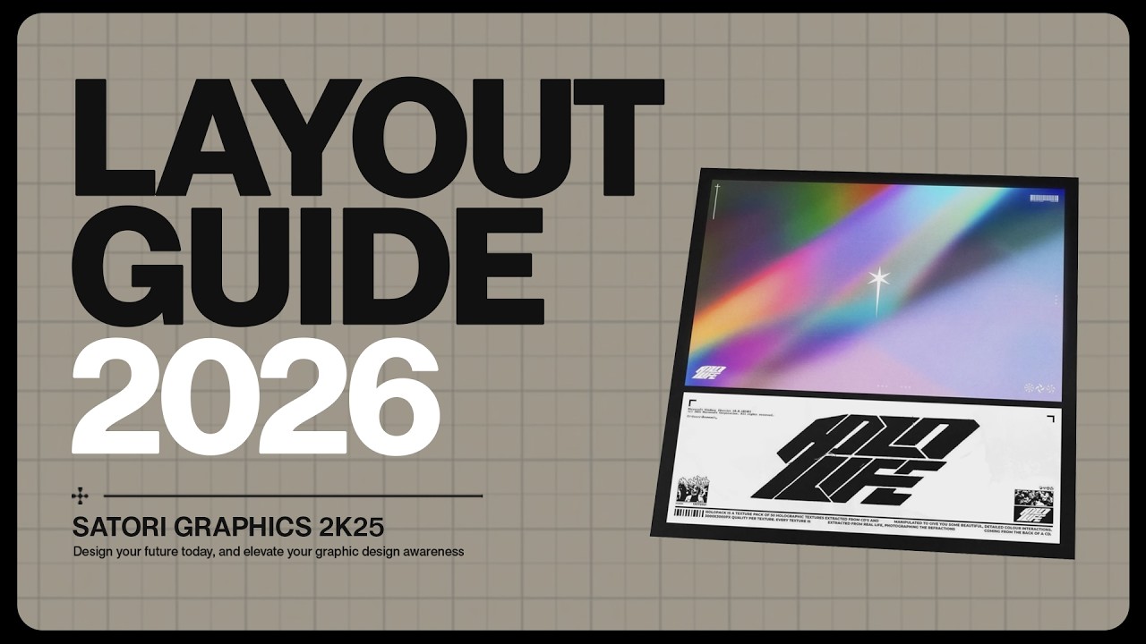
Every graphic designer knows the feeling of opening a blank canvas and not knowing where to start exactly. Let's say you're designing a promotional poster for a music festival aimed at young adults who love electronic dance music. Now ask yourself, what's the purpose of this design? It might be to inform and to excite potential people who are going to go to that festival while reflecting on the energy of the event. Who is the audience? Primarily people aed 18 to 30 who enjoy high energy music, vibrant night life, and social gatherings. Now, this clarity informs every decision moving forward, and it's very, very important. So, for this design, we want to use potentially bold visuals, striking topography, and colors that evoke excitement and energy. Things like neon tones or electric contrasts. But more about this later. And without this foundational understanding, your design risks missing the mark entirely. And on your graphic design projects, I do suggest that you go really hard on understanding and identifying your audiences. Now, for gathering inspiration and references, start by looking at examples of posters from similar events such as rave festivals or club nights. Ask yourself what catches your eye. Maybe it's a dynamic use of gradients. the futuristic typography or the way the designs layer textures or create depth. And for this project, you might collect references showcasing neon gradients to emulate nightclub lighting, abstract geometric patterns for modern edgy feels, topography that balances boldness with readability. These are just examples though, of course. And tools like Pinterest and Behance or Dribble can help with this process. But don't just stop there. Pay attention to other mediums like album covers or even fashion trends and this would inspire unique approaches for your project. Remember the goal is to absorb ideas and get a feel for the visual communication of this niche, not to copy ideas. But the next step can really make or break your graphic designs success. Next, we need to craft a visual language through color and typography as well as other things too. Your color palette and typography are more than just aesthetic choices. They are tools that will define the personality of your design and communicate its purpose to the audience. Now, if you fail this step, your design will totally miss the mark. And I cannot emphasize enough how important this is. For a music festival poster, imagine creating an atmosphere that captures the energy of nightife and the thrill of live music. Maybe start with bold palettes like vibrant purples, neon greens, and electric blues. These colors instantly invoke excitement, fun, and cuttingedge vibes. And if you pair that with a dark background, for example, for strike and contrast, this ensures the design feels dynamic and modern, but also it captures the essence of nightlife linked to dance music festivals and genres. As you can see, we're linking everything back here. But next, focus on typography, and that is to tailor it to the message and to the audience. So perhaps for the festival name, we could use a bold futuristic sanser font, and that is to make the title impossible to ignore. This choice signals energy and modernity, perfect for a young, trendy crowd. For event details, we need to go for a slightly different approach. Here, we want clean, legible type faces such as Robboto or Open Sands. And these fonts ensure the crucial information like dates and locations is clear even at a quick glance. And again, yes, we are linking every choice back to the purpose of our design. But here's something really useful that you should be keeping in mind when crafting your visual language. Consider how and where your audience will encounter the poster. It might be in a busy subway station or on a fast scrolling social media feed. They'll need to absorb key information almost instantly, but they do need to be drawn in first and foremost. But yeah, test your fonts for legibility across different sizes and formats to ensure nothing gets lost. By thoughtfully pairing color and topography, you're not just making the poster look good, you're creating a visual language that connects with the audience, conveys the event's vibe, and ensures the design's message lands perfectly. But just remember that a visual language goes further than just topography and colors. You want to use imagery, symbols, shapes, and psychology to actually fit into the niche that you've actually established. But a little more about that later. And next, we're going to consider a very important step indeed. Now, we're going to define psychology and messaging before structure and layout. So, yeah, before you dive into grids and layouts, pause to consider psychology behind your design. Ask yourself what emotion or reaction should the design evoke? Is it excitement, curiosity, urgency, and so on? What message is the design communicating? Is it about the festival's vibrant energy? Is it about exclusive lineups? Or is it just simply a cuttingedge vibe? Once you understand the psychology and the message behind your design, you can make informed decisions about how to organize the elements in terms of layout. For example, if the goal is to create excitement, you'll need dynamic visuals and a layout that grabs attention immediately. If clarity is the key, such as ensuring people know when and where to go for the event, your structure should prioritize readability. We now want to do something very clever, and that is to build a layout around the psychology and the intention. So, let's take the music festival poster as an example. Again, start by imagining how someone interacts with the design. We have the first impression. Their eye is drawn to the headline or the key visuals. And this is where you deliver the emotional hook or the focal point. Information flow. Now, they can scan for supporting details like dates, locations, and lineups. Action. They look for actionable information like ticket links or contact details. And to align with this thought process, use a grid as your framework. So the top section could be dedicated to the festival's name in a bold visual that conveys the energy. You can use large type and striking imagery like neon gradients or abstract shapes and this will grab attention. Now the midsection you can organize essential details such as a date, location, the lineup and so on. A clean structure arrangement here ensures the information is easy to find. And the bottom section can be reserved for space for actionoriented elements like ticket purchase info, website links or social media headlines. Now using a grid and the grid will depend on your personal choice and the design ensures everything is aligned and intentional, but it doesn't have to be rigid. Once you've mapped out the essential structure, look for ways to break it strategically. For example, let the festival name span across multiple columns to create impact. Overlay design elements like abstract patterns or glowing effects to add a sense of motion and energy. Tilt or angle certain elements slightly to convey vibrancy of the event. As you can hopefully see, it's very vitally important that you do understand or establish the psychology and the intention of your design. And that's because after you've done that, every design choice and decision can relate back to that understanding. Now that you've gone through the four stages and crafted a solid design, here's a technique that most designers will overlook, but it can elevate your work from good to unforgettable. Ask yourself, what story or message is my design telling beneath the surface? Introduce cultural or symbolic meaning. Think about your audience's values and how to subtly reflect them. For instance, for an audience that values connection, you could add geometric patterns in the grid that symbolize unity, such as interlocking circles or lines, or you could simply just show imagery of people actively dancing together and being social. Layer with an interactive visual cue. You could add a QR code or even AR elements that bring your design to life. Now, for the festival poster, maybe scanning a QR code could reveal an animated version of the poster, and it would have glowing typography or pulsating colors that mimic the festival's energy. This would really draw them in and really sell the idea and the feeling of this festival. Test for emotional response. So, step back and critique your design, not just for technical perfection, but for how it feels. Show it to someone in your target audience and ask, "Does this excite you? Would it make you want to act and go? " If the answer is not a resounding yes, then you need to refine those subtle layers of emotion. So, yeah, here we're looking at ways to take the design to that next level. But again, we're always keeping in mind the message of the design and the target audience. It might be just as simple as adding some relevant graphics or symbols to the niche, but everything should have a purpose. —
— So the first step is something many designers overlook but you really cannot afford to ignore this. And actually all of these four steps do link together. So do follow along throughout the entire video. But the first step is to look at the canvas size and orientation that you're working with. Take a look at the social media graphic designs. Pretty decent, aren't they? But look closely and you might notice how most of these designs are actually square in shape. When you start any graphic design project, the very first thing you should do is to understand your canvas size and orientation. If the designer here was told by the client that the designs were for a wide banner as opposed to square, their design choices and composition would be very different to how they are now. It seems intuitive and it seems basic, but the more you consider the first step when designing, the better your designs will become. On the flip side of that, without fully understanding and considering the dimensions of your canvas, you may very well make some poor layout design choices as an example. But here's a pro tip you do not want to miss. If you're designing for a brand, consider how your design will fit across various different size and shapes of canvas. And that's so it can be adapted to future projects and still look like they are linked together as one united design. So once you've thought about the size and the orientation of your project canvas, the next step is equally as crucial. Have you ever heard of the saying context is king? This saying actually applies so strongly to graphic design and here's why. So what do you think about this Billy Eyish design? Pretty cool, right? Now, imagine you're zooming down the road in a car or perhaps a motorbike, and this design is there on a giant digital billboard off to the side of the road. Are you going to understand what this design is all about? And can you obtain information about whatever it's trying to communicate? Chances are, no. Instead, something like this would be better suited for this project. And that's because there's very little text information on the design itself. It's simple and it's easy to understand. And this is perfect for its context. In graphic design, the context basically means where and how the design will be seen and used. This applies to every single design you make. If it's a favicon for a website or packaging for a cosmetic brand, you need to think about and visualize how the design is going to be seen and interacted with in the real world. It's no good making what seems like an awesome design which then falls flat when the client comes to use it because it becomes lost against other products or it doesn't look right in its natural environment. And you'll be surprised about how many beginner and even intermediate designers actually fall down for this reason alone. So far, we've considered the canvas shape, size, and the design's context. Next, something that very few designers question, but which every single designer should consider. How dynamic do you want your design or need your design to be? When we speak about a design being dynamic, we refer to how much movement, flow, and energy it has. And to question this is super important. And here's exactly why. Typically speaking, designs that are heavily dynamic are designs that need to capture attention and fast. And the more static a design is, the better suited for projects where the design needs to convey more information. But this whole thing about a design being dynamic or not actually goes far deeper than this. How dynamic your design should be also comes down to the target audience. In general, younger audiences will relate more to dynamic designs. Also, we can look at things within the target audience such as their hobbies and their interests. A target audience that is interested in action sports would more often than not appeal to a more dynamic type of design layout. But another crucially important factor that goes into the dynamic scale of a design is the message complexity level. As a general rule, the more complex a message is to convey, the more static a design probably is going to be. So here, a design that raises awareness of marketing and automation platforms is obviously quite static and simple. The message is quite hard to convey. There is still some movement with the arms and the phones leading the eye upwards, but overall the design is quite static. So before you actually begin to design anything, make sure you consider how much movement and flow will fit into your design based on the target audience and the message. The fourth step, which will totally revolutionize the way you approach a design, is contextual relevancy. This is really important to tie your design down to its purpose and is where the designer tailor's decisions to meet a specific approach. So on this design here, the bright bold colors and energetic typography can convey the lively atmosphere of the music event. Also notice the date of the event. It's in June. The colors are reminiscent of summer, which is relevant to the purpose or the situation of this design. And these choices, they help make this design more relevant to the audience and the background of the design message. And then here's an organic package design. Employing earthy tones and natural textures on the packaging would align with the brand's organic and eco-friendly message. Now, here's another pro tip to keep in mind. The trick is to really understand the audience and the industry of your client or the brand. Then you can tailor the design to match up with those things. And in turn then your design will become super relevant. Now let's quickly wrap everything up into one design example. I know you want to. The first step was to look at the dimensions of the canvas. So this canvas is narrow and tall and the designer has made great use of that by having a person that stretches up to match the shape of the design of the canvas. The main information is at the bottom which is where the viewer's eye will likely finish or end up. The second step was to consider the context of the design. So this design is an advert and so it needs to be conveyed to the audience pretty quickly and as you can see the designer has made sure the important information is easily accessible and the design itself is fairly simple. The color scheme ensures the main information stands out from the other aspects on the design as well. The third step was to consider how dynamic the design should be. As you can probably tell, this design is quite dynamic with lots of illustrations and even some typography swirling around in the background. The main typography is also in italics. And so, yeah, this is a dynamic design for sure. But why? Well, because the audience is young and importantly, the message is quite easy to convey in such a quick, clean action. There isn't too much information. So, the design doesn't need to be static. And lastly, how is the design relevant to its cause or its message? Well, like I mentioned, the bright colors help make the topography stand out. The font choices help match the young audience as it uses modern sand serifs, and the model in the middle as a focal point will help the target audience relate to the design as well. This is a brief rundown of the four steps, but make sure to maybe take some notes, bookmark the video, or just simply watch it again to fully understand these points. A lot of designers just start designing without considering these steps and they can then easily get into some problems or design something that is below what they're capable of making. And if you'd like to discover more content on actual real graphic design, you know, not just Photoshop tutorials or fluff pieces, then subscribe to Tutorial Graphics for future content and click a video on screen. But until next time, guys, design your future today. Peace.