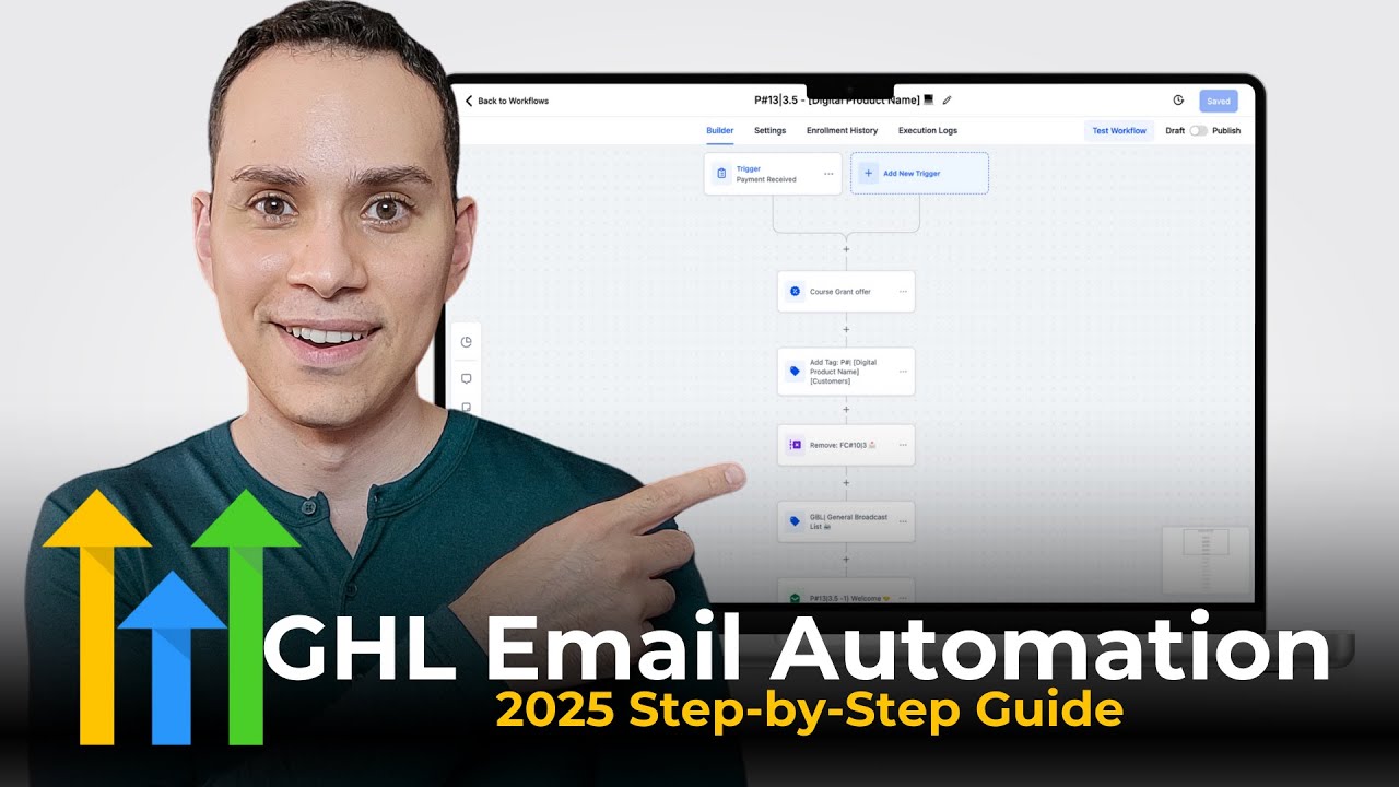
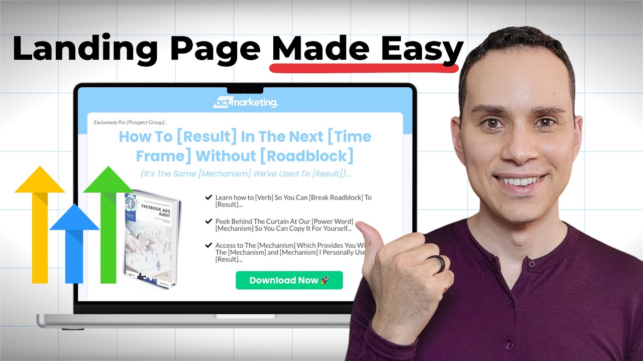
46% conversion rates from cold Facebook traffic. 50 59 even 69% conversion rates from YouTube. If you want high converting landing pages like these for your own products and funnels, this is the simple four-step framework to copy for yourself. And it works with just about any go highle template. And we have a cool bonus one if you are a course creator or selling your own digital products. Hey, I'm Jason faith-based entrepreneur. timestamps and resources below, including a link to a 30-day free trial of High Level. If you decide to sign up via our link, you'll get all of our funnel templates for free, including the landing page template you're about to see, as well as a private community access where you can jump on a call with me, ask me questions personally to build your own funnel and sales processes, as well as a complete library of AI tools, templates, and strategies to help you take your business to the next level via the link in the top of the description. So, let's go ahead jump into high level here. I'm inside one of my accounts. And to create your landing page, you're going to go to sites and funnels. And so, you actually have three options. I'm going to add a fourth since I just want to give you a template to make this process a whole lot easier. But to create a new what we're going to call funnel. We're going to click on this blue button over here. And then we have three options. Now, I'm going to use a pre-done template to really speed things up. But if you think our templates are ugly, they do have a really big template library. As you can see here, there are hundreds upon hundreds of templates just for landing pages. So, it's highly unlikely you're not going to find a design that you can at least start with. They also have the ability here, if we jump back over to our example, you can see here we can click on AI and continue. And you can generate up to five free uh templates. And what this is going to do is it's going to go through the template library for you and try and put things together and create a funnel for you based upon your business. Uh, and then you do need to pay because AI isn't always free. So after the first five, there is a small fee if you want to keep using their AI to generate templates. But for this particular example, I'm going to start from blank. I'm going to give this a name just so I know that this is a demo. And then we'll go ahead and click on create. And then when you do it this way, you can add any type of template or if you're importing a snapshot not from us or somebody else. This is kind of how I like to build funnels. So, we've got our funnel in here. Of course, you can create a new funnel step, but what I'm going to do is I'm going to come back out here so I can show you how to copy and paste between different funnels. So, inside of our snapshot, you'll get uh a version of this. And then all I need to do is come up here and click clone funnel step. And then I can go ahead and select uh my account of course and then go ahead and select the demo that I just created. And I'm going to add the selected funnel step over there. So if you are using go high level a lot, then you probably want to create what I like to call like a template funnel. You'll see I have all of my ideal pages here. And then whenever I'm building something new, I just copy it over to the new one. So that way I always have a master version and I don't accidentally edit a template because I've done that before and it's really painful. So I'll go ahead and jump into my demo here. And you can see here it's loaded up the landing page. If you jump over here to settings real quick, you can go ahead and choose your domain. You can actually purchase domains via through go high level now. And if you're doing any sort of paid ads, this is where you can add your tracking codes and all that other fun stuff. But for now, I'm just going to keep things basic. and we're actually going to hop into edit the page. Let's go ahead and build out our landing page using the ADA framework. So, we're going to grab attention with our headline. We're going to build interest with our bullet points and image here. Then, we're going to create some desire either through testimonials or through a self- quote. And then, we're going to drive action by, of course, actually collecting that oho important email. You can ask for the name as well. So, I'll go ahead and start at the top here. So you can see here we have a little element uh exclusively for prospect group. So I'm just I've gone ahead and queued up the copy. I'll leave a link in the description if you want a full guide on how to actually write your landing page copy. But if you are copying from a document all you need to do is hold control shiftV on Windows or commandshiftv on Mac and it will not mess up the formatting. So you can see here this first one I held shift controlV or commandV and it copied the formatting of the go highle page whereas down here I just hit controlV or commandV and it brings in the colors from the um document. So uh just keep that in mind if you start finding your formatting is going all wonky. So I'm
Segment 2 (05:00 - 10:00)
going to go ahead and copy our headline here and then I'll show you some basics when it comes to changing the typography. So, of course, it does not look very good. So, the first thing we want to do is make sure that we're using the right colors. So, all we need to do to change the colors is just go ahead and highlight all the text that you want. And now, this box will appear. And you can go ahead and change the colors to whatever you see fit. So, in this particular instance, let's say I'm going to use this darker blue for some reason. Kind of clashes with the color up here, but we'll let that slide for now. Actually, let's come up here and we can change that. So, I'll click on the um green section. So, I'm clicking on the green section and I'm coming over here to change the background color to match the um color of the headline. You really only need if you have more than three colors on your landing page, you're doing too much because you really want the button to pop. That's where you want people's eyes to go. So, the more you can make that color stand out, the better. And the easiest way to do that is by not overusing colors. So I'll go ahead and highlight this text here. So you can see we don't really like how it looks. So you have two options when it comes to messing with text on any highle page. The first of course is changing the font size. So I can go ahead and bring the font size down a little bit so that it comes out on one page. But I think that's a little too small. So I'm going to hit the undo uh little undo arrow that's behind my head right now. I know you can't see it. Please don't rage in the comments. It's just a lot to keep moving me up and down, right? So, I'm blocking the undo or redo button as well as publish and save. So, I'll go ahead and click on save here. So, instead, what I'll do is you can mess with padding and margin. So, this is how much space things have in between elements on a page. So, and of course, this is going to apply to any page that you're building. And so, we can go ahead and click on styles here. I've selected the headline element and you can see here I've put padding of 20 and 20 to kind of bring it in smaller on the page. But if I take that away and let's say I'm going to go zero and now all of a sudden I can get it on one line. But as you can see here there's very little space in between the end of the text and then um the row or the background element. So I look at this and go, okay, well it's on one line, but now it does not look good at all. So we can actually go the opposite direction here and we can actually put in more margin. So let's say we want to go 80 on both sides. Do make sure it's equal. Uh, and that looks a little nicer, but honestly it would look better if it goes like this. But the reason you don't want to do that is if we switch to the mobile preview, it's going to look all sorts of terrible. So, we'll go ahead and click on there. Uh, for time purposes, we won't go through editing on the mobile side, but just know when it comes to the typography, the sizing, and the spacing, and the padding, you can modify all of that for mobile. So, you can have a nice mobile version that actually looks good, and a nice desktop version that also, you know, decently looks good. But, um, manually hitting enter is a big no no. So the only other option we have is trying to bring the padding up on both sides or the margin up on both sides. Margin is the space outside the element. Padding is the spacing inside the element. I know gets confusing. You you'll develop your own system relatively quickly. What's most important is it makes sense to you and you use it consistently, right? I know like actual developers will be like, "Oh my gosh, I can't believe you say that. " Well, you know, you just got to keep it simple. We don't have all day to build these pages. So, speaking of all day, I'm gonna try one more time here. You can tell I'm doing this live and it's just I think that's the best I'm going to get. Uh I don't like how much white space there is. So, one of the other things I sometimes do too is I'll go back to, you know, GPT and I'll play around with the headline again to see if I can get it so to add or subtract some words so it just looks nicer on the page. But, um for now, that's uh pretty much what we're going to be stuck with. But that also shows you how you can move text around the page because you definitely never want to manually hit enter. It's going to mess up your mobile preview and a lot of your traffic's coming from mobile. So then for our sub headline here, I don't um I don't actually have one, but you have the same options. You can even animate things as well. So if like for example, we wanted it to fade in for some reason, we could do that. I think it's distracting. So, I'm just going to go ahead and remove our sub headline al together. And I'll go ahead and click on save behind my big head that's blocking it in your preview. So, that does it for grabbing attention. That's really all you need. A headline, a little pre headline saying who the offer is for
Segment 3 (10:00 - 15:00)
and then a big promise and then a promise of a result and a removal of a roadblock. So, that's again link in the description to a copywriting guide. So, the next step is going to be your bullet points. And this one really got me confused when I first started. There's a couple things here that I had no idea. So, uh, number one, if we click go to elements here and we go over to elements, like where is it? Elements. And we use the bulleted list, um, you'll see here if I click enter and start typing, it really doesn't look very good. Um, you can go ahead and mess with the spacing and the lining, but actually, and I've actually talked to someone on the high level team about this, is you want to make one bullet element, format it the way you need, and then hit duplicate. So, you're just going to use one element per bullet. It's a little backwards compared to some of the other things I've used in the past, but apparently that's how they design their bullets. So, when it comes to our bullet, I'm going to go ahead and drop our uh bullet point in. And then I'm going to bold a specific part. So, when you're bolding your bullets, you want to think about if someone's just skimming, how do what part of the bullet point can we bold that just makes it really obvious what we're delivering or a roadblock we're removing. So, here, eliminate wasteful clicks to double your leads. If they take nothing else from the bullet, we'll just say that. Um, but of course the text is all squished now, right? So, we can click on our element here and then we can come over here to line height and I'm going to go 1. 3 between one 1. 2 and 1. 5 generally works. You see, it's a little maybe I'll just do 1. 2. There we go. I think that's okay. I think that's uh readable. It's supposed to be legible. All right. And then of course you can also change all of your font weights. We can change the size of course. And then we have our colors as well. I'm just going to leave it the gray color that it is. Um and then if we wanted to add more space in between our bullets, we could go ahead and let's say add a bunch of margin, right? But we're not going to do that. I'll keep that at uh zero. And our template has a basic padding of 20. So there's a nice space in between each bullet point. Now, the other thing that really tripped me up, this is the one where I was like, I how nobody Why did nobody say this? You need to come all the way down to icon at the very bottom here. And I probably had to special edit this because it's so far down. Um, and you check this. When you click inside of icon, there's a bunch of icons here. None of them are going to be helpful. You're gonna look and go, what kind of software only has these options? You have to search. Um, I'm sure that there's some list, but here I'm just going to search check. And then you're going to see a bunch of different check mark elements, right? Um, and so that's something that really confused the heck out of me when I first started with high level. I was like, why can I not change these? Well, you have to come all the way down here and then the default list does not actually show you everything. So, um, if you have something in mind for your bullet, just try five or six different ways of describing it. Just one keyword and you might be able to find what you're looking for. Um, I think they probably just have so many they decided to make a search, but it is is a little cumbersome. And of course, I can go ahead and change the icon color here. Let's say I want to change it to the blue I'm using everywhere else. All right, cool. So, now we can go ahead and copy paste the rest of my bullets here. So, I'll go ahead and skip ahead to that being done so you don't watch me do the same thing three times. And just like that, our bullet points are done. Now, when it comes to the image for your landing page, you want an image that represents whatever free the free offer is. So, even if it's just booking a call with you, then you could just have a picture of yourself. I know that kind of feels weird sometimes, but we just need some sort of graphical representation. Now, of course, I did not build this in high level. I did create this using um Canva and of course a lot of people like creating things with AI but what I will say is it just needs to a represent whatever that they're getting and b not look like you just generated it using AI. So, if you have any sort of workbook or worksheet or template that you're giving away as a lead magnet, it's actually better, I'd say now, better now to just show screenshots of it so people know that you didn't just generate something in AI for 10 minutes and then asked for their email with it. So, um or you can take the time to make a real image um inside of Canva. So, to do that, I've gone ahead and used the image element. Now, um for time purposes, I'm not like clicking and dragging all the elements. You can always check these out for yourself. But uh there is a image element right here under media. So we just click and drag that in. But I will say something that also tripped me up. I'm just trying to show you all the stuff that tripped me up. Um is the
Segment 4 (15:00 - 20:00)
sizing. So if I go ahead and duplicate this real quick and I come over here to the right hand side in general, you can go ahead and click on this and then you can bring in your images. So like let's say I'm just going to bring in a product image here. And let's say that's a image I want to bring in. You see it looks terrible now. Um, and that's because I've set the height to 350. So I need to go ahead and leave it at auto. And then it will go ahead and fix itself. Uh, you can always go ahead and change the width. So like let's say I want 500. Um, but if you're messing with the width or the height, you want the opposite to be auto so it doesn't look all funny. So, if I click and drag this over, I know this looks terrible, but let's go ahead and say this is auto as well. Now, it's going to make the image a lot bigger. Or maybe I want to change the height to only be 700 for some reason. Um, and now it's going to make it uh look really bad. So, um, you will have to play with this quite a bit. It is actually kind of annoying because I personally, it also depends on your browser. So, like the browser I'm using right now, I can't set this I can't delete um the height that I've put in. So if I mess this up, I literally have to delete the element then um duplicate and start over again. Um so I just wanted to show you that and hopefully that saves like one person headaches. It's so annoying. But um just keep in mind when you're playing with your height and width, it may take some time to get something that actually looks good. Um, but if you don't want to deal with it, just leave it at auto. And I think that's uh the best way to go. So, I'll go ahead and leave both at auto here. And then that way, if I jump over to the mobile preview, you'll see that it you can um it'll automatically resize it for you. Or on the mobile preview, we can go ahead and say, okay, you know what? That's way too big. Let's go ahead and make it only 350. That way, it's not taking up the entire page. Right? So, that does it for your interest section. If you have any questions about building with High Level or you want to copy this and all of our other templates, of course, comment below or check out that link at the top of the description. So, before we get to the button and forms, which they finally fixed, thank you. It's like they heard everyone complaining. Um, you do want to have some sort of quote on your page. Now, if you're driving traffic, cold traffic, like I showed you at the beginning with that Facebook ads uh landing page, I went ahead and clipped a bunch of testimonials and positive comments on our trainings. That's really important for paid traffic. You need testimonials. But guess what? Most of us don't have those when we're just starting. So, you can quote yourself, which is what we'll do here. So, I'll just quickly go ahead and grab this uh self quote. I do this on all of my pages because uh when you're first creating a lead magnet, of course, nobody's seen it before. So, you can say how great you think the lead magnet is. And then, of course, we can go ahead and put in our name and title. And then we could swap out our image. Uh do note that with the circle images, this is something that I also did inside of Canva. I just uploaded it and used a circle frame and then downloaded without uh without a background. Although now I guess you could just upload your image to GPT and ask it to do that for you if you're not paying for Canva. But uh Gohigh Level is not going to create a circle image for you right out of the gate there with um that. And then before we get to the download button, just want to quickly point out that uh any sort of pretty much every platform wants you to have some legal disclaimer text underneath it. So I use something called Termageddon. I'll leave that link in the description. and they essentially create your privacy policy for you and then they keep it updated because every single state has its own rules and they're always changing it. And so Termageddon pretty much just updates all that for you and then you know Facebook and YouTube and Tik Tok don't get angry at you for having the wrong text at the bottom of your uh bottom of your landing page or in your privacy policy. But just to be clear, I'm just sharing what I do. I'm not giving you legal advice at all. So there you go. All right. So now I'm going to go ahead and click on save here. And the only thing we're missing is driving some action that is actually collecting that contact information. So the way I like setting up these pages mostly because I don't like what we're about to do. Um I create a button. And of course you can go over click on here and they have a button element somewhere in here. I'm sure you already saw it and I just can't find it. There it is. It's at the top. you um have this button element. Uh and then you can see this kind of it comes in really plain and you're going to spend 20 to 30 minutes just creating your button. So once you figure out your button, save it. Um we could spend all the time we've talked about the entire rest of the page just trying to format the button so it doesn't look dumb. Um uh so which is why
Segment 5 (20:00 - 25:00)
we just spend all the time for you. So uh what I quickly do want to point out is for animations you can create hover effects. So you can see here when someone mouses over it kind of jumps up a little bit. That's the only time I use effects. And then when it comes to the button action, you can see down here you have a bunch of options. Of course, if you've ever read any reviews of High Level, people talk about how over complicated it is. This is one of those areas where you can completely get lost because a one button element can do so many different things. But in this particular instance, I'm setting the action to open a popup. So, the way you create popups is, of course, you can click on this popup icon here. And then you can go ahead and click on create new popup. And then when you click edit, the pop-up will show up here blank. And you can actually add in your own elements. But you're going to notice that unlike other page builders, there's no form. There's a form element here, but this is not the one that you want to use. So, I'm going to go ahead and exit out because it this is where it gets confusing. But I'm going to open my popups here and I'm going to click on the one that I've already created. And you'll see here that uh this is a form. And so what's really confusing is forms are actually edited in a completely different part of high level. So to make sure nobody gets lost, I'm going to overexlain this part. So I'm going to save and then I'm going to exit. So I'm going to go back and jump over to forms here. And so we've left funnels. You can see here I have some forms. Uh I have a form template here. So I'm just going to go ahead and duplicate the template. So you can see here design once and then just copy it all over again. And then we're going to say T-52 demo. There we go. So I know where my form is. Click on save. And so with that, our form has been duplicated. We can go ahead and click on to edit here. And it's again confusing, but uh if you click on these style, this little icon over here, styles and options, you'll be able to start modifying how the form looks. You can load in a custom theme, a basic theme here. So, for example, it's on the default theme right now because I customized it, but you could go ahead and say use a different theme, and then it'll go ahead and load it up for you, and then you can modify it. I'll go ahead and undo that because I like the plain version we have here. And then if you click on advanced, you'll be able to change the typography, the background colors, the lines, and the shadows, and all that other fun stuff, right? Um, but our template already has this ready for you, so you can skip all of that work and just get to building. So, the thing I would recommend changing here would just be the download now button color. So, I can go to colors and backgrounds, and you just want to change the color to whatever the color of the button is on your landing page. Uh, and so we'll go ahead and click on save, even though we didn't do anything. And I'm going to go ahead and click on back. You don't need to set up any sort of automations or rules here. That'll be handled inside your workflows. Again, link in the description to a video that goes through building out the entire funnel where I go connect this form to an actual workflow based on whether or not someone purchases or not. So, that's pretty cool. So, we'll jump back over to funnels now and then we'll go to our demo and we'll go ahead and open that up. And we can go ahead and come over here to popup settings and let's go ahead and use the popup I just created. So, I'm going to go ahead and add uh one column here. I'm going to add an element and I'm going to select form now. And then you're going to have your drop-own list of forms. So I can select my T uh T-52 demo and go ahead and click on save. And so the next step after doing this is we need to connect this popup to the download now button. Uh so you'll see here on the right hand side I'm in the popup settings and you'll see right now it's set to show up on exit. So if someone's trying to leave the pop-up shows up. Um most social media platforms really don't like that. especially if you're doing paid advertising. Um, you could probably get away with it organically for a while, but if you do any paid ads, don't have an exit intent. That'll piss off Google. But, um, we can go ahead and say none for the action, right? And then that way, let me hit exit. I'm going to exit out of this. We'll click on our button now. And then when we come down to our settings here, open popup, we can select the new popup that we created. Click on save. And so now when we click download, now it will show this popup, the new pop-up that we created. And then someone can enter their name and email. And then inside of your automations and workflows, you start sending emails and doing all the other fun complex stuff you can do with high level. And with that, your landing page is complete. So I'll go ahead and
Segment 6 (25:00 - 26:00)
click on save here. And then I will show the preview. And just like that, our landing page is complete here. Of course, it took me more than 15 minutes to explain it to you, but you can see how you can definitely start putting to these together really fast. Click download now. The name and email pops up and then you're off to the races creating your workflows or other steps in your funnel process or getting people on the phone with you to close them on coaching or consulting. So, thank you so much for watching. Sincerely hope you have a much better idea and picture of what it looks like creating a landing page inside of High Level. There are a ton of other options when it comes to page building. So, link in the description to that 90minute guide where I go through not only the landing page, but all the other steps of the funnel so you can see exactly how all of this connects together. And of course, at the top of the description, check out that link to the 30-day free trial. You'll get access to this template, all of our other funnel templates, including our workflows, and our membership site templates, private community to ask me questions, and a nice little library of tools, templates, and AI agents to help you with building your own business. So, sincerely hope you got some value out of this video. Comment below if you have any more questions. Subscribe and until the next, keep building the business you
![Lead Generation Funnel Tutorial [ Go High Level 2025]](/thumbnail/7cVo5xKMUbY.jpg)