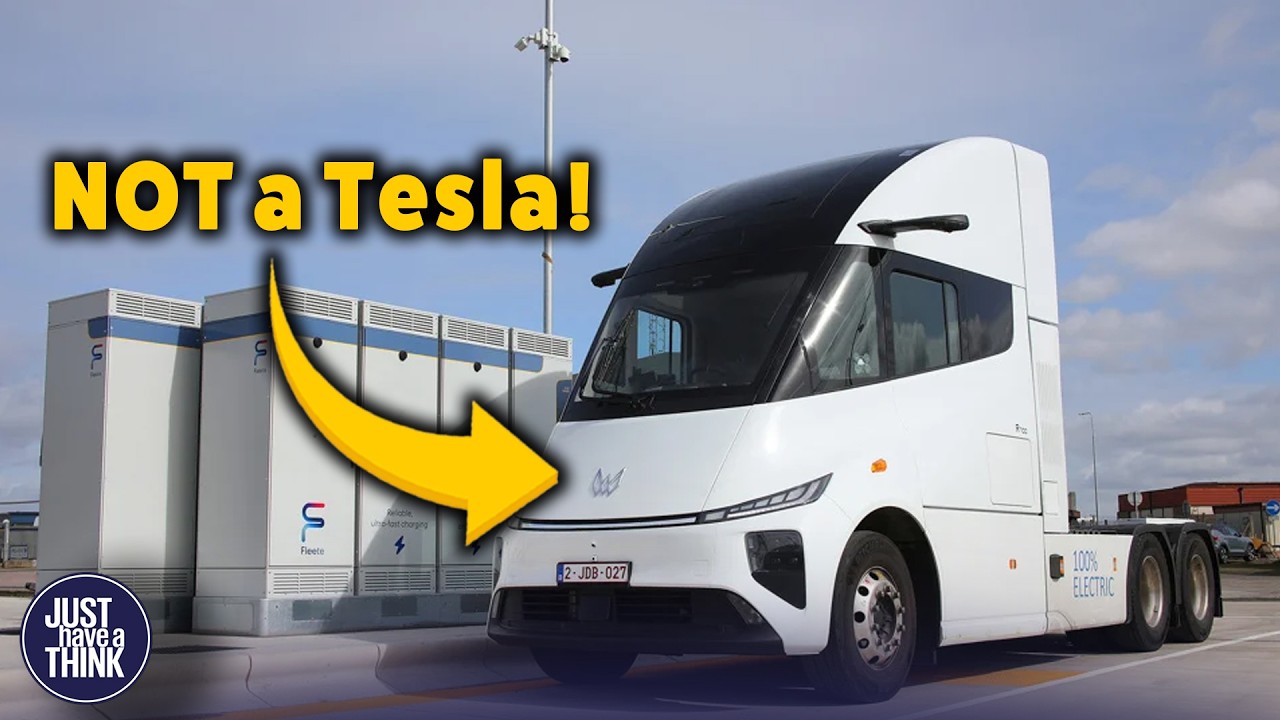
If you’ve spent any time at all looking at global energy statistics over the past few years, you’ll probably have seen a chart that looks something like this. Fossil fuels: still around 80 percent of global primary energy. Solar and wind: still a relatively modest slice of the pie. And if you’re anything like me, you may have stared at that chart and thought: “Hang on a minute… solar installations are booming, electric vehicles are everywhere, coal is collapsing in some regions… so why does this chart look like almost nothing has changed? ” It’s a good question, isn’t it? Well, I thought it was anyway. And as it happens there’s a very robust new piece of analysis just been published that has helped me greatly to understand why that apparent paradox exists. Turns out the problem isn’t the transition. It’s the way we’ve been counting it! Hello and welcome to Just Have a Think I am guessing you’ve heard of this guy. He’s called Michael Liebreich He’s a British clean energy analyst, investor and commentator best known as the founder of Bloomberg New Energy Finance, which he launched in 2004 and built into one of the world’s leading providers of data and analysis on the energy transition. He’s since become a prominent voice on global decarbonisation pathways, advising governments, financial institutions and international organisations on clean energy finance, electrification and climate strategy, and of course on his famous hydrogen ladder, which we’ve referenced several times on this channel. He knows his onions, and he’s just teamed up with the folks at the ever-brilliant EMBER to publish this new piece of analysis. Most global energy analysis begins with something we’ve covered lots of times here on the channel over the years. The concept of primary energy. It’s been a while since we dismantled this one to take a closer look, so it’s definitely worth a recap. Before we do that though, I wonder if you might be an absolute looby-loo and take a couple of seconds to click the like and subscribe buttons just down here. It won’t cost you a penny and it won’t prompt a torrent of spam emails from me either, I promise you. I haven’t got the time or the inclination quite frankly. What it does do though is offer this channel a better chance of getting selected for your attention by the YouTube algorithm ahead of all the AI clickbait nonsense. If you’re already a subscriber, then you’re a superstar. And if you haven’t yet subscribed, then this is surely the easiest way to become a superstar, isn’t it? A-N-Y-W-A-Y…Primary energy… So, this is the term that the industry bods use to describe the raw energy content of fuels extracted from nature. So that’s the coal in the ground, the oil in a barrel, the gas at the wellhead, the sunlight hitting a solar panel, or the wind turning a turbine. You get the idea. It’s the STARTING point of the energy system. And when you look at our global energy system through that lens alone then quite clearly fossil fuels still dominate by a big margin because we’re still digging and drilling a butt-tonne of it up all over the place. But as the Ember authors explain, that rather simplistic, supply-first framing obscures some pretty eye-watering conversion losses. For example, when coal is burnt in a power station, only about a third of the energy content of that coal actually becomes electricity. The rest disappears as waste heat. When we burn petrol in a combustion engine vehicle, most of the energy goes into heat and friction, not motion. By contrast, wind turbines and solar panels don’t involve combustion at all. There’s no giant thermal loss at the start of the chain. The energy arrives already in electrical form. BUT, under traditional PRIMARY energy accounting, one exajoule of coal is treated the same as one exajoule of wind, even though physically they are not the same thing at all. So, some reframing is required here to provide not only industry investors but also interested human beings like you and me with data that’s a bit more helpful. The Ember paper essentially proposes that we should flip the entire model on its head. Instead of starting with Primary energy supply, let’s start with what consumers actually want and need, and work from there instead. Nothing fancy, just the obvious stuff like warm homes, moving vehicles, running factories, lighting spaces, using computing power, and cooling and refrigeration. Stuff like that. The paper’s authors suggest collapsing the complexity of energy demand into two fundamental outputs: Useful work and useful heat. That’s it. Dead simple. Everything else is essentially a variation on those two things. So instead of asking, “How much coal, oil and gas are we extracting? ” we should be asking: “How are we delivering useful work and useful heat? ” And suddenly the picture starts to shift. Because at the other end of this colourful
Segment 2 (05:00 - 10:00)
swirly piece of artwork known as a Sankey Chart, final energy – in other words the energy that reaches end users — only comes in two forms as well. It’s either electrons or it’s molecules. Electrons is clearly electricity. I think we can all manage that one. And MOLECULES mean the fuels like oil, gas, coal, hydrogen and biofuels. So far so good… I think. But here’s the thing about FINAL energy. Electric technologies are, on average, far more efficient at converting it into useful output than combustion-based technologies. An electric motor converts a very high percentage of electrical energy into motion. An internal combustion engine converts a much smaller percentage of fuel energy into motion. A heat pump can deliver multiple units of heat for every unit of electricity consumed. A gas boiler or furnace can’t. So, when you look at the system from the perspective of useful energy delivered, electricity punches far above its apparent weight. And when you combine that with the fact that renewables generate electricity directly — without the intermediate thermal step of combustion— the efficiency gap widens further upstream as well. So now we’ve got three system layers in the Ember analysis Primary energy — where energy originates. Final energy — what consumers actually purchase. And USEFUL energy, which is what actually delivers the services that those consumers require. And in each of those steps, some energy is lost because…thermodynamics. The real point – the real insight the paper is trying to put across to us is that fossil fuel systems suffer enormous losses in the transition from PRIMARY to USEFUL energy. Electrified systems lose far less. And that difference is absolutely essential to any ‘apples to apples’ comparison. Because it means that as we electrify, total PRIMARY energy demand can actually go DOWN — even as USEFUL energy DEMAND stays constant or grows. That’s definitely NOT the impression you get if you’re just looking at supply charts. But perfectly logical if you choose to apply some basic principles of physics, which is what these folks have done, and by the way is also what plenty of other industry experts have been trying to explain to us all for quite some time now. This paper’s authors argue that when measured in terms of useful output rather than primary input, renewables are ALREADY MUCH more competitive than traditional statistics imply. Which probably explains why renewables now dominate ALL NEW capacity additions globally. Because hard-nosed investors look at the bottom line. And the bottom line, in the majority of projects, says ‘renewables’. Similar thing with transport. Electric vehicles convert electrical energy into motion much more efficiently than combustion engines convert fuel into motion. So, when a driver switches from petrol to electric, not only do tailpipe emissions disappear — total energy demand falls as well. Not because the driver is travelling less but because the physics of the electric motor are better. Heat pumps have the edge over gas boilers because instead of generating heat directly from combustion, they MOVE existing heat using electricity to drive fans, condensers, pumps and compressors. The result is that they can be two, three, or even four or more times more energy efficient than a traditional boiler. From a USEFUL energy perspective, these are profound structural shifts, and yet, in PRIMARY energy charts, the advantage is largely invisible. One really fast way to screw up the advantages of direct electrification is to try to convert those electrons back into combustible fuels. It’s just such a retrograde decision it doesn’t make any sense at all. We’re talking about things like green hydrogen 8:56 and synthetic fuels, which REINTRODUCE the conversion losses that renewables-generated electrons initially eradicate from the system. Electricity to hydrogen: massively energy wasteful. Turning hydrogen into a combustible fuel: hugely energy hungry process. And burning any fuel for any reason provides most of its useful energy to the atmosphere rather than to the contraption we want to be useful. So, the report suggests that while molecules may still be required for certain hard-to-electrify sectors, the energy transition, if you look at it through the lens of basic physics, naturally favours direct electrification wherever possible. Because every time we avoid reintroducing combustion, we preserve efficiency. Now you might be thinking: “Okay, Dave – mildly interesting presentation of accounting semantics. But does it REALLY matter? ” Well, the authors of this paper argue that it definitely does matter, and for three reasons, not least of which is public perception. If people believe the disinformation and are wrongly persuaded that the transition is stalling because fossil fuels still appear to be dominant in widely published PRIMARY energy statistics, then that has the tendency to WEAKEN POLITICAL momentum.
Segment 3 (10:00 - 11:00)
And then if policymakers overestimate future primary energy demand, which is what they’re being directed to do today by very powerful industry lobbyists, then they’re provided with a way to justify entirely unnecessary new fossil fuel investment. And thirdly, electrification reduces total energy input required for the same output. That changes infrastructure needs, investment priorities, and long-term forecasting. In other words, what gets measured gets done and the way we count stuff will absolutely shape the way we plan for the future. Now, Michael Liebriech and his Ember co-writers are certainly not suggesting fossil fuels are already obsolete, nor are they arguing that electrification solves every problem. There are certain sectors like some heavy industries, aviation, and long-distance freight shipping, where molecules may still play a role. What they are very strongly arguing though is that the STRUCTURAL advantage of electricity is so strong that wherever electrification is technically feasible, it tends to win out over time. Not because of any kind of political ideology. Because of physics. I’ve left a link in the description to Ember’s full report so you can read it for yourself and draw your own conclusions. And I’m sure many of you will have strong views that right now you’re keen to share— so the place to leave them, as ever, is in the comments below. That’s it for this week though Thanks to the incredible group of supporters over on Patreon who make it possible to keep this channel free from all ads and sponsorship messages. Don’t forget to like and subscribe if you found this useful. And most importantly of all — Thanks for watching. Have a great week. And remember… To just have a think. See you next week.