Master CSS selectors with my FREE CSS Selector Cheat Sheet - _30+ selectors_ 👉 https://webdevsimplified.com/specificity-cheat-sheet.html
Become a CSS Developer with my CSS Simplified Course - _100+ videos, 20+ projects, 16+ hours_ 👉 https://courses.webdevsimplified.com/css-simplified/?utm_source=youtube&utm_medium=video-description&utm_term=video-id-vmzt6I1IZg8
Am I still able to create CSS designs in a quick time? In this video I challenge myself with a complicated CSS design where I only have 10 minutes to create it. Can I do it?
📚 Materials/References:
CSS Daily Challenge: https://cssdaily.dev/challenge/2026-04-08/
FREE CSS Selector Cheat Sheet: https://webdevsimplified.com/specificity-cheat-sheet.html
CSS Simplified Course: https://courses.webdevsimplified.com/css-simplified/?utm_source=youtube&utm_medium=video-description&utm_term=video-id-vmzt6I1IZg8
🌎 Find Me Here:
My Blog: https://blog.webdevsimplified.com/
My Courses: https://courses.webdevsimplified.com/
Patreon: https://www.patreon.com/WebDevSimplified
Twitter: https://twitter.com/DevSimplified
Discord: https://discord.gg/7StTjnR
GitHub: https://github.com/WebDevSimplified
CodePen: https://codepen.io/WebDevSimplified
⏱️ Timestamps:
00:00 - Introduction
00:15 - Challenge Prep
03:21 - Challenge Start
13:24 - Challenge Extension
23:06 - AI Solution
#CSS #WDS #CSSDaily
Оглавление (5 сегментов)
Introduction
I recently got knocked out in the final four of the March Mad CSS tournament, so I feel like I need to redeem myself. So, I'm going to see if I can turn this ugly HTML into this final design in just 10 minutes.
Challenge Prep
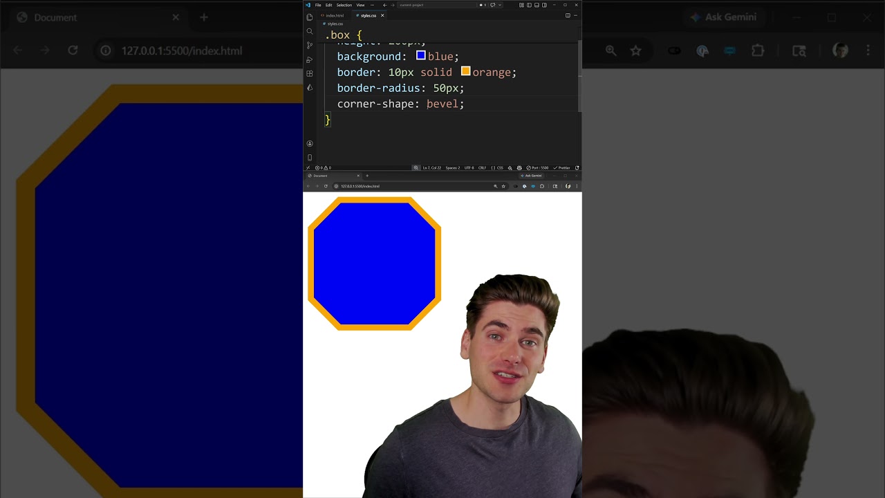
Now, the very first thing I want to do with any challenge like this, since we're given time to prep before the actual 10-minute counter starts counting down, I want to take a look at all the existing code from the HTML to the CSS that we have to see what's already there and give myself a game plan for how I want to implement this. So, first of all, if we take a look at the HTML, you can see it's read only. I can't actually modify any of this. If we look in the CSS, we just have all of the CSS colors that we're going to be using, as well as all the selectors for anything that we may want just to make it a little bit easier and quicker for us to type everything out. This is all supplied for us. And all of this is on the CSS daily. dev site. If you want a link this exact challenge in the description. Yours is going to look more like this. I've just modified the CSS on the page to make it easier for you to see by increasing font size and so on. Now, the very first thing that I want to take a look at is just the actual final design over here. You can see we have this high score section with stars. That's this HTML right here. So, if I take a look at the CSS or the HTML, sorry, it looks like that's all inside this board header. So, that's going to be some type of flex container with a gap to space out the stars, and then just coloring these different elements to be the exact color that I want. Then, if I look down, I have this Galaxy Blaster section, which is just the subtitle. Again, this is just going to be something that I'm going to lay out and put like a border top and bottom on it with some potential padding and centering the text. And this entire element is probably just going to be flex box because it's just a vertically stacked column of elements with a set width on it, so that shouldn't be too hard to do. Next, we can see we have these score rows. So, that's each one of these rows down here for first, second, third, and so on. And we're able to easily modify what we want. Again, this looks like a flex box situation where this score dots is essentially going to be a flex container that grows to fill the full width, and it's just going to have a border to give us that dotted based border. Now, if I scroll down a little bit further, the final thing on here, I guess, is just this footer. So, for this footer, again, I'm just going to center the text, maybe add a border on the top to match the border that we have up here. And other than that, I think it's going to be relatively straightforward. I do want to take a look at my colors just so I have those in my mind before I start because as soon as I type any code in this left panel, that's when my timer is going to start. You'll see it count down up here as long as the percentage of how close I am to the actual final solution. So, we look background board, that's pretty self-explanatory. Background header, I guess the header has a different background color than the rest of the board. I don't actually see that when I'm looking at this, but it must have a slightly different color. The border on the entire thing, that's that pink color, most likely. The inner border, I guess that is the blue color. Yeah, cuz the red is zero on this one, so that's that turquoise blue color. The title color, that's the yellow. Subtitle is again that same blue color. Then, we have our gold, silver, bronze. That's these three text colors for first, second, third. And then finally, our normal color is just the fourth and fifth place. Badge color, I'm guessing that is the Oh, that's all the badges. They all have the exact same background. The dots is that border that we talked about. Footer is going to be this pink color, I'm assuming. And the color icon is also pink. Oh, that's for the stars. And then finally, we have our row hover. This site was kind of made using AI, so there's actually no hover effects being applied to this, so I can probably just ignore this completely. But overall, I think I know where all my different CSS variables go. So, let's actually start by just going and trying to lay this out. And I think we'll start with just the arcade board itself cuz that will be flex box based, and this should start my
Challenge Start
timer. So, we're going to come in here with a display of flex. We're going to have a gap of like 1 REM. That's probably too much, but we'll start there. And we want a flex direction of column. There we go. That does lay everything out just like I want. Next, we're going to work on our header. This is going to have a display of flex as well, and we'll do a gap of 1 REM. And for this one, I need to have a background here. And we called that our background board. There we go. Perfect. And then let's come in here with our color. And that's our color, and I think we called that normal. There we go. So, that at least gets us a good stepping stone. We'll add some padding, maybe like 2 REM. A border radius. Uh maybe like 5 pixels. That looks about right, actually. If we do a little bit of a overlay, we can actually see ours on top of it. And we want to hard code the width on this, I believe. The height will be automatically generated, but we do need to have a hard coded width. And let's just say that's going to be like 300 pixels. 500 pixels. Nope, that's too much. 400 pixels. Maybe 420. Actually, that looks pretty close. 410. Yeah, we'll go with 410 for now because I do need to add on my border. And that's going to be a 1 pixel solid And that is our accent color. Um what was that? Our border main. There we go. And let's see, this is probably like 5 pixels. There we go. And I do think this needs to be like 415 pixels wide. 420. 420 actually looks pretty close. It's not 100%, but it's good enough for now. If we take a look at the diff view, yeah, we can see it's getting there. Okay. Now, let's finish out with this header. I want to make it so that my items are in the center. So, align Oops. Items center, just like that. And the color on this one is going to be our header color. So, we have color title. There we go. Now, I need to get my header icons. Those are going to have a color which is the color icon, I believe is what it's called. There we go. So, at least those have the right color. Everything is centered, so that's correct. I need my text to be in the center, so we can say justify content center. There we go. That is centered as well. There's a lot of space going on, so I think my padding maybe is off. We'll change that to like 1 REM. And then we just need some letter spacing, so we'll come in here with letter spacing, and we'll just say like 0. 5 What is that? 2 pixels? I don't actually know the letter spacing syntax very well. Oops. 10 pixels. Um 15. All right. I'm not 100% sure. Oh, it's cuz it's I'm putting that on my icon. No wonder it's not working. Here we go. So, now let's change that to like 5 pixels. That actually looks pretty spot on. So, we'll just stick with that. Let's go on to our rows cuz that'll help us with the score the most. So, for our score row here, we're going to have a display of flex, and we're going to have space between. So, justify Actually, we don't need to worry about that. We just need a gap of 10 pixels or something like that. Not 100% sure what it's going to be. Uh let's see. We have our badge. We have our content. Let's get our border next. So, where is that at? Badges, name, score dots. So, this is going to be a flex grow of one, so it fills the full space. This is going to have a border on the bottom. Let's just say that's going to be 1 pixel dashed. Actually, no. I think it's called dotted. There we go. Dotted. And the color on that is going to be our border color. So, um actually, I'm not sure what that color is. Let's see here. Color dots. There we go. So, we'll use And the time is absolutely flying on this. Let's go ahead and make that like 2 pixels, 3 pixels. I think 2 pixels is about right. And we need to make sure this is in the center, so we'll say align items center, just like that. Now, let's work on our badge here. So, this is going to have a background. And there's I believe a badge color. Yep, color badge background. There we go. Padding is going to be, let's say, 5 pixels. That looks relatively good. We also want our row to have some padding, so we'll say padding of 5 pixels, just like that. Okay. And actually, it looks like Okay, yeah. It does actually look like they're not using grid cuz these don't fill the full width on the bottom section. So, that's looking pretty good. I need to change my font size on this to maybe be like 15 pixels or 10 pixels or something. Not 100% sure what that needs to be. Maybe 12 pixels. It's not quite the full size. And again, it looks like it has some weird letter spacing stuff going on. Um let's get these set up. So, this is going to have a color of And this is gold. There we go. And I'm just going to copy this to all of these. Oops. Silver. Bronze. Normal. Okay, that gives us our colors correct. We also want to do the exact same thing with the player name. So, I'll just copy all of that. Paste it down, and this is just going to say player name. There we go. That way we get the same color for all of those. And we need the exact same thing for score. I would never write my CSS like this normally, but for time purposes, this is going to work fine. So, score value, I think is what it's called. Um yeah, there we go. Okay. So, that gives us all the scores, everything that's lined up. We also need to have a border on our row. So, let's come in here. This is going to be a border uh 1 pixel solid var I think we have a border color uh or is it just the normal color? I'm not really sure. Oh, border inner, maybe? No, that's not that. Let's just say color normal. These gray colors are really hard for me to see the difference in, so I'm just going to guess Oh, that's definitely not the right color. All right. Let's just look. Uh color icon, hover, dots. Maybe it's the same color as the dots. It actually does look the same as the dots. So, we'll just call this color dots, and that'll be close enough for now. I then want to have a gap between each one of my items in this particular section. It's quite a small gap between them. Let me see here. We have our score list. Where's that at? Here we go. Display grid. Gap 5 pixels. And I'm just doing display grid so I don't have to worry about doing flex direction in the column. Let's see here. Border radius 5 pixels. There we go. We got that all lined up. It looks like my padding needs to be a little bit bigger, like 10 pixels. Uh that's definitely maybe too big. Uh it's really hard for me to see. Uh we'll just go with 5 pixels and 10 pixels. Hopefully that is the correct way to do it. And let's move on to our score value. That's probably good enough. It looks like it's actually a font weight of bold. So we'll just go with bold on that. Uh it's maybe not bold, but close enough. The font is kind of looking weird, like it doesn't look like I have the right font. Or maybe also the names need to be bold. So where do I have that? Player name. Font weight bold on that as well. Mm. And yeah, we definitely need some letter spacing on this. Like 2 pixels or something. That's close enough. There's definitely something with the font that's not right cuz also I need to have font bold on the badge. There we go. That's at least closer. Let's try to get this Galaxy Blaster. That is the board title, I believe. So we'll come in here and we'll say display flex justify content center. Uh actually, maybe that's not the board title. Where is board title? Oh, board title is high scores. Definitely don't want to modify that. We want the board subtitle. So I'm going to take all that, put it in this subtitle. There we go. Um that's centered. Color is going to be color and there should be subtitle. Perfect. This is also going to have that letter spacing applied to it. Um we'll just say like 5 pixels for now. That's too far. We'll do 2 pixels. Font size is maybe like 10 pixels. Font weight This is going to be bold. There we go. Um letter spacing has got to be bigger than that. Sure, that looks about right. Border is going to be 1 pixel solid. And that is our border inner color. There we go. Padding is going to be 1 REM. Uh it's a maybe not right. 0. 5 REM. Uh still not quite right. Anyway, this is a border on the top. We're going to do the exact same thing on the bottom. So we'll do like 10 or 5 pixels on the top. Um border bottom That is going to be smaller at like 1 pixel, 2 pixel maybe. And of course, I put padding on the entire thing. So I need to remove the padding on the entire thing and put it on each of the element. For now, I'll just do a negative margin. So we'll say 0 -1 REM. That way it fills that full width. Um let's see. I think if I reduce the gap on my overall container as like the last thing I do. Do I even have a gap? 0. 5 REM. That'll get me a little closer. But I'm pretty much out of time on this one. Let's see what my diff view looks like. Yeah, definitely off a little bit.
Challenge Extension
Let's just keep tweaking on this to see how long it actually takes me. I'll start a separate timer and actually just check how long it takes me. But if we look at the diff on ours, interesting. The Okay, here's the overlay. Yeah, so our text is a little bit smaller, I believe. Let's see here. Yeah, our text is definitely smaller for the high scores. Oh no, it's bigger. I need to decrease the text of high scores. So let's go up to that section and decrease our text size. So board title font size. Now keep tweaking. Font size, let's try like 20 pixels. Okay, I don't know why it keeps asking me to change it again. Let's actually just skip past this section and move all the way to the bottom cuz I didn't actually do the footer. So I kind of want to let's see where we're at here. Footer is just this bottom section. So I can kind of copy what I did for the subtitle. It's almost going to be identical. This is going to be in the footer instead. Keeps asking me to tweak the display. That is quite annoying. Okay, I think I fixed that keep tweaking things so it hopefully shouldn't pop back up. Uh so now we've got this copied down. Obviously I don't need a border on the bottom. I will need the border on the top. Our padding, margin. I need to change my color. So this is going to be the color for the footer. There we go. And then I just need to change Looks like my letter spacing is about right. Font size is definitely wrong. Maybe it's like 12. Yeah, it looks about right. Let's come in here and fix our padding. Let's just say that we have zero padding on that. And I think what I'm going to do is I'm actually going to get rid of my gap cuz that's kind of messing some things up. So wherever my overall gap is, this right here, we're just going to get rid of that. Uh no, I actually I think I'm going to keep it on there. Yeah, I'll probably keep that on there. Uh it seems like point or one is definitely too far though. Seems actually quite small, like maybe 0. 25. Uh maybe 0. 5 actually. Yeah, that looks like about the correct distance between those. Okay, so let's move on to this bottom section cuz yeah, my padding needs to be just on the top. And it needs to be like 1 REM. Okay, that's actually pretty good already. Um I think our border radius needs to be bumped up a little bit. So here is our border radius. Let's try like 10 pixels on that. And our border looks to be too wide. So try like 3 pixels. That actually looks really good. Let's get a overview on this and see. So currently mine is a little bit taller than theirs. Mostly cuz my high sco- Oh no, their high score text is way bigger than mine. Cuz this is what mine looks like. This is what theirs looks like. So mine's a little bit shorter mostly from the high score text. So let's work on that high score text to see if we can get it to look like the actual target. So we're going to come in here. Font size of 30 pixels. Actually, that's already pretty spot on, I'd say. So look at the overlay view. So mine is maybe a little bit too big. Let's try 25. Okay. Think that's about the right size. It's just in the wrong place. So the Galaxy Blaster needs to have more padding on just the bottom portion, I think. So let's go ahead and do that. So that's the subtitle. Here we go. Padding just on the bottom needs to be bigger. Uh that's definitely too big, I think. Yeah, definitely too big. So we'll try like 0. 75. Okay, that looks really, really close. So my line is pretty much in the right place. It looks like the biggest difference is that middle section on mine. Uh let's see. Yeah, there's something with the text. Like the text is closer together on their on mine than it is on theirs. So maybe there's more letter spacing on the text. It's kind of weird if they have it set up that way, but we'll just assume that the score value has a letter spacing of like 1 pixel. Maybe two. Let's see. Two is definitely too far. So we'll try one. And looks like their font size is slightly smaller than whatever mine is. So we'll change this to like 15 pixels. Let's see. That actually looks like pretty correct on the font. Theirs is just a little bit more inward than mine. But yeah, that's pretty good. Let's see what else I'm missing. Cuz yeah, that font section's good. It looks like there's more spacing between like my rows are a little more squished together than their rows. They're a little bit wider, a little bit further apart, I think. So I think I need to increase the padding on my row. So let's go ahead and go to the row. And we will say that the padding is going to be maybe 7 pixels. That's way too big. Let's see here. Cuz yeah, if I go into the diff view, you can definitely see where it's off right here. We're at 73% with this. And I believe that is my actual score. Let's just Yeah, result. That is 73%. Let's just see if maybe lining some other stuff up will help with that cuz it still looks like when I change my high scores that the final version is actually larger than my current version. It has less padding on it. So let's go to wherever we have that header section. That's here. I want to put my letter spacing, I think just Okay, this is just on the header. Yeah. So I want to change the font size of this. And I think I already have that defined somewhere else. Let's see. Board title. Yeah. So let's change the letter spacing here to go on this element. There we go. And let's change the font size cuz it's definitely Yeah, theirs is definitely a little bit smaller or maybe it's just the padding. Let's try to fix the padding first. So wherever I have my padding on the board header Let's see here. The gap. Padding on the top here of 1 REM. Yeah, I can probably just remove that. Oops. Padding on the top and change it to like 0. 5 REM. Okay, that's a little bit better. My bottom section's a little bit too shrunk down there. So, I'm actually just going to change that back to what I had it one. Good enough, I think. And then on my border header, I'm just going to put a negative margin on it to hack this in place. So, we'll say margin is like -5 pixels. Let's see if we can get that in the right place. Put it on the overlay view. -6, shoot, -10. That's definitely Oh, of course, I need this just on the top. -5 pixels. That actually looks like it lines my text up perfectly. Now, I just want to mess with the letter spacing. 10 is too far. 2 1 3 4, so it's like 6 7. 6 looks pretty good. Yeah, I'm going to stick with 6 for my letter spacing. And then we just need a little bit of gap to get our stars to line up. There we go, one REM. That looks I mean, as good as it's going to get. There's maybe minute differences. Maybe my font size is slightly different, but I highly doubt it. Actually, 26 looks like it lined it up pretty well. Yeah, it's just the stars that are off now. So, wherever I have my stars, let's change my gap to like 14 pixels. 13. Okay, that looks like it's perfectly lined up. Yeah, so this header section is as good as I think I'm going to get it with the small differences between the browser. Next thing that we need to focus on is that Galaxy section. It looks like their text is slightly larger than my text, which is just pushing things down cuz So, let's go ahead and make our text slightly larger on the subtitle. So, the subtitle font size maybe 12. Actually, it might just be 11. It'd be a really weird number for them to use, but that does look to be the exact same font size that they're using. Now, they just have a slightly more padding on the top. So, we'll say padding top. This is going to be like 10 pixels. Okay, so my version is a little bit more than theirs. Let's try 8 pixels. that. 9 pixels. All right, that looks dead on. Looks like this is probably bold font, too. So, we'll say font weight bold. I mean, that looks pretty good. There's a little bit of jiggle, but I mean, that just might be browser differences more than anything. Other than that, I think my first place badges and stuff, they're really pretty good. Let's look at the diff view here. It's still a little messed up. For some reason, like it looks like my high scores is on a different line or something. Kind of weird. Same with the insert coin to play. It's like on a different line. Not really sure what's going on there. Still says we only have a 73% match, but I mean, I would say that this is close enough to get the job done. Maybe at the very bottom we could add a little bit of padding, but that's pretty much it. There's really not much else we could change about this to make
AI Solution
it better. Now, one of the most common comments I'm going to get on a video like this is, "Just throw it into AI. They can generate this for you in 10 seconds instead of you wasting 10 minutes not even finishing the actual prompt. " Well, I did exactly that. I took the exact HTML and CSS of the starting code from this and handed the exact same screenshot of the actual implementation. I'd copied the image directly from the site and I said, "Implement this using the existing HTML without changing it and using all these CSS variables. " This is the output it gave me. First of all, it just decided to add its own retro font because it thought that this is retro themed. So, I went ahead and I changed the font to the font it's supposed to be, which is the enter font. And when we do that, you can see it's a little bit closer, but it's still definitely not correct. And it actually has some really interesting things inside the code that it's doing. First of all, it's applying a random linear gradient to the background of the entire card because AIs love to add linear gradients to literally every background, no matter what, even though there is no need for it at all. It decided to add in a tiny linear gradient that's almost entirely transparent, but it's there just because that's what AI does. They also threw a box shadow on, which may just be something to do with the screenshot being a little weird or something like that. Other than that, you can see there's a lot of like hard-coded pixel values for the padding and stuff to get it exactly right. It uses random background colors instead of the ones I actually told it to use for everything. You can see it's just randomly applying its own borders and backgrounds, not doing what I said. And probably my favorite part of the entire thing is instead of using like a dashed border or something here, it's using a repeating linear gradient for the actual background of this section, which is not a bad idea. I mean, it definitely works, but it's obviously not even spanning the full width and is definitely an interesting way to tackle something like this when a dashed border is probably exactly what the original implementation of this did. It's also missing certain elements. For example, this bottom line right here is just completely missing from this design. And overall, this is not that great of a design. And when I actually pipe this design in and I pasted the exact same thing into this solver, you can see it gets a 61% match. And if we look at the diff view, it's completely off. It's a much larger version and it has like different colors and it's just definitely not the exact same thing. So, even with AI and how powerful it is, it still can't even get nearly as close as I was able to do in just a short period of time. And now, I could take this and tweak it and try to get it closer, but you could see it already did, you know, some interesting things inside the design process with like the background repeat and things like that. So, if you think AI is some silver bullet that's going to solve all your problems, unfortunately, it's not quite there yet. It's nice for like a starting point, especially for something like this, but it can definitely hallucinate and do some really weird things in your code like this linear gradient that makes no sense at all just because that's kind of stuff that's hard-coded into how the AI writes the code itself.