3 ways to make timelines in PowerPoint
12:15

3 ways to make timelines in PowerPoint

storytelling with data 21.05.2026 368 просмотров 28 лайков

Machine-readable: Markdown · JSON API · Site index

Поделиться Telegram VK Бот
Транскрипт Скачать .md
Анализ с AI
Описание видео
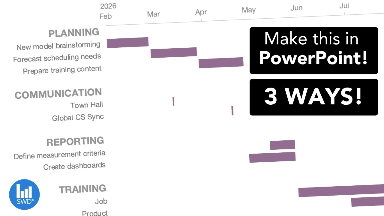
Need to build a timeline in PowerPoint? This video shows three practical ways to create timeline visuals, from a quick manual method with shapes and tables to a Gantt-style chart using a stacked bar view and a clean milestone view using a line chart approach. Watch to see when to use which option, how to set up the data, and learn formatting tips so the final visual looks polished. JUMP TO THE SECTION THAT INTERESTS YOU 00:00 Intro 00:33 Brute force approach 03:21 Gantt chart view 07:53 Line chart option 11:48 Outro BROWSE RELATED RESOURCES ● SWD Timeline Challenge: https://community.storytellingwithdata.com/challenges/apr-2026-visualize-a-timeline 
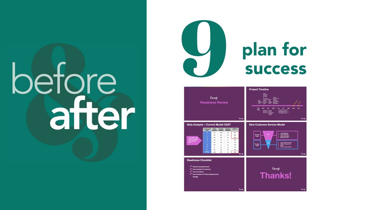
● Gannt chart guide article: https://www.storytellingwithdata.com/blog/what-is-a-gantt-chart ● Before & After Gantt chart template: https://www.storytellingwithdata.com/s/CH09-plan-for-success.pptx IMPROVE YOUR DATA VISUALIZATION & STORYTELLING SKILLS WORKSHOPS and 8-WEEK COURSE - Use YOUTUBE10 for 10% off! 🍎 Attend a workshop: https://storytellingwithdata.com/workshops. 🎓 Become an SWD scholar: https://www.storytellingwithdata.com/public-workshops#course ADDITIONAL RESOURCES 📚 Read the books: https://www.storytellingwithdata.com/books 📈 Enroll in an on-demand course: https://www.storytellingwithdata.com/on-demand-data-storytelling-courses 🖥 Follow the blog: https://storytellingwithdata.com/blog 📊 Practice in the SWD community: https://community.storytellingwithdata.com 🎧 Listen to the podcast: https://storytellingwithdata.com/podcast STAY CONNECTED 👉 Newsletter: https://eepurl.com/gduMBP 👉 LinkedIn: https://linkedin.com/company/storytelling-with-data-llc 👉 X/Twitter: https://twitter.com/storywithdata 👉 Instagram: https://instagram.com/storywithdata 👉 TikTok: https://www.tiktok.com/@storywithdata 💡 Don’t forget to subscribe for new videos! https://youtube.com/c/storytellingwithdata?sub_confirmation=1

Оглавление (5 сегментов)

Intro

Have you ever wanted to visualize the timeline in PowerPoint, but you weren't quite sure how to go about it cuz it's not a standard chart type? Well, in this video I'm going to share with you a few different ways that you can achieve this. Timelines are fantastic ways to show a sequence of events like project schedules or workflows. We recently ran a timeline challenge in our online community and received several examples. As we scroll through here, we can see many Gantt-style charts, lines with dots. And in this video, I'm going to show you three different ways you can create these types of views in PowerPoint. Let's get started. Now, the

Brute force approach

first way I want to show you how to create a timeline are some brute force approaches. These work well if you have just a simple timeline, and you can do this by inserting different shapes and tables. So, to create a more Gantt-style view with the horizontal rectangle boxes, we could actually just create a table. In the table, we can add some headers like perhaps we add the months, and then we can start to add some milestones or work streams, rather. Then, we could easily insert some rectangles to represent the time period of these events. And I can copy and paste and resize them over the months to fit with whatever time frame I wanted. Now, this looks pretty heavy. We can of course do some formatting changes here like getting rid of all of that heavy shading, maybe even spacing out and giving a little bit of breathing room to our work streams. And you'll notice as I do that, now my rectangle's in the wrong spot. So, it is very manual. You have to click and drag and resize and align them as you do that. So, you don't want to do this for anything that's an overly complicated timeline, but if it's something just quick that you want to implement, you can do that using shapes. Another way we is by using lines and dots. If you want a more simplified view of a timeline, inserting just a horizontal line, we could then overlay some circle shapes to represent different points and drag them across our view, spacing them out. And then we could insert some more lines to connect these to perhaps text boxes that explain the different milestones or events that we want to highlight. We could even stagger these top and bottom as we went. Again, it takes a little bit of finesse to add all of these elements, but you could do it easily if you just had a simple timeline, for example. A third brute force approach could be to leverage PowerPoints SmartArt. So, this is again under the Insert menu, SmartArt. They have process graphics, and so these look like natural constructs for time and milestones. For example, there's a chevron view here, and we can start to put in some details and aspects underneath it. So, any of those manual approaches can work really quick and easy if you only have a few work streams. You don't need to continually update the image. However, if you have a pretty complex plan that you want to communicate, it can be rather cumbersome to create. And if you're going to be changing dates and things as the project progress, this could be difficult to maintain. So, if you are dealing with something a little bit more complex, you can make it automated by using an existing chart type. So, let's consider how we do this first

Gantt chart view

with a Gantt style chart. Here is a Gantt style chart that has a number of work streams with different tasks underneath them and then different durations for each of them here. And as I click on this, you'll see that it's actually a graph here. So, this is based on underlying data in an Excel spreadsheet. So, if I make any changes to that spreadsheet, then it quickly moves these bars around. So, let's take a look at how we would do that. I'm going to create a new slide here, and I'll go into the Insert ribbon, and I'm going to opt a horizontal bar view. And as I do that, a spreadsheet will open up where I can populate my data. Now, the way we want to organize the information is have one column that is the start date, end date, and then one column that will represent the duration, which will be the length of the bar in our view. And then we can start filling in each of the rows with the items that we want in our timeline. And then the duration will just be a formula where we'll take the end date minus the start date plus one, and then we'll carry that through to get the range that we want for each of the values. Then we can close this, and we get something that's quite what we want, but with a few tweaks we'll get there. We're going to highlight the end category and delete that because it's really this duration bar that we want to reference. And for the starting aspect, I can actually go in and format this with no fill so that I just see the duration of each of the events. Now, I highlight the vertical grid lines and delete them, and I'll also do a little bit of formatting here. I'm going to format the axes. First off, I want to get rid of that line because we don't need it. If I go to the bar chart, I can do categories in reverse order, and now I have things looking closer to what I wanted. It's a little weird because the dates are pretty wide. I've got a lot of white space. So, I could zoom in here by adjusting the range of values. Now, you'll notice when I click on the axes there, I have numbers. And so, to understand what these numbers are, we can click back into to the data itself. In the spreadsheet, we can calculate the min and max of the dates and use this as our range within the chart. So, with these, I'm going to come back here and adjust the range values to 46 054 and I'm going to go a little over here just so it's not cut off to 46 300 and as I do that, I'm going to format the numbers at the top just for easier reading. And also adjust the units to align more with month information. So I'll make that 31. Last thing I'll do is just add a line and show the tick marks so that we have a nice anchor reference. We can get rid of the legends and I'll have to add a clearer title just with a text box and it's looking good. There's a few minor formatting things we can do like perhaps we reduce the gap width to make the bars wider. And you'll notice in the original view we had more spacing. We had more space in between some of these work streams. That actually occurs within the data itself. So again, we can go back to the spreadsheet and add in some elements. A few lines here. And when I click out of here, you'll see now there are headers with some more spacing just so it's a little bit easier to read. So there's how you can create a Gantt style chart within PowerPoint. It's not a native chart type, but using a horizontal bar chart, we can get to that type of timeline graphic. This is fantastic if your goal is to show timing, dependencies, and durations across several work streams. But if your story is more about milestones and less about durations, then maybe a simple line chart with dots would be a cleaner view. So let's take a look at that option now. Again, I'll go back into PowerPoint and imagine if we just want to show some quick milestones over time. And again, if I click in this, you'll see that it's not individual elements, but this is actually a graph. So, let's take a look at how we can create that. Create a new slide, and then I will insert a line

Line chart option

chart under the chart menu, line, and I'll opt for the one with markers. And as I do that, it pops open a spreadsheet. So, I'm going to organize my data with the first one being the labels that I'll have. This one will be the distance from the line. This will be the baseline, and then finally, I will have the baseline label. And it'll become clear what these mean in a moment, but let me put in some information. Let's imagine we have these labels here. And the distance is just how far I want the baseline from the label itself. And these can be arbitrary. You can play around with it. Sometimes nice to alternate positive and negative numbers to make it easier to see, especially if you have long text. But you can make these whatever to begin and then play around with them as you go. And for the baseline, I'll keep it at zero. This is just going to allow me to have larger circles and markers that then I could put labels in. Now, imagine my timeline is monthly, so perhaps my labeling there is just going to be the months abbreviated, so they'll fit nicely within the dots that I create. So, if I close this, you'll see I've got a pretty busy view. It's not quite what I wanted just yet. I'm going to clean up a little bit of this by getting rid of the chart type, the grid lines, and even the axes. And then when I get to the baseline here, I'm not going to put the labels on the baseline. I'm going to delete those as well. This will act as my baseline, so let's do a little bit of formatting here. I'm going to format the data series. I'm going to make these markers really large circles, let's say 30. And I'm going to right click and add data labels. I'm going to put these data labels in the center. And I'm going to create them from the cell. This will be my baseline label. And I'll click okay and close those windows. And now you'll see I've got the label in the comma zero. I can get rid of that comma zero by unticking these aspects. And to make it more legible, I'll opt to change the text to white. And I want to keep Let's make the markers themselves say a dark blue, baseline a more neutral gray. Then this line is going to be the elements that I the text elements. And so here, to make that line connection, I will click on a dot, go to the chart design ribbon, and add an error bar. I'll just do standard. As I click on this, we'll just opt for the minus, no cap, and we'll do custom specified values. And these will be the distance bars. And click okay, and when I get out of here, you'll see the lines then connecting it. I'll highlight the blue line and click no outline. And then for the dots that remain, I can add a data label. And again, I can adjust these labels to be the values from cell. And those then become the labels I want for the events. And I'll get rid of the value and show leader line again. And you can move these around, like maybe I put the top ones on the top, and say the bottom ones below just to keep it cleaner. And I can finally get rid of my legend. And so I can adjust these elements and then it will automatically update in the view.

Outro

view. So there are a few options for you to explore next time you want to create a line chart in your PowerPoint deck. Of course you can brute force it if you have something simple using shapes, tables, or even a SmartArt graphic. Or if you have something a little bit more complicated, you can consider a Gantt style chart using a horizontal bar graph. And for a more simple spied milestone view, line charts work well. If you want to see more PowerPoint tips, check out this playlist. Otherwise, we'll see you next time.

Другие видео автора — storytelling with data

Ctrl+V

Экстракт Знаний в Telegram

Экстракты и дистилляты из лучших YouTube-каналов — сразу после публикации.

Подписаться

Дайджест Экстрактов

Лучшие методички за неделю — каждый понедельник