Watch + Join BYOL for the full Procreate course and 10% off: https://byol.com/prcrt10
In this video, I’m testing out Procreate from a designer's perspective. I've always seen it as an artist’s tool, but I wanted to see if it could bridge the gap in my design workflow. I’m following Nathan Brown’s "Procreate for Designers" course to see if I can move from rough sketchbook drawings to polished designs more easily than jumping straight into Illustrator. I'll show you how I customize brushes for better lettering, my coloring process, and my final verdict on whether it's a keeper for Adobe users.
Download the free Procreate brush:
https://www.dropbox.com/scl/fi/u4rn43fgxcj2i9spvbunl/Dans-Lettering.brush?rlkey=ugfzyh2dfqbm1k66nim7urwgu&st=k09fxvgz&dl=1
00:00 – Intro and project overview
00:31 – Testing the "Procreate for Designers" course
00:50 – Customizing a basic lettering brush
01:06 – Useful shortcuts and stabilization settings
01:22 – Adjusting brush taper and pressure
04:39 – Changing background colors and layer setup
04:44 – Refining lines and clearing fills
12:13 – Final thoughts: Procreate vs. Sketchbook
Join the Bring Your Own Laptop Facebook Group: https://www.byol.com/FB
Follow me on Instagram: https://www.byol.com/IG
Follow me on TikTok: https://www.byol.com/tiktok/
Follow me on Twitter: https://twitter.com/danlovesadobe
Join the LinkedIn Group: https://www.byol.com/LINKEDIN/
#Procreate #DigitalLettering #DesignWorkflow
Оглавление (8 сегментов)
Intro and project overview
Spoiler alert. Look, this is what I made and I love it. And I made some custom brushes, too. You can download those free from the link in the description. Let me show you how I got to here. I've always ignored Procreate as a designer. It always felt more like an artist tool. Uh, watercolors, that type of thing. Not my jam. I'm more of a. 5 Pigma micron pen kind of guy. Best pen in the world. Uh, but when it comes to coloring, no matter how many uh markers I buy, I never seem to have the right
Testing the "Procreate for Designers" course
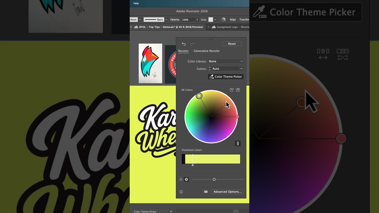
colors. So, today I'm going to test out Nathan Brown's new bring our own laptop course. Uh, it's Procreate for designers, people from Adobe land like me. Uh, I'm going to see what I can learn in one or two days and see whether Procreate's like a useful tool or just a more cumbersome version of my already good workbook. All right, start with a background color. And I don't
Customizing a basic lettering brush
want to use a brush that you have to download. But I want to start with one and kind of customize it like Nathan showed me. So I'm going to start with the basics one just with Stanley. It's super simple and duplicate it and name it. Okay. Double click it to open it. And I'm not going to go through everything, but the main things that I
Useful shortcuts and stabilization settings
found really useful was um three finger zigzag is useful. Crank up the streamline and play around with the pressure. Get it a bit higher. A little bit more stabilization. It makes me look much more fluid and nice. Next, I want
Adjusting brush taper and pressure
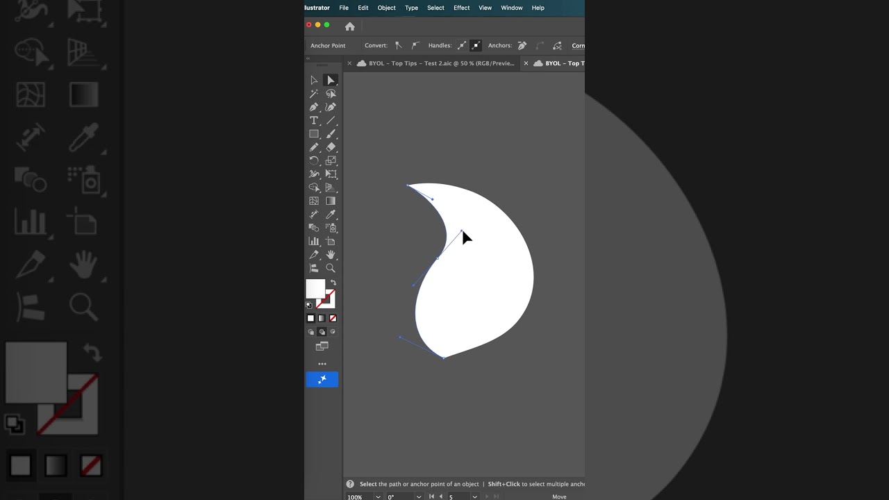
to play with the taper. both ends and just tuck these both in so that uh can you see the ends will get smaller. Like the ends to be relatively small along with my pencil like the pressure to adjust and the tip here I want it to be a bit fatter and thicker. Last handy tip from Nathan was the pencil. Uh I want to kind of make it so that it kind of I don't have to push so hard and just kind of like play around with this a little bit. So, a lot of my work happens when I'm pushing lightly, not when I have to push super hard. Play with the size as well. All right. And the one thing that was annoying me about this was this end part. Can you see it? It's kind of just a big blob at the end. If you taper it, means you can kind of get a nice swishy end as well. That'll do. All right. So, now I'm going to put on my fancy glove. One finger at a time. There you go. What I really like about this program, the undos. just get the O that you want. All right. So, now I'm just going to kind of move it around to get it how I want. All right. So, now I want to put an outline around my lettering. Uh, we need to duplicate this guy. Actually, duplicate him. We [snorts] need two of them. And I need to make them black. To do that, it's a bit of a hack. Um, you have got to turn this thing called alpha lock on. Basically, it just locks anything that is transparent. And what it'll allow us to do is alpha lock. I can then go into both of these and say you I've picked a fill color, which is my black. And I'm going to say uh fill layer. And I'll do that for both of them. And go through and turn alpha lock off on both of them. Otherwise, it'll cause you trouble. Ask me how I know. Grab the middle one and let's blur it. So, go up to our adjustments, go to Gaussian blur, and you click, hold, and drag it. Uh don't do too much. Basically, it'll determine your uh the width of the line around it. So, I've played around with this. So, I want something reasonably light cuz I want a small line around the outside. Once you've got that, go to and merge the one that's not blurred with the one that is. And I'm going to say merge down. All right. To turn into a line, I am going to turn off the top layer just so I can see the background. Let's go to selection. Okay. And we're going to be automatic. Make sure color fill is not on. And I'm going to go around and select everything. You wait there. Now, if we start on any of these, click, hold, and drag out. We can expand that selection to start grabbing some of that. You got to start again. You can reset your pencil. Okay. Just start getting some of the you see the lines there. Now, how thick that'll end up being, okay, will depend on your Gaussian blur. Mine's quite small. And if some of them drop off for some reason, you can just click them again. I don't know why it drops off. There you go. Now you've got all of that selected, you can go to uh new layer. Why not? I click on it. I'm going to go to fill this layer with whatever color I've got here. Don't really need this layer anymore. Let's turn the white back on. We outlined it. It's a bit of a hack, but it works. I find it even more dramatic that uh I'm in obviously Photoshop and Illustrator can do outlines really easy. That's all right. Can't do drawing really easy. I'm
Changing background colors and layer setup
going to change my background color to something darker. darker and red.
Refining lines and clearing fills
Now what I want to do is I want to cut the hole out of these because the moment I would like just the black line without the white fill. And what we can do is I should have done this before. We can select this and go to select. Nope. Go to select everything on that layer and go back into here and double take this one and say clear. And what's ended up happening is I just have the black lines. Okay. So, what I've done here is I created a new layer. I'm going to make it underneath my lettering. And I am going to pick one of the default brushes, new marker. I've started with Juniper and done a little bit of modifications under rendering. I just like it when it doesn't blend so much. And under stabilization of cranked it up a bit, so it's just a little bit easier for me to look good. Um, other than that, uh, that's it. I start to use some of these colors that are from the uh flourish um color palette that is built in. I like to do these big overlaps and kind of color them in afterwards. Got to remember to do a new layer for each one, which I never do. Nearly forgot. Whoops. did them all on the same layer. I give up. All right. After lunch, I came back and decided it needed a new background color. And we need some halftonone stuff. I'll show you how to do it. So, I'm going to make a new layer. Why not? And I think I can pick any old color. Um, and just kind of paint in. Actually, it needs to be this side. I think now I can use these effects. Uh, what is it? Half tone. I like newspaper. And then you just click, hold, and drag it. Oh, I like it so much. What did I get up to? Half tone of 10%. Just so I remember to do it for the next one. Yep, that's cool. So, I am now going to undo that so I can go through and color the rest of it in. All right, let's give that a go. So uh you tone newspaper instant awesome. Oh, I do like that. That's cool. All right, I like that. All right, next thing is an easy thing. I just want to add some white highlights. Use the lettering in this first one here. That'll do. As long as this is kind of helping me out. and a new layer because I normally forget. Actually, I'm going to grab this one and play around with the taper. Do like the taper. All right. Next thing I want to do is do some like cutting in. I like to do this with a pen as well. So, new layer. And what I want to do is just grab a using a pen. This one here, Kestrel, seems to be all good. Um, so what I'm going to do now is kind of cut it in so that there's a little bit of overlap. You'll get what I mean. See what I mean? I do lots of that. Man, being able to undo things is pretty is almost just worth it all. Real life and do love it. All right. At the risk of uh really overworking this, I'm going to put a gradient in. I don't know how to do it. So, I'm just going to go basic uh fourstar. And I'm going to pick a color that I'm going to use. And just turn the size way up. And then something like that. Just little touches. Make your ingredient. Good work. I bet there's a better way. Let for the moment. Little drop shadow. That is meant to be a drop shadow. And that'll do. Yes, I should have made it wider. I don't know why. It was one of the preset sizes, but now I know. All right. And if you wiggle it fast enough, I don't know. I'm pretty happy with it. Let's jump back to the big camera. Actually, there should be a lens flare button. There is not. No lens flares. Boo. So, the pros and cons of Procreate. Um, the cons. Uh, cons are that what you make is not vector. I guess it was never meant to be, but I don't know. I want things to be vector. Um, the other one was layers. Layers keep catching me out. Uh, but I guess I'll learn that. It's like Photoshop when you first learn it. Everything ends up being smooshed. And in Procreate, it caught me out a few times and kind of ruined what I was doing. Um, and the other one is frankly it's just not as fast as my notebook. I can grab my notebook and start sketching and get into idea phase a lot faster than digging out the iPad and getting a special glove on. Uh so those are the cons. Let's talk about the pros. Uh the main one undos. Uh has anybody else in like real life thought about undoss? Imagine if you had like a real life undo you do in Procreate. Anybody do that action? Okay, that kind of like command or control Z. Uh I do that. I feel like I'm doing that in real life sometimes. That just maybe that's just me. The next is stabilization. Uh for the brush strokes when you're drawing and your brain says nice smooth curve, but your actual hand goes okay. The stabilization feature in Procreate, I don't know, made me feel excited about my drawing ability. Feels like if you're crappy drawer, it's going to make you average. If you're average, you're going to be good. If you're good, you get the idea. I do love that stabilization feature. Makes me excited. Now, when I said the con was that it's not as fast as my notebook. Um, where it gets to the colors, that's where it actually is so much faster than trying to work out through my markers what colors to use and like having to 100% commit. Uh, the colors are RGB, so there's more colors. And also the um like uh pre-made swatch palette is they're just good. and I found I was picking better colors for it. So, uh that part of it is actually faster when it comes to like rendering and adding a bit of fidelity to my drawings. The last pro is how quickly it was to learn. Uh anybody trying to learn the pen tool? That is a life experience. Uh whereas I just did a shortcut and did Nathan Brown's course. It aimed at designers basically aimed at me. So that made it super fast. I spent about a day learning the course, doing the exercises with him and that got me to a really good place that I feel like I don't need anything else now. I just need to start making. So that was a big pro. So
Final thoughts: Procreate vs. Sketchbook
honestly, I think what I've learned is that it's not a replacement for my sketchbook. That's what I thought it was going to be. What it's done is I think it's opened up a gap between the sketches that I do in my sketchbook that are super quick that are so bad that you hope your customers and clients and colleagues never see these drawings. And what I normally do is then jump straight into something like Illustrator where I want this polished version. And often that can be a really tough uh transition. I feel like taking a couple of good ideas from the crappy drawings and working them in Procreate can help bridge that gap between those two where the strokes are nicer and the colors are better and there's undos. All of those things make I think yeah, it's opened up a gap I think in my design process. That's where it's going to fit. Final verdict. It is handier than I thought it was going to be for my design process. It's got me excited about creating things, which is I guess the best bit. This is the end. I never know how to end videos. How do other people do it? Thanks for watching. Do they always wave? I don't know. The end. —